Area Card
Area Card is an area-focused dashboard card. It shows a large area icon, an area/card name, status text, optional side buttons, optional curved buttons, and optional standalone action button.
type: custom:orbit-area-cardtype: custom:orbit-area-card
area_name: Living Room
area: living_room
accent_color: blue
main_entity: light.living_room
tap_action:
action: navigate
navigation_path: /lovelace/living-room
status1: sensor.living_room_temperature
status2: sensor.living_room_humidity
status_separator: "|"
button1: light.floor_lamptype: custom:orbit-area-card
area_name: Living Room
area: living_room
accent_color: theme
status_color: green
main_entity: light.living_room
main_entity_icon_source: custom
main_entity_icon: mdi:sofa
main_entity_icon_on: mdi:lightbulb-on
main_entity_icon_off: mdi:lightbulb
tap_action:
action: navigate
navigation_path: /lovelace/living-room
hold_action:
action: none
double_tap_action:
action: none
main_entity_tap_action:
action: more-info
status1: sensor.living_room_temperature
status1_icon: mdi:thermometer
status1_decimal_places: 1
status2: sensor.living_room_humidity
status2_icon: mdi:water-percent
status2_decimal_places: 0
status3: binary_sensor.living_room_motion
status3_icon: mdi:motion-sensor
button1: light.floor_lamp
button1_icon: mdi:floor-lamp
button1_on_color: amber
button1_off_color: theme
button1_tap_action:
action: toggle
button2: fan.living_room
button2_icon: mdi:fan
button2_tap_action:
action: toggle
curve_buttons_lock_position: true
curve_button1: scene.movie_time
curve_button1_icon: mdi:movie-open
curve_button1_on_color: amber
curve_button1_off_color: theme
curve_button1_tap_action:
action: call-service
service: scene.turn_on
service_data:
entity_id: scene.movie_time
curve_button2: script.good_night
curve_button2_icon: mdi:weather-night
curve_button2_tap_action:
action: call-service
service: script.turn_on
service_data:
entity_id: script.good_night
action_button: script.room_shortcut
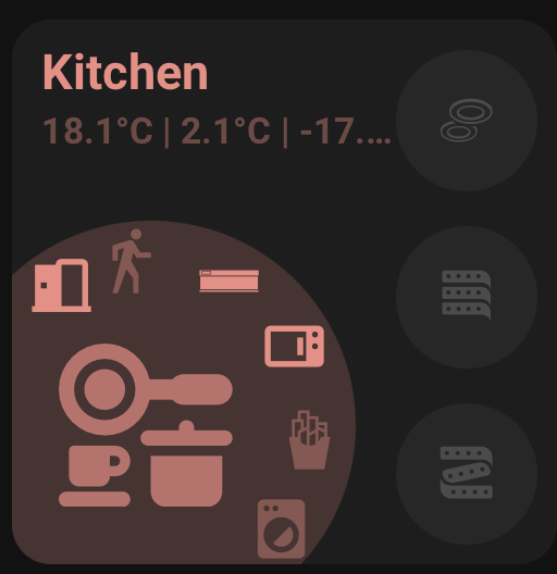
action_button_icon: mdi:dots-horizontal-circleArea Card has these main parts:
- Area/card name
- Status row
- Large main icon/circle
- Optional side buttons
- Optional curved buttons around the main icon
- Optional action button near the upper-right edge of the main circle
area: living_room
area_name: Living Room
area is the Home Assistant area id. It is used for area icon fallback and automatic area naming.
area_name is optional. It can be plain text or a composed name. When unset, the card resolves the name from the selected area, then the main entity. If no area/entity name is available, it stays empty.
room_name is still supported as a legacy alias, but new editor changes write area_name.
main_entity: light.living_roomThe main entity drives the large icon, main icon colour, and main icon interactions.
main_entity_icon_source: areaOptions:
-
areauses the selected Home Assistant area icon. -
entityuses the main entity icon. -
customuses the configured icon fields.
When unset, the card defaults to:
-
areawhen an area is configured -
entitywhen a main entity is configured -
customotherwise
Custom icon fields:
main_entity_icon: mdi:sofa
main_entity_icon_on: mdi:lightbulb-on
main_entity_icon_off: mdi:lightbulbtap_action:
action: navigate
navigation_path: /lovelace/living-room
hold_action:
action: none
double_tap_action:
action: nonetap_action replaces the old Navigation Path editor field.
Legacy configs using:
navigate:
  navigation_path: /lovelace/living-room
continue to work as a fallback.
main_entity_tap_action:
  action: more-info

main_entity_hold_action:
  action: none

main_entity_double_tap_action:
  action: none
Defaults:
- Main entity tap:
more-info - Main entity hold:
none - Main entity double tap:
none
If main entity tap is explicitly none, it can fall back to the card tap action.
Area Card supports three status entities:
status1: sensor.living_room_temperature
status2: sensor.living_room_humidity
status3: binary_sensor.living_room_motion
status_separator: "|"
Optional status settings:
status1_icon_source: entity
status1_icon: mdi:thermometer
status1_decimal_places: 1
status_separator defaults to |. Spaces are added automatically in the rendered card.
Area Card supports four side buttons:
button1: light.floor_lamp
button2: fan.living_room
button3: switch.living_room_socket
button4: cover.living_room_blind
Button icon options:
button1_icon_source: custom
button1_icon: mdi:floor-lamp
button1_icon_on: mdi:lightbulb-on
button1_icon_off: mdi:lightbulb
Button colour options:
button1_on_color: amber
button1_off_color: theme
Button interactions:
button1_tap_action:
  action: toggle

button1_hold_action:
  action: more-info

button1_double_tap_action:
  action: none
Defaults:
- Tap:
toggle - Hold:
more-info - Double tap:
none
Area Card supports six curved buttons:
curve_button1: scene.movie_time
curve_button2: script.good_night
curve_button3: light.lamp
curve_button4: switch.socket
curve_button5: cover.blind
curve_button6: binary_sensor.motion
Lock positions:
curve_buttons_lock_position: trueCurved button icon options:
curve_button1_icon_source: custom
curve_button1_icon: mdi:movie-open
curve_button1_icon_on: mdi:movie-open
curve_button1_icon_off: mdi:movie-open-outline
Curved button colour options:
curve_button1_on_color: amber
curve_button1_off_color: theme
Curved button interactions:
curve_button1_tap_action:
  action: more-info

curve_button1_hold_action:
  action: none

curve_button1_double_tap_action:
  action: none
Defaults:
- Tap:
more-info - Hold:
none - Double tap:
none
The standalone action button uses the same entity/icon/colour/action pattern as curved buttons.
action_button: script.room_shortcut
action_button_icon_source: custom
action_button_icon: mdi:dots-horizontal-circle
action_button_on_color: amber
action_button_off_color: theme
Interactions:
action_button_tap_action:
  action: call-service
  service: script.turn_on
  service_data:
    entity_id: script.room_shortcut

action_button_hold_action:
  action: none

action_button_double_tap_action:
  action: none
The default tap action is selected from the entity domain. Scenes, scripts, automations, buttons, and input buttons call their appropriate service.
The visual editor uses quick filters inside pickers.
Side buttons:
- All
- Cameras
- Lights
- Switches
Curve buttons:
- All
- Covers
- Lights
- Sensors
- Switches
Action button:
- All
- Automations
- Buttons
- Cameras
- Scenes
- Scripts
All keeps the picker unrestricted.