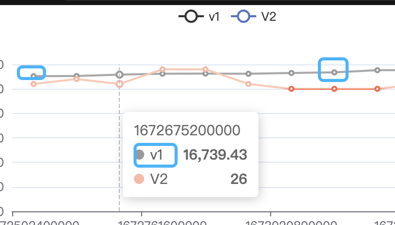
visualMap make all symbol color changed in dataset model , but work well in traditional series data
option = {
      darkMode: true,
      backgroundColor: "transparent",
      dataset: {
        source: [
          ["1672502400000", "16559.00", "26"],
          ["1672588800000", "16573.69", "27"],
          ["1672675200000", "16739.43", "26"],
          ["1672761600000", "16850.00", "29"],
          ["1672848000000", "16865.59", "29"],
          ["1672934400000", "16847.24", "26"],
          ["1673020800000", "16940.40", "25"],
          ["1673107200000", "17017.80", "25"],
          ["1673193600000", "17279.10", "25"],
          ["1673280000000", "17309.21", "26"]
        ]
      },
      tooltip: {
        trigger: "axis",
        confine: true,
        axisPointer: {
          type: "line",
          label: {}
        }
      },
      xAxis: {
        type: "category",
        boundaryGap: ["1%", "1%"],
        axisLabel: {}
      },
      yAxis: [
        {
          type: "value",
          splitLine: {
            show: false
          },
          axisLabel: {}
        },
        {
          type: "value",
          axisLabel: {}
        }
      ],
      series: [
        {
          name: "V1",
          type: "line",
          connectNulls: true,
          yAxisIndex: 0,
          itemStyle: {
            color: "#333"
          }
        },
        {
          name: "V2",
          type: "line",
          connectNulls: true,
          yAxisIndex: 1
        }
      ],
      legend: {
        type: "scroll"
      },
      visualMap: {
        dimension: 2,
        show: false,
        pieces: [
          {
            gt: 0,
            lte: 25,
            color: "#fa664c"
          },
          {
            gt: 25,
            lte: 50,
            color: "#fdb7a5"
          },
          {
            gt: 50,
            lte: 75,
            color: "#a4e0a7"
          },
          {
            gt: 75,
            lte: 100,
            color: "#5ac262"
          }
        ],
        outOfRange: {
          color: "#999"
        }
      },
      dataZoom: [
        {
          type: "slider",
          throttle: 16,
          showDetail: true,
          zoomOnMouseWheel: true,
          moveOnMouseMove: true,
          moveOnMouseWheel: false
        },
        {
          type: "inside",
          throttle: 16,
          zoomOnMouseWheel: true,
          moveOnMouseMove: true,
          moveOnMouseWheel: false
        }
      ]
    }
visualMap make all symbol color and tooltip color changed in dataset model , but work well in traditional series data
visualMap 在使用 dataset 数据集的时候, 会把所有数据在 symbol 都改变 tooltip 中显示的 symbol 也被改变了 , 在使用普通的 series data 并不会出样这个访问
- OS: All
- Browser: All
- Framework: Vue OR React OR JS
Version
5.4.1
Link to Minimal Reproduction
https://codesandbox.io/s/beijing-aqi-forked-ts460l?file=/index.js
Steps to Reproduce
visualMap make all symbol color changed in dataset model , but work well in traditional series data
this is not work well link in dataset model:
这是使用dataset 方式出现问题的链接:
https://codesandbox.io/s/beijing-aqi-forked-ts460l
this is work well link in series data model:
这是使用 series data 方式可以正常工作链接:
https://codesandbox.io/s/beijing-aqi-forked-r5lc6y
Current Behavior
visualMap make all symbol color and tooltip color changed in dataset model , but work well in traditional series data
visualMap 在使用 dataset 数据集的时候, 会把所有数据在 symbol 都改变 tooltip 中显示的 symbol 也被改变了 , 在使用普通的 series data 并不会出样这个访问
Expected Behavior
visualMap should only change the right dimension symbol color and tooltip
visualMap 应该只改变设置的指定的维度的数据的颜色 像下面这样
Environment
Any additional comments?
No response