Although this utility can also be used to extract data from line graphs or bar graphs, its main intent is to succeed where other data extraction utilities fail - scatter plots and color maps. The workhorse of this program is separation of data streams by color using a clustering algorithm.
Here we will show how to extract the data from a scatter plot. Start with the graph at its natural resolution. Do not increase the size of the graph as this will slow the program down and not improve results.
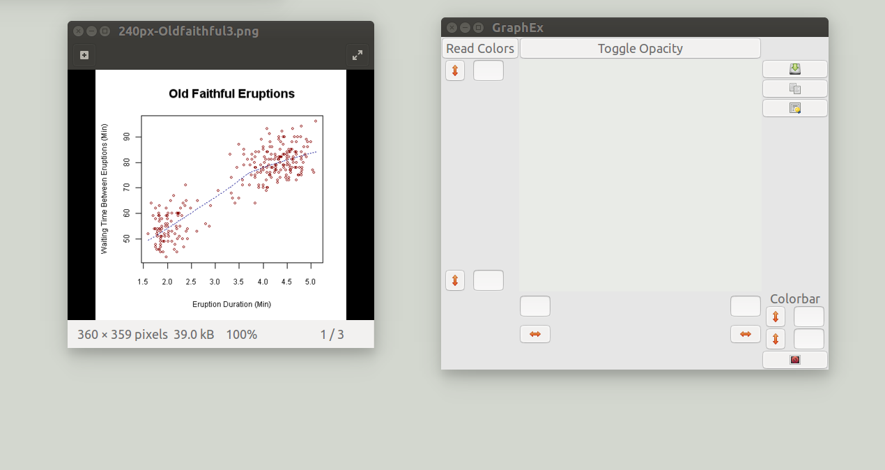
This plot contains 4 colors: white, black, red, and blue. The data is in red, so to extract the data, we will isolate the pixels which are colored red, and we will calibrate the axes so the program can convert from pixel space to graph space.
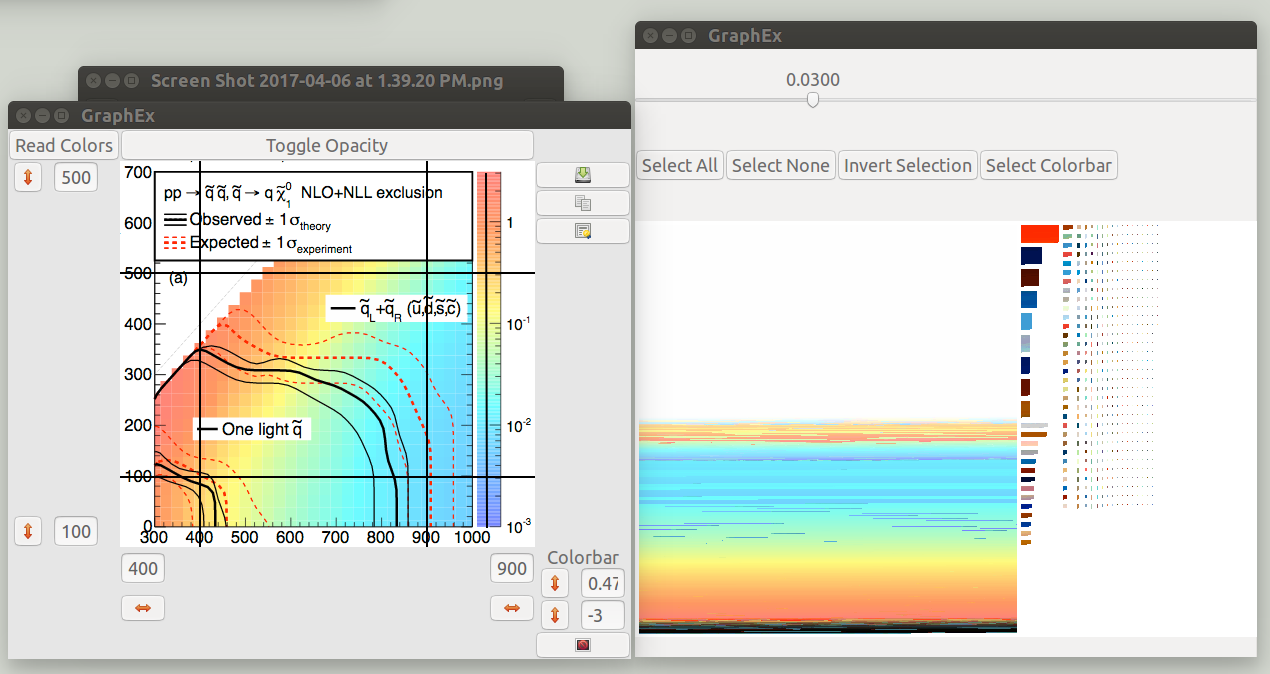
First place the window over the graph you wish to extract the data from, turn off the window opacity, and then resize the window so that all of the data and the axes are visible.
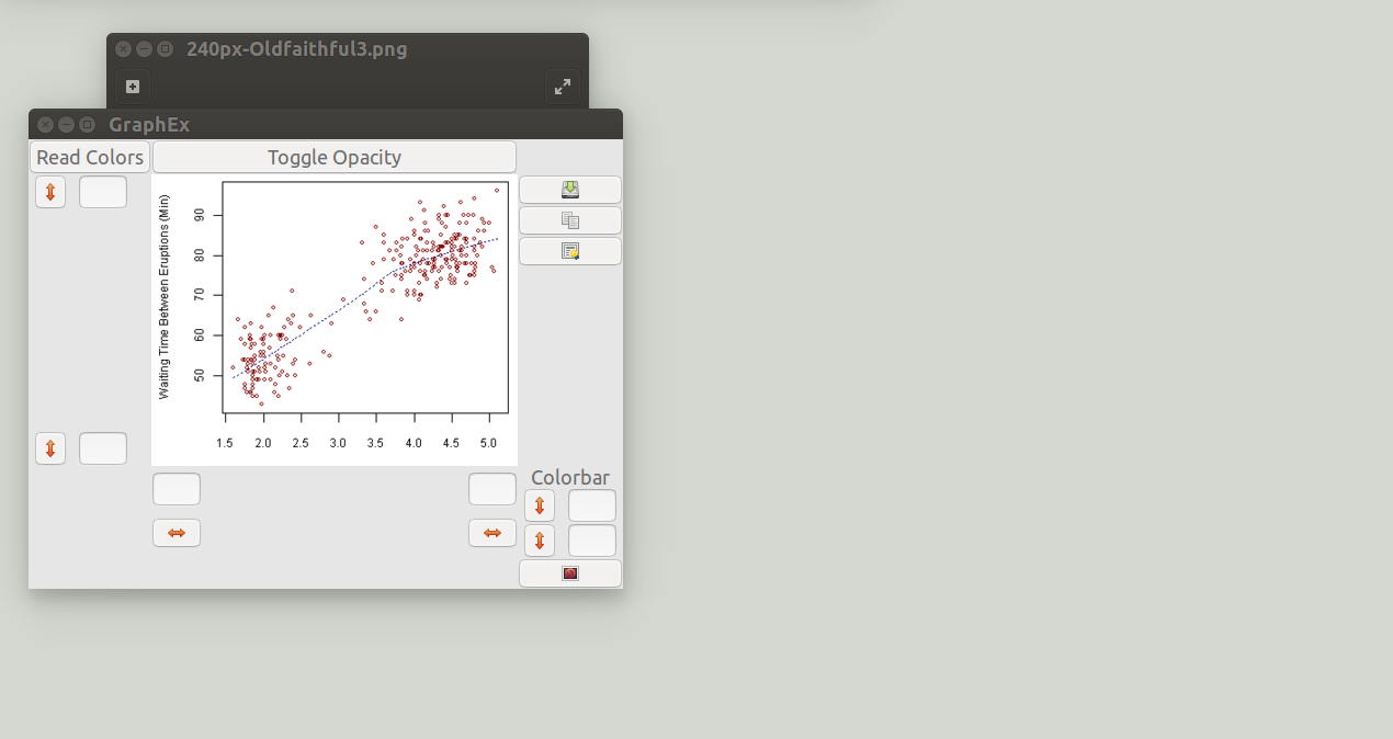
Then press the read colors button.
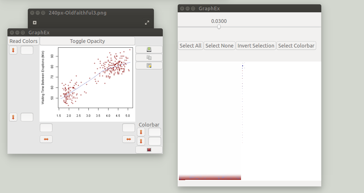
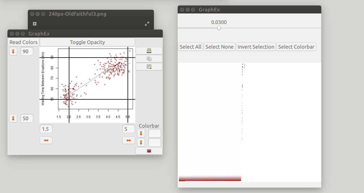
A new window popped up showing the clustering of the colors, but before attending to that we will calibrate the axes. Fill in values for the top-right and bottom left values in the entrys on the bottom and left sides of the window. These do not need to be the corners of the graph, but they should be somewhere that is easy to align with the graph's tick marks. Then press the <-> button for the top right point and place it on the graph. Do the same for the bottom left point.
The clustering of pixels according to color proceeds as follows: All of the pixels in the program's viewing area will be read in and pixels of identical color are grouped together. Next, the distance between colors in RGB space is measured and a clustering algorithm is used to group colors. The scroll bar at the top sets the threshhold distance for a color to join an existing cluster. The default setting has grouped the white, red, and some black pixels together. Adjust the scroll bar until you have separated the colors appropriately.
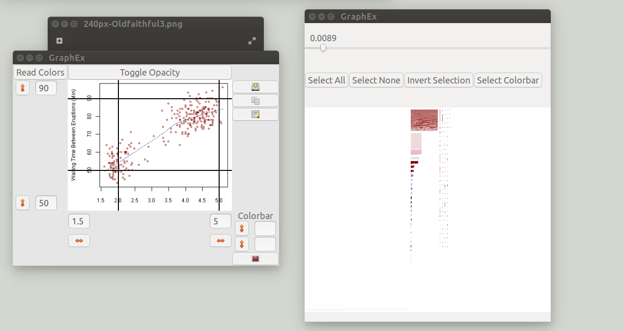
Then select the clusters which contain the data you would like to save. Selected clusters are surrounded by an orange box.
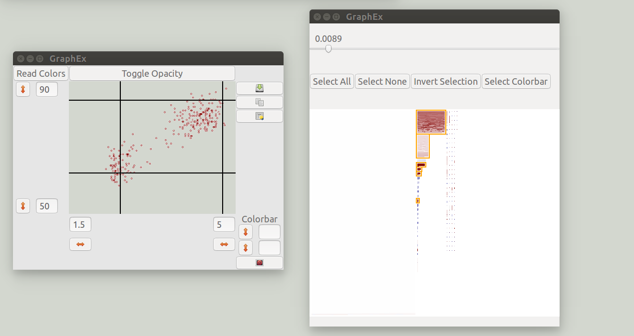
Additionally all pixels from selected clusters are colored in in the viewing area. The original graph has been hidden and only the extracted data is shown.
That's it!!!! You have isolated the relevant information and provided a means for the program to convert the x and y values of the data. Click the save to file or copy to clipboard functions on the right side to save your work. Additionally, you can save the extracted data as an image file which is useful in demonstrating what data was extracted from the image.
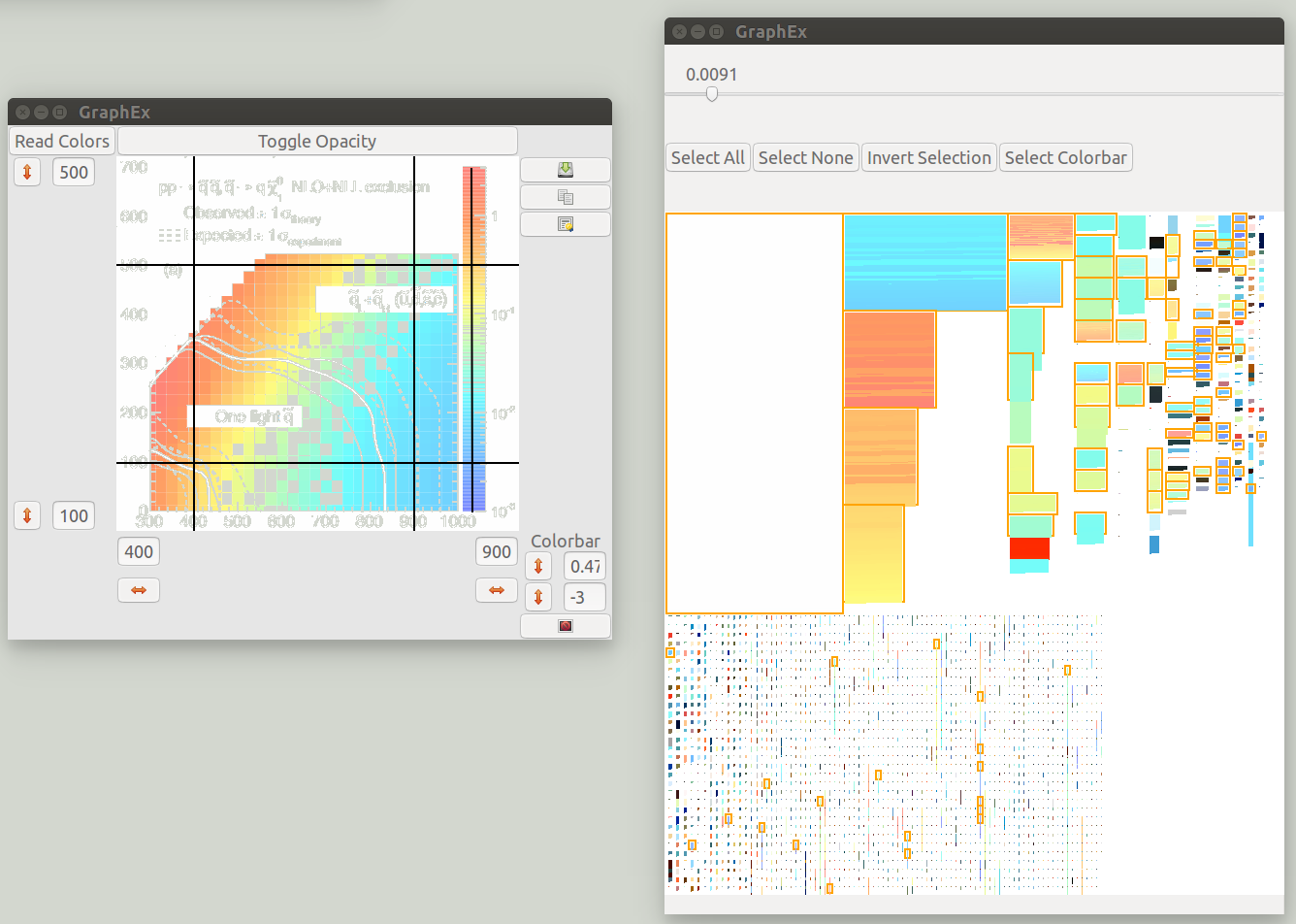
The extraction of data from a color map proceeds in much the same way as for a scatter plot.
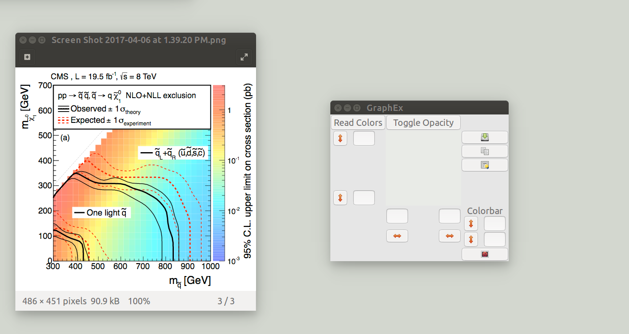
Begin by placing the window over the graph, turning off the viewing port opacity, reading the colors, and setting the x and y axes exactly as in the scatter plot example.
Next, fill in the lower and upper limits for the color bar in the bottom right corner. Since the colorbar is listed with logarithmic scaling, I will record the exponent instead of the actual value. Then, click the upper and lower <-> set buttons and place them on the color bar. Be sure the line crosses the entire color bar, only colors which the line crosses will be used.
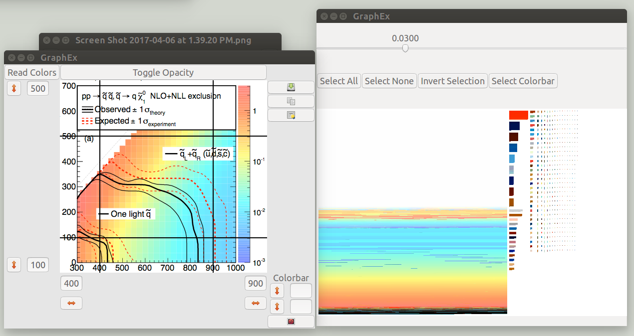
Just like for the scatter plot example, we will have to try a few different values of the clustering parameter to separate the bins. When the data is saved, each cluster will be assigned a different value based on the program "looking-up" the value in the color bar.
The data was selected using the select color bar option. This will select every cluster for which a data value exists from the color bar. The original graph was minimized to illustrate the data which has been extracted by the program. There are a few gaps, but almost the entire graph has been accounted for. Some of the data is unreachable and exists as many different clusters each with a few pixels. The value of the clustering parameter should be chosen to strike a balance between extracting all data versus resolving differences between colors. Don't forget to disable the white cluster, as it does not actually contain any useful information.
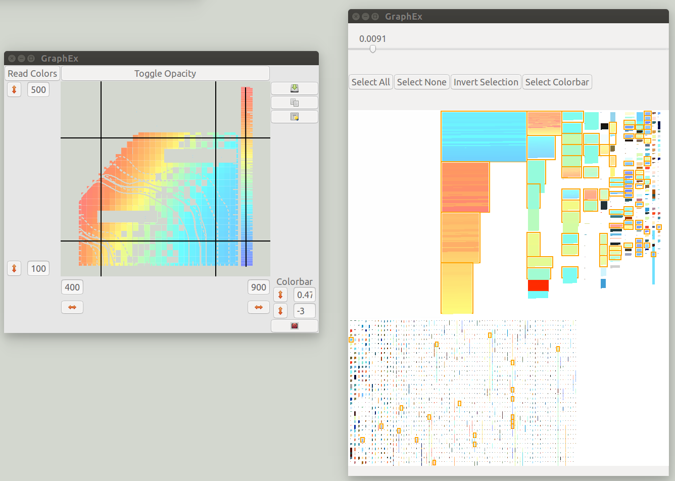
When this data is saved, it will automatically be stored as a 3 column data set, where the 3rd column has been determined by using the colorbar as a lookup table. The colorbar itself is also saved as the program cannot intelligently know not to do this, so in this example data points with an x value greater than 1000 should be discarded because they are part of the colorbar not the graph.
Linux: compile with this command
gcc GrapheEx.c -o GrapheEx `pkg-config --cflags --libs gtk+-3.0` -lm
To Run:
./GrapheEx
Mac: Use this script to install the prerequisites:
ruby -e "$(curl -fsSL https://raw.githubusercontent.com/Homebrew/install/master/install)"
brew install gtk+3
install gnuplot
BASEDIR="$( dirname "$0" )"
cd "$BASEDIR"
Then compile
gcc GrapheEx.c -o GrapheEx `pkg-config --cflags --libs gtk+-3.0` -lm
And Run
./GrapheEx