HTML & CSS course - January 2024
- Introduction to HTML & CSS.
- Typography in CSS.
- Box Model & Positioning
- CSS Layout - Flexbox
- Responsive Web Design
- Forms & Working with Forms
-
Introduction to HTML
-
What is HTML?
- This is a markup language.
- HTML is the basis for creating web pages and other information that can bedisplayed in a web browser.
- Language for expressing semantic structure in textual documents.
- HTML is a language for describing web pages.
- HTML documents contain HTML tags and plain text.
- A markup language is a set of markup tags.
- The tags describe document content.
- HTML is consumed by web browsers.
- The purpose of a web browser is to read HTML documents and compose them intovisible or audible web pages.
- The browser does not display the HTML tags, it uses the tags to interpret thecontent of the page.
-
HTML Tags:
- Tags are keywords surrounded by angle brackets. - HTML tags normally come inpairs: '<' + 'p' + '>' and '</' + 'p' + '>'
- The first tag in a pair is the start tag, the second tag is the end tag.
- The end tag is written like the start tag, with a forward slash before thetag name.
- Start and end tags are also called opening tags and closing tags.
-
Main HTML Tags:
- Describes the start and end of the web page/document -
<html></html> - Describes the start and end of the metadata section of the document
<head><head> - Describes the start and end of the web page/document -
<body></body> - Describes the start and end of the title section of the document -
<title><title>
- Describes the start and end of the web page/document -
-
_ Example:_ <img src="https://stuyhsdesign.files.wordpress.com/2015/09/basic-structure.png"width=250 height=150>
-
More HTML Tags:
-
Headings -
<h1> to <h6> -
Paragraphs -
<p> -
Text formating -
<strong>Text</strong>or<em>Text</em> -
Links -
<a href="https://softuni.bg">Click this to go to SoftUni.bg</a> -
Images -
<img src="/images/logo.png"> -
Ordered List -
<ol> <li>List item</li> <li>List item</li> </ol> -
Unordered Lst - can be differant types ('disc, circle,square') -
<ul <li>list item</li> <li>list item</li> </ul> -
Definition List -
<dl> <dt>Definition title </dt> <dd>Definition description</dd> <dt>Definition title </dt> <dd>Definition description</dd> </dl> -
Table -
     <table>

         <thead>
             <tr>
                 <th>Table Header 1</th>
                 <th>Table Header 2</th>
             </tr>
         </thead>
         <tbody>
             <tr>
                 <td>Table Cell 1</td>
                 <td>Table Cell 2</td>
             </tr>
         </tbody>

     </table>
-
-
HTML Tag Attributes:
- Attributes provide additional information about HTML elements
- Tags elements can have attributes:
<p class='my_theme'>Some text</p> - Attributes provide additional information about an element
- Attributes are always specified in the start tag
- Attributes come in name/value pairs like - name="value"
- Examples:
- href – gives the tag the location information for the link:
<a href="http://google.bg">Google</a> - src – tells the tag where to look for the image file:
<img src="/images/icons/logo.png">
- href – gives the tag the location information for the link:
- Some Tips:
- Always Quote Attribute Values. Attribute values should always be enclosed in quotes
- Double style quotes are the most common, but single style quotes are also allowed
- Be careful when combining single and double quotes, make sure you use only one type
- Reference Documentation - https://developer.mozilla.org/en-US/docs/Web/HTML/Attributes
-
HEAD Tag -
-
The
<head>element is a container for all the head elements.Elements inside<head>can include scripts, instruct the browser where to find style sheets, provide meta information, and more. -
The following tags can be added to the head section:
<title>, <style>, <meta>, <link>, <script>, <noscript>
-
Title -
<head> <title>HTML Document title</title> </head> -
Link -
<head> <link rel="stylesheet" type="text/css" href="style.css"> </head> -
Meta -
<head>
    <!-- Define keywords for search engines: -->
    <meta name="keywords" content="HTML, CSS, XML, XHTML,JavaScript">
    <!--Define a description of your web page:-->
    <meta name="description" content=”Courses on HTML and CSS">
    <!--Define the author of a page:-->
    <meta name="author" content=”Koko">
</head>
-
-
-
Introduction to CSS
-
What is CSS?
- CSS stands for Cascading Style Sheets.
- Styles define the visual presentation of HTML elements.
- CSS solved a problem.
- HTML was never intended to contain tags for formatting a document.
- With CSS the separation between semantic content and visual presentation can be achieved again.
- CSS can save you a lot of work!
- External visual style guide shared across all pages of your site.
- Change the style guide - change all page's visual presentation.
-
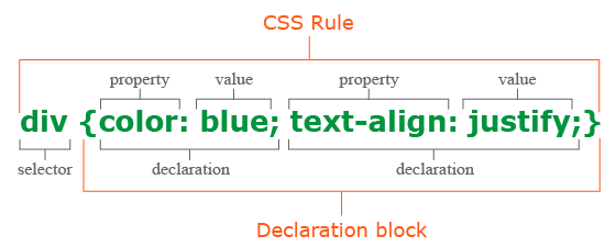
CSS syntax:
- Every CSS document is a collection of CSS rules.
- CSS rule has two main parts, Select and one or more declarations.
- Each declaration consists of a property and a value.
-
CSS rule has two main parts - SELECTOR and one or more DECLARATIONS!
[selector]{ [declaration] [declaration] } -
The CSS Selector is an identifier of the HTML element or the group of HTML elements you want to style.
body{ .... } -
CSS Declarations end with a semicolon, and declaration groups are surrounded by curly brackets.
{
    font:16px/1.5 Verdana, sans-serif;
    color: #333;
}
-
CSS Selectors
- In CSS, selectors are used to target the HTML elements on our web pages that we want to style
- There are a wide variety of CSS selectors available, allowing for fine-grained precision when selecting elements to style
- A CSS selector is the first part of a CSS Rule
-
Type selectors - The CSS type selector matches elements by node name. In other words, it selects all elements of the given type within a document.
[tag-name]{ OR h1{ [declaration] color:red; [declaration] font-weight:bold; } } -
Class selectors - The CSS class selector matches elements based on the contents of their class attribute.
.[tag-name]{ OR .[class-name]{ [declaration] color:red; [declaration] font-weight:bold; } } -
ID selectors - The CSS ID selector matches an element based on the value of the element's id attribute. For the element to be selected, its id attribute must match exactly the value given in the selector.
#[tag-name]{ OR #[id-name]{ [declaration] color:red; [declaration] font-weight:bold; } } -
Attribute selector - The CSS attribute selector matches elements based on the element having a given attribute explicitly set, with options for defining an attribute value or substring value match.
[attribute="value"]{ OR [href="https://google.com"]{ [declaration] color:red; [declaration] font-weight:bold; } } -
Universal selector - The CSS universal selector (*) matches elements of any type.
*{                            OR        *{
    [declaration]                           color:red;
    [declaration]                           font-weight:bold;
}                                       }
-
CSS Combinators
-
Descendant combinator - The descendant combinator — typically represented by a single space (" ") character — combines two selectors such that elements matched by the second selector are selected if they have an ancestor (parent, parent's parent, parent's parent's parent, etc.) element matching the first selector.
header p { color:red; font-weight: bold; } -
Selector list - The CSS selector list (,) selects all the matching nodes. A selector list is a comma-separated list of selectors.
header, p, div { color:red; font-weight: bold; } -
Child combinator - The child combinator (>) is placed between two CSS selectors. It matches only those elements matched by the second selector that are the direct children of elements matched by the first.
header > p {
    color:red;
    font-weight:bold;
}
-
-
CSS Pseudo-class - HERE...
-
CSS Pseudo-element - HERE...
-
-
Adding CSS to HTML - There are three ways of inserting a style sheet:
-
External style sheet:
-
An external style sheet is ideal when the style is applied to many pages. With an external style sheet, you can change the look of an entire Web site by changing one file. Each page must link to the style sheet using the tag.
-
The tag goes inside the head section:
<head>
    <link rel="stylesheet" type="text/css" href="style.css">
</head>
-
-
Internal style sheet:
-
An internal style sheet should be used when a single document has a unique style. You define internal styles in the head section of an HTML page, by using the style tag.
<head>
    <style>
        body{
            ...
        }
    </style>
</head>
-
-
Inline style:
-
An inline style loses many of the advantages of style sheets by mixing content with presentation.
-
Do not use this method unless you have no other choice.
-
To use inline styles, you use the style attribute in the relevant tag. The style attribute can contain any CSS property.
<div style="color: red;">
        …
</div>
-
-
-
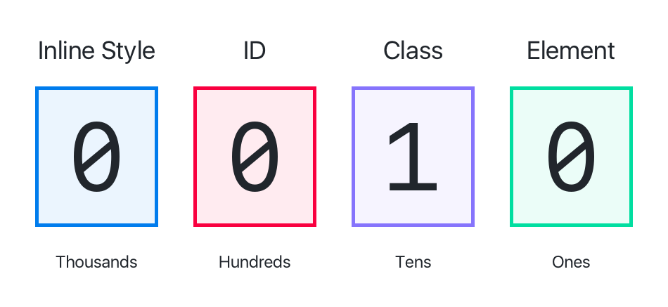
CSS Selector Inhertance & Specificity:
-
CSS relies heavily on specificity and style overwriting.
-
It's in the name!.
-
Cascading Style Sheets.
-
Cascade Order - in increasing order of priority.
- External
<link> - In the
<head> - Inline style attribute
- Using !importan
- External
-
-
CSS Properties:
-
Practice
- some zip files with solutions (homework)
- more exercises

-
What is Typography? - Typography is the art and technique of arranging type to make written language legible, readable, and appealing when displayed.Typography is the visual component of the written word.
- Styling text - Choosing a comfortable measure
- The measure is the number of characters in single line of a column of text.
- Anything from 45 to 75 characters is widely regarded as a satisfactory length of line for a single-column page set in a serifed text face in a text size.
- The 66-character line (counting both letters and spaces) is widely regarded as ideal. For multiple column work, a better average is 40 to 50 characters.
- Fonts & Font Famiy
- Font Family:
- In typography, a font family (also known as typeface) is a set of one or more fonts each composed of glyphs that share common design features.
- Each font of a typeface has a specific weight, style, condensation, width, slant, italicization, ornamentation, and designer or foundry.
- Font:
- A computer font (or font) is implemented as a digital data file containing a set of graphically related glyphs, characters, or symbols such as dingbats.
- Although the term font first referred to a set of movable metal type pieces in one style and size, since the 1990s it is generally used to refer to a set of digital shapes in a single style, scalable to different sizes.
- Generic Font Families:
- serif
- sans-serif
- monospace
- cursive
- fantasy
- Web Fonts:
- At the time, fetching font files from the web was controversial because fonts meant to be used only for certain web pages could also be downloaded and installed in breach of the font license.
- Font Family:
- Styling text - Choosing a comfortable measure
-
CSS Units
-
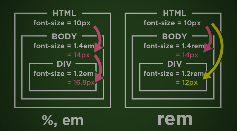
EM & REM:
- Ems are so-called because they are thought to approximate the size of an uppercase letter M, although 1em is significantly larger than this.
- The em is a sliding measure. One em is a distance equal to the type size.
- In 6-point type, an em is 6 points; in 12 point type an em is 12 points and in 60 point type an em is 60 points.
-
-
CSS Properties
- color & background - comes together!
- text:
- text-align: left,right,center ...
- text-decoration: - decorate the text
- text-indent: - move the text with space
- text-overflow: - if the text is more than the box
- text-shadow: 0 0 5px black - shadow of the text
- font:
- font-family: serif etc. - type of the font
- font-size: 2em - font size
- font-style: italic - style of the font
- font-weight: 700 - weight of the font
- line-height: 1.5 - space between lines
-
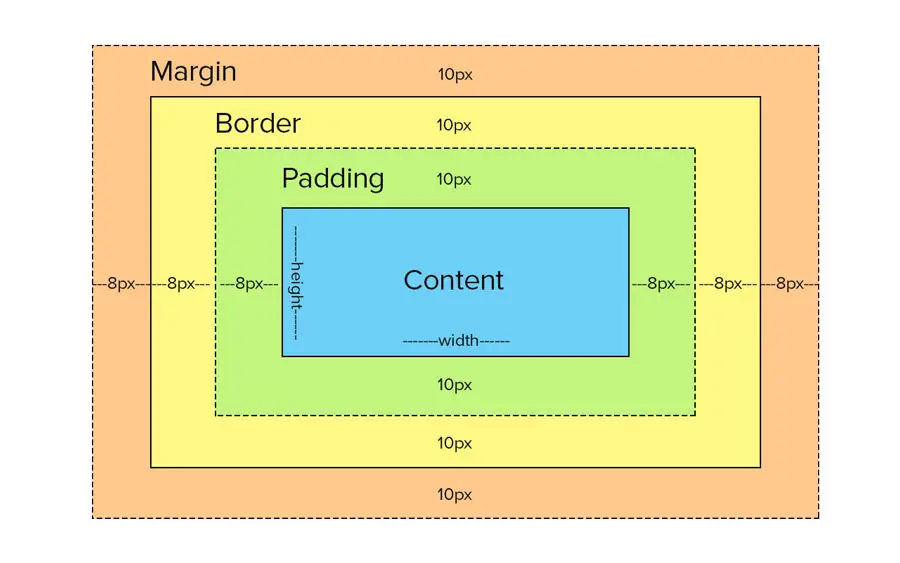
When laying out a document, the browser's rendering engine represents each element as a rectangular box according to the standard CSS basic box model.CSS determines the size, position, and properties (color,background, border size, etc.) of these boxes.
-
Display: - The display CSS property defines the display type of an element, which consists of the two basic qualities of how an element generates boxes.
-
the outer display type defining how the box participates in flow layout;
-
he inner display type defining how the children of the box are laid out;
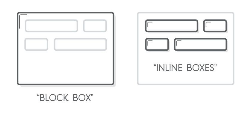
- display: block;
- TML elements historically were categorized as either "block-level" elements or "inline" elements.
- By default, a block-level element occupies the entire space of its parent element (container), thereby creating a "block".
- Browsers typically display the block-level element with a newline both before and after the element.
- You can visualize them as a stack of boxes.
- display: inline;
- Inline elements are those which only occupy the space bounded by the tags defining the element, instead of breaking the flow of the content.
- display: inline-block;
- Gives us the ability to use vertical padding and margin on inline elements as well as adding width and height.
-
-
Width: - The width CSS property sets an element's width. By default,it sets the width of the content area, but if box-sizing is set to border-box, it sets the width of the border area.
- Default width of block elements:
- If you don't declare a width, and the box has static or relative positioning, the width will remain 100% in width and the padding and border will push inwards instead of outward.
- If you explicitly set the width of the box to be 100%, the padding will push the box outward as normal.
- min-width: ...px || em;
- The min-width CSS property sets the minimum width of an element.
- It prevents the used value of the width property from becoming smaller than the value specified for min-width.
- max-width: ...px || em;
- The max-width CSS property sets the maximum width of an element.
- It prevents the used value of the width property from becoming larger than the value specified by max-width.
- Default width of block elements:
-
Height: - The height CSS property specifies the height of an element.By default, the property defines the height of the content area.If box-sizing is set to border-box, however, it instead determines the height of the border area.
- min-height: ...px || em;
- The min-height CSS property sets the minimum height of an element.
- It prevents the used value of the height property from becoming smaller than the value specified for min-height.
- max-height: ...px || em;
- The max-height CSS property sets the maximum height of an element.
- It prevents the used value of the height property from becoming larger than the value specified for max-height.
- min-height: ...px || em;
-
Margin:
- The margin CSS property sets the margin area on all four sides of an element.
- It is a shorthand for margin-top, margin-right,margin-bottom,and margin-left.
-
Border:
- The border CSS property sets an element's border.
- It's a shorthand for border-width, border-style, and border-color.
-
Padding:
- The padding CSS property sets the padding area on all four sides of an element.
- It is a shorthand for padding-top, padding-right, padding-bottom,and padding-left.
-
-
Block and Inline boxes:
- In CSS we have several types of boxes that generally fit into the categories of block boxes and inline boxes.
- The type refers to how the box behaves in terms of page flow and in relation to other boxes on the page.
- Boxes have an inner display type and an outer display type.
- In general, you can set various values for the display type using the display property, which can have various values.
-
Outer display type - Inline:
-
If a box has an outer display type of inline, then:
- The box will not break onto a new line;
- The width and height properties will not apply;
- Top and bottom padding, margins, and borders will apply but will not cause other inline boxes to move away from the box;
- Left and right padding, margins, and borders will apply and will cause other inline boxes to move away from the box;
- Some HTML elements, such as
<a>,<span>,<em>and<strong>use inline as their outer display type by default.
-
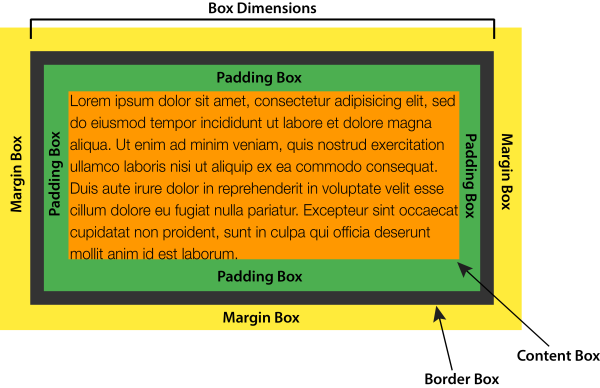
The CSS box model defines how the different parts of a box — margin,border, padding, and content — work together to create a box that you can see on a page;
- Inline boxes use just some of the behavior defined in the box model.
-
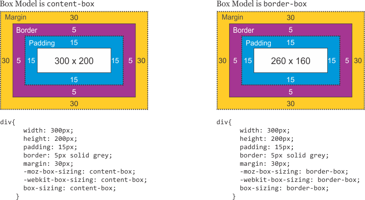
To add complexity, there is a standard and an alternate box model;
- By default, browsers use the standard box model.
-
-
Parts of a box:
-
Making up a block box in CSS we have the:
-
Content box: The area where your content is displayed; size it using properties like inline-size and block-size or width and height;
-
Padding box: The padding sits around the content as white space; size it using padding and related properties;
-
Border box: wraps the content and any padding; size it using border and related properties;
-
Margin box: the outermost layer, wrapping the content,padding, and border as whitespace between this box and other elements; size it using margin and related properties;
-
-
In the standard box model, if you give a box an inline-size and a block-size (or width and a height) attributes, this defines the inlinesize and block-size (width and height in horizontal languages) of the content box;
- Any padding and border is then added to those dimensions to get the total size taken up by the box.
- If we assume that a box has the following CSS:
- The actual space taken up by the box will be 410px wide (350 + 25 + 25 + 5 + 5) and 210px high (150 + 25 + 25 + 5 + 5).
-
In the alternative box model, any width is the width of the visible box on the page;
- The content area width is that width minus the width for the padding and border (see image below)
- No need to add up the border and padding to get the real size of the box.
- To turn on the alternative model for an element use:
.box{box-sizing:border-box;} - If we assume the box has the same CSS as above:
- Now, the actual space taken up by the box will be 350px in the inline direction and 150px in the block direction.
The position property specifies the type of positioning method used for an element (static, relative, fixed, absolute or sticky)
Elements are then positioned using the top, bottom, left, and right properties
However, these properties will not work unless the position property is set first. They also work differently depending on the position value.
- position:static;
- The default state of every element — it just means"put the element into its normal position in the document layout flow — nothing special to see here."
- position: relative;
- Very similar to static positioning, except that once the positioned element has taken its place in the normal layout flow, you can then modify its final position, including making it overlap other elements on the page.
- position: absolute;
- This way we have to position the element based on a two dimentional coordinate system.
- We can use left, top, bottom, right to place the element exactly where we want.
- position: fixed;
- The element is removed from the normal document flow, and no space is created for the element in the page layout.
- The element is positioned relative to its initial containing block, which is the viewport in the case of visual media.
- Its final position is determined by the values of top, right, bottom, and left.
- This value always creates a new stacking context.
- In printed documents, the element is placed in the same position on every page.
- position: sticky
- The element is positioned according to the normal flow of the document,and then offset relative to its nearest scrolling ancestor and containing block (nearest block-level ancestor), including table-related elements,based on the values of top, right, bottom, and left.
- The offset does not affect the position of any other elements.
- This value always creates a new stacking context.
- Note that a sticky element "sticks" to its nearest ancestor that has a "scrolling mechanism" (created when overflow is hidden, scroll, auto, or overlay), even if that ancestor isn't the nearest actually scrolling ancestor.
- z-index
- The z-index CSS property sets the z-order of a positioned element and its descendants or flex items.
- Overlapping elements with a larger z-index cover those with a smaller one.
- more info...
- Box Model:
- https://developer.mozilla.org/en-US/docs/Web/CSS/CSS_Box_Model
- https://developer.mozilla.org/en-US/docs/Web/CSS/display
- https://developer.mozilla.org/en-US/docs/Web/CSS/box-sizing
- https://css-tricks.com/the-css-box-model
- https://css-tricks.com/box-sizing
- https://www.paulirish.com/2012/box-sizing-border-box-ftw/
- Position:
- https://developer.mozilla.org/en-US/docs/Web/CSS/position
- https://developer.mozilla.org/en-US/docs/Web/CSS/z-index
- https://developer.mozilla.org/en-US/docs/Web/CSS/CSS_positioned_layout/Understanding_z-index
- https://interactive-examples.mdn.mozilla.net/pages/css/position.html
- https://css-tricks.com/video-screencasts/198-about-the-position-property/
- https://css-tricks.com/almanac/properties/p/position/
- https://css-tricks.com/position-sticky-2/
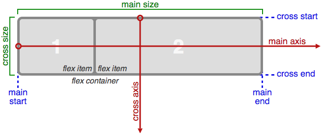
The Flexible Box Module, usually referred to as flexbox, was designed as a one-dimensional layout model, and as a method that could offer space distribution between items in an interface and powerful alignment capabilities.
For a long time, the only reliable cross browser-compatible tools available for creating CSS layouts were things like floats and positioning.
- These are fine and they work, but in some ways, they are also rather limiting and frustrating.
Flexbox can be look at as a logical system to arrange boxes in 2 dimensions
There are many places where an understanding of the ideas of Flexbox will be very useful.
For elements to be laid out as flexible boxes we set a special value of display on the parent element of the elements you want to affect.
This causes the element to become a flex container and its children to become flex items.
When elements are laid out as flex items, they are laid out along two axes:

Complexity and the value of reference
- The entire specification with all possible properties that are related to flexbox can be overwhelming, especially in the beginning
- Don't try to learn and remember everything
- Try to understand the basic concepts – the properties will be learned through exercise and repetition
- https://css-tricks.com/snippets/css/a-guide-to-flexbox/
Container and Item properties:
- We can separate the collection of properties related to Flexbox in to two main categories.
- Properties that are applied to the Flex container and properties applied to the Flex items.
-
Flex Container
-
display: flex;
- We set a value of 'flex' to the display property on the parent element of the elements you want to affect.
-
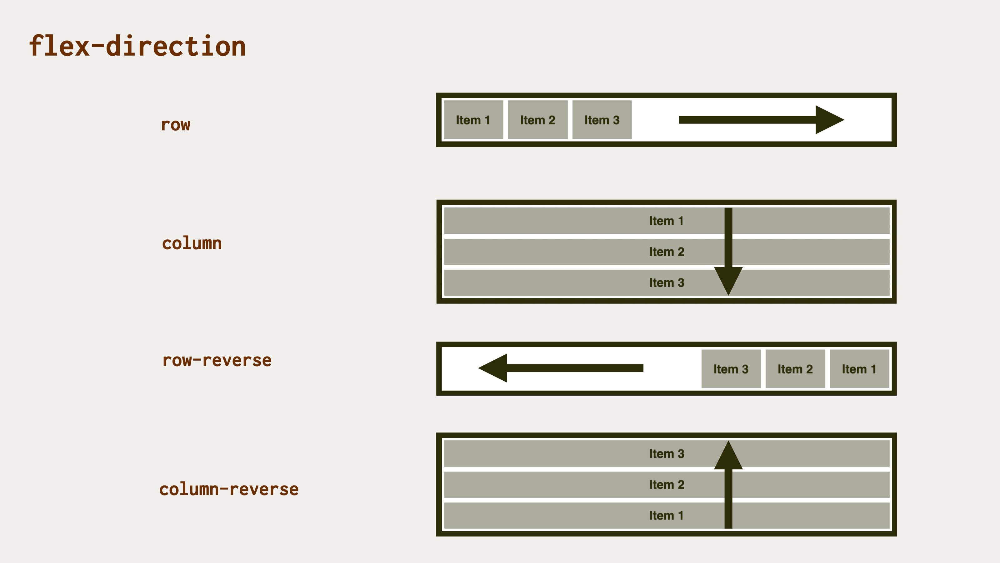
flex-direction: column || row
- Flexbox provides a property called flex-direction that specifies which direction the main axis runs (which direction the flexbox children are laid out in)
- By default, this is set to row, which causes them to be laid out in a row in the direction your browser's default language works in
-
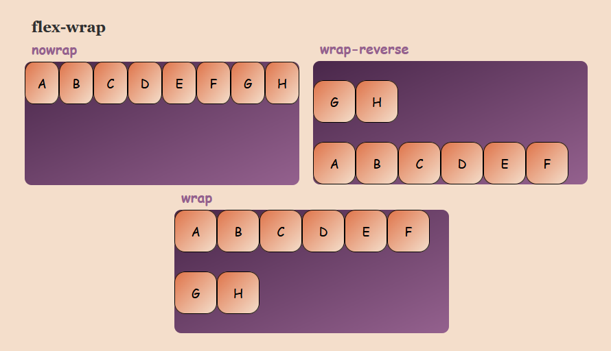
flex-wrap
- One issue that arises when you have a fixed width or height in your layout is that eventually your flexbox children will overflow their container, breaking the layout.
-
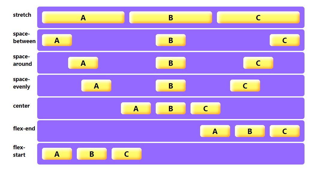
justify-content
- Defines how the browser distributes space between and around content items along the main-axis of a flex container, and the inline axis of a grid container.
-
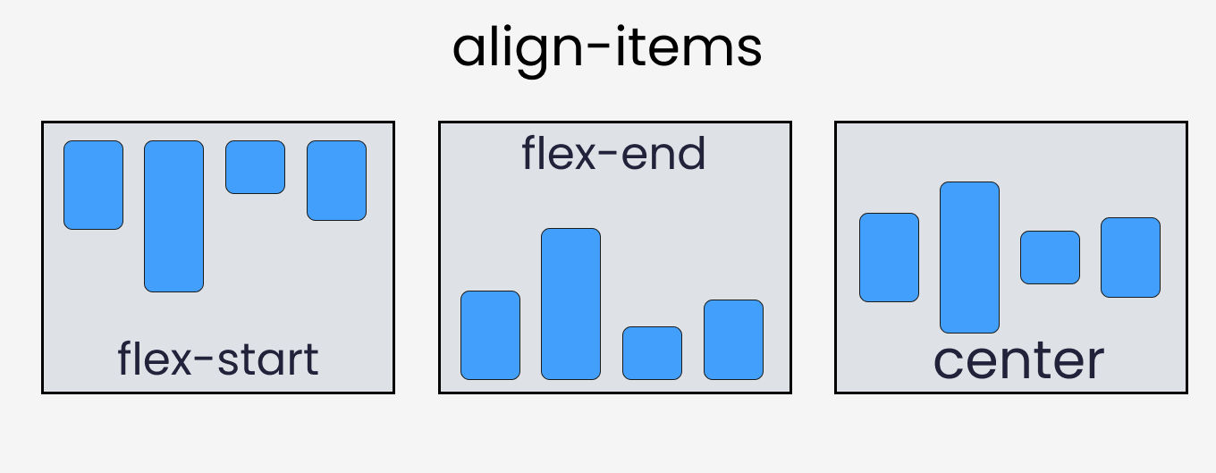
align-items
- Sets the align-self value on all direct children as a group
- In Flexbox, it controls the alignment of items on the Cross Axis
-
gap
- Sets the gaps (gutters) between rows and columns
-
-
Flex Item
-
order
- Sets the order to lay out an item in a flex container
- Items in a container are sorted by ascending order value and then by their source code order.
-
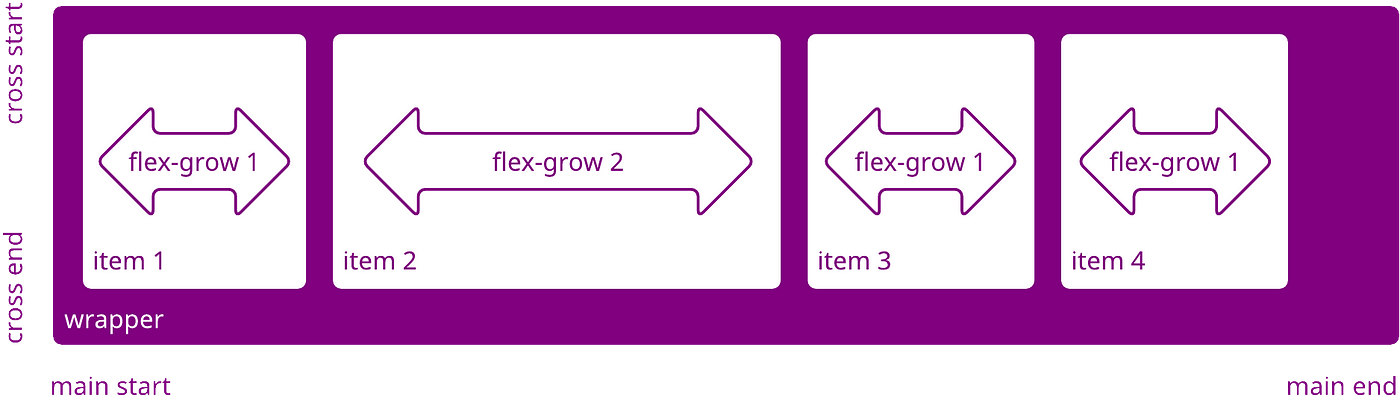
flex-grow
- Sets the flex grow factor, which specifies how much of the flex container's remaining space should be assigned to the flex item's main size.
-
flex-shrink
- Sets the flex shrink factor of a flex item
- If the size of all flex items is larger than the flex container,items shrink to fit according to flex-shrink.
-
flex-basis
- Sets the initial main size of a flex item
- It sets the size of the content box unless otherwise set with box-sizing.
-
- https://developer.mozilla.org/en-US/docs/Learn/CSS/CSS_layout/Flexbox
- https://developer.mozilla.org/en-US/docs/Web/CSS/CSS_Flexible_Box_Layout/Basic_Concepts_of_Flexbox
- https://css-tricks.com/snippets/css/a-guide-to-flexbox/
- https://www.youtube.com/watch?v=hs3piaN4b5I
- https://www.flexboxgame.com/
-
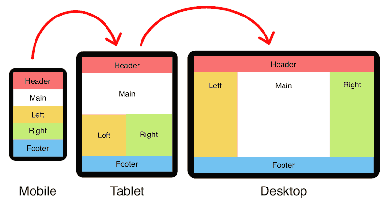
What is Responsive Web Desgn?
- It is an approach to make web pages render well on all screen sizes and resolutions while ensuring good usability.
- It is the way to design for a multi-device web.
-
Responsive Web Design - How?
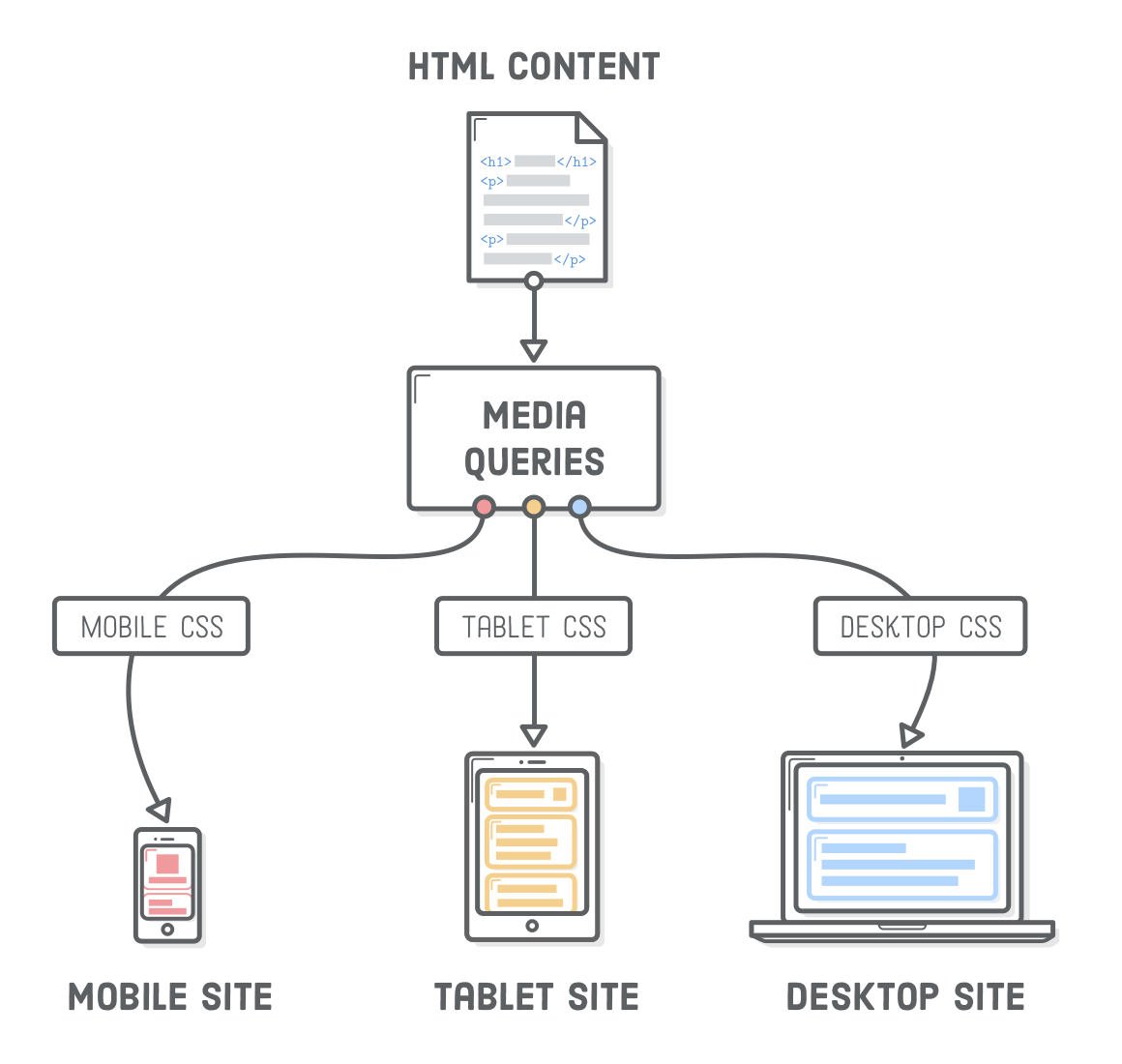
- Media queries - Allow us to run a series of tests (e.g., whether the user's screen is greater than a certain width, or a certain resolution) and apply CSS selectively to style the page appropriately for the user's needs.
- Media queries - Allow us to run a series of tests (e.g., whether the user's screen is greater than a certain width, or a certain resolution) and apply CSS selectively to style the page appropriately for the user's needs.
-
Media Queries
-
In HTML - Media Queries can be applied to various elements:
- In the link element's media attribute, they define the media to which a linked resource (typically CSS) should be applied
- In the source element's media attribute, they define the media to which that source should be applied (This is only valid inside picture elements.)
- In the style element's media attribute, they define the media to which the style should be applied.
-
Media Types:
-
Media types describe the general category of a given device.
-
Although, websites are commonly designed with screens in mind, you may want to create styles that target special devices such as printers or audio-based screen readers.
      @media print {...}
      @media screen,print{...}
-
-
@import:
-
The @import CSS at-rule is used to import style rules from other style sheets.
-
These rules must precede all other types of rules, except @charset rules.
-
As it is not a nested statement, @import cannot be used inside conditional group at-rules.
@impor url("style.css") screen;
-
-
Media Features
-
Media features describe a specific characteristic of the user agent, output device, or environment:
@media (min-width:600px){...}-
min-width - Specifies a minimal width for the viewport in order to apply the rules included
-
max-width - Specifies a maximum width for the viewport up to which it will apply the rules included
-
Orientation - Specifies a device orientation for which it will apply therules included
@media (orientation:landscape || portrait){...} -
hover - Checks for a device ability for which it will apply the rules included
@media (hover:hover){...} -
pointer - Checks for a device ability for which it will apply the rules included
@media (pointer:fine){...}
-
-
-
Logical operators - The logical operators only can be used to compose a complex media query. You can also combine multiple media queries into a single rule by separating them with commas.
@media screen and (pointer:fine){...}-
and - The and operator is used for combining multiple media features together into a single media query, requiring each chained feature to return true in order for the query to be true. It is also used for joining media features with media types.
-
not - The not operator is used to negate a media query, returning true if the query would otherwise return false. If present in a comma-separated list of queries, it will only negate the specific query to which it is applied. If you use the not operator, you must also specify a media type.
-
only - The only operator is used to apply a style only if an entire query matches and is useful for preventing older browsers from applying selected styles. If you use the only operator, you must also specify a media type.
-
, (comma) - Commas are used to combine multiple media queries into a single rule. Each query in a comma-separated list is treated separately from the others. Thus, if any of the queries in a list is true, the entire media statement returns true. In other words, lists behave like a logical or operator.
@media (min-width:680px),only screen and (orientation:portrait){...}
-
-
-
Resources:
- https://developer.mozilla.org/en-US/docs/Web/CSS/Media_Queries
- https://developer.mozilla.org/en-US/docs/Web/CSS/@import
- https://developer.mozilla.org/en-US/docs/Web/CSS/Media_Queries/Testing_media_queries
- https://developer.mozilla.org/en-US/docs/Web/CSS/Media_Queries/Using_media_queries#Media_features
- https://caniuse.com/#feat=css-mediaqueries
- https://css-tricks.com/snippets/css/mediaqueries-for-standard-devices/
- https://responsivedesign.is/articles/why-youdont-need-device-specific-breakpoints/
- https://davidwalsh.name/animate-mediaqueries
- https://mediaqueri.es/
- https://responsivedesign.is/

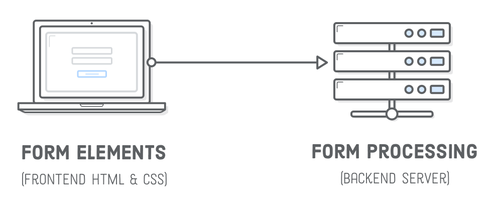
- HTML Forms - The HTML form element represents a document section that contains interactive controls for submitting information to a web server.
-
Attributes - Method
The HTTP method that the browser uses to submit the form.
<form action="/server/" method="...">-
post method - Corresponds to the HTTP POST method. Form data are included in the body of the form and sent to the server.
<form action="/server/" method="POST"> -
get method - Form data are appended to the action attribute URI with a '?' as separator, and the resulting URI is sent to the server. Use this method when the form has no side-effects and contains only ASCII characters.
-
-
Label - The HTML label element represents a caption for an item in a user interface.
<label for='full-name'>Text</label> <input id='full-name' name='some-name' type='text' />- The label text is not only visually associated with its corresponding text input.
- It is programmatically associated with it too.
- You can click the associated label to focus/activate the input, as well as the input itself.
- This increased hit area provides an advantage to anyone trying to activate the input, including those using a touch-screen device.
- The label text is not only visually associated with its corresponding text input.
-
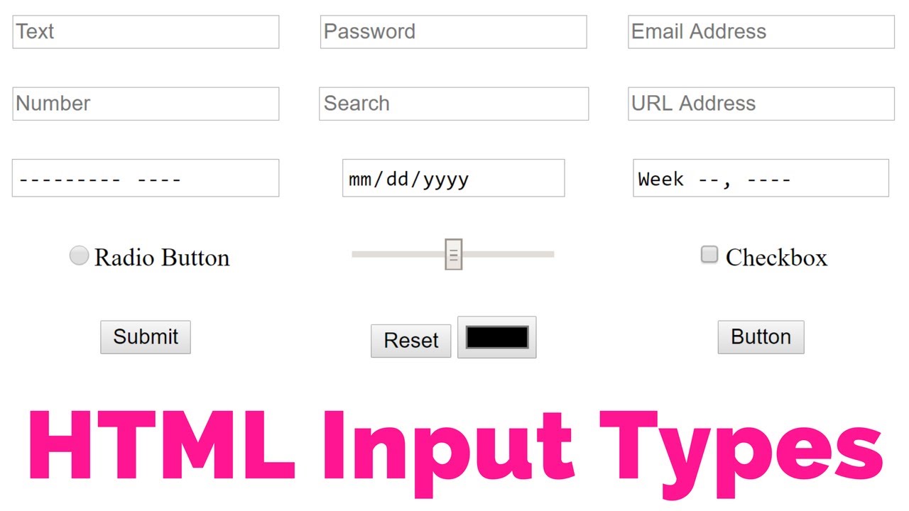
Input -
- Used to create interactive controls for web-based forms in order to accept data from the user.
- A wide variety of types of input data and control widgets are available, depending on the device and user agent.
- The
<input>element is one of the most powerful and complex in all of HTML due to the sheer number of combinations of input types and attributes HTML Form – HTML Tags.
-
Textarea - Represents a multi-line plain-text editing control, useful when you want to allow users to enter a sizeable amount of free-form text, for example a comment on a review or feedback form.
<label for="story">Tell us your story:</label> <textarea id="story" name="story" rows="5" cols="33">...</textarea> -
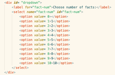
Select&option - The
<select>HTML element represents a control that provides a menu of options. The<option>HTML element is used to define an item contained in a<select>, an<optgroup>, or a<datalist>element. As such,<option>can represent menu items in popups and other lists of items in an HTML document. -
Button - Interactive element activated by a user with a mouse, keyboard, finger, voice command, or other assistive technology. Once activated, it then performs an action, such as submitting a form or opening a dialog.
<button class="Start" type="button">Start</button> -
Fieldset&Legend - The HTML fieldset element is used to group several controls as well as labels within a web form.
-
Resources:
-
https://developer.mozilla.org/en-US/docs/Web/HTML/Element/form
-
https://developer.mozilla.org/en-US/docs/Learn/HTML/Forms/How_to_structure_an_HTML_form
-
https://developer.mozilla.org/en-US/docs/Learn/HTML/Forms/Your_first_HTML_form
-
https://developer.mozilla.org/en-US/docs/Learn/HTML/Forms/Styling_HTML_forms
-
https://css-tricks.com/options-for-web-forms
floating label
-

