Components:beforeCreate helpers
beforeCreate helpers provide convenient functions and Components that make it easier to configure your Prefabs with the beforeCreate pop-up. For a basic explanation of beforeCreate check this page.
The following props are available inside the beforeCreate component:
An object which contains the original prefab.
A function that accepts a (mutated) prefab as an argument. When called the beforeCreate pop-up will close and the prefab will be added to the canvas.
A function which closes the pop-up and prevents the prefab from being dropped on the canvas when called.
A collection of components we made available for you to use. The components help to keep to the Betty Blocks style guide and give read access to metadata. Here is a list in alphabetical order containing every component we expose, their API, and an example on how to use them:
Box is a powerful component of the Grommet framework. Use it to easily set up layouts.
Check Grommet's documentation to see how it can be used and which props are available: https://v2.grommet.io/box
Button is a component of the Grommet framework.
Check Grommet's documentation to see how it can be used and which props are available: https://v2.grommet.io/button
We recommend only the usage of the following props:
| Props | type | default | description |
|---|---|---|---|
| color | "blue" | "orange" | "purple" | "turquoise" |
"turquoise" |
Color of the button. Also applies to hover, focus and active styling |
| disabled | boolean |
false |
Disable all interactions with component |
| label | string |
"" |
Button label |
| onClick | () => void |
Function executed when the button is clicked | |
| plain | boolean |
false |
Property to create an outline button |
| primary | boolean |
false |
Property to create a primary button |
| size | "small" | "medium" | "large" |
"medium" |
Size of the button |
Examples:
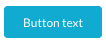
Primary button:
<Button
  label="Button text"
  onClick={() => {}}
  primary
/>
Screenshot:
Secondary button:
<Button
  label="Button text"
  onClick={() => {}}
/>
Screenshot:

Tertiary button:
<Button
  label="Button text"
  onClick={() => {}}
  plain
/>
Screenshot:

A button group with the functionality of a radio button group. Use it together with ButtonGroupButton.
| Props | type | default | description |
|---|---|---|---|
| color | "purple" | "turquoise" | "blue" | "orange" |
"turquoise" |
Color of the button group. Also applies to hover, focus and active styling |
| fill | boolean |
false |
Fill the component width to its parent. |
| onChange* | (event: React.ChangeEvent<HTMLInputElement>) => void |
Function which executes when a button is selected in the button group | |
| value | string |
Value of the button group button which should be shown as active | |
| size | "small" | "medium" | "large" |
"medium" |
Size of the button group |
Example:
See ButtonGroupButton for a usage example.
Screenshot:
See ButtonGroupButton for a screenshot.
A button group button to use inside a ButtonGroup.
| Props | type | default | description |
|---|---|---|---|
| disabled | boolean |
false |
Disable all interactions with component |
| label | string |
Label of the button group button | |
| name* | string |
Should be the same string as other button group buttons in the current button group to make the radio button functionality work | |
| value | string |
Unique string which is available in ButtonGroup's callback function's argument as event.target.value
|
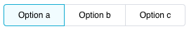
Example:
({ components : { ButtonGroup, ButtonGroupButton } }) => {
  const [state, setState] = React.useState('a');

  return (
    <ButtonGroup
      onChange={({ target: { value } }) => {
        setState(value);
      }}
      value={state}
    >
      <ButtonGroupButton label="Option a" value="a" name="options" />
      <ButtonGroupButton label="Option b" value="b" name="options" />
      <ButtonGroupButton label="Option c" value="c" name="options" />
    </ButtonGroup>
  );
}
Screenshot:
A layout helper component that applies spacing to comply with the Betty Blocks style guide.
Example usage:
({ components : { Content } }) => {
  return (
    <Content>
      Your content here...
    </Content>
  );
}
DeleteButton is a component from the Grommet framework which we extended and changed styles to make it comply with the delete button in the Betty Blocks style guides.
Check Grommet's documentation to see how it can be used and which props are available: https://v2.grommet.io/button
We recommend only the usage of the following props:
| Props | type | default | description |
|---|---|---|---|
| disabled | boolean |
false |
Disable all interactions with component |
| label | string |
"" |
Button label |
| onClick | () => void |
Function executed when the button is clicked | |
| size | "small" | "medium" | "large" |
"medium" |
Size of the button |
Example:
<DeleteButton
  label="Button text"
  onClick={() => {}}
/>
Screenshot:

NOTE: This is the hover state of the delete button. The normal state is the same as the secondary button.
DestructiveButton is a component from the Grommet framework which we extended and changed styles to make it comply with the destructive button in the Betty Blocks style guides.
Check Grommet's documentation to see how it can be used and which props are available: https://v2.grommet.io/button
We recommend only the usage of the following props:
| Props | type | default | description |
|---|---|---|---|
| disabled | boolean |
false |
Disable all interactions with component |
| label | string |
"" |
Button label |
| onClick | () => void |
Function executed when the button is clicked | |
| size | "small" | "medium" | "large" |
"medium" |
Size of the button |
Example:
<DestructiveButton
  label="Button text"
  onClick={() => {}}
/>
Screenshot:

A layout helper component to wrap around input components to add a label and spacing which both comply with the Betty Blocks style guide.
| Props | type | default | description |
|---|---|---|---|
| label | string |
"" |
Field label |
| error | ReactNode |
Error text | |
| info | ReactNode |
Help text |
Example usage:
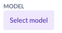
({ components : { Content, Field, ModelSelector } }) => {
  return (
    <Content>
      <Field label="Model">
        <ModelSelector ... />
      </Field>
    </Content>
  );
}
Screenshot:
A layout helper component to get a pop-up footer that complies with the Betty Blocks style guide.
| Props | type | default | description |
|---|---|---|---|
| onClose | () => void |
Function which is executed when the cancel button is clicked. | |
| onSave | () => void |
Function which is executed when the save button is clicked. |
Example usage:
({ close, components : { Footer }, save }) => {
  return (
    <Footer
      onClose={close}
      onSave={() => {
        save(newPrefab);
      }}
    />
  );
}
Screenshot:

A layout helper component to get a pop-up header which complies with the Betty Blocks style guide.
| Props | type | default | description |
|---|---|---|---|
| title | string |
Title of the header. | |
| subtitle | string |
Subtitle of the header. | |
| onClose | () => void |
Function which is executed when the close icon is clicked. |
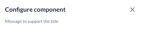
Example usage:
({ close, components : { Header } }) => {
  return (
    <Header
      title="Configure component"
      subtitle="Message to support the title"
      onClose={close}
    />
  );
}
Screenshot:
Heading is a component of the Grommet framework. Use it to display titles that comply with the Betty Blocks style guide.
Check Grommet's documentation to see how it can be used and which props are available: https://v2.grommet.io/heading
Most important props:
| Props | type | default | description |
|---|---|---|---|
| level | "1" | "2" | "3" | "4" | "5" | "6" | "7" |
"1" |
Level for the html heading element to be used. |
| size | "small" | "medium" | "large" | "xlarge" |
"medium" |
Size of the text |
Example:
<Heading size="xlarge">Hello world</Heading>Screenshot:

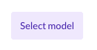
Use it to select a model from the current application.
| Props | type | default | description |
|---|---|---|---|
| disabled | boolean |
false |
Disable all interactions with component. |
| fill | boolean |
false |
Fill the component width to its parent. |
| onChange | (id: string) => void |
Function which executes when a model is selected in the model selector. | |
| size | "small" | "medium" | "large" |
"large" |
Size of the model selector. |
| value | string |
A model id used to show the selected model in the model selector. |
Example usage:
({ components : { ModelSelector } }) => {
  const [modelId, setModelId] = React.useState('');

  return (
    <ModelSelector
      onChange={value => {
        setModelId(value);
      }}
      value={modelId}
    />
  );
}
Screenshot:
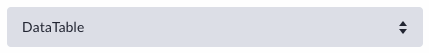
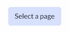
The componentSelector is a dropdown helper for selecting a component, the components that it shows can be configured. The componentSelector accepts the following arguments:
| Props | type | default | description |
|---|---|---|---|
| allowedComponents | [stings] |
[] |
An array comprising component names which are allowed to be shown by the dropdown menu. |
| placeholder | string |
"No component available" |
Text that is shown when no value is selected in the dropdown menu. |
| value | string |
'' |
Id of the component to set as selected in the dropdown. |
| onChange | (component: NormalizedComponent) => void |
Function which executes when a component is selected in the component selector. |
Example usage:
<ComponentSelector
  onChange={component => {
    const foundModelId = Object.values(component.options).reduce(
      (acc, option) =>
        option.type === 'MODEL' ? option.value : acc,
      null,
    );
    setThisPageState(prevState => ({
      ...prevState,
      modelId: foundModelId,
      component,
    }));
    setModelId(foundModelId);
  }}
  value={
    thisPageState.component ? thisPageState.component.id : ''
  }
  placeholder="No components available."
  allowedComponents={['DataTable', 'DataList']}
/>
Screenshot:
Use it to select an authentication profile from the current application.
| Props | type | default | description |
|---|---|---|---|
| disabled | boolean |
false |
Disable all interactions with component. |
| fill | boolean |
false |
Fill the component width to its parent. |
| onChange | (id: string) => void |
Function which executes when an authentication profile is selected in the authentication profile selector. | |
| size | "small" | "medium" | "large" |
"large" |
Size of the authentication profile selector. |
| value | string |
An authentication profile id used to show the selected profile in the authentication profile selector. |
Example usage:
({ components : { AuthenticationProfileSelector } }) => {
  const [authProfileId, setAuthProfileId] = React.useState('');

  return (
    <AuthenticationProfileSelector
      onChange={id => {
        setAuthProfileId(id);
      }}
      value={authProfileId}
    />
  );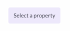
}Use it to select a property from the current application in the current data scope.
| Props | type | default | description |
|---|---|---|---|
| disabled | boolean |
false |
Disable all interactions with component. |
| fill | boolean |
false |
Fill the component width to its parent. |
| modelId | string |
Model id of a model to add to the current scope of models to select properties from. | |
| onChange | (property: string | Property) => void |
Function which executes when a property is selected in one of the property | |
| size | "small" | "medium" | "large" |
"large" |
Size of the property selector. |
| value* | string | Property |
A property id used to show the selected property in the property selector. |
Example usage:
({ components : { PropertySelector } }) => {
  const [property, setProperty] = React.useState('');

  return (
    <PropertySelector
      onChange={value => {
        setProperty(value);
      }}
      value={property}
    />
  );
}
Screenshot:
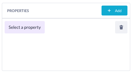
Use it to select properties from the current page scope in the application.
| Props | type | default | description |
|---|---|---|---|
| modelId | string |
Model id of a model to add to the current scope of models to select properties from. | |
| onChange* | (property: Property[]) => void |
Function which executes when a property is selected in one of the property selectors. | |
| value* | Property[] |
An array of properties used to show the selected properties in the properties selector. |
Example usage:
({ components : { PropertiesSelector } }) => {
  const [properties, setProperties] = React.useState([]);

  return (
    <PropertiesSelector
      onChange={value => {
        setProperties(value);
      }}
      value={properties}
    />
  );
}
Screenshot:
Use it to select an endpoint from the current application.
| Props | type | default | description |
|---|---|---|---|
| fill | boolean |
false |
Fill the component width to its parent. |
| onChange | (endpoint: string) => void |
Function which executes when a endpoint is selected in one of the endpoint selectors | |
| value* | string |
A endpoint id used to show the selected endpoint in the endpoint selector. |
Example usage:
({ components : { EndpointSelector } }) => {
  const [endpoint, setEndpoint] = React.useState('');

  return (
    <EndpointSelector
      onChange={endpoint => {
        setProperty(endpoint);
      }}
      value={endpoint}
    />
  );
}
Screenshot:
Text is a component of the Grommet framework. Use it to display text which complies with the Betty Blocks style guide.
Check Grommet's documentation to see how it can be used and which props are available: https://v2.grommet.io/text
Most important props:
| Props | type | default | description |
|---|---|---|---|
| size | "xsmall" | "small" | "medium" | "large" |
"medium" |
Size of the text |
Example:
<Text>Hello world</Text>Screenshot:

TextInput is a component of the Grommet framework. Use it to display text inputs that comply with the Betty Blocks style guide.
Check Grommet's documentation to see how it can be used and which props are available: https://v2.grommet.io/textinput
Most important props:
| Props | type | default | description |
|---|---|---|---|
| disabled | boolean |
false |
Disable all interactions with component |
| name | string |
The name of the text input for when in a form | |
| onChange | (event: React.ChangeEvent<HTMLInputElement>) => void |
Function which executes when text is changed in the text input | |
| placeholder | string |
Text input placeholder text | |
| size | "medium" | "large" |
"medium" |
Size of the text input |
Example:
({ components : { TextInput } }) => {
  const [state, setState] = React.useState('');

  return (
    <TextInput
      placeholder="Placeholder..."
      value={state}
      onChange={({ target: { value } }) => {
        setState(value)
      }}
    />
  );
}
Screenshot:

Focussed:

This is a helper to convert camelCase to snake_case this is used for generating variables from the beforeCreate based on models. Will lowercase all characters and replace spaces with underscores.
You can use this helper like this:
camelToSnakeCase("Test String")
// will return: "test_string"
This helper will retrieve the UUID of the current page. If there is no UUID available it will return an empty string. You can use the helper like this:
beforeCreate: ({
  // extract other components if needed
  helpers: { useCurrentPageId }
}
const pageUuid = useCurrentPageId();
Sometimes you need more information from a model than just the id (e.g. all the properties for a given model), this is where you can use useModelQuery. It works much in the same way as a useQuery from apollo does.
You can either use the onCompleted hook in the modelQuery to set your state.
useModelQuery({
  variables: { id: modelId },
  skip: !modelId,
  onCompleted: data => {
    // use data here
  },
});
Or you can use it more traditionally and destruct the objects from the query call.
const { data, loading, error } = useModelQuery({
  variables: { id: modelId },
  skip: !modelId,
});