Skip to content

feat: add outlineColor prop in TextInputOutlined#2475

Merged
lukewalczak merged 9 commits intocallstack:mainfrom
ahce:feat/textinput-outlinecolor
May 27, 2021
Merged

feat: add outlineColor prop in TextInputOutlined#2475
lukewalczak merged 9 commits intocallstack:mainfrom
ahce:feat/textinput-outlinecolor

Conversation

@ahce
Copy link
Copy Markdown
Contributor

@ahce ahce commented Dec 31, 2020

Motivation

Allows to controls the outline color.

Test plan

  1. Download this branch
  2. Open the TextInput example
  3. Change the prop outlineColor

Demo

import React, { Fragment } from 'react';
import { TextInput } from 'react-native-paper';

const Demo = () => (
  <Fragment>
    <TextInput mode='outlined' />
    <TextInput mode='outlined' outlineColor='red' />
    <TextInput mode='outlined' outlineColor='blue' />
    <TextInput mode='outlined' outlineColor='green' />
  </Fragment>
);

image

@callstack-bot
Copy link
Copy Markdown

callstack-bot commented Dec 31, 2020

Hey @ahce, thank you for your pull request 🤗. The documentation from this branch can be viewed here.

@Trancever Trancever changed the base branch from master to main January 5, 2021 12:40
@github-actions
Copy link
Copy Markdown

Hello 👋, this pull request has been open for more than 2 months with no activity on it. If you think this is still necessary with the latest version, please comment and ping a maintainer to get this reviewed, otherwise it will be closed automatically in 7 days.

@github-actions github-actions Bot added the Stale label Apr 24, 2021
@ahce
Copy link
Copy Markdown
Contributor Author

ahce commented Apr 29, 2021

@Trancever any chance to merge this?

@lukewalczak
Copy link
Copy Markdown
Member

I'm not convinced in introducing the additional prop since you can customize the active/inactive color by passing the specific one via theme prop, e.g.:

     <TextInput
        mode="outlined"
        theme={{ colors: { 
          primary: 'green', // active outline color
          placeholder: 'purple' // inactive outline color
          } 
        }}
        ...
     />

@ahce
Copy link
Copy Markdown
Contributor Author

ahce commented May 1, 2021

I'm not convinced in introducing the additional prop since you can customize the active/inactive color by passing the specific one via theme prop, e.g.:

     <TextInput
        mode="outlined"
        theme={{ colors: { 
          primary: 'green', // active outline color
          placeholder: 'purple' // inactive outline color
          } 
        }}
        ...
     />

Hi @lukewalczak, thanks for your reply!

With theme also changes placeholder and label color, check this demo

My PR has the same behavior as underlineColor prop

hasActiveOutline={hasActiveOutline}
activeColor={activeColor}
outlineColor={outlineColor}
outlineColor={outlineColor || defaultOutlineColor}
Copy link
Copy Markdown
Member

Choose a reason for hiding this comment

The reason will be displayed to describe this comment to others. Learn more.

Actually with that condition there won't be any difference between disabled and enabled state, since outlineColor will be always defined if passed by user.

Current behavior

enabled disabled
Zrzut ekranu 2021-05-5 o 14 33 54 Zrzut ekranu 2021-05-5 o 14 34 02

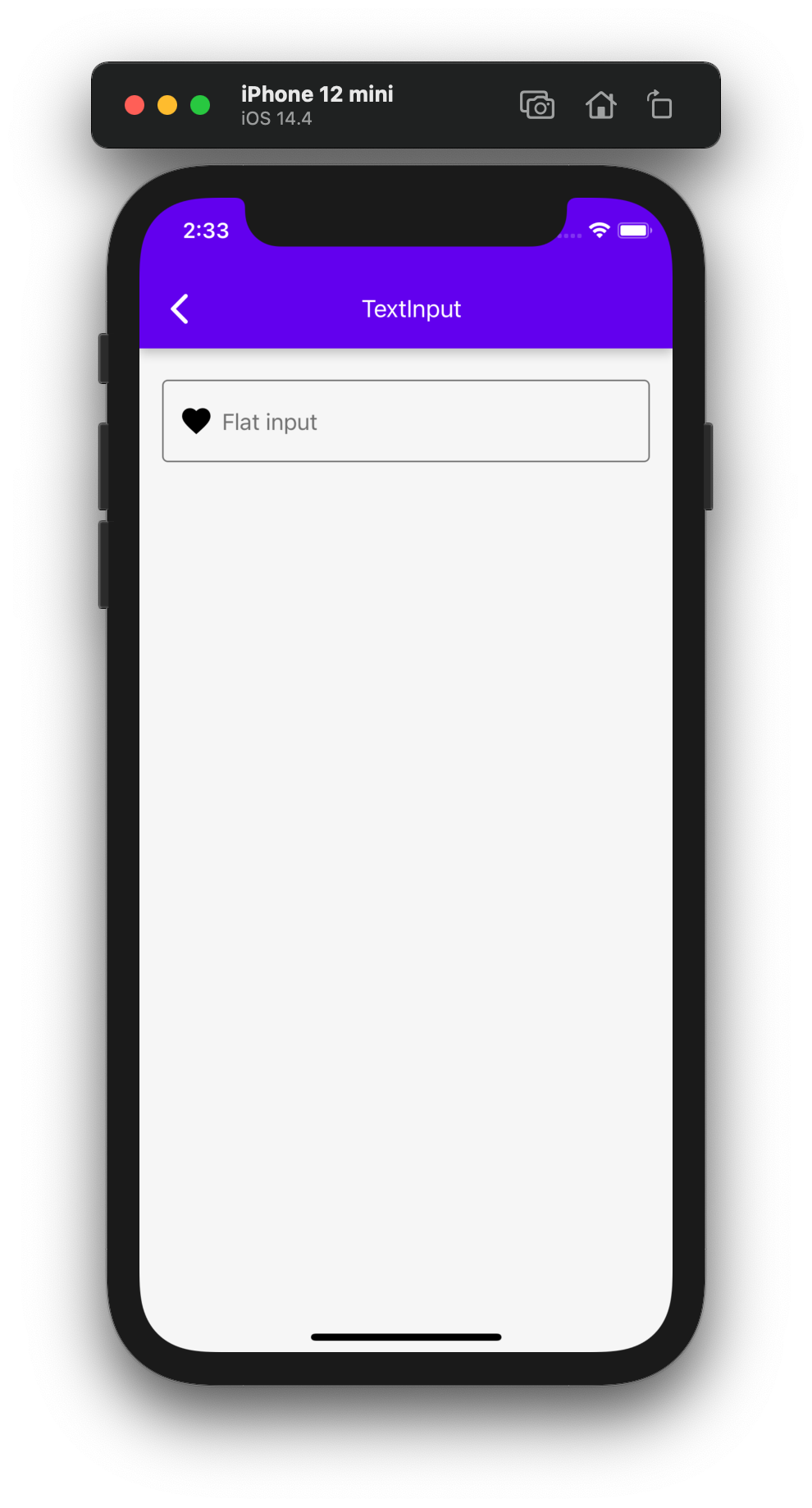
outlineColor prop passed

enabled disabled
Zrzut ekranu 2021-05-5 o 14 36 39 Zrzut ekranu 2021-05-5 o 14 36 39

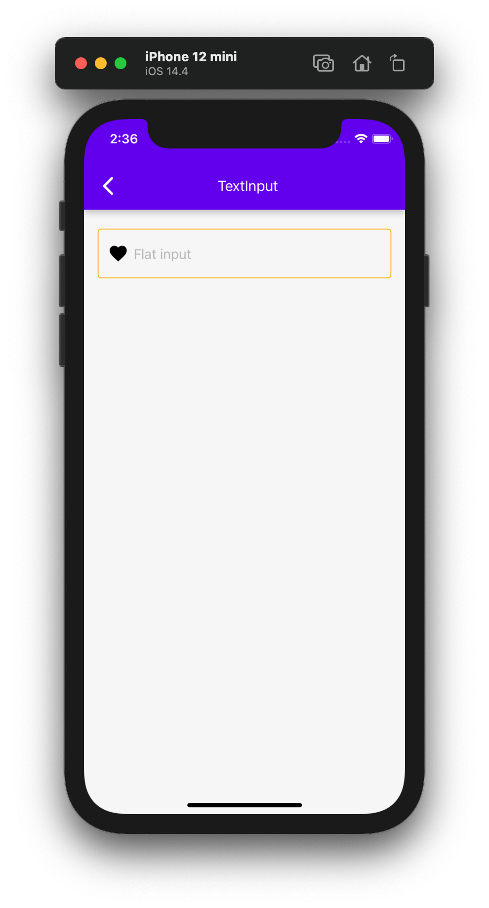
Please correct it to have the visual feedback between those two states.

Copy link
Copy Markdown
Contributor Author

Choose a reason for hiding this comment

The reason will be displayed to describe this comment to others. Learn more.

Done!

Copy link
Copy Markdown
Member

@lukewalczak lukewalczak left a comment

Choose a reason for hiding this comment

The reason will be displayed to describe this comment to others. Learn more.

Left one issue which has to be solved before merge.

@lukewalczak
Copy link
Copy Markdown
Member

Hi @lukewalczak, thanks for your reply!

@ahce thanks for specifying more details! I see the reason for that PR and would like to merge, however there is one issue, which has to be fixed before.

@ahce ahce requested a review from lukewalczak May 5, 2021 23:52
placeholderColor = outlineColor = colors.disabled;
placeholderColor = colors.disabled;
customOutlineColor =
outlineColor === 'transparent' ? outlineColor : colors.disabled;
Copy link
Copy Markdown
Member

Choose a reason for hiding this comment

The reason will be displayed to describe this comment to others. Learn more.

I guess the reason for that check is to have transparent outline when input is disabled, but the way you handle it is incorrect. User can specify the color in various ways using hex or rgb format as well. To check if the passed outlineColor is transparent, please introduce the variable:

const isTransparent = color(customOutlineColor).alpha() === 0

then:

outlineColor = isTransparent ? customOutlineColor : placeholderColor;

Copy link
Copy Markdown
Contributor Author

Choose a reason for hiding this comment

The reason will be displayed to describe this comment to others. Learn more.

Done! Thanks!

selectionColor,
// eslint-disable-next-line @typescript-eslint/no-unused-vars
underlineColor,
outlineColor,
Copy link
Copy Markdown
Member

Choose a reason for hiding this comment

The reason will be displayed to describe this comment to others. Learn more.

Suggested change
outlineColor,
outlineColor: customOutlineColor,

Copy link
Copy Markdown
Contributor Author

Choose a reason for hiding this comment

The reason will be displayed to describe this comment to others. Learn more.

Done!

let inputTextColor, activeColor, outlineColor, placeholderColor, errorColor;
let inputTextColor,
activeColor,
customOutlineColor,
Copy link
Copy Markdown
Member

Choose a reason for hiding this comment

The reason will be displayed to describe this comment to others. Learn more.

Suggested change
customOutlineColor,
outlineColor,

Copy link
Copy Markdown
Contributor Author

Choose a reason for hiding this comment

The reason will be displayed to describe this comment to others. Learn more.

Done!

activeColor = error ? colors.error : colors.primary;
placeholderColor = outlineColor = colors.placeholder;
placeholderColor = colors.placeholder;
customOutlineColor = outlineColor || colors.placeholder;
Copy link
Copy Markdown
Member

Choose a reason for hiding this comment

The reason will be displayed to describe this comment to others. Learn more.

Suggested change
customOutlineColor = outlineColor || colors.placeholder;
outlineColor = customOutlineColor || placeholderColor;

Copy link
Copy Markdown
Contributor Author

Choose a reason for hiding this comment

The reason will be displayed to describe this comment to others. Learn more.

Done!

hasActiveOutline={hasActiveOutline}
activeColor={activeColor}
outlineColor={outlineColor}
outlineColor={customOutlineColor}
Copy link
Copy Markdown
Member

Choose a reason for hiding this comment

The reason will be displayed to describe this comment to others. Learn more.

Suggested change
outlineColor={customOutlineColor}
outlineColor={outlineColor}

Copy link
Copy Markdown
Contributor Author

Choose a reason for hiding this comment

The reason will be displayed to describe this comment to others. Learn more.

Done!

@ahce ahce requested a review from lukewalczak May 6, 2021 17:39
@lukewalczak lukewalczak merged commit 70f83a9 into callstack:main May 27, 2021
Sign up for free to join this conversation on GitHub. Already have an account? Sign in to comment

Projects

None yet

Development

Successfully merging this pull request may close these issues.

4 participants