
A Flutter package offering a collection of reusable, customizable widgets to streamline UI development with minimal setup and no third-party dependencies. This package includes buttons, inputs, avatars, network images, shimmer effects, and more.
Add ready_widgets to your pubspec.yaml dependencies:
dependencies:
  ready_widgets: ^latest_version
Then run:
flutter pub getImport the package in your Dart file:
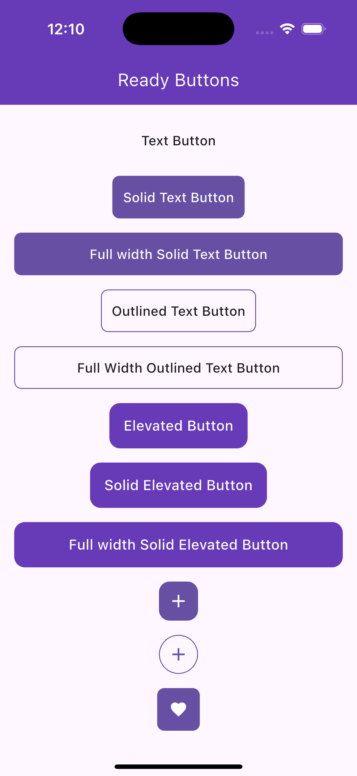
import 'package:ready_widgets/ready_widgets.dart';A flexible text button with solid, outlined, or transparent styles, supporting icons and customizable sizes.
ReadyTextButton(
  text: 'Click Me',
  onPress: () => print('Pressed!'),
),ReadyTextButton.solid(
text: 'Submit',
icon: Icons.check,
iconPosition: IconPosition.leading,
backgroundColor: Colors.blue,
textColor: Colors.white,
size: ReadyButtonSize.large,
),ReadyTextButton.outlined(
text: 'Cancel',
borderColor: Colors.red,
onPress: () => print('Cancelled!'),
),A toggleable like button with animation, supporting solid, outlined, or transparent styles.
ReadyLikeButton(
  onPress: (isLiked) async {
    await Future.delayed(Duration(milliseconds: 500));
    return !isLiked;
  },
),ReadyLikeButton.solid(
color: Colors.red,
iconColor: Colors.white,
size: ReadyButtonSize.large,
isLiked: true,
),An icon-only button with support for badges, tooltips, and rounded or rectangular shapes.
ReadyIconButton(
  iconData: Icons.favorite_border,
  onPress: () => print('Icon pressed!'),
  tooltip: 'Favorite',
),ReadyIconButton.solid(
iconData: Icons.notifications,
backgroundColor: Colors.blue,
badge: 5,
size: ReadyButtonSize.large,
),A customizable elevated button with optional icons and predefined size variants.
ReadyElevatedButton(
  text: 'Submit',
  onPress: () => print('Submitted!'),
),ReadyElevatedButton.small(
text: 'Save',
icon: Icons.save,
backgroundColor: Colors.green,
textColor: Colors.white,
),
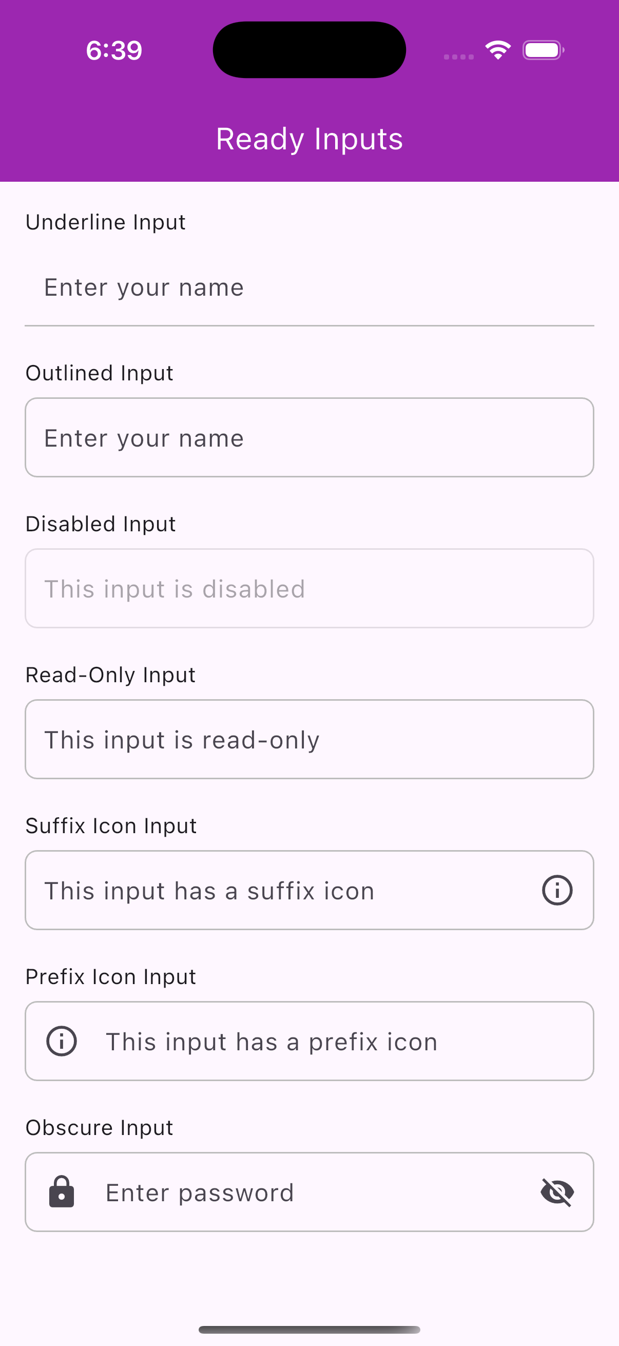
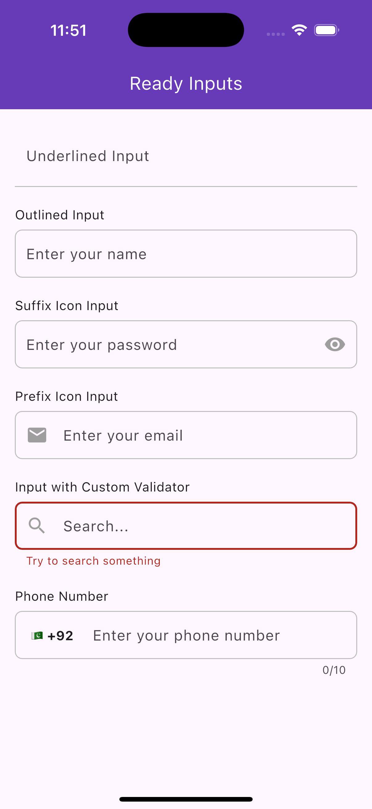
A customizable text input field with support for prefix/suffix icons, validation, and decoration styles.
ReadyInput(
  label: 'Name',
  hint: 'Enter your name',
  controller: TextEditingController(),
),ReadyInput(
label: 'Password',
hint: 'Enter your password',
isObscure: true,
prefixIcon: Icon(Icons.lock),
),A phone number input with a country code picker and localized country names.
ReadyPhoneInput(
  controller: TextEditingController(),
  onCountryChange: (country) => print('Selected: ${country.name}'),
  initialDialCode: '+1',
),ReadyPhoneInput(
controller: TextEditingController(),
onCountryChange: (country) => print('Country: ${country.dialCode}'),
validator: (value) =>
value!.length < 10 ? 'Phone number too short' : null,
),
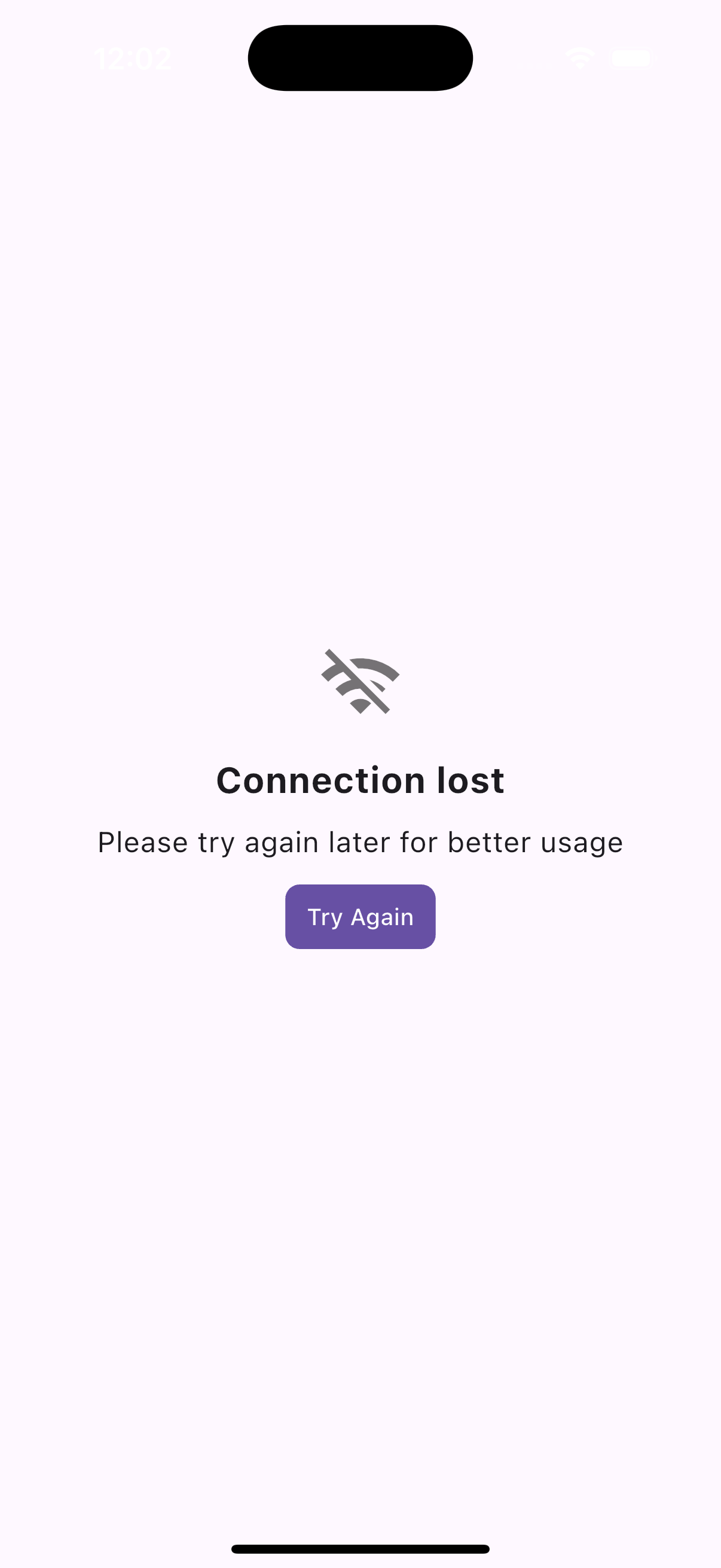
A widget for empty states with an animated icon, title, subtitle, and optional additional widget.
ReadyEmptyWidget(
  title: 'No Data Found',
  subtitle: 'Try adding some items.',
  icon: Icons.info_outline,
),ReadyEmptyWidget(
title: 'Empty List',
subtitle: 'Start by adding a new item.',
customIcon: Icon(Icons.error, size: 40, color: Colors.red),
additionalWidget: ReadyElevatedButton(
text: 'Add Item',
onPress: () => print('Add item pressed!'),
),
),
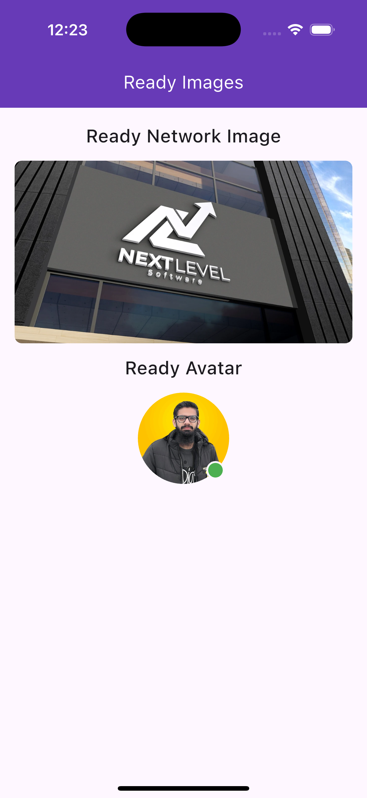
A network image widget with shimmer loading and error handling.
ReadyNetworkImage(
  imageUrl: 'https://example.com/image.jpg',
  width: 100,
  height: 100,
),ReadyNetworkImage(
imageUrl: 'https://example.com/invalid.jpg',
width: 120,
height: 120,
isRounded: true,
borderColor: Colors.blue,
borderWidth: 2,
errorWidget: Icon(Icons.error, size: 40),
),
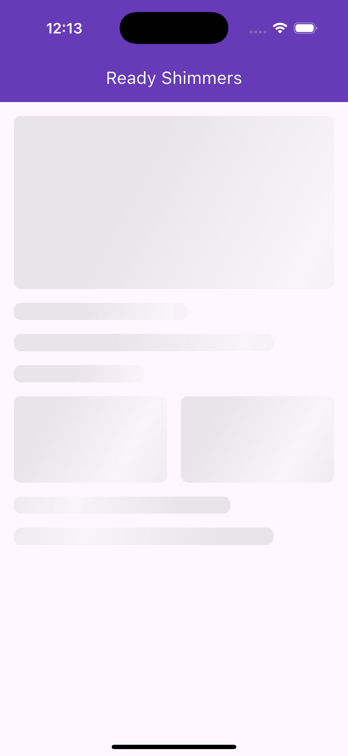
A dependency-free shimmer effect for loading placeholders.
ReadyShimmer(
  width: 200,
  height: 100,
),ReadyShimmer(
width: 150,
height: 150,
borderRadius: BorderRadius.circular(16),
shimmerColors: [Colors.blue.shade200, Colors.blue.shade50, Colors.blue.shade200],
),
An avatar widget displaying a network image or initials, with an optional online status indicator.
ReadyAvatar(
  imageUrl: 'https://example.com/avatar.jpg',
  size: 60,
),ReadyAvatar(
name: 'John Doe',
isOnline: true,
size: 80,
backgroundColor: Colors.blue,
textColor: Colors.white,
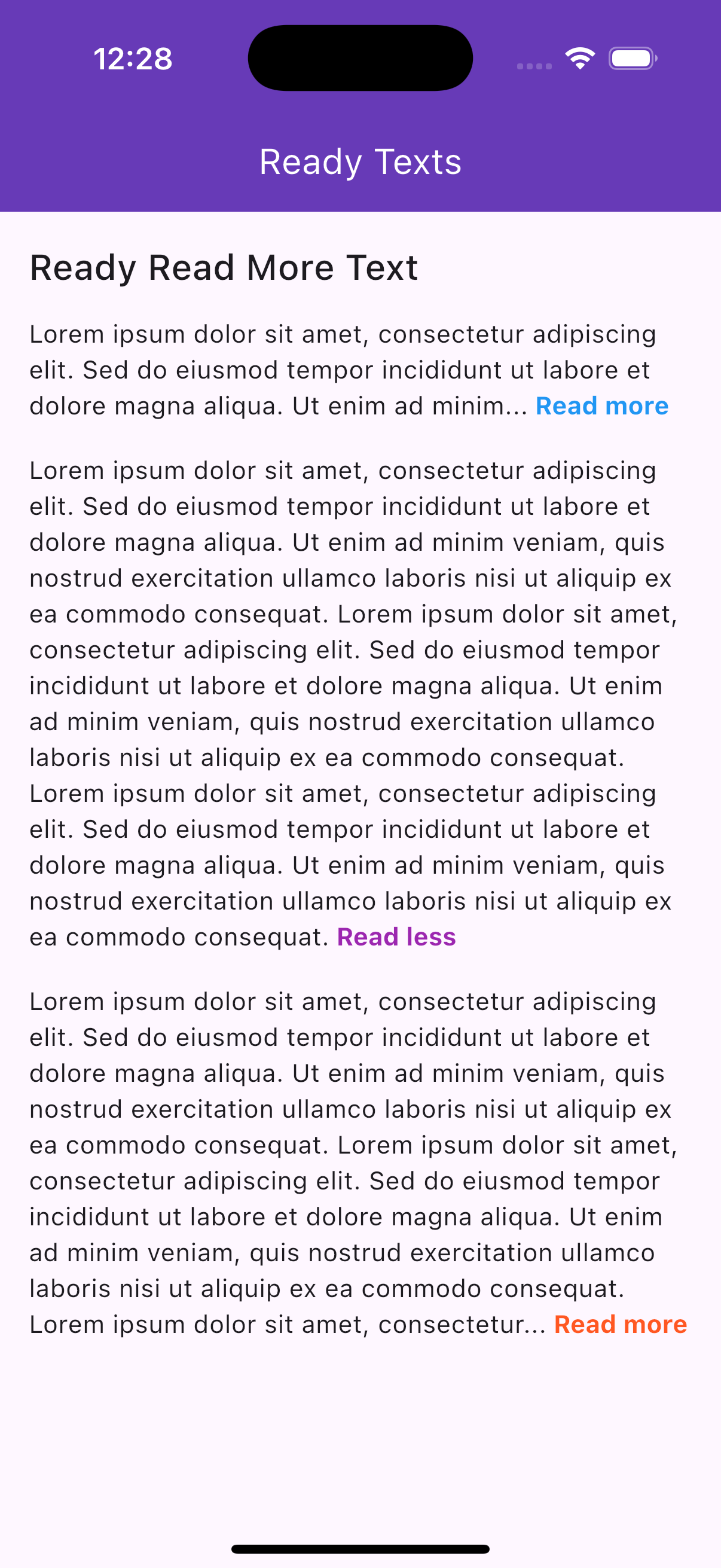
),A widget for trimming long text with "Read more" and "Read less" toggle links.
ReadyReadMoreText(
  text: 'This is a very long text that needs to be truncated because it exceeds the maximum number of lines allowed.',
  maxLines: 2,
),ReadyReadMoreText(
text: 'Lorem ipsum dolor sit amet, consectetur adipiscing elit.',
trimMode: TrimMode.length,
trimLength: 50,
moreLessStyle: TextStyle(color: Colors.red, fontWeight: FontWeight.bold),
),
- No Third-Party Dependencies: Lightweight and built with Flutter's core libraries.
- Customizable: Extensive styling options for colors, sizes, icons, and more.
- Responsive: Adapts to different screen sizes and orientations.
- Platform Support: Works on all Flutter-supported platforms (iOS, Android, web, etc.).
- Interactive: Includes animations (e.g., shimmer, like button scale) and interactive elements (e.g., country picker, read more links).
If you find ready_widgets helpful, consider supporting the developer:

- Documentation: Check the ready_widgets page on pub.dev for the latest version and additional details.
- Versioning: Always use the latest version in
pubspec.yamlto access new features and fixes. - Contributions: Contributions, issues, and feature requests are welcome on the package's GitHub repository.