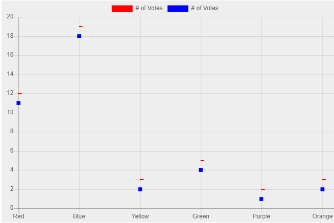
When creating a line graph with dash and rect points, the points won't be aligned on the x-axes. #6875
Description
I'm creating a line graph with multiple datasets. One of my datasets is configured to use a rectangle point style and the other is configured to use a dash. What happens is that the alignment on the two points on the graph is different. The dash point is always on the right of the point, while the rectangle is in the middle. The graph looks odd.
See this fiddle as an example: https://jsfiddle.net/7y9hj5vc/2/