Conversation
Contributor
|
@nvmusoke Since this is a visible change, can you provide a screenshot showing the changes? |
pixelbandito
suggested changes
Nov 19, 2019
Contributor
 pixelbandito
left a comment
pixelbandito
left a comment
There was a problem hiding this comment.
Let's figure out the bold thing.
Contributor
Author
|
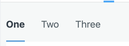
New version: |
mdespuits
approved these changes
Nov 19, 2019
Contributor
 mdespuits
left a comment
mdespuits
left a comment
There was a problem hiding this comment.
Looking good. Pending @pixelbandito's review
pixelbandito
approved these changes
Nov 19, 2019
This file contains hidden or bidirectional Unicode text that may be interpreted or compiled differently than what appears below. To review, open the file in an editor that reveals hidden Unicode characters.
Learn more about bidirectional Unicode characters
Sign up for free
to join this conversation on GitHub.
Already have an account?
Sign in to comment
3 participants
Add this suggestion to a batch that can be applied as a single commit.This suggestion is invalid because no changes were made to the code.Suggestions cannot be applied while the pull request is closed.Suggestions cannot be applied while viewing a subset of changes.Only one suggestion per line can be applied in a batch.Add this suggestion to a batch that can be applied as a single commit.Applying suggestions on deleted lines is not supported.You must change the existing code in this line in order to create a valid suggestion.Outdated suggestions cannot be applied.This suggestion has been applied or marked resolved.Suggestions cannot be applied from pending reviews.Suggestions cannot be applied on multi-line comments.Suggestions cannot be applied while the pull request is queued to merge.Suggestion cannot be applied right now. Please check back later.
SUMMARY: Per https://jira.cision.com/browse/EVER-3594, made active tab name color darker, and attempted to make it bolder but looks like that particular font doesn't get bold. Also went ahead and re ordered an Icon in the icon list so it's in alphabetical order.
RISK: low
VERIFICATION: in roverUI, the
EasyTabMenuoverview should have a noticeably darker active tab.