Hi,
I don't want to offend anyone, but I'm somehow disappointed in the new UI (Version 2.0.0-SNAPSHOT). It's very confusing and the layout is not the best. (If this is just a problem with my installation, then ignore this issue).
For example:
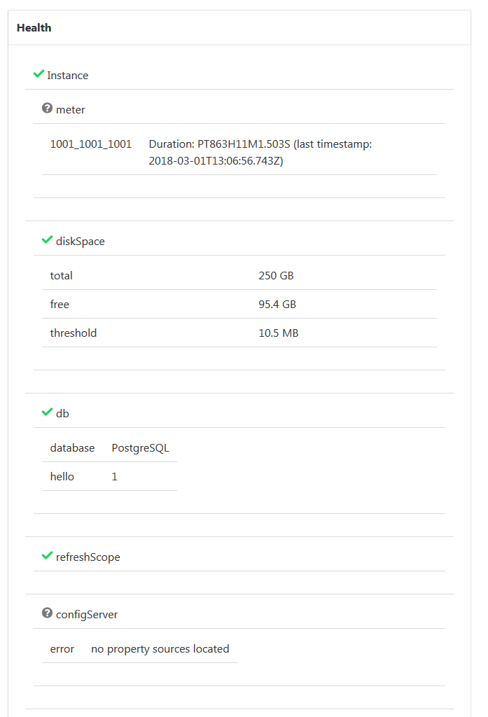
Here a lot of space is wasted with empty table rows or huge margins. All those table border lines don't look so good.
Also, showing the status of health indicators could be more prominent, the little tick marks aren't very visible.
Another example:
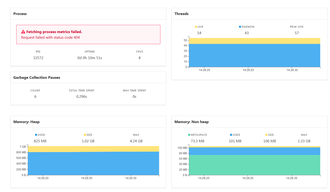
The cards are all over the place, some are aligned, other are not.
Overall, the look is not bad, but at some points too "lightweight" (in my opinion).

Hi,
I don't want to offend anyone, but I'm somehow disappointed in the new UI (Version 2.0.0-SNAPSHOT). It's very confusing and the layout is not the best. (If this is just a problem with my installation, then ignore this issue).
For example:

Here a lot of space is wasted with empty table rows or huge margins. All those table border lines don't look so good.
Also, showing the status of health indicators could be more prominent, the little tick marks aren't very visible.
Another example:

The cards are all over the place, some are aligned, other are not.
Overall, the look is not bad, but at some points too "lightweight" (in my opinion).