This repository was archived by the owner on Mar 7, 2024. It is now read-only.
add responsive standfor page to show fullly aligned contents on md and sm screens. #47
Conversation
This file contains hidden or bidirectional Unicode text that may be interpreted or compiled differently than what appears below. To review, open the file in an editor that reveals hidden Unicode characters.
Learn more about bidirectional Unicode characters
…and smaller screens
 Abhishek-kumar09
force-pushed
the
mobile_version_optimizations
branch
from
Abhishek-kumar09
force-pushed
the
mobile_version_optimizations
branch
from
199999c to
1c07fd4
Compare
Member
|
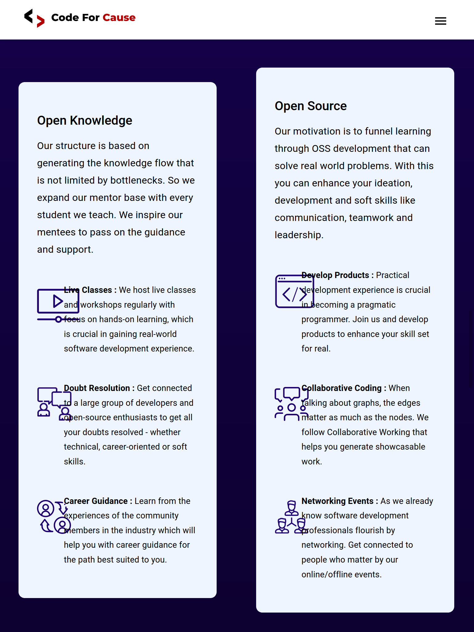
@Abhishek-kumar09 there are changes in the content of this section so I've updated that. You can check it here. For mobile screen, we'll not show the details but only icon and its corresponding heading/title below each icon, both horizontally center aligned. |
Contributor
Author
|
Now, medium screens like ipod have both the subpage, is it intended. It looks compact there. |
Contributor
Author
|
@GangaChatrvedi ping! |
Member
|
We can keep only one column for the screen width for medium screen. |
…ull width on medium screens
Contributor
Author
|
Done |
Sign up for free
to subscribe to this conversation on GitHub.
Already have an account?
Sign in.
2 participants
Add this suggestion to a batch that can be applied as a single commit.
This suggestion is invalid because no changes were made to the code.
Suggestions cannot be applied while the pull request is closed.
Suggestions cannot be applied while viewing a subset of changes.
Only one suggestion per line can be applied in a batch.
Add this suggestion to a batch that can be applied as a single commit.
Applying suggestions on deleted lines is not supported.
You must change the existing code in this line in order to create a valid suggestion.
Outdated suggestions cannot be applied.
This suggestion has been applied or marked resolved.
Suggestions cannot be applied from pending reviews.
Suggestions cannot be applied on multi-line comments.
Suggestions cannot be applied while the pull request is queued to merge.
Suggestion cannot be applied right now. Please check back later.
@KeenWarrior please review.
checked responsive behaviour on all screens