A customizable Range Slider control for .NET MAUI applications, featuring:
- Minimum and Maximum values
- Dual thumbs for selecting a range
- Track and range colors
- Customizable thumb size and color
- Floating labels with currency, percentage, or custom formatting
- Label alignment (Left, Center, Right)
- Fully compatible with Android, iOS, Mac Catalyst, and Windows
- Range selection: Select a minimum and maximum value with two thumbs.
- Custom labels: Show values as currency, percentage, or custom string format.
- Customizable appearance: Track color, range color, thumb color, and label colors.
- Label alignment: Horizontal alignment (Left, Center, Right) for the floating label.
- MAUI-friendly: Fully supports .NET MAUI cross-platform apps.
Install the NuGet package via NuGet Package Manager or dotnet CLI:
dotnet add package MauiRangeControl --version 1.0.0<?xml version="1.0" encoding="utf-8" ?>
<ContentPage xmlns="http://schemas.microsoft.com/dotnet/2021/maui"
xmlns:x="http://schemas.microsoft.com/winfx/2009/xaml"
xmlns:controls="clr-namespace:MauiRangeControl;assembly=MauiRangeControl"
x:Class="YourApp.MainPage">
<VerticalStackLayout Padding="20">
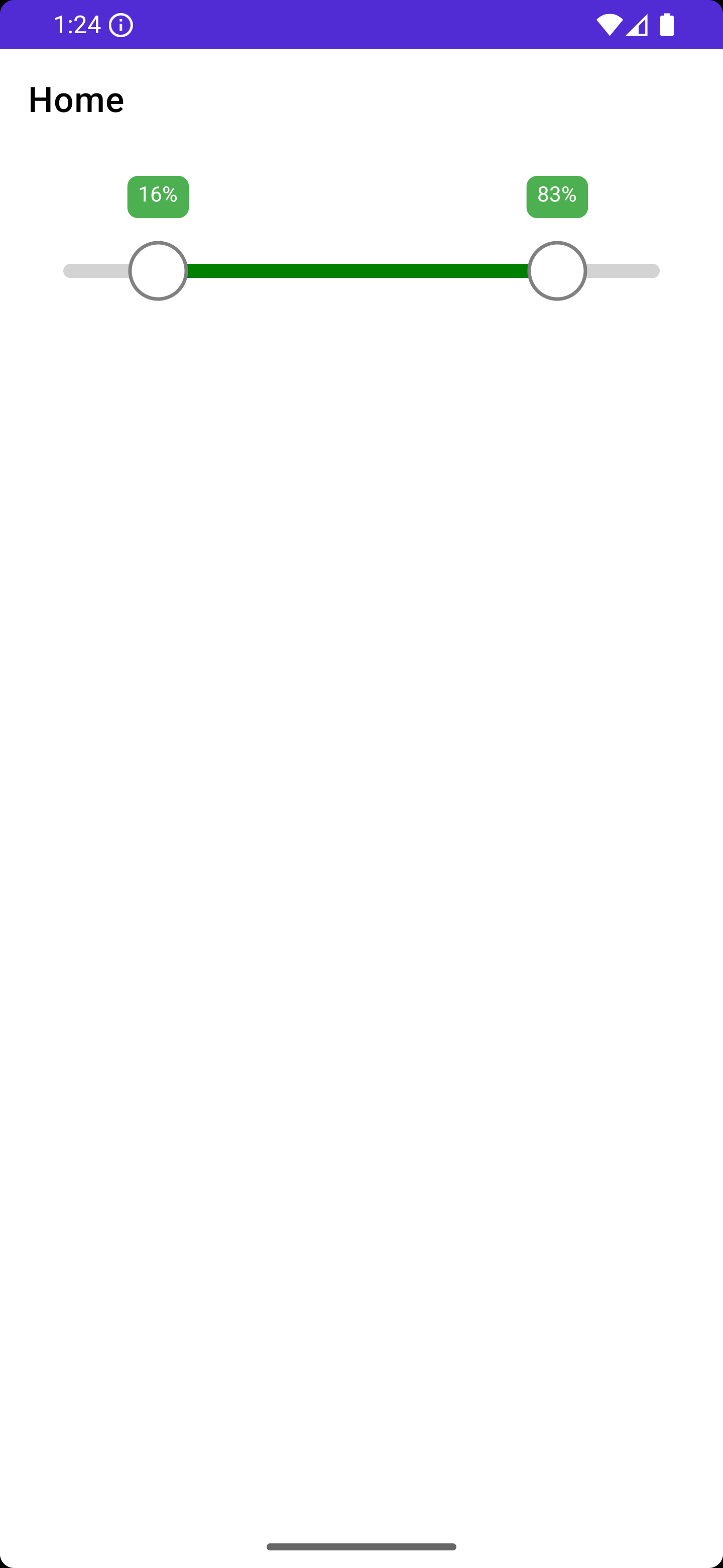
<controls:RangeSlider x:Name="SliderControl"
Minimum="0"
Maximum="100"
SelectedMin="10"
SelectedMax="90"
TrackColor="LightGray"
RangeColor="Green"
ThumbColor="White"
ThumbBorderColor="Gray"
LabelBackgroundColor="#4CAF50"
LabelTextColor="White"
LabelTextAlignment="Center"
TrackHeight="8"
ThumbRadius="16"
HeightRequest="80" />
</VerticalStackLayout>
</ContentPage>
You can display percentage, currency, or custom formatted labels:
public MainPage()
{
    InitializeComponent();

    // Currency
    SliderControl.LabelFormatter = value => $"${value:F0}";

    // Percentage
    // SliderControl.LabelFormatter = value => $"{value:F0}%";
}
This package is ideal for scenarios such as:
- Price range selection in shopping apps
- Discount or percentage selection
- Any situation requiring a min-max range slider
MIT License © asfend