
Part of the Dashlibs suite — Databricks libraries built for business users.
Shared ipywidgets components so every dash-* library looks and behaves the
same way inside a Databricks (or plain Jupyter) notebook: headers, the
UC Table / DataFrame / SQL source picker, output panels, status lines, and
schema introspection helpers — styled to match the team's
datapal-access Databricks App design system
(IBM Plex Sans, a teal primary, rounded-lg cards with a soft shadow)
instead of default ipywidgets styling.
The top card is dashsynthetic's "Single Table" tab, built entirely out of dashui components.
%pip install dash-uisNote: the PyPI distribution is named
dash-uis(the namedash-uiwas already taken by an unrelated package). The importable module is stilldashui.
import dashui
from IPython.display import display

src = dashui.source_selector()
run_btn = dashui.action_button("Run", style="success", emoji="▶")
out = dashui.output_panel()

def on_run(b):
    with out:
        out.clear_output()
        kind, value = src.value()
        print(f"✅ Source: {kind} = {value!r}")

run_btn.on_click(on_run)

ui = dashui.card([
    dashui.header("My Library", library="dashsynthetic", emoji="🧬"),
    dashui.section("Step 1: Source data"),
    src.toggle, src.box,
    run_btn, out,
])
display(ui)The banner at the top of every launch() UI. Color comes from a per-library accent
(dashsynthetic is purple, dashobserve is red, etc. — see dashui.theme.ACCENTS).
dashui.header("DashObserve — Data Observability", library="dashobserve", emoji="👁️")A small uppercase step divider with a bottom border, used to break a form into steps ("Step 1: Source data", "Step 2: Generation settings", ...).
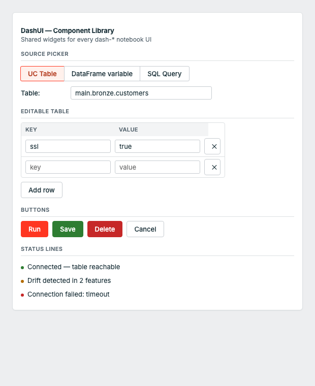
dashui.section("Step 2: Generation settings")The UC Table / DataFrame variable / SQL Query picker used by every Dashlibs UI that
reads from Databricks. Returns a SourceSelector with .toggle, .box (swap-on-select
widgets) and helpers to resolve the chosen source.
src = dashui.source_selector()
ui = dashui.card([src.toggle, src.box])

kind, value = src.value()   # ("table", "catalog.schema.customers")
df = src.resolve_df() # resolves straight to a Spark DataFrameA styled button matching the datapal-access button variants. style is one of
primary | success | warning | danger | info.
run_btn = dashui.action_button("Generate Synthetic Data", style="success", emoji="▶")A one-line colored status message. kind is one of success | error | warning | info.
dashui.status_line("Row count 9,842 within expected bounds", kind="success")
dashui.status_line("Schema changed — added: discount_code", kind="warning")The standard scrollable result/error area used under every action button — an
ipywidgets.Output pre-styled with a muted background and rounded border.
out = dashui.output_panel()
with out:
print("✅ Done")A live-updating numbered list for "added items" accumulators (tables, relationships,
monitors, ...). Returns (output_widget, render_fn).
items = []
out, render = dashui.running_list(lambda i, item: f"{i}. {item['name']}")
items.append({"name": "Customer"})
render(items)The bordered, shadowed container every launch() UI is wrapped in. Injects the shared
<style> block (fonts, button variants, card shell) once per notebook kernel.
ui = dashui.card([header, section_title, src.toggle, src.box, run_btn, out])
display(ui)UC table column introspection — list_columns_safe returns [] instead of raising,
which is what you want when populating a dropdown in a UI callback.
cols = dashui.list_columns_safe("catalog.schema.customers")The raw palette is also exported for building fully custom widgets that still match
the system: dashui.PRIMARY, dashui.SUCCESS, dashui.DANGER, dashui.WARNING,
dashui.BORDER, dashui.CARD, dashui.MUTED, dashui.FONT_SANS, dashui.FONT_MONO.
| Library | Purpose |
|---|---|
| dash-dq | Data Quality |
| dash-synthetic | Synthetic Data Generation |
| dash-observe | Data Observability (freshness, volume, schema) |
| dash-ml | ML Model Monitoring |
| dash-ingest | Data Ingestion |
| dash-gov | Data Governance |
| dash-ontology | Ontology & Lineage for AI |
| dash-ui | Shared UI components (PyPI: dash-uis) |
- 10 unit tests, zero Spark dependency to run them —
pytest tests/ -v - Lint-clean (
ruff check dashui/), PEP 561 typed (py.typed) - Every change ships through a reviewed pull request; CI (lint → test on Python 3.9–3.12 → build) gates every PR and every release
- See CONTRIBUTING.md for dev setup, CHANGELOG.md for release history, SECURITY.md to report a vulnerability, and CODE_OF_CONDUCT.md
Apache 2.0