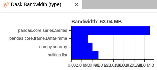
We should probably slightly rotate the labels on the x axis so that they pack a bit more nicely.
This requires understanding a bit of Bokeh (or looking at their docs) and modifying the BandwidthTypes class here
|
class BandwidthTypes(DashboardComponent): |
|
""" Bar chart showing bandwidth per type """ |
|
|
|
def __init__(self, scheduler, **kwargs): |
|
with log_errors(): |
|
self.last = 0 |
|
self.scheduler = scheduler |
|
self.source = ColumnDataSource( |
|
{ |
|
"bandwidth": [1, 2], |
|
"bandwidth-half": [0.5, 1], |
|
"type": ["a", "b"], |
|
"bandwidth_text": ["1", "2"], |
|
} |
|
) |
|
|
|
fig = figure( |
|
title="Bandwidth by Type", |
|
tools="", |
|
id="bk-bandwidth-type-plot", |
|
name="bandwidth_type_histogram", |
|
y_range=["a", "b"], |
|
**kwargs, |
|
) |
|
rect = fig.rect( |
|
source=self.source, |
|
x="bandwidth-half", |
|
y="type", |
|
width="bandwidth", |
|
height=1, |
|
color="blue", |
|
) |
|
fig.x_range.start = 0 |
|
fig.xaxis[0].formatter = NumeralTickFormatter(format="0.0 b") |
|
fig.xaxis.ticker = AdaptiveTicker(**TICKS_1024) |
|
rect.nonselection_glyph = None |
|
|
|
fig.xaxis.minor_tick_line_alpha = 0 |
|
fig.ygrid.visible = False |
|
|
|
fig.toolbar.logo = None |
|
fig.toolbar_location = None |
|
|
|
hover = HoverTool() |
|
hover.tooltips = "@type: @bandwidth_text / s" |
|
hover.point_policy = "follow_mouse" |
|
fig.add_tools(hover) |
|
|
|
self.fig = fig |
We should probably slightly rotate the labels on the x axis so that they pack a bit more nicely.
This requires understanding a bit of Bokeh (or looking at their docs) and modifying the BandwidthTypes class here
distributed/distributed/dashboard/components/scheduler.py
Lines 274 to 322 in 907452b