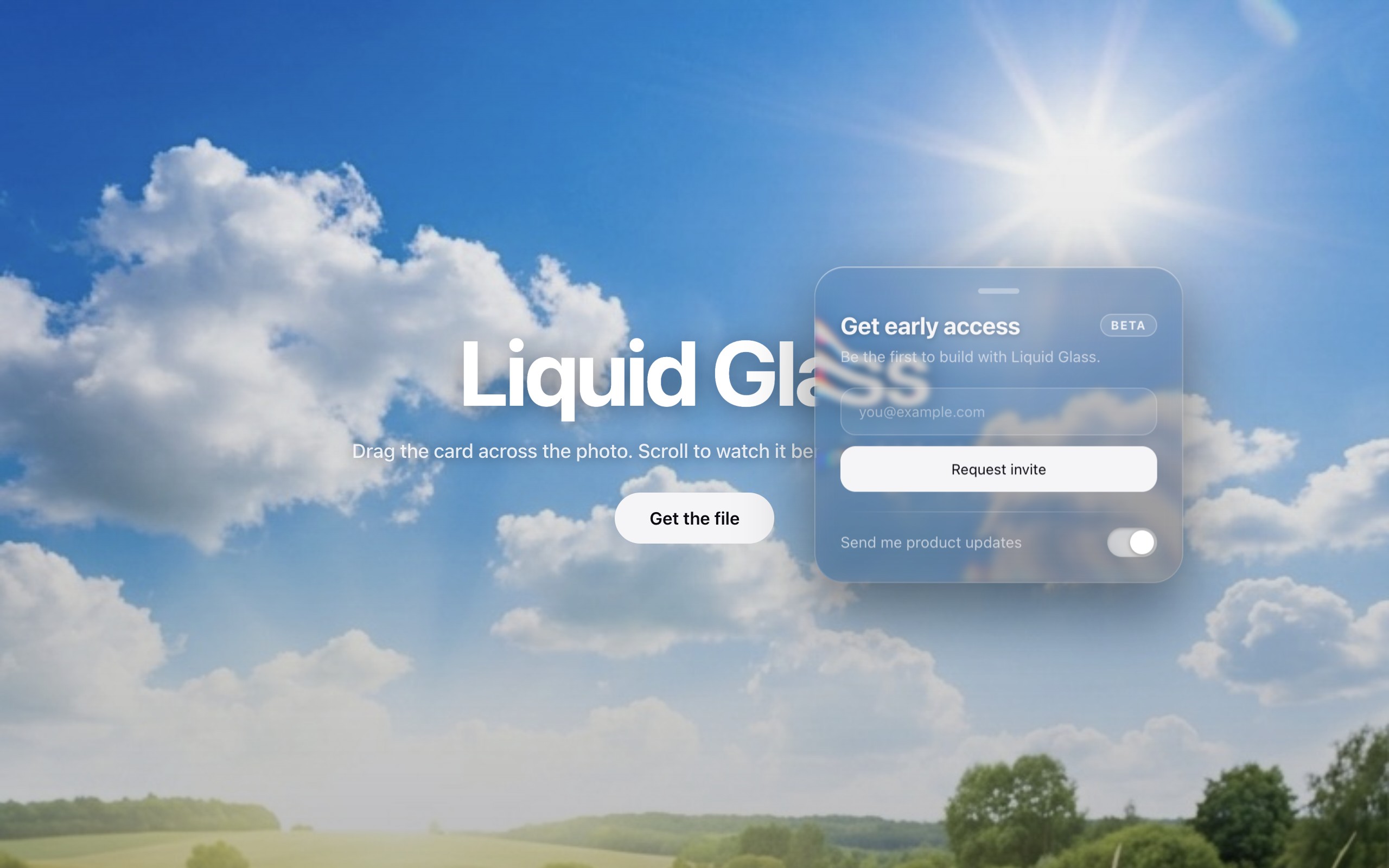
Apple-style liquid glass for the web: a translucent panel that visibly bends the content behind it at its rim — with a faint prism fringe — while the interior stays legible. One file, zero dependencies, works on any DOM element.
Real refraction in Chromium browsers (Chrome, Edge, Arc, Brave); automatic frosted-blur fallback in Safari and Firefox.
<script src="liquid-glass.js"></script>

<div class="glass">…your content…</div>

<script>
  const glass = liquidGlass(document.querySelector(".glass"));
  // glass.supported  — false on Safari/Firefox (frosted fallback applied)
  // glass.refresh()  — regenerate after manual size changes (auto on resize)
  // glass.destroy()  — remove the effect
</script>
The module owns the optics — SVG filter, displacement map, backdrop-filter, resize handling, fallback. The material dressing is plain CSS on your element, and it's what makes the panel read as glass:
.glass {
  border-radius: 28px;                 /* the module reads this for the map */
  background: linear-gradient(180deg,  /* slight tint for text contrast     */
    rgba(14, 14, 22, 0.18), rgba(14, 14, 22, 0.32));
  box-shadow:
    0 24px 60px rgba(0, 0, 0, 0.45),           /* drop shadow               */
    inset 0 1px 1px rgba(255, 255, 255, 0.5),  /* specular top highlight    */
    inset 0 -8px 20px rgba(255, 255, 255, 0.06),
    inset 0 0 0 1px rgba(255, 255, 255, 0.13); /* 1px glass border          */
}
Open demo/index.html for a live example with a draggable
card.
liquidGlass(el, {
  scale: -112,      // displacement strength; negative = magnifying bulge
                    //   −60 subtle … −180 dramatic
  chroma: 6,        // per-channel scale stagger (prism fringe); 0 disables
  border: 0.07,     // neutral interior inset, fraction of the smaller side
  mapBlur: 12,      // curvature of the bulge: small = hard rim, large = dome
  blur: 3,          // backdrop blur inside the glass (raise for busy bgs)
  saturate: 1.5,    // backdrop saturation boost
  radius: null,     // corner radius override (px); defaults to border-radius
  fallbackBlur: 16, // frosted blur on Safari/Firefox
});- Displacement map (canvas → data URI): a red left→right ramp encodes X
displacement and a blue top→bottom ramp encodes Y, combined with
globalCompositeOperation: "difference". A blurred, inset, 50%-gray rounded rect neutralizes the interior, confining refraction to an edge band. RGB(128, 128, ·) = neutral; deviation from 128 = push. - SVG filter:
feImageloads the map; threefeDisplacementMappasses at staggered scales, each isolated to one channel withfeColorMatrix, recombined withfeBlend mode="screen"→ chromatic aberration at the rim. - Applied via
backdrop-filter: url(#id) …so real DOM content refracts — text stays selectable, inputs stay usable.
color-interpolation-filters="sRGB"is mandatory (the module sets it). SVG filters default to linearRGB, which re-maps the map's neutral gray and injects a constant phantom displacement over the whole element.- Keep the interior legible. If content behind the glass smears, lower
scale/chroma, raiseblur, or increaseborder— don't reach for an opaque background, which kills the material. - Refraction is Chromium-only. Never let it carry meaning, only delight.
- The 0×0 host
<svg>must not bedisplay:none(the module handles this). - Map generation is O(w×h); the filter runs on the GPU per frame. Great for cards, navs, and buttons; avoid elements larger than ~800px per side. Position-only animation needs no new map — only size changes do.
Wrap in an effect hook tied to the element ref and call destroy() on
unmount:
useEffect(() => {
  const glass = liquidGlass(ref.current);
  return () => glass.destroy();
}, []);Technique informed by Aave's "Building glass for the web" and rizroze/liquid-glass.