Conversation
|
🚀 Deployed on https://pr-908--dhis2-ui.netlify.app |
|
Test summary
Run details
View run in Cypress Dashboard ➡️ This comment has been generated by cypress-bot as a result of this project's GitHub integration settings. You can manage this integration in this project's settings in the Cypress Dashboard |
fix(button): remove unneeded zindex rule
fix(segmented-control): remove unneeded zindex
 cooper-joe
force-pushed
the
focus-stresstest
branch
from
cooper-joe
force-pushed
the
focus-stresstest
branch
from
adf9a3e to
0e2f414
Compare
| textarea:focus { | ||
| outline: none; | ||
| box-shadow: 0 0 0 3px ${theme.focus}; | ||
| box-shadow: inset 0 0 0 2px ${theme.focus}; |
There was a problem hiding this comment.
Should the spread radius here (the 2px) not be 3px?
There was a problem hiding this comment.
I think this is correct, he's using an inset box-shadow with a width of 2px plus a blue border of 1px, so the total visual width is 3px.
There was a problem hiding this comment.
That's right, the box-shadow and border combine to make 3px.
There was a problem hiding this comment.
Ah nice. Yeah I assumed it was intentional since it was changed from 3 to 2, but it stood out to me so I thought I'd ask.
4 participants
Fixes UX-20.
This PR fixes focus styles across the library. Focus styles were previously updated, but there were issues where the focus outline was cut off by the parent container. All focus styles are now contained within the element.
For example, issues like:
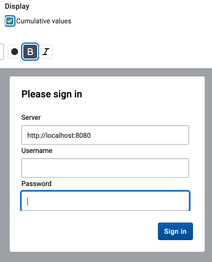
Screenshots
ButtonButton secondaryButton primaryButton destructiveCheckboxRadioInput/SelectSegmented controlSwitchNote: The focus styles appear outside of the
Checkbox,Radio, andSwitch, but are actually inside the bounds of the element.