

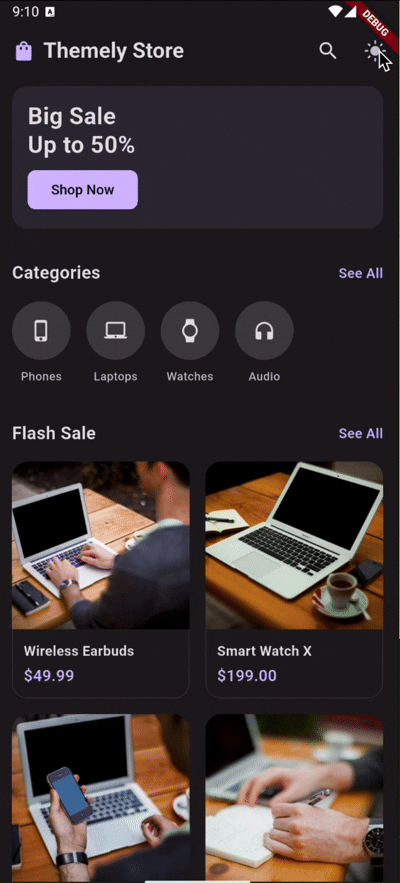
A modular, highly customizable Flutter theme manager supporting dark, light and custom named themes with semantic color tokens, animated transitions, scheduling, and more.
- Features
- Requirements
- Installation
- Getting Started
- Quick Start
- Customization
- API Reference
- Cookbook & FAQ
- Contributing
- Support
- Contributors
- Changelog
- License
- Core Toggle: Switch between
light,darkandsystemmodes effortlessly. - Persistence: Automatically saves user preferences using SharedPreferences.
- Semantic Tokens: Define and use colors semantically via type-safe context extensions.
- Smooth Animations: Built-in
AnimatedThemetransitions when switching modes. - Widget Switchers: Swap widgets (
ThemeAsset,ThemeIcon,ThemeText,ThemeLottie,ThemeBuilder) based on the current mode automatically. - Preview Mode: Let users preview a theme before saving it permanently.
- Named Themes: Support for infinite custom themes (e.g., "sepia", "high_contrast").
- Auto Schedule: Automatically switch modes based on the time of day.
- No Boilerplate: Access everything easily via
BuildContextextensions (context.isDark,context.themeColors). - Debug Overlay: Built-in overlay to visually debug your active theme tokens.
- Flutter >= 3.10.0
- Dart >= 3.0.0
Add the dependency to your pubspec.yaml:
dependencies:
themely: ^1.0.0To get started with Themely, you need to configure your ThemeController and wrap your app with ThemelyApp. Themely handles the ThemeData injection automatically via AnimatedTheme for smooth transitions.
A brief tutorial from zero to running.
- Install package
dependencies:
themely: ^1.0.0- Initialize ThemeController in main.dart
import 'package:flutter/material.dart';
import 'package:themely/themely.dart';

void main() async {
  WidgetsFlutterBinding.ensureInitialized();

  // Initialize the controller with your ThemeData
  final controller = ThemeController(
    lightTheme: ThemeData.light(),
    darkTheme: ThemeData.dark(),
  );

  // Await initialization to load saved preferences
  await controller.initialize();

  runApp(MyApp(controller: controller));
}- Wrap MaterialApp with package
class MyApp extends StatelessWidget {
  final ThemeController controller;

  const MyApp({super.key, required this.controller});

  @override
  Widget build(BuildContext context) {
    // Inject ThemeScope and listen to stream
    return ThemelyApp(
      controller: controller,
      builder: (context, theme, child) => MaterialApp(
        theme: theme,
        home: const Home(),
      ),
    );
  }
}- Toggle mode from a button
ElevatedButton(
  // Toggles between dark and light mode
  onPressed: () => context.themeController.toggleDark(),
  child: Text(context.isDark ? 'Switch to Light' : 'Switch to Dark'),
)- Access color tokens in widgets
Container(
  // Automatically adapts based on active mode
  color: context.themeColors.cardSurface,
)- Use a widget switcher
// Renders different icons based on mode without manual ternary checks
ThemeIcon(
  light: Icons.wb_sunny,
  dark: Icons.nightlight_round,
)

// Seamlessly switch Lottie animations
ThemeLottie.asset(
  light: 'assets/animations/sun.json',
  dark: 'assets/animations/moon.json',
)- Activate scheduled auto switch
final controller = ThemeController(
  lightTheme: ThemeData.light(),
  darkTheme: ThemeData.dark(),
  autoSchedule: true, // Enable scheduling
  darkFrom: const TimeOfDay(hour: 18, minute: 0), // Dark starts at 6 PM
  darkUntil: const TimeOfDay(hour: 6, minute: 0), // Dark ends at 6 AM
);Themely is built to be extended. Here is how you can customize every aspect of it.
To define a custom color palette, use ThemeData and pass it to the controller.
final myLightTheme = ThemeData(
  brightness: Brightness.light,
  colorSchemeSeed: Colors.green,
);You can add your own custom tokens by subclassing AppThemeTokens and overriding lerp.
class MyCustomTokens extends AppThemeTokens {
  final Color brandColor;

  const MyCustomTokens({
    required super.buttonBackground,
    // ... other super fields
    required this.brandColor,
  });

  @override
  MyCustomTokens lerp(AppThemeTokens? other, double t) {
    if (other is! MyCustomTokens) return this;
    return MyCustomTokens(
      buttonBackground: Color.lerp(buttonBackground, other.buttonBackground, t)!,
      // ... lerp other super fields
      brandColor: Color.lerp(brandColor, other.brandColor, t)!,
    );
  }
}

// Pass it via ThemeExtension
final theme = ThemeData(
  extensions: [
    AppThemeExtension<MyCustomTokens>(tokens: myTokens),
  ]
);

// Access it
final brand = context.themeTokens<MyCustomTokens>().brandColor;You can adjust opacity on any token independently using .withValues(alpha: ...).
Container(
  color: context.themeColors.buttonBackground.withValues(alpha: 0.5),
)While tokens natively hold Color, you can build gradients using your tokens.
Container(
  decoration: BoxDecoration(
    gradient: LinearGradient(
      colors: [
        context.themeColors.buttonBackground,
        context.themeColors.cardSurface,
      ],
    ),
  ),
)Define fonts differently per mode using ThemeData or via semantic tokens.
Text(
  'Hello',
  style: TextStyle(fontFamily: context.themeColors.primaryFont),
)You can define entire TextTheme per mode in ThemeData.
final lightTheme = ThemeData(
  textTheme: const TextTheme(
    bodyLarge: TextStyle(fontSize: 16, fontWeight: FontWeight.normal, letterSpacing: 0.5),
  ),
);Override shapes per mode in ThemeData.
final amoledTheme = ThemeData(
  cardTheme: CardTheme(
    shape: RoundedRectangleBorder(borderRadius: BorderRadius.circular(0)), // Sharp edges
  ),
);Use ThemeValue to return different dimensions based on mode.
Padding(
  padding: EdgeInsets.all(
    context.themeValue<double>(
      light: 16.0,
      dark: 24.0, // More breathing room in dark mode
    )
  ),
  child: const Text('Spaced Content'),
)Card(
elevation: context.themeValue<double>(
light: 2.0,
dark: 0.0, // Flat design in dark mode
),
)Modify ripple and highlight colors globally in ThemeData.
final theme = ThemeData(
  splashColor: Colors.blue.withValues(alpha: 0.2),
  highlightColor: Colors.transparent,
);Customize the cross-fade animation between modes via ThemeController.
final controller = ThemeController(
  animationDuration: const Duration(milliseconds: 500),
  animationCurve: Curves.easeInOutBack,
);Bypass the built-in autoSchedule and trigger mode changes via your own logic (e.g., location, battery level).
Battery().onBatteryStateChanged.listen((state) {
  if (state == BatteryState.powerSave) {
    context.themeController.setMode(AppThemeMode.amoled);
  }
});Create your own adapter by implementing ThemeStorage.
class HiveThemeStorage implements ThemeStorage {
  @override
  Future<String?> loadMode(String key) async {
    return Hive.box('settings').get(key);
  }

  @override
  Future<void> saveMode(String key, String mode) async {
    await Hive.box('settings').put(key, mode);
  }
}

// Inject it
final controller = ThemeController(storage: HiveThemeStorage());If you need to avoid collisions, build a custom adapter that prefixes the keys.
// Inside your custom storage adapter:
final String prefix = 'my_app_v2_';
await prefs.setString('$prefix$key', mode);You can read current active values and serialize them to JSON.
// Example serialized output
{
  "mode": "dark",
  "named": "sepia"
}
final currentMode = context.currentMode.name;
final namedTheme = context.themeController.activeNamedTheme;
final jsonExport = jsonEncode({'mode': currentMode, 'named': namedTheme});Clear all named themes and revert to initial configuration.
await context.themeController.clearNamedTheme();
await context.themeController.setMode(AppThemeMode.system);setMode(AppThemeMode mode): Sets the global theme mode.toggleDark(): Toggles between Light and Dark mode.cycleMode(): Cycles through all available AppThemeModes.registerTheme(String name, {ThemeData? light, ThemeData? dark}): Registers a new custom named theme.setNamedTheme(String name): Activates a registered named theme.clearNamedTheme(): Reverts to standard mode.preview(AppThemeMode mode): Temporarily changes the theme without saving.confirmPreview(): Saves the currently previewed theme.cancelPreview(): Reverts to the previously saved theme.modeStream:Stream<AppThemeMode>of mode changes.currentMode: Returns activeAppThemeMode.activeNamedTheme: Returns the active named theme string (nullable).
light,dark,amoled,system
context.isDark:boolcontext.isLight:boolcontext.isAmoled:boolcontext.currentMode:AppThemeModecontext.themeColors:AppThemeTokenscontext.themeTokens<T>():T extends AppThemeTokenscontext.themeController:ThemeControllercontext.themeValue<T>({required T light, T? dark, T? amoled, T? orElse}): Returns specific value based on mode.
ThemeBuilder:Widget Function(BuildContext)for different modes.ThemeAsset:ImageProviderper mode.ThemeIcon:IconDataper mode.ThemeText:Stringper mode.ThemeLottie: Renders.jsonanimations per mode vialottiepackage (.asset()or.network()).LocalTheme: Force a subtree to a specific mode.
Here are the most common questions from developers building with Themely.
You don't need to rewrite anything. Just use .copyWith() on the default tokens when registering your theme.
final myLightTokens = AppThemeTokens.light.copyWith(
  cardSurface: Colors.white,
  buttonBackground: Colors.blueAccent,
);

// Register it in your ThemeController/ThemeData extensionsIf the default attributes aren't enough, just extend the class.
class MyColors extends AppThemeTokens {
  final Color brandColor;
  const MyColors({required this.brandColor, ...super_fields});

  // Override lerp to support animations (see Customization section)
}

// Access it anywhere:
final brand = context.themeTokens<MyColors>().brandColor;Stop guessing if text should be black or white. Use the contrastOn helper which automatically picks the best contrast based on WCAG luminance.
Text(
  'I adapt to my background!',
  style: TextStyle(
    // If buttonBackground is dark, this returns white. If light, returns black.
    color: context.themeColors.contrastOn(context.themeColors.buttonBackground),
  ),
)You have two ways:
- Stateless/Standard: Use
context.themeColors.x. When the theme changes, the widget rebuilds with the new color. - Animated: Use
ThemeAnimatedColorfor a smooth transition.
ThemeAnimatedColor(
  color: context.themeColors.buttonBackground,
  duration: Duration(milliseconds: 500),
  builder: (context, color, child) => Container(color: color),
)Yes! Use our built-in switchers for zero boilerplate:
ThemeIcon(light: Icons.sunny, dark: Icons.moon)ThemeAsset(light: 'day.png', dark: 'night.png')ThemeText(light: 'Good Morning', dark: 'Good Evening')
Contributions are welcome! If you find a bug or have a feature request, please open an issue. If you cannot contribute code yet, giving this repository a ⭐ Star is also a great way to support the project!
If you want to contribute code, please:
- Fork the repository.
- Create a new branch.
- Make your changes.
- Submit a pull request.
If you find this library useful and want to support its development, you can support me on Ko-fi!
- Dimas Febriano (@dimassfeb-09) - Creator & Lead Developer
- Website: dimassfeb.com
v1.0.1
- Updated README with a centered, responsive preview GIF.
- Improved documentation layout.
v1.0.0
- Initial core release.
- Core: Added
ThemeControllerwith persistence andAppThemeMode(light, dark, amoled, system). - Architecture: Implemented
ThemeExtensionwith generic support for type-safe custom tokens. - Tokens: Added Semantic Color Tokens, Typography (Font) tokens, and
AppThemeIcons. - UI: Integrated
AnimatedThemefor smooth global theme transitions. - Widgets: Introduced
ThemeBuilder,ThemeAsset,ThemeIcon,ThemeText, andThemeLottie. - Logic: Added
ThemeSchedulerfor automatic time-based switching. - Tools: Built-in
DebugThemeOverlayfor visual token debugging. - Utilities: Added
contrastOnhelper for automatic WCAG-compliant text color selection.
MIT License. See LICENSE file for details.