In this section, you'll create a Python script to visualize the weather of over 500 cities of varying distances from the equator. You'll use a simple Python library (Links to an external site.), the OpenWeatherMap API (Links to an external site.), and your problem-solving skills to create a representative model of weather across cities.
The first requirement is to create a series of scatter plots to showcase the following relationships:
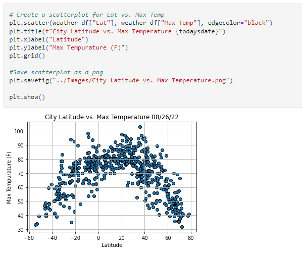
Temperature (F) vs. Latitude
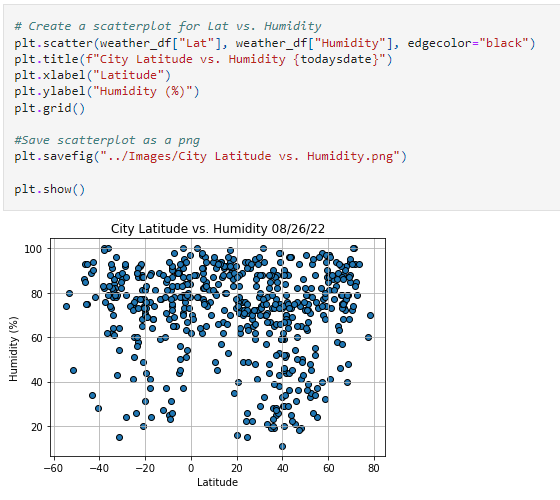
Humidity (%) vs. Latitude
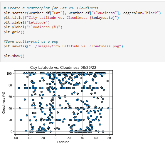
Cloudiness (%) vs. Latitude
Wind Speed (mph) vs. Latitude
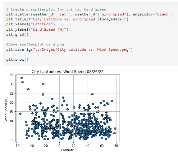
After each plot, add one to two sentences to explain what the code is analyzing.
The second requirement is to compute the linear regression for each relationship. This time, separate the plots into Northern Hemisphere (greater than or equal to 0 degrees latitude) and Southern Hemisphere (less than 0 degrees latitude):
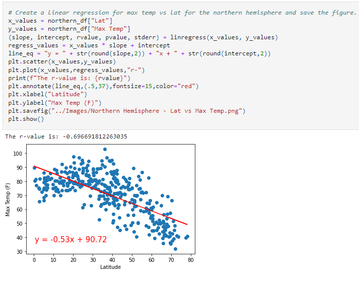
Northern Hemisphere: Temperature (F) vs. Latitude
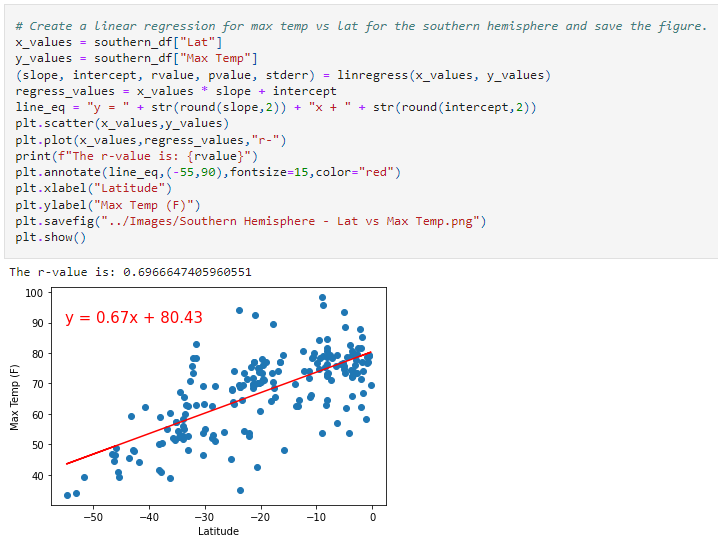
Southern Hemisphere: Temperature (F) vs. Latitude
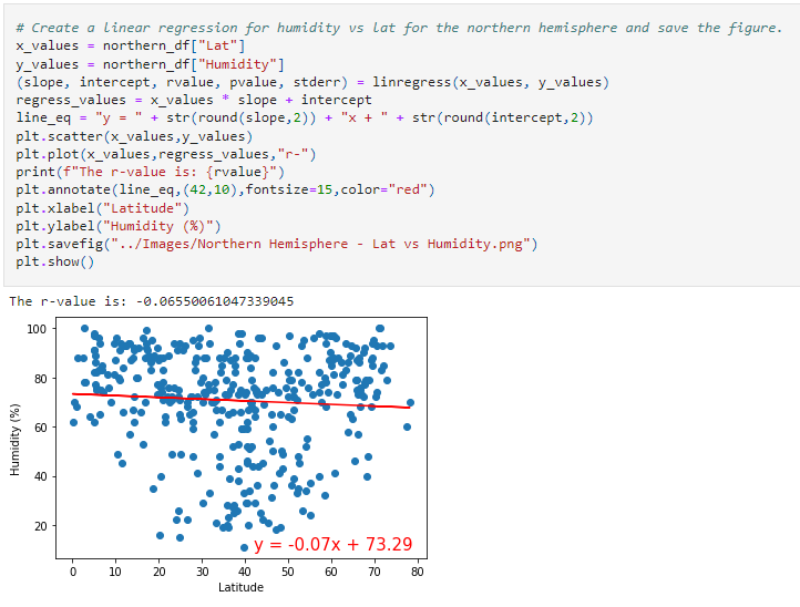
Northern Hemisphere: Humidity (%) vs. Latitude
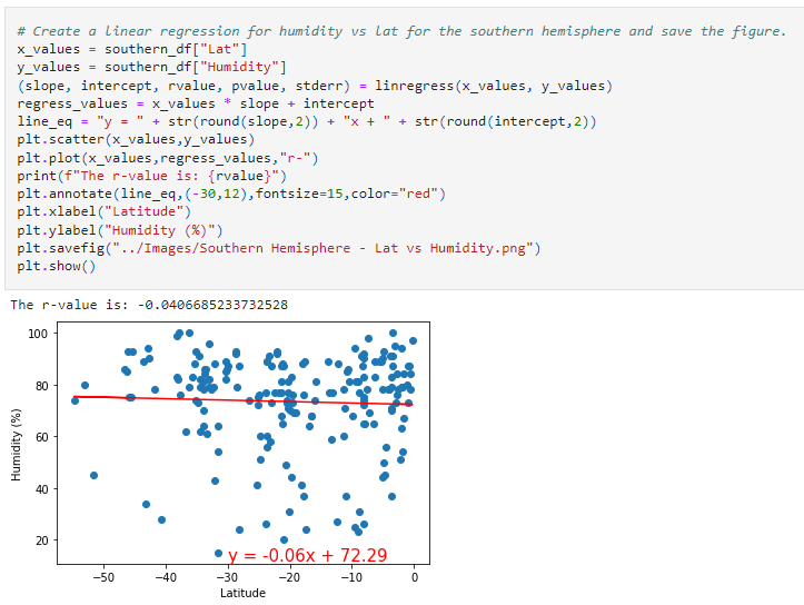
Southern Hemisphere: Humidity (%) vs. Latitude
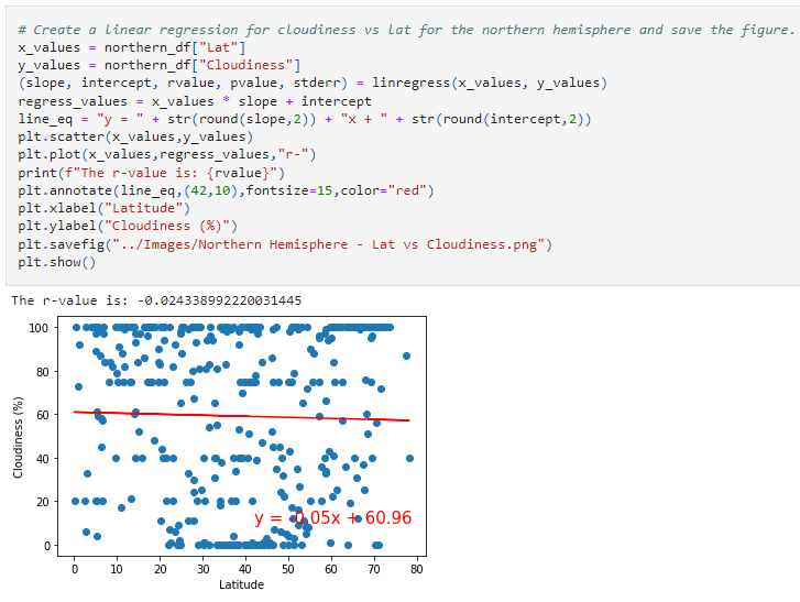
Northern Hemisphere: Cloudiness (%) vs. Latitude
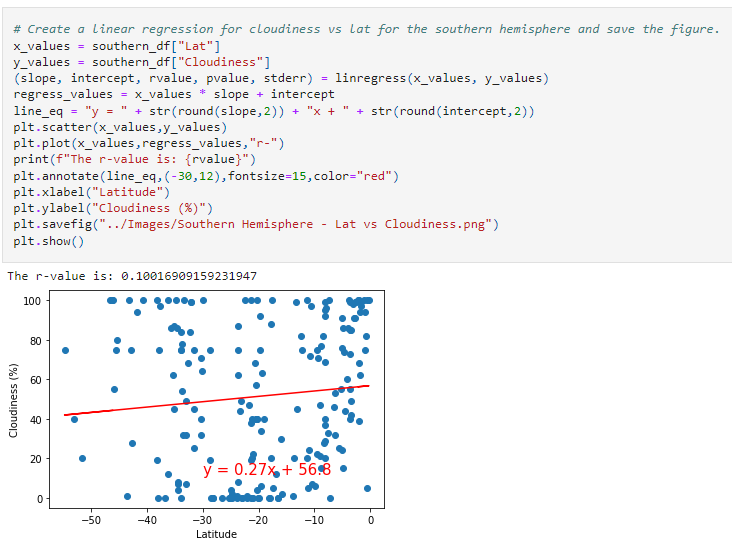
Southern Hemisphere: Cloudiness (%) vs. Latitude
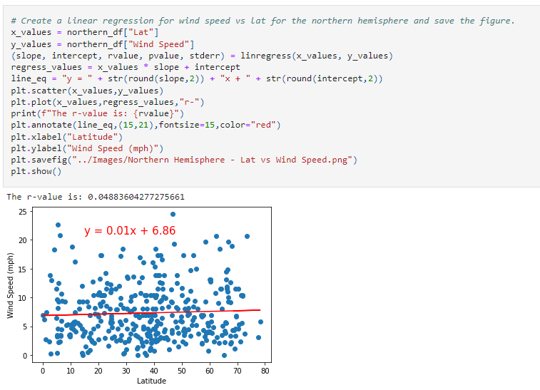
Northern Hemisphere: Wind Speed (mph) vs. Latitude
Southern Hemisphere: Wind Speed (mph) vs. Latitude
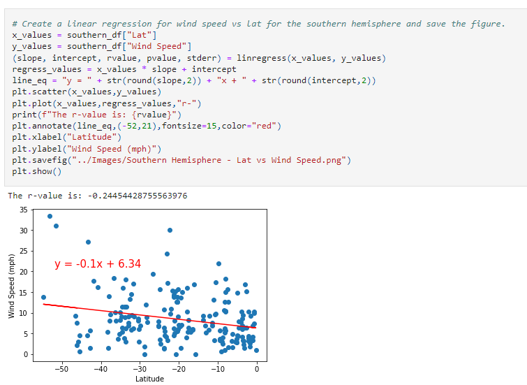
After each pair of plots, explain what the linear regression is modeling. Describe any relationships that you notice and any other findings you may uncover.
Your final notebook must meet the following requirements:
Randomly select at least 500 unique (not repeated) cities based on latitude and longitude.
Perform a weather check on each of the cities by using a series of successive API calls.
Include a print log of each city as it's being processed, with the city number and city name.
Save a CSV of all retrieved data and a PNG image for each scatter plot.
Now, use your weather data skills to plan future vacations. Use Jupyter gmaps and the Google Places API for this part of the assignment.
To complete this part of the assignment, complete the following steps:
Create a heat map that displays the humidity for every city from Part 1, as in the following image: heatmap
Narrow down the DataFrame to find your ideal weather condition. For example: A max temperature lower than 80 degrees but higher than 70
Wind speed less than 10 mph
Zero cloudiness
Drop any rows that don't satisfy all three conditions. You want to be sure that the weather is ideal.
For each city, use the Google Places API to find the first hotel located within 5,000 meters of your coordinates.
Plot the hotels on top of the humidity heatmap, with each pin containing the Hotel Name, City, and Country.
Finally, make sure to meet the following requirements:
You must complete your analysis using a Jupyter notebook.
You must use the Matplotlib or Pandas plotting libraries.
For Part 1, you must include a written description of three observable trends based on the data.
For Part 2, you must take a screenshot of the heatmap that you create and include it in your submission.
Your plots must include labeling aspects like plot title (with date of analysis) and axis labels.
For max intensity in the heatmap, try setting it to the highest humidity found in the dataset.