WeatherPy & VacationPy
Whether financial, political, or social -- data's true power lies in its ability to answer questions definitively. So let's take what you've learned about Python requests, APIs, and JSON traversals to answer a fundamental question: "What's the weather like as we approach the equator?"
Now, we know what you may be thinking: "Duh. It gets hotter..."
But, if pressed, how would you prove it?
-
Create a new repository for this project called
python-api-challenge. Do not add this homework to an existing repository. -
Clone the new repository to your computer.
-
Inside your local git repository, create a directory for both of the Python Challenges. Use folder names corresponding to the challenges: WeatherPy.
-
Inside the folder that you just created, add new files called
WeatherPy.ipynbandVacationPy.ipynb. These will be the main scripts to run for each analysis. -
Push the above changes to GitHub.
In this example, you'll be creating a Python script to visualize the weather of 500+ cities across the world of varying distance from the equator. To accomplish this, you'll be utilizing a simple Python library, the OpenWeatherMap API, and a little common sense to create a representative model of weather across world cities.
Your first requirement is to create a series of scatter plots to showcase the following relationships:
- Temperature (F) vs. Latitude
- Humidity (%) vs. Latitude
- Cloudiness (%) vs. Latitude
- Wind Speed (mph) vs. Latitude
After each plot add a sentence or too explaining what the code is and analyzing.
Your second requirement is to run linear regression on each relationship, only this time separating them into Northern Hemisphere (greater than or equal to 0 degrees latitude) and Southern Hemisphere (less than 0 degrees latitude):
- Northern Hemisphere - Temperature (F) vs. Latitude
- Southern Hemisphere - Temperature (F) vs. Latitude
- Northern Hemisphere - Humidity (%) vs. Latitude
- Southern Hemisphere - Humidity (%) vs. Latitude
- Northern Hemisphere - Cloudiness (%) vs. Latitude
- Southern Hemisphere - Cloudiness (%) vs. Latitude
- Northern Hemisphere - Wind Speed (mph) vs. Latitude
- Southern Hemisphere - Wind Speed (mph) vs. Latitude
After each pair of plots explain what the linear regression is modeling such as any relationships you notice and any other analysis you may have.
Your final notebook must:
- Randomly select at least 500 unique (non-repeat) cities based on latitude and longitude.
- Perform a weather check on each of the cities using a series of successive API calls.
- Include a print log of each city as it's being processed with the city number and city name.
- Save a CSV of all retrieved data and a PNG image for each scatter plot.
Now let's use your skills in working with weather data to plan future vacations. Use jupyter-gmaps and the Google Places API for this part of the assignment.
-
Note: Remember that any API usage beyond the $200 credit will be charged to your personal account. You can set quotas and limits to your daily requests to be sure you can't be charged. Check out Google Maps Platform Billing and Manage your cost of use for more information.
-
Note: if you having trouble displaying the maps try running
jupyter nbextension enable --py gmapsin your environment and retry. -
Create a heat map that displays the humidity for every city from the part I of the homework.
-
Narrow down the DataFrame to find your ideal weather condition. For example:
-
A max temperature lower than 80 degrees but higher than 70.
-
Wind speed less than 10 mph.
-
Zero cloudiness.
-
Drop any rows that don't contain all three conditions. You want to be sure the weather is ideal.
-
Note: Feel free to adjust to your specifications but be sure to limit the number of rows returned by your API requests to a reasonable number.
-
-
Using Google Places API to find the first hotel for each city located within 5000 meters of your coordinates.
-
Plot the hotels on top of the humidity heatmap with each pin containing the Hotel Name, City, and Country.
As final considerations:
- Create a new GitHub repository for this project called
API-Challenge(note the kebab-case). Do not add to an existing repo - You must complete your analysis using a Jupyter notebook.
- You must use the Matplotlib or Pandas plotting libraries.
- For Part I, you must include a written description of three observable trends based on the data.
- For Part II, you must include a screenshot of the heatmap you create and include it in your submission.
- You must use proper labeling of your plots, including aspects like: Plot Titles (with date of analysis) and Axes Labels.
- For max intensity in the heat map, try setting it to the highest humidity found in the data set.

There is no significant trend between latitude and cloudiness.
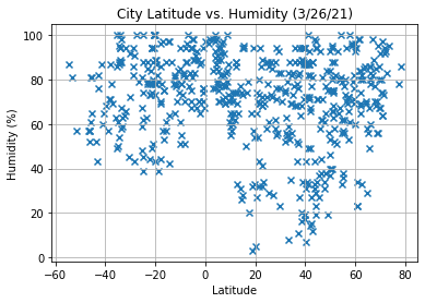
There is no significant trend between latitude and humidity. Cities near latitude of 20 generally seems to have lower humidity and near the equator tends to have higher humidity
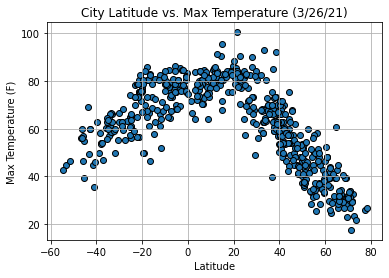
Max temperature is the highest for cities near the equator or slightly north and the lowest temperatures are very far north though cities have more extreme north latitude points
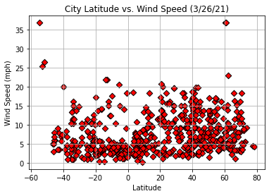
There is no significant trend between latitude and wind speed, not enough data points on the extremes where wind speed seems to increase slightly in the southern hemisphere to draw a conclusion