Enhance get tickets button design#362
Conversation
There was a problem hiding this comment.
👍🏽 to increasing the size of the button
👍🏽 adding a shadow to give more importance to the button
I still see some opportunities to improve the importance of this button a little bit:
Improve the contrast ratio
The contrast ratio can reach better numbers. I found an interesting website where we can play with the colours of the background and the button to achieve a better contrast score:
https://buttonbuddy.dev/#generator
The values I introduced:
--surface: #8a83c7;
--background: #2a3b90;
--color: #f9ead4;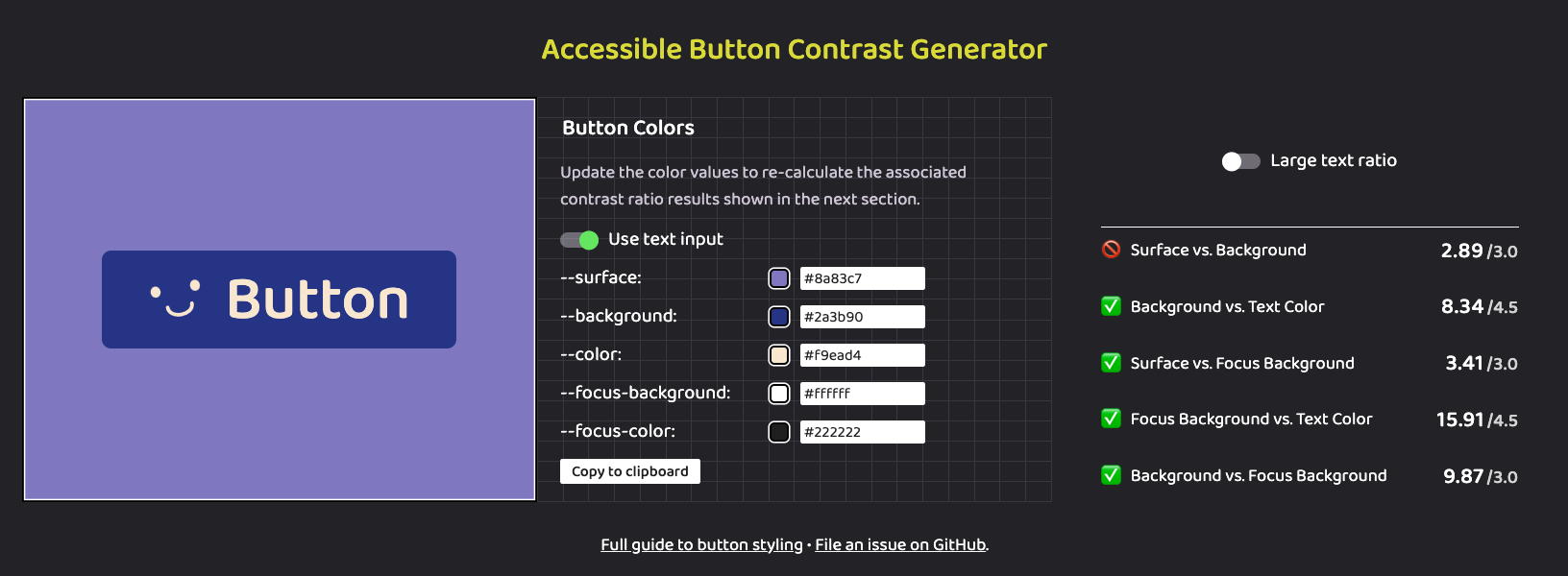
Social Buttons still are bigger
When checking the page, the Social Buttons still are bigger. Some ideas we can experiment with are:
- 💁🏽💡 Increase the
font-sizefor theGET YOUR TICKETbutton - 💁🏽💡 Increase the area (
padding) for theGET YOUR TICKETbutton - 💁🏽💡 Decrease the area (
padding) for theTwitterandMailing Listbuttons. - 💁🏽💡 Make the icons appear in the same line with the text to make the button smaller.
|
Actually, we can merge what you did and we (I can do it) can do another iteration in a different PR. |
Seems good to me, I will merge it and I can take a look again on this tomorrow |
|
Thank you, that's an improvement, the box shadow really lifts it out. It still blends in with the Eiffel Tower behind it – if could dim the background somehow, I think that would solve it but there might be other ways to achieve the same. |
I created a new issue where we can keep iterating the button: #363 |
It closes #324
I increased the padding-bottom of the hero image, so that the text stays more on top of the Eiffel Tower.
I also added a shadow behind the button so it stands out more.