Design Conventions
The design-side sibling of API Conventions. Where API Conventions states what the code conventions are, this page states what good design looks like in Astryx — and why the defaults are what they are — so designers and engineers can build in compliance and reviewers can evaluate against a shared bar.
Consolidation, not invention. Every convention here already lives in the token system, component source, theming infrastructure, or the review rubrics. This page gathers them into one reference and, where possible, into checks you can run. New standards enter via the Component Specification Protocol; Component Hardening Protocol Layer 3 decisions roll up into this page so judgments compound. Over time the checkable ones become Night Watch Component Auditor checks.
- Understand the intention behind a decision. Tokens encode the system's design thinking, so they're a reliable guide — follow the token when in doubt. But they're a guide, not absolute law: a token used in the wrong role is still wrong. Know why a value exists so you can tell the difference.
- Themes control look, core controls structure. Every visual value references a token; the theme decides what it resolves to.
- Minimize visuals per state. Every distinct visual for the same state is overhead a user must learn. Reuse an existing representation before inventing a new one.
- Consistency is scoped to the family first, then the system.
- Design for every state — rest, hover, focus, active, disabled, loading, and the relevant status/selected states.
- Guidance over enforcement. Capability, not runtime design guardrails.
Each foundation pairs a design principle with the token category that expresses it. The defaults aren't arbitrary — they encode these intentions, which are also the rubric for judging whether a custom theme is well-designed.
| Principle | Space is the primary signal for how elements relate. Closely-related things sit tight; separate concerns sit apart; and the gap grows with each level of grouping — label→input < fields in a group < groups in a section < section→section. The 4px grid (--spacing-*, 2px half-steps for optical work) gives enough steps to express these tiers. |
| Why it matters | Before a word is read, proximity has already told the user what belongs together (Gestalt). Get relationships right and a dense screen still feels organized; get them wrong and no color or border will rescue it. Spacing does structural work — so it must be varied and intentional, not one value everywhere. |
|
Smells checkable |
|
| Got it right | you can squint at the layout and still see the groupings; gaps step up monotonically with grouping order; every value traces to a spacing token. Tight where related, generous where separate — never uniform. |
| Principle | Elements come in two flavors: fixed-height ones use size props (control heights sm 28 / md 32 / lg 36px); variable-height ones (inputs, list rows, menu items) use density props (internal padding). Both must be tuned together so a stack of mixed elements shares one vertical rhythm — a md Button and a default-density input should land on the same height. |
| Why it matters | Rhythm is what makes a stack of controls feel engineered rather than assembled. Because size and density are set by different props, they drift apart easily. Visual size and touch size are also different jobs: a control can look compact but must still offer a ~44px hit area. |
|
Smells checkable |
|
| Got it right | fixed- and variable-height elements in a row share a baseline; size and density were adjusted together; touch targets clear ~44px without the visual growing to match. (Open: density padding may deserve a themeable token so rhythm can be tuned system-wide.) |
| Principle | Radius is chosen by an element's role (--radius-inner 4 · -element 8 · -container 12 · -page 28 · -full), and a nested element's radius equals its parent's minus the padding between them (r_inner = r_outer − gap) so curves stay parallel. This ties radius to the spacing scale, not to free choice. |
| Why it matters | Non-concentric corners are one of the most recognizable tells of unconsidered UI — the inner curve visibly fights the outer. Astryx derives child radii via calc() so concentricity falls out; a theme that sets radius freely breaks it. |
|
Smells checkable |
|
| Got it right | every nested pair satisfies r_inner ≈ r_outer − gap; radius comes from a role token; sharpness/roundness is one theme dial (radius.multiplier), not per-element overrides. |
| Principle | Outer shadows ascend --shadow-low < -med < -high to signal height, and height implies a stacking order: base < dropdown < sticky < overlay/modal < toast < tooltip. Input state rings are a separate inset family, not elevation. |
| Why it matters | Elevation is a promise about what sits above what. Get the order wrong and content renders underneath where it should cover (a dropdown clipped by a sticky header, a toast behind a modal). Shadow strength carries meaning too — an over-strong shadow reads as a higher layer than intended. |
|
Smells checkable |
|
| Got it right | each surface's shadow tier matches its place in the stacking order; nothing renders underneath a higher layer; popovers escape their containers; shadows are subtle enough that you feel depth without noticing the blur. |
| Principle | Type is a geometric scale (base 14, ratio 1.2) exposed as roles — headings 1–6, body/large/label/code/supporting, display 1–3 — with four meaningful weights (400 body · 500 label+dataviz · 600 titles+headings · 700 strong). Base+ratio is a personality dial: lower/tighter reads dense (dashboards), higher/larger reads editorial (reading surfaces). |
| Why it matters | Hierarchy is what lets the eye triage a screen, and it comes from real contrast in size and weight — not many sizes that are almost the same. Line-heights snap to the 4px grid so text shares the spacing rhythm. |
|
Smells checkable |
|
| Got it right | heading, body, and supporting text are unmistakably different at a glance; sizes come from role tokens; leading gives multi-line text room; line length stays ~65–75ch; and the scale's density matches the surface's intent. |
| Principle | A color is only meaningful relative to what it sits on, so foreground and background are decided together. Every token ships a light-dark() pair; neutrals are chosen by role — --color-overlay-hover (states), --color-track (rails), --color-muted (containers with content), --color-secondary (self-contained elements). --color-wash is page-level only. |
| Why it matters | Contrast is legibility, and emphasis is hierarchy: color is how the eye finds the primary action and reads status. The wrong neutral (a resting fill where an overlay belongs) reads as the wrong thing even when the shade looks similar. Overlays must be alpha, not opaque, so a tint composites over any surface. |
|
Smells checkable |
|
| Got it right | every fg/bg pair passes AA in both modes; the neutral matches the element's role; interaction tints are alpha overlays; status pairs color with an icon; and one clear primary action carries the emphasis. |
| Principle | Motion matches the visual weight of the change: micro-interactions use the fast band (~175ms), entrances/exits medium (~410ms), continuous/large motions slow, all eased with --ease-standard. Reduced-motion collapses transitions to 0s. |
| Why it matters | Motion should clarify a change, not perform. Natural movement decelerates smoothly and animates cheap properties; anything else reads as either janky or gimmicky, and unbounded motion is an accessibility problem. |
|
Smells checkable |
|
| Got it right | duration matches the change's weight; easing decelerates smoothly; only transform/opacity animate; motion carries meaning; and reduced-motion is honored. |
Every component expresses state. Astryx organizes state visuals by who drives the change — the user (Foundation), the system (Async), or an agent (Generative). Each state has a small set of approved visual representations; reuse one before inventing. Captions read token + how it's applied.
Design names vs. API names. Labels are design states (how it looks); the API / ARIA reference is in each state's cell. Per API Conventions: booleans use
is/has(isDisabled,isLoading); validation usesstatus={type, message?}withtype: 'error' | 'warning' | 'success'; selection varies by component. Rest, hover, and focus are CSS states, not props.
States a person drives directly by pointing, clicking, typing, or tabbing.
| State | Approved visuals |
|---|---|
|
Rest neutral default · base tokens |
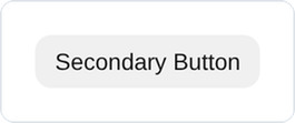 base tokens |
|
Hovered cursor over · :hover, guarded
|
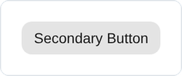 --color-overlay-hover tint |
|
Pressed being clicked · :active
|
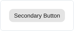 scale(0.98) + --color-overlay-pressed
|
|
Focused keyboard · :focus-visible
|
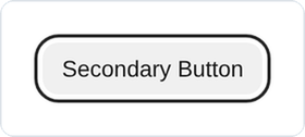 --color-accent outline (2px, 3px offset) 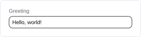 --color-accent border + inset ring |
|
Selected chosen / active · aria-selected/-checked/-current, isSelected, value
|
 --color-accent fill (checkbox) 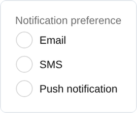 --color-accent fill (radio)  --color-accent track (switch) 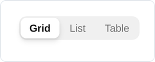 --color-background-surface + --shadow-low (segmented)  --color-accent underline (tabs) 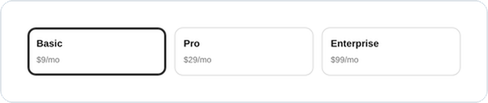 --color-accent border + inset ring (card) 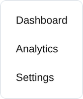 --color-neutral fill (nav item) 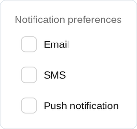 --color-accent-muted fill (list row) |
|
Disabled non-interactive · isDisabled → native disabled; disabledMessage
|
 --color-text-disabled 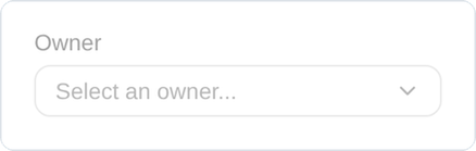 --color-text-disabled + message |
Selected has 8 approved treatments — one intention, many visuals and many code states. Pick the one that fits the component and stay consistent within its family.
States the system drives: waiting, validating, reporting outcome. Status always pairs a semantic token with an icon — never color alone.
| State | Approved visuals |
|---|---|
|
Loading waiting to appear · isLoading → aria-busy
|
 color: transparent + spinner |
|
Success succeeded · status.type='success'
|
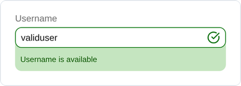 --color-success border + --shadow-inset-success  --color-success-muted surface |
|
Warning non-blocking · status.type='warning'
|
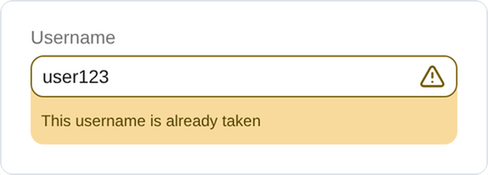 --color-warning border + --shadow-inset-warning  --color-warning-muted surface |
|
Error blocking · status.type='error' → aria-invalid
|
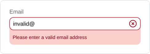 --color-error border + --shadow-inset-error + message  --color-error solid fill (transient) |
|
Processing computing · inline spinner, control stays sized |
inline spinner in place |
Status prominence tiers — same meaning, scaled by prominence + permanence.
| Tier | Visual |
|---|---|
| Persistent, in-flow |
 --color-{status}-muted surface (Banner) |
| Compact chip |
 --color-{status} solid fill (Badge) |
| Low-severity transient |
 --color-background-inverted (Toast) |
| High-severity transient |
--color-error solid fill (same as Badge) |
Mostly undefined. The intentions are named but the visuals aren't settled — the highest-value open design questions for an AI-native system. Propose treatments via the Component Specification Protocol; keep new visuals close to the Foundation / Async language.
| State | Description | Approved visuals |
|---|---|---|
| Thinking | agent reasoning / processing | 🔲 open |
| Reasoning | chain-of-thought, thinking out loud | 🔲 open |
| Streaming | receiving incremental text | 🔲 open |
| Tool Executing | backend tool running | 🔲 open |
| Awaiting Input | waiting for user response | 🔲 open |
| Syncing / Synchronized | state synchronization | 🔲 open |
| Inspecting | agent browsing / inspecting UI | 🔲 open |
| Rendering | UI being generated & mounted | 🔲 open |
Let designers and engineers build in compliance with objective feedback, not taste alone. Many conventions can be expressed as deterministic detectors with a clear pass/fail signal. Conventions tier by how they can be checked:
| Convention | Tier |
|---|---|
| Tokens only — no raw color/space/radius/shadow | 🟢 Automatable |
| Spacing on the 4px grid; child gap ≤ parent gap | 🟢 Automatable |
Concentric radius (r_inner ≈ r_outer − gap) |
🟢 Automatable |
| Size/density aligned for vertical rhythm | 🟡 Assisted |
| WCAG AA contrast; overlays use alpha; no color-alone status | 🟢 Automatable |
| Type hierarchy ≥1.25 ratio; leading ≥1.3; body ≥12px | 🟢 Automatable |
| Hover guarded; focus-visible; reduced-motion; transform/opacity only | 🟢 Automatable |
| Elevation ↔ z-index order; popovers escape overflow | 🟢 Automatable |
| Right state representation for the archetype | 🔴 Human |
| Proportions / density / composition feel | 🔴 Human |
Direction: the 🟢 rows are candidates for a design linter / Night Watch Component Auditor checks and a theme-quality report (the concentric + contrast checks). The 🔴 rows stay in Component Hardening Protocol Layer 3. This is how design quality becomes enforceable, not just documented — mirroring how the API side already works.
Templates — page templates (full-page scaffolds) and blocks (drop-in patterns) — carry design responsibility beyond any single component. These consolidate the existing Contributing Templates rubric, the Night Watch Designer axes, and Component Hardening Protocol L3 — a checklist, not a new invention.
Component & token purity
- Compose from Astryx, not raw HTML (
VStack/Grid/Cardover<div>,Text/Heading,Button,Link,Table,FormLayout). Necessary exceptions:<img>with a CDN src,<form>for native submit. - Icons via
Icon/ icon props — never raw<svg>. - Style through props, not custom CSS. Tokens, never raw values.
Layout & structure
- Page root is
LayoutorCenter, content-only — templates don't shipAppShell(the host owns chrome); the exception is theShell -category. - App chrome vs in-page nav: omit global nav; section nav →
LayoutPanelstart slot; page headers →LayoutHeader. - Responsive grids use
Grid+minChildWidth, not fixed columns. Blocks are single-pattern, ~20–100 lines, with a correctaspectRatio.
Content & imagery
- Realistic mock data — never "Lorem ipsum" / "Item 1". Images from the astryx CDN only. Accurate
.doc.mjs(required fields, completecomponentsUsed).
Visual quality (the design-judge axes) — beyond purity, a template is judged as a design on the same 5 axes the vision judge uses, the page-level analog of Hardening L3:
| Axis | What it checks |
|---|---|
| Layout fidelity | Structural regions, grid, stacking — reads as an intentional page |
| Visual hierarchy | Sizing, weight, eye flow — passes the squint test |
| Spacing & alignment | Consistent, on-grid, proportional |
| Component fidelity | Right components/variants, correct affordances |
| Color & theming | Correct surface/accent usage, holds in light + dark |
Bar: every gallery template should grade B or above on the Contributing Templates rubric and read well on the 5 visual axes. Purity/structure is largely automatable; the visual axes are the human layer.
Themes control what things look like; core controls what things are.
| Change | Where | Why |
|---|---|---|
| "This gray should be darker" | Theme | Already references the right token |
| "Buttons rounder" | Theme | Role fixed; value is a theme call (respect concentricity) |
| "Badge should use a different gray than body text" | Core | Token selection changes the contract |
| "Add a compact Card variant" | Core | Variants are structural |
| "This needs a hover state" | Core | Interaction states are behavior |
Corollary: a raw value in core is fixed by replacing it with the right token reference — never by swapping one raw value for another.
Designers: you don't write specs. Highest-value contributions: themes (judged against the foundations' rationale), gap reports, stories, templates, and hardening review. See Contributing with AI Assistants.
Reviewers (Hardening L3): run the 🟢 automatable checks first (tokens, grid, concentric radius, contrast, z-index), then judge state representation, proportions, density, and composition. When a review resolves a new design question, record the decision back into this page so the conventions compound.
- API Conventions — the code-side sibling
- Astryx Philosophy — the principles these express
- Theming Infrastructure — token layers, neutral-gray semantics, scales, concentric radius
- Container Padding System — the layout / bleed contract
- Component Hardening Protocol — where these apply as a review rubric
- Contributing Templates · Contributing with AI Assistants