UI improvements for title bar / tab bar #1193
Description
Is your feature request related to a problem? Please describe.
Right now, the app uses tab metaphors similar to Edge Chromium.
In Edge, it can be seen that there is a small gap between tab and top edge of app only when the app is NOT maximized to fullscreen. In other cases, there is no gap.
This is to let the user drag and move the window when it's not fullscreen.
Coming to a similar issue, a gap is left at the top-left corner of Edge Chromium for two reasons:
- The tab has an outward curve in the bottom (this is not the main reason)
- The gap is for the user to drag and move the window even when full-screen


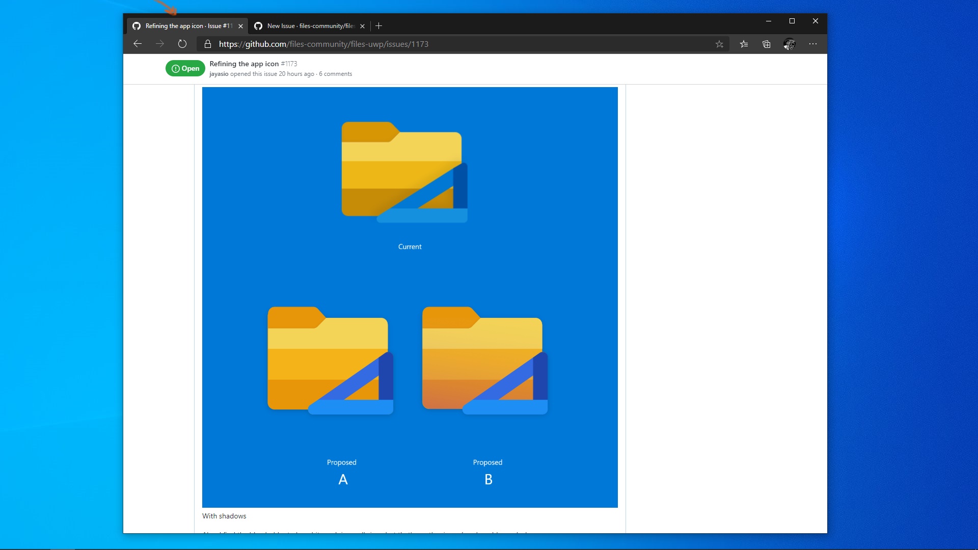
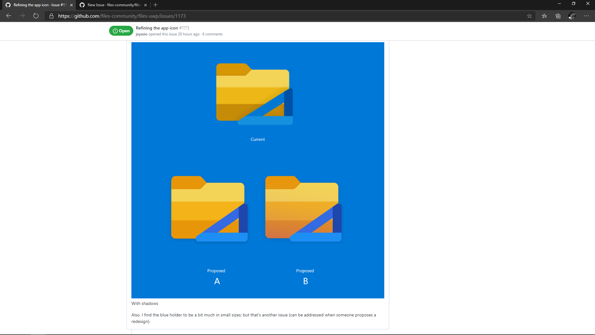
In the above image,
(1) is not required at all
(2) is required only when app is not fullscreen (also let user drag and move in that area)
(3) must support drag and move
With the implementation of (3), (2) can be ignored since Edge Chromium does that only since it doesn't have a space like the sidebar. This will look similar to the actual proposal of Windows Sets, with the modern visual style of Edge Chromium.
Describe the solution you'd like
In Files UWP, I propose a few changes:
- Since there is a sidebar, the top left gap of tabs in Edge chromium need not be replicated.
- The space above the sidebar elements must let the user drag and move the window.
- Once these two are implemented, the top gap above the tabs can be removed when fullscreen.
This will improve the visual layout too, by providing a natural division between sidebar and tabs; right now, the top-left gap is breaking the UI.