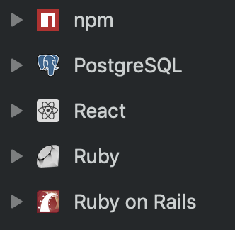
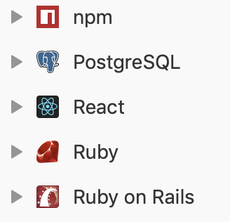
I'm a bit confused by the rationale behind dark_icon_fix. The W3C docs it links to seem to reference text contrast, or images of text, but I don't think that really applies to icons. You can see the strange results of this approach below, where the npm & Rails icons are not inverted, despite being mostly red, but the ruby one is, which makes it look like some sort of abstract art

Light mode, for reference:
