v0.0.114
Release Notes
Render tools and panels in docs (#62)
Panel/Tools in Docs
Instead of the prop tables and source code we used to render in the docs:
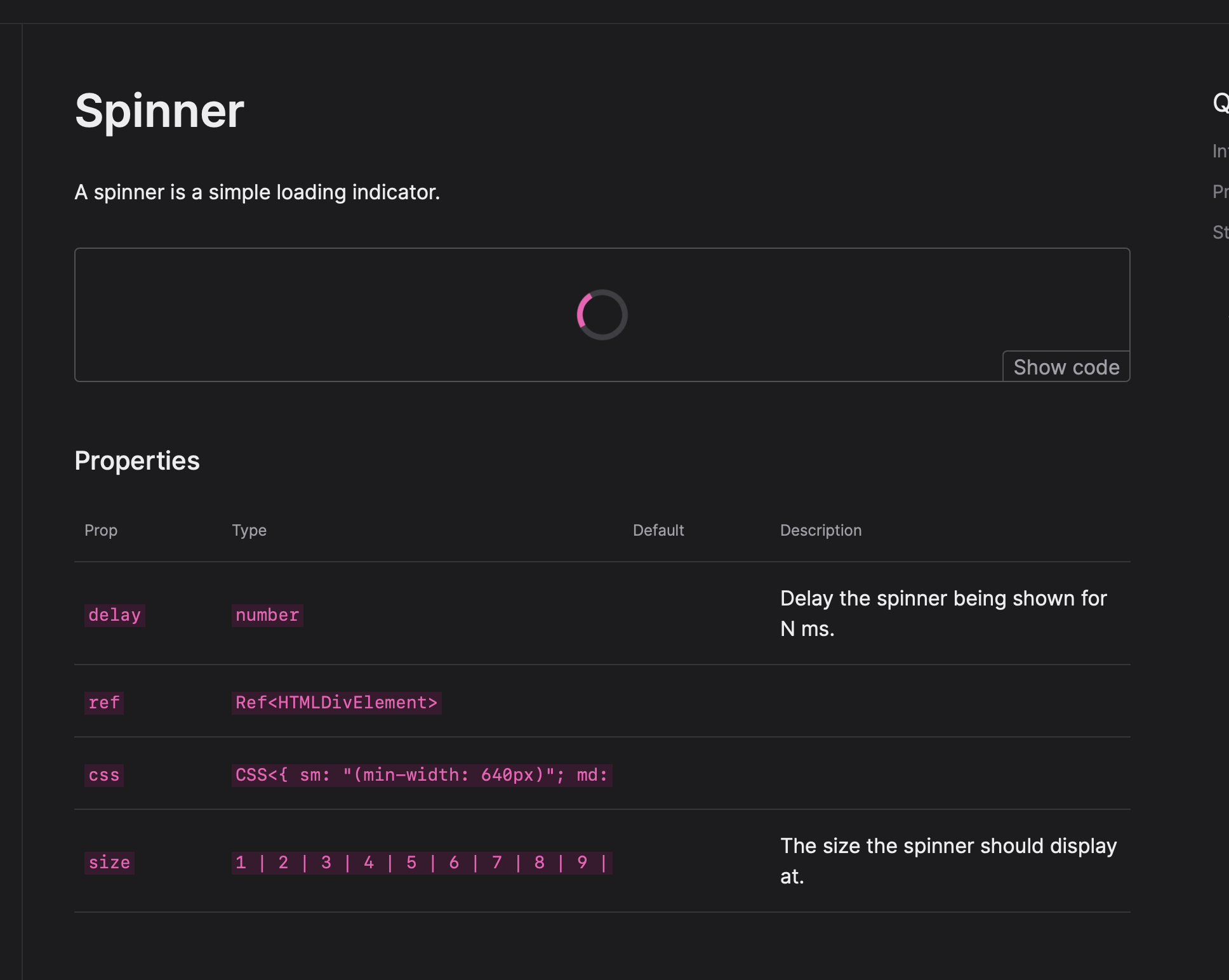
Now it reuses the panels and tools from the workbench:
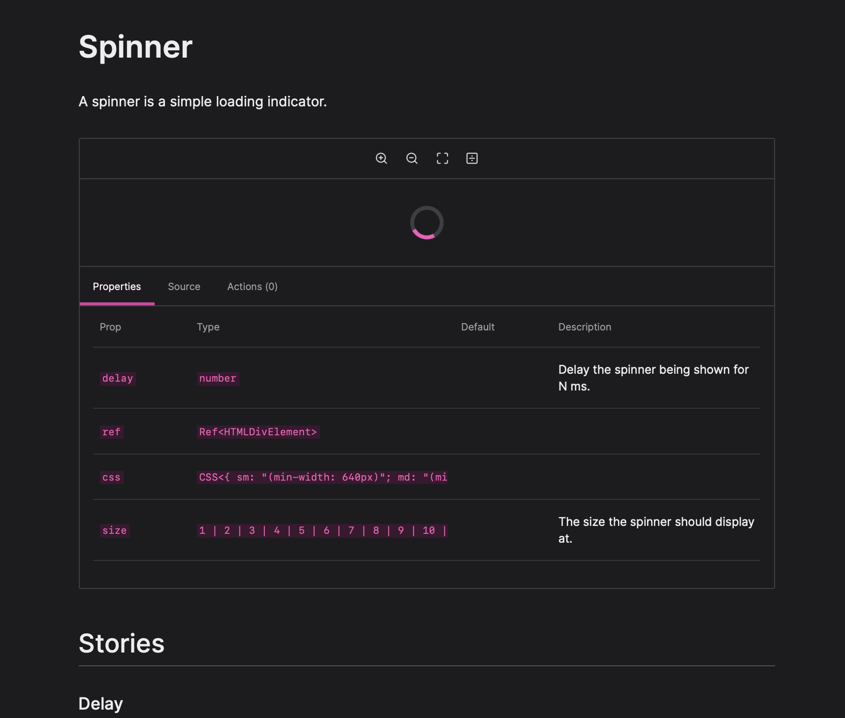
Panels and tools can be configured to be hidden in the docs view. This way you can have dev only plugins for /workbench.
Improved Meta and Story Types
Meta and story types just became a whole lot easier!
Instead of having to import every decorator type to use on fwoosh's generic Story and Meta you can provide your config to them and declare the types globally!
import type { FwooshOptions } from "fwoosh";
import type {
  StoryMeta as ReactStoryMeta,
  Story as ReactStory,
} from "@fwoosh/react";

const config = {
   // your config
} satisfies FwooshOptions;

declare module "fwoosh" {
  type Meta = ReactStoryMeta<typeof config>;
  type Story = ReactStory<Meta>;
}
Now writing stories is clean and you don't have to worry about types.
import * as React from "react";
import type { StoryMeta, Story } from "fwoosh";
import { Button } from "./Button";

export const meta: StoryMeta = {
  title: "Components/Buttons/Button",
  component: Button,
  parameters: {
    designs: "https://www.figma.com/file/LKQ4FJ4bTnCSjedbRpk931/Sample-File",
  },
};

/**
 * The default story.
 */
export const Playground: StoryMeta = () => {
  return <Button onClick={action("onClick")}>Click me</Button>;
};
🐛 Bug Fix
@fwoosh/app,fwoosh,@fwoosh/components,@fwoosh/hooks,@fwoosh/types,@fwoosh/panel-actions,@fwoosh/panel-designs,@fwoosh/panel-props,@fwoosh/panel-source,@fwoosh/panel-story-description,@fwoosh/react,@fwoosh/tool-github,@fwoosh/tool-measure,@fwoosh/tool-viewport,@fwoosh/tool-zoom- Render tools and panels in docs #62 (@hipstersmoothie)
Authors: 1
- Andrew Lisowski (@hipstersmoothie)