block alignment
<body>
    <div class="box"></div>
</body>.box {
position: absolute;
top: 50%;
left: 50%;
transform: translate(-50%, -50%);
background: #000;
color: #fff;
width: 300px;
height: 200px;
}<body>
<div class="box">
<div class="content"></div>
</div>
</body>.box {
position: absolute;
top: 50%;
left: 50%;
transform: translate(-50%, -50%);
color: #fff;
width: 300px;
height: 200px;
}
.box > .content {
position: absolute;
background: #000;
top: 20px;
bottom: 10px;
box-sizing: border-box;
left: -30px;
width: calc(100% + 60px);
}
.box:before, .box:after {
content: "";
position: absolute;
width: 100%;
height: 100%;
}
.box:before {
border-top: 10px solid #f50;
border-left: 10px solid #f50;
}
.box:after {
border-bottom: 10px solid #f50;
border-right: 10px solid #f50;
}<body>
<div class="box">
<div class="content"></div>
</div>
</body>.box {
position: absolute;
top: 50%;
left: 50%;
transform: translate(-50%, -50%);
color: #fff;
width: 300px;
height: 200px;
transform-style: preserve-3d;
transition: 0.5s ease;
}
.box > .content {
position: absolute;
background: #000;
top: 20px;
bottom: 10px;
box-sizing: border-box;
left: -30px;
width: calc(100% + 60px);
transition: 0.5s ease;
}
.box:before, .box:after {
content: "";
position: absolute;
width: 100%;
height: 100%;
}
.box:before {
border-top: 10px solid #f50;
border-left: 10px solid #f50;
}
.box:after {
border-bottom: 10px solid #f50;
border-right: 10px solid #f50;
}
.box:hover {
transform: translate(-50%, -50%) rotateY(-3deg) skew(-20deg);
}
.box:hover > .content {
transform: rotateY(6deg) skew(40deg) translate(-10px);
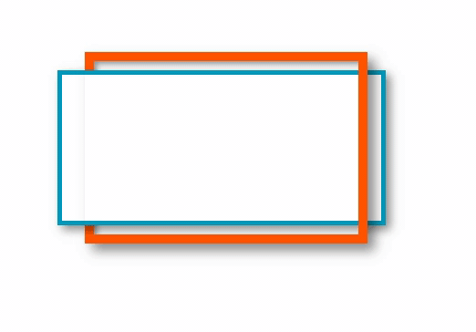
}.box {
position: absolute;
top: 50%;
left: 50%;
transform: translate(-50%, -50%);
color: #fff;
width: 300px;
height: 200px;
transform-style: preserve-3d;
transition: 0.5s ease;
perspective: 300px;
}
.box > .content {
position: absolute;
background: #fff;
top: 20px;
bottom: 10px;
box-sizing: border-box;
left: -30px;
width: calc(100% + 60px);
transition: 0.5s ease;
border: solid 5px #09b;
box-shadow: 5px 5px 10px #00000070;
}
.box:before, .box:after {
content: "";
position: absolute;
width: 100%;
height: 100%;
perspective: 300px;
}
.box:before {
border-top: 10px solid #f50;
border-left: 10px solid #f50;
box-shadow: inset 3px 3px 6px #00000070;
}
.box:after {
border-bottom: 10px solid #f50;
border-right: 10px solid #f50;
box-shadow: 8px 8px 12px #00000070;
}
.box:hover {
transform: translate(-50%, -50%) rotateY(-4deg) skew(-10deg);
}
.box:hover > .content {
transform: rotateY(8deg) skew(20deg);
}


 Всемирная паутина
 Пример
 Flexbox Froggy
