Repository navigation

Replies: 9 comments 13 replies

|
I suppose it depends on what 'easily labeling points selectively' means. To my knowledge there are few tools out there:
With regards to a ggplot2 friendly interface to A few loose remarks:
|

That's a good point. I hadn't thought about faceting or groups, but I can see that this would be useful in a general approach. What would have to change in your sketch below for this? |

|
You'd swap out the |
Here is a quick sketch: library(ggplot2)
library(ggrepel)
# Class
StatNoteworthy <- ggproto(
"StatNoteworthy", Stat,
required_aes = c("x", "y"),
compute_group = function(data, scales, method = "dsq", n = 10) {
idx <- heplots::noteworthy(x = data$x, y = data$y, n = n, method = method)
data[idx, , drop = FALSE]
}
)
# Constructor: standard stuff + method + n
stat_noteworthy <- function(
mapping = NULL, data = NULL, geom = "text", position = "identity",
..., method = "dsq", n = 10,
na.rm = FALSE, show.legend = NA, inherit.aes = TRUE
) {
layer(
data = data, mapping = mapping, stat = StatNoteworthy, geom = geom,
position = position, show.legend = show.legend, inherit.aes = inherit.aes,
params = rlang::list2(
method = method,
n = n,
...
)
)
}
# Example
ggplot(mpg, aes(displ, hwy)) +
geom_point() +
stat_noteworthy(aes(label = model), geom = "text_repel")Created on 2025-04-16 with reprex v2.1.1 |


|
if 'text_repel' is the anticipated use and you willing to take that dependency, maybe just make that 'text_repel' as the default too. # Constructor: standard stuff + method + n
stat_noteworthy <- function(
mapping = NULL, data = NULL, geom = "text_repel", position = "identity",
..., method = "dsq", n = 10,
na.rm = FALSE, show.legend = NA, inherit.aes = TRUE
) {
layer(
data = data, mapping = mapping, stat = StatNoteworthy, geom = geom,
position = position, show.legend = show.legend, inherit.aes = inherit.aes,
params = rlang::list2(
method = method,
n = n,
...
)
)
}ggplot(mpg) +
aes(displ, hwy, label = model) +
geom_point() +
stat_noteworthy()Iif a geom_ prefix feels friendlier, (I think it does for many of people), you could follow the springs case study 'constructors' https://ggplot2-book.org/ext-springs.html#constructors and just switch what's fixed (Geom is fixed): # Constructor: standard stuff + method + n
geom_noteworthy <- function(
mapping = NULL, data = NULL, stat = "noteworthy", position = "identity",
..., method = "dsq", n = 10,
na.rm = FALSE, show.legend = NA, inherit.aes = TRUE
) {
layer(
data = data, mapping = mapping, stat = stat, geom = GeomTextRepel,
position = position, show.legend = show.legend, inherit.aes = inherit.aes,
params = rlang::list2(
method = method,
n = n,
...
)
)
}This feels a little weird, because you can remove the noteworthy-ness of the layer (the stat). So another approach is to do verbatim alias - essentially the approach of ggbump::geom_bump(); and what I recommend in easy-geom-recipes.. Using stat_ or geom_ if you're not going to change any defaults should feel identitcal, so name doesn't really matter. geom_notable <- stat_notableThis has it's own weirdness to it, but it's a concise weirdness - you can go back and do verbose construction later? |
|
I like the alternative universe in which we just expose all the main characters (stat, geom, and position) in the constructor function... |

|
Thanks so much @teunbrand @EvaMaeRey !!
My current code is at https://github.com/friendly/heplots/blob/master/dev/stat_noteworthy.R Here are the cases I've tested, all with expected results: |
You don't need to do any extra infrastructure. Everything that is passed via
This happens automatically when other aesthetics are discrete. This is neither under control of the Stat or Geom but under Layer. |
|
I may be asking for way too much, but here is the example that prompted me to raise this idea. For a plot of the Penguins data, plotting
First, calculate the data(peng, package = "heplots")
# use all numeric variables
DSQ <- heplots::Mahalanobis(peng[, 3:6])
ids <- order(DSQ, decreasing = TRUE)[1:3] |> print()
#> [1] 283 10 35
# augment the dataset to add `note` variable for selecting labels
peng_plot <- peng |>
tibble::rownames_to_column(var = "id") |>
mutate(note = id %in% ids)Then, my Here is my attempt at a simplified version using But this generates an error: |

|
you could define StatNoteworthy panel-wise and compute a row number along the way (id), and have the default_aes for label be the row number. StatNoteworthy <- ggproto(
"StatNoteworthy", Stat,
required_aes = c("x", "y"),
compute_panel = function(data, scales, method = "dsq", n = 10) {
data <- data |>
mutate(id = row_number())
id_rows <- heplots::noteworthy(x = data$x, y = data$y, n = n, method = method)
data[id_rows, , drop = FALSE]
},
default_aes = aes(label = after_stat(id)) # <<
)
peng |>
select(x = bill_length, y = bill_depth) |>
StatNoteworthy$compute_panel()
ggplot(peng,
aes(x = bill_length,
y = bill_depth,
color = species,
shape = species,
fill = species)) +
geom_point() +
geom_smooth(method = "lm",
formula = y ~ x,
se = FALSE,
linewidth = 2) +
stat_ellipse(geom = "polygon", level = 0.95, alpha = 0.1) +
geom_text(stat = StatNoteworthy, method = ids, n = 3, color = "black")But I'm not quite sure I understand the intent. It seems like you want Mahalanobis computed in multiple dimensions. But does the |
|
Does using |
|
@EvaMaeRey Thanks for this suggestion. In nearly all use cases, noteworthy points are determined by (x,y) within the plot, This example is unusual (and possibly confusing) in that I want to identify noteworthy points in the full space of the numeric penguin variables. |
|
@friendly, thanks for the explanation! I don't think it would be that strange for others to want to do the same (look at noteworthy points in a 2-D projection). I think there are some interesting plotting/ggplot2 extension problems if you think about a Stat to do the compute internally -- something for when some free time happens to find us. 🙃😭 I think the main extension issue might be bringing a bunch of vars from the data verbatim to the plotting space, like a aes_as_is(). @yjunechoe showed me another approach #18 (reply in thread), (vars_pack) but I've wondered about something that mirrors aes(sex = sex, species = species) where the syntax would be aes_as_is(sex, species) to scoot the variables over to the plotting environment without having to repeat yourself. For now, I think @teunbrand is right that if you used peng_plot for example (which has the 'id' var), you could do with the Stat as you'd specified it earlier: ggplot(peng_plot,
aes(x = bill_length,
y = bill_depth,
color = species,
shape = species,
fill = species,
label = id)) + #<<
geom_point() +
geom_smooth(method = "lm",
formula = y ~ x,
se = FALSE,
linewidth = 2) +
stat_ellipse(geom = "polygon", level = 0.95, alpha = 0.1) +
geom_text(stat = StatNoteworthy, method = ids, color = "black") |

|
@friendly Something to keep in mind when using Package 'ggpp' has some tools for selective labelling, but not specific ones for statistical plots as you envision for The equivalent of In scatter plots, volcano plots and quadrant plots The documentation of 'ggpp' includes several examples in the help pages and in the User Guide vignette. Sections on 2D density filtering of labels, and Simple position functions are the most relevant. It also includes an article on Combining repulsion and nudging, i.e., using 'ggpp' and 'ggrepel' together. The page Volcano and quadrant plots with ‘ggpmisc’ at my website has several examples also relevant in other contexts. Although 'ggpp' does not directly implement what |

|
Here I may be repeating in part what has been discussed earlier in this thread. Hopefully, not too much. gp + geom_noteworthy(aes(label=Department), method="mahal", geom="repel", n=7)geoms do not have a If used with repulsive geoms, as I mentioned above, selecting the rows in data would not work always as desired. Instead of data = gdf[gdf$dsq > 4.6,]something like In 'ggpp' Repulsive geoms need to have access to the location of observations to be able to avoid overlaps. This means that only position functions that preserve the original coordinates when displacing the initial position of labels work well with repulsion, and obviously also allow drawing connecting segments. As far as I know, only position functions defined in packages 'ggrepel' and 'ggpp' work well with repulsion. Package 'ggpp' defines in addition to many new types of positions, (I will be travelling during the next few days, and I may be even slower than usual with replying...) |
|
This topic has been dormant for quite a while, but I'd like to pick it up again and achieve closure-- hey, ship a feature! I'm currently going over my previous attempts with a view to specifying the behavior I want for a general, easily used method for identifying "unusual" points in ggplot displays. I'll post a follow-up when this is ready. |
|
I think you are after something else, but might be worth checking out this little experiment, that uses highest cooks as qualification for notewortiness. https://evamaerey.github.io/mytidytuesday/2026-09-23-noteable-gg-friendly/noteable-gg-friendly.html I think even if you are using another notable-ness measure, you might think about including a 
Compute borrows from ggxmean::geom_point_high_cooks, which was written by my student in independent study in Fall 2021 🙃. Lessons learned teaching that turned into 'easy geom recipes' V1, also drafted together with an independent study student in Spring 2022. Translated to plotnine in 2026! https://github.com/has2k1/easy-geom-recipes 🚀 
|
|
I've also always liked the idea to compute a 2D density of some sort and labelling the least dense points. library(ggplot2)
library(ggpointdensity)
library(ggrepel)
gapminder::gapminder |>
dplyr::filter(year == 2002) |>
ggplot(aes(gdpPercap, lifeExp)) +
geom_point() +
stat_pointdensity(
geom = "text_repel",
method = "kde2d",
aes(label = stage(
as.character(country),
after_stat = ifelse(scales::rescale(density) < 0.1, label, "")
)),
colour = 'black'
) +
scale_x_log10()Created on 2026-09-24 with reprex v2.1.1 You can also move the 'hide the high-density labels' mechanism to the scales if you like that better. gapminder::gapminder |>
dplyr::filter(year == 2002) |>
ggplot(aes(gdpPercap, lifeExp, label = country)) +
geom_point() +
stat_pointdensity(
geom = "text_repel",
method = "kde2d",
aes(colour = after_stat(density))
) +
continuous_scale(
"colour",
palette = function(x) ifelse(x > 0.1, NA, "black"),
guide = "none"
) +
scale_x_log10() |

|
hello stat_pointdensity() 👋🙌 I didn't know it - about to check it out. I'd thought a little about stat ellipse for this, but didn't get far at all - since it doesn't return point-wise values (I don't believe). stat_pointdensity seems like a great direction ... more general than cooks. I was aware of ggpointdensity::geom_pointdensity() - really love the visuals it helps produce! |
|
lol... I missed the ggpointdensity import. And geom_pointdensity and stat_pointdensity are basically alliases. |
|
Yes, no exotic voodoo witchcraft here I'm afraid. Just garden variety voodoo witchcraft :D |
|
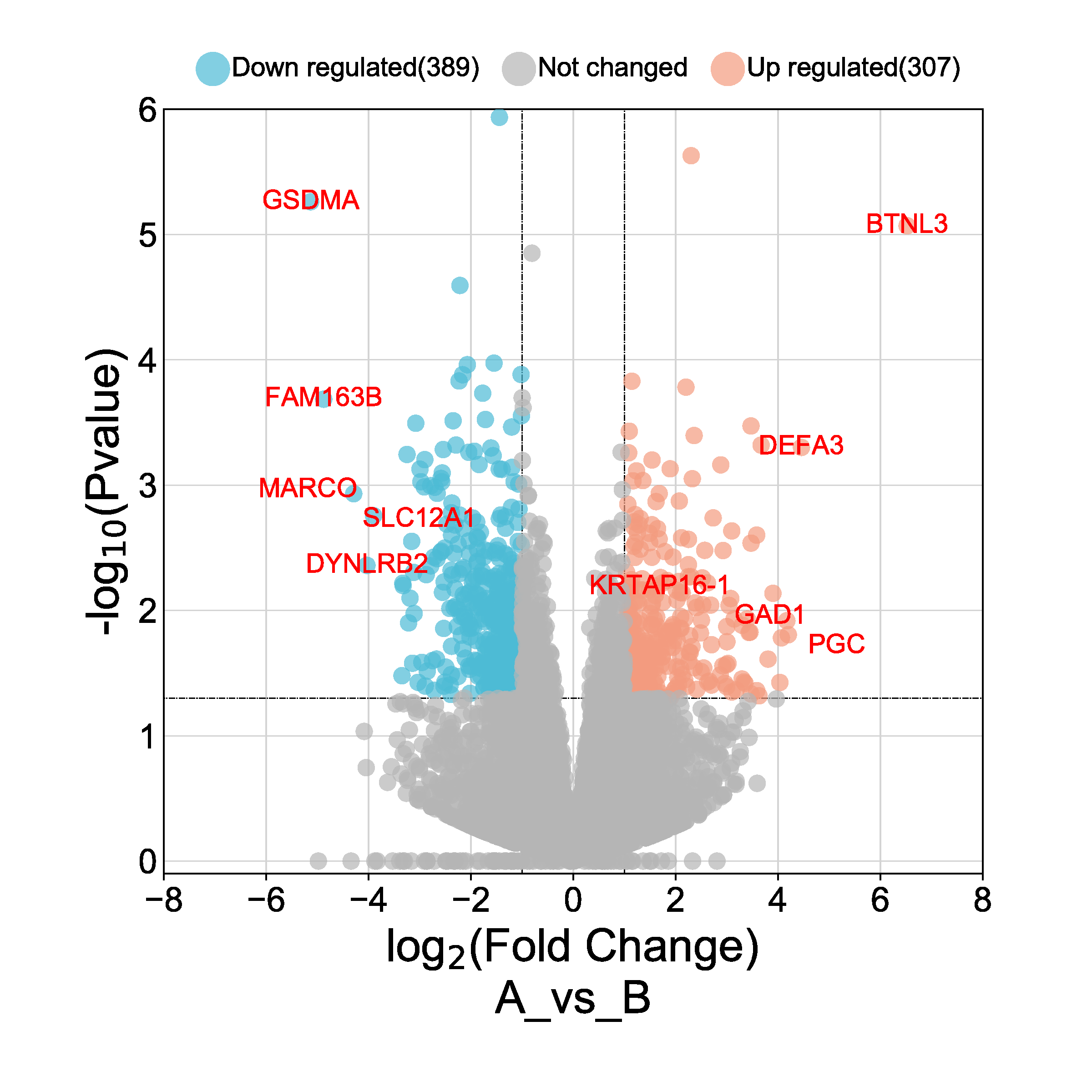
@EvaMaeRey In 'ggpp' there is an implementation based based on local density. As Teun's example shows using
Yes, I have also found that sometimes manually setting which observations are be label is useful, so this is also supported. I have quite a few examples of combining nudging and repulsion in in an article in the on-line documentation. In the vignette there are some examples not using 'ggrepel' to avoid the dependency. In my web site I have additional examples, from which I copy here one plot. This example uses 'ggplot2', 'ggrepel', 'ggpp' and 'ggpmisc'. ggplot(volcano_example.df,
aes(logFC,
PValue, colour = outcome2factor(outcome),
label = gene)) +
geom_point() +
stat_dens2d_labels(geom = "text_repel",
size = 2,
colour = "black",
position = position_nudge_centre(x = 0.1,
y = 0.1,
direction = "radial"),
keep.fraction = 0.03, # 3% of data points
min.segment.length = 0) +
scale_x_logFC(name = "Transcript abundance%unit") +
scale_y_Pvalue() +
scale_colour_outcome() +
stat_quadrant_counts(data = function(x) {subset(x, outcome != 0)},
aes(label = after_stat(count.label))) +
theme_bw()
|


Uh oh!
There was an error while loading. Please reload this page.
An important feature of graphical methods for datavis is automatic labeling of unusual or "noteworthy" points
in scatterplots. This is handled automatically in base R for
plot(model), and much more generally in thecarpackage, where anid = list(n, method, ...)argument to many functions provides for most use casesvia a function
car::showLabels().I use this extensively with base R graphs in my packages, e.g,$D^2$ :
heplots::cqplot(), which produces chisquare QQ plots for a multivariatelinear model, labeling the 3 points with largest Mahalanobis
A nice feature of
car::showLabels()is that it has an argumentlocationfor positioning the text label relative to the point to avoidoverplotting these.
Correct me if I'm wrong, but I do not find any similar facility for easily labeling points selectively in statistical
applications of
ggplot2. It can be done, but is currently awkward to implement in ggplot2.For a simple example, I want to plot
Crime_persagainstLiteracyin theGuerrydata, and label thosedepartments which are extreme in terms of Mahalanobis distance, to get this:
Then, this is what I had to do to add the point labels:
From
qchisq(0.9, df=2) = 4.6I had to create a separate datasetgdf,and then subset that using
gdf[gdf$dsq > 4.6,]What I'm looking for is something like a
geom_noteworthy()function. It would provide similar methods to those incar::showLabels()to select points to beidentified in a plot, and a
geomargument that controls how the identified points are labeled in a plot.To this end, in the latest release (v 1.7.4) of
heplotsI've written a
computefunction,heplots::noteworthy(x, y, n, method, ...)that tries to be very general,https://github.com/friendly/heplots/blob/master/R/noteworthy.R.
The
methodargument can be any of the following:length(x)numbers: the largestnare chosen, e.g.,cooks.distance(model)to label influentialIt returns the row IDs of the selected points
If I had a
geom_noteworthy(), I could simply do something like:Is there anything like this in the ggplot2 world? I'm not sure where I would begin to try to implement this.
All reactions