Implement skipped repositories tabs#1549
Conversation
| function getSkipReasonAlert( | ||
| reason: SkippedRepositoriesReason, | ||
| repos: VariantAnalysisSkippedRepositoryGroup | ||
| ) { | ||
| return ( | ||
| <Alert | ||
| key='alert' | ||
| type='warning' | ||
| title={getSkipReasonAlertTitle(reason)} | ||
| message={getSkipReasonAlertMessage(reason, repos)} | ||
| /> | ||
| ); | ||
| } |
There was a problem hiding this comment.
I think it would be fine to render the Alert component inline instead of extracting it to a function.
There was a problem hiding this comment.
I agree with you on the original state of the code, but in the transformation to the props, this function has now gained a tiny bit of complexity. It has one variable for the extra text when repositories are omitted which would be good to keep contained to this function. So I think I'll keep this function as it is. Let me know if you still feel it should be inlined.
| <Container> | ||
| {getSkipReasonAlert(reason, skippedRepositoryGroup)} | ||
| {skippedRepositoryGroup.repositories.map((repo) => | ||
| <VariantAnalysisSkippedRepositoryRow key={`repo/${repo.fullName}`} repository={repo} /> |
There was a problem hiding this comment.
The key only needs to be unique within its parent, so just using repo.fullName would be enough:
| <VariantAnalysisSkippedRepositoryRow key={`repo/${repo.fullName}`} repository={repo} /> | |
| <VariantAnalysisSkippedRepositoryRow key={repo.fullName} repository={repo} /> |
There was a problem hiding this comment.
My reasoning here was only to make super sure it doesn't conflict with the key for the alert, which is alert. Should be fine since a repo name contains a slash, but I didn't want to rely on that or risk conflicts if another component is added to this container. So unless there's more of a benefit to simplifying it I'd prefer to keep it as it is.
There was a problem hiding this comment.
I'm happy to leave it as-is, but I don't think you need the key on the alert at all since it's not part of the list. React only uses the keys for change detection in a map call/list. Even when the component is a sibling of a map call, it shouldn't be necessary to add the key.
| return ( | ||
| <Row> | ||
| <VSCodeCheckbox /> | ||
| <ChevronIcon className="codicon codicon-chevron-right" /> |
There was a problem hiding this comment.
If we're using the Codicon component, this would change to:
| <ChevronIcon className="codicon codicon-chevron-right" /> | |
| <ChevronIcon name="chevron-right" label="Expand" /> |
There was a problem hiding this comment.
I'm not really sure what to put as the label, because it doesn't actually expand. As far as I can tell from the designs, the chevron is there to make it look like the other pages, but there's no case where it could expand and show more for this view. It can certainly be "expand" for now though. Would also be good for this to match whatever it used in the scanned repos tab.
2 participants
Implements the "skipped repository" tabs.
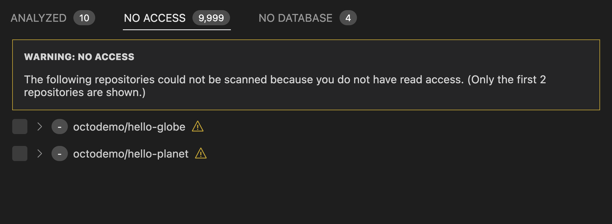
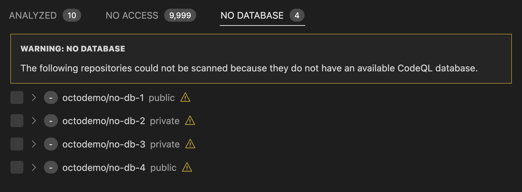
Both the "no access" and "no database" tabs are implemented by one component since the only difference is the text.
I've tried to add stories for new components but I've been having trouble getting them to show up in storybook. Would be interesting to see if anyone else can reproduce this or can see what's going wrong here and what I've not configured correctly.
Checklist
ready-for-doc-reviewlabel there.