Conversation
 Osmose
left a comment
Osmose
left a comment
Osmose
left a comment
There was a problem hiding this comment.
Nice work, thanks for the PR!
One difference I noted between the normal overlay in master and in this branch is that the title bar has a white background instead of grey; we should fix that so that existing overlays don't change appearance at all.
lib/block.js
Outdated
| color: var(--colors-primary); | ||
| background-color: var(--colors-background); | ||
| `, | ||
| alignright: css` |
There was a problem hiding this comment.
This variant also removes the background color and top border, so we should probably also name it "banner" since it's more than just alignment.
There was a problem hiding this comment.
Is alignrightbanner okay? Can also do actionsbanner because it would only be used there. I'm thrown errors when I try to hyphenate and I'm not sure if camel case is the convention here.
There was a problem hiding this comment.
ohhh how about actionsbanner and infobanner under sectionVariants ?
| <p> | ||
| The Overlay component renders an accessible modal. See <a href="#Story_Blocks_for_Overlay_and_Popover_content">blocks to use with Overlays</a> | ||
| . | ||
| </p> |
There was a problem hiding this comment.
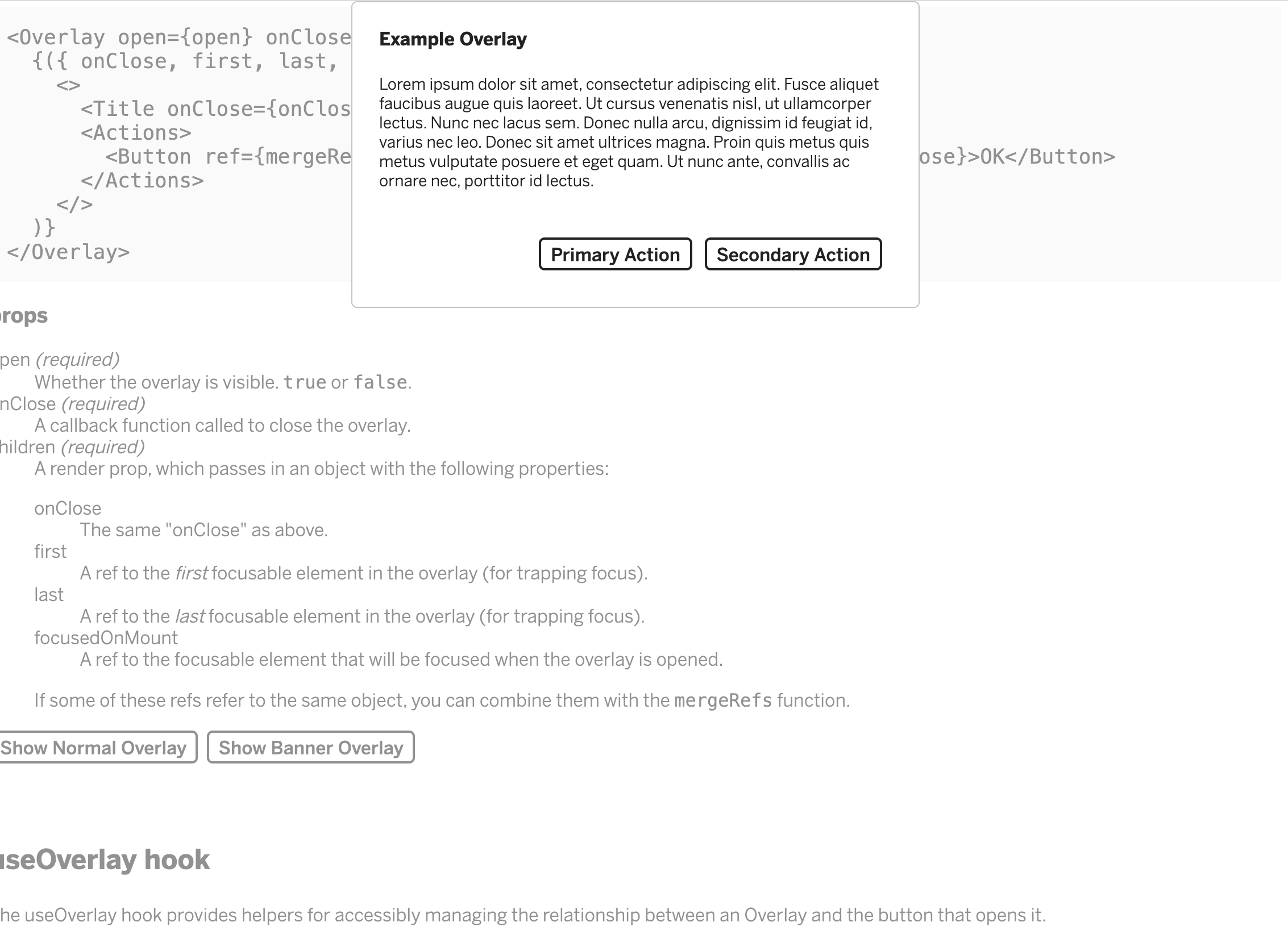
Can we add a second button to the story docs showing the variant overlay and how to use it?
|
Will the dropshadow, buttons and 'X' be updated to match the design in Figma in this PR? |
@jlord I missed the dropshadow on the Overlay, so I will pull that out in this PR! The "X" can just be deleted and the buttons can be styled independently, but I can make everything look like the Figma design in the example button I'm adding in now! |
|
@anjapatel this looks great! Just want to call out typography and spacing feedback:
|
|
@ackristen question on the radius of the modal: in Figma on its own it's shown with rounded corners on each corner but in the screenshot of it in the editor, there is no to top radius. |
Originally: Update: Sorry for the confusion! |
|
@ackristen is this looking better? Edit: I did put 6px of space between the header and body, but it does look a little more spaced out than the figma. I'm combing through now in case there's some extra padding somewhere. Let me know if this is on the right track! |
This looks good to me! I'm happy with it 👏 |
Osmose
left a comment
Osmose
left a comment
There was a problem hiding this comment.
Looks good, nice work! Once the fix for useOverlay is in we can land this.
lib/overlay.js
Outdated
| export const useOverlay = () => { | ||
| const [open, setOpen] = React.useState(false); | ||
| const [openNormal, setOpenNormal] = React.useState(false); | ||
| const [openBanner, setOpenBanner] = React.useState(false); | ||
| const toggleRef = React.useRef(); | ||
| const onOpen = () => setOpen(true); | ||
| const onOpenNormal = () => setOpenNormal(true); | ||
| const onOpenBanner = () => setOpenBanner(true); | ||
| const onClose = () => { | ||
| setOpen(false); | ||
| setOpenNormal(false); | ||
| setOpenBanner(false); | ||
| toggleRef.current.focus(); | ||
| }; | ||
| return { open, onOpen, onClose, toggleRef }; | ||
| return { openNormal, onOpenNormal, openBanner, onOpenBanner, onClose, toggleRef }; |
There was a problem hiding this comment.
useOverlay is actually exported for use outside shared-components, so we shouldn't add a second set of state values since it's meant to handle a single overlay. We can call it twice in StoryOverlay, though, once for each overlay.
|
Also @ackristen, this new overlay style is positioned against the top of the browser window. Is this okay? The overlay is positioned relative to the browser so it would take a lot more time for me to find a way to work around that. If this doesn't work for what you have in mind for the future, let me know! Maybe I can add this style variant to a different component that's easier to position. |
|
Approved via Slack. |
|
🚀 PR was released in |
5 participants
This PR adds a banner variant for Overlay. The goal is to create an Overlay option that looks close to the one in this design spec: https://www.figma.com/file/LLBMwcB37R4fQrn7kgZKUi/061820_PrivateApps_MI%2BKAC?node-id=34%3A0
This introduces new variants in
block.jsfor this Overlay banner, specifically. I commented above the relevant banners to hopefully make this clearer.How to Test
overlay.jsvariant={'banner'}to theOverlay,Title,andInfocomponentsvariant={'alignright'}to theActionscomponent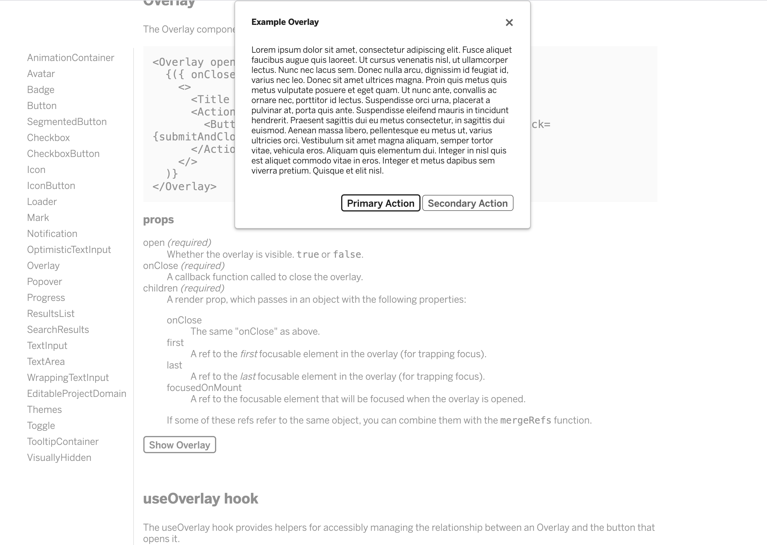
5. Test in dark mode!