Skip to content

Conversation

eak12913
Copy link
Contributor

The original JIRA issue called for different work - but we determined that we wanted to punt on that work in favor of what was done in this PR:

  • Updated to remove number padded paths
  • Updated all URLs
  • Updated all guides to make use of index pages
  • Updated sidebars to per guide

@netlify
Copy link

netlify bot commented Jan 13, 2022

✔️ Deploy Preview for pensive-meitner-faaeee ready!

🔨 Explore the source changes: 980e9bd

🔍 Inspect the deploy log: https://app.netlify.com/sites/pensive-meitner-faaeee/deploys/61e1f703c89e8e0008034134

😎 Browse the preview: https://deploy-preview-132--pensive-meitner-faaeee.netlify.app

oredavids
oredavids previously approved these changes Jan 14, 2022
Copy link
Contributor

@oredavids oredavids left a comment

Choose a reason for hiding this comment

The reason will be displayed to describe this comment to others. Learn more.

Stamp.

@eak12913 eak12913 merged commit a9390ad into master Jan 14, 2022
@eak12913 eak12913 deleted the guides-sidebar-refactor branch January 14, 2022 22:26
@brikis98
Copy link
Member

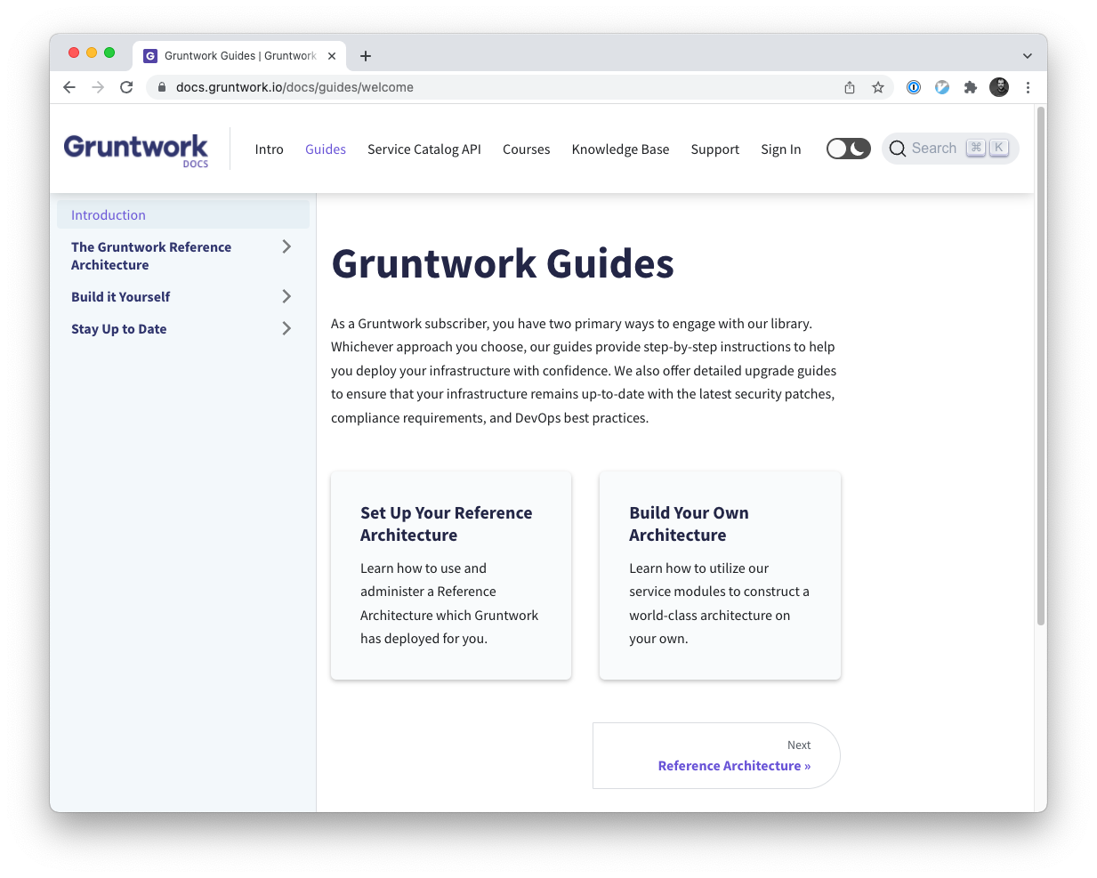
Did we intentionally remove the left sidebar when you click the "Guides" link?

What's live:

Screen Shot 2022-01-18 at 4 33 33 PM

What I'm seeing by running the latest version checked into master:

Screen Shot 2022-01-18 at 4 33 46 PM

I've found it leads to a few issues:

  1. Whereas before, I could see a list of all our guides at a glance in the left nav, now I have to scroll through the entire page, going well below the fold to discover what's available.
  2. The links to guides are not consistent, so it's not obvious what's a top-level guide and what's not: i.e., some links are "big boxes" that go to different pages (e.g., "Set up your reference architecture"), some are "big boxes" that scroll elsewhere on the same page ("e.g., Build your own architecture"), and some are bullet-point links (e.g., all the ones under "Stay Up to Date").
  3. Once you click on something, the left nav is only for the one guide, so there's no more discoverability for the other guides. This combined with (2) makes me worried users are simply going to miss / be unaware of a lot of important content.
  4. The intro sentence says "As a Gruntwork subscriber, you have two primary ways to engage with our library", with those two ways being "Set up your reference architecture" and "e.g., Build your own architecture," but where do we put content that applies to both or neither of those items? Without a clear nav / list of content, the mental model is a bit muddy. For example, "stay up to date" and "dig into the code" both feel tacked on, and it's not obvious what they apply to. I wanted to add the "Gruntwork Production Framework" to the site, and again, it's not clear where it can go.

Were these changes intentional? If so, what was the thinking behind them?

@ebeneliason
Copy link
Contributor

ebeneliason commented Jan 19, 2022

These are good questions. There are some hidden tradeoffs here, and it's possible we've made some of the wrong ones. I'll provide our general rationale first, and then address your points directly. There's no avoiding an in-depth response, but I think this is foundational to how we structure docs content, and so worth the investment.

General Rationale

Motivation

We came to the approach presented in this PR based on a few problems we observed:

  1. Our search results weren't very good. The Algolia search integration that Docusaurus supports out-of-the-box is biased heavily toward a two-level docs structure in which the sidebar lists top-level categories, each containing a list of articles. Search results are displayed with the first one or two elements of their path, and the last, omitting any levels of hierarchy in between. For us, this means the top-level nav section (e.g. Guides), the outer-most sidebar category, and the page title.

    As an example of why this matters, consider that the name of each of our guides in the old site structure fell somewhere in the middle of the path hierarchy. This made it impossible to understand which guide a given search result pertained to. This issue is exacerbated by the deep hierarchy within the guides and non-specific page names (e.g. "Core Concepts", etc.)

  2. Links to guides were onerous. This was true both with respect to the manner in which authors maintained links in the source, as well as how they appeared to readers in the address bar of their browsers.

    On the source side, the numbered prefixes on all files and folders were a maintenance nightmare. While they enabled auto-generation of our sidebars, they also meant that adding/removing/reordering any sections anywhere required re-numbering potentially many files, and then also updating every link reference throughout the site.

    On the output side, our guides wound up with links like https://docs.gruntwork.io/docs/guides/build-it-yourself/kubernetes-cluster/intro/what-youll-learn-in-this-guide/ instead of e.g. https://docs.gruntwork.io/docs/guides/kubernetes. Not only are they a little unsightly, they play back into the source side, where any time you need to link to one you have to hunt down the full path all the way to the first actual page in the nested hierarchy.

  3. Sidebars were deeply nested and at times overwhelming. In essence this is a contributing cause to both of the above, but worth calling out in itself. There was a lot of sidebar content to drill into and get lost in. Multi-level indentation combined with long page names also caused some awkward wrapping, and made the sidebar even longer.

Insight: Guides ≠ Docs

After staring at our content and the structure of many other documentation sites, we came to a realization that traditional "docs" content differs in some respect from our "guides". Docs are generally broken into relatively small sections by topic, and serve as bite-sized, self-contained references to specific products or features. Our guides, in contrast, are fairly extensive, step-by-step series of pages.

In other words, their "access mode" is different. Docs are random access, intended to convey focused information about a given topic. Guides are serial access, intended to be followed from start to finish. It would be perfectly reasonable to consult "docs" scattershot while following a single "guide". We posit that it's less likely for readers to parallelize across several guides at once, since it would require a bunch of context shifting.

At the moment, most of our content follows the "Guides" format. I think it would make a lot of sense to add more traditional "Docs" content for our products as well. In this iteration, there is no true "Docs" content.

Our Solution

The solution we've put forth here combines a number of tactics to address the the issues motivating the change. Some of these are mix-and-match. Some have other alternatives we did and/or could still consider. If we want to get into that, a call might serve us better.

  • Explicit sidebar definitions: Auto-generated sidebars sound great, but ultimately, the relative order and proper label for each item it contains needs to be codified somewhere. Using auto-generation required the unwieldy numbered prefixes, combined with _category_.json files and article front-matter. In a sense, this gave a better real-time ordering of the content in Finder/editor, but in practice, it's actually easier to get the full picture with the declarative nature of the sidebar source files like this one. This also gives us the freedom to separate the path an article is served at from its place in the sidebar.

  • Category index pages: Category index pages allow us to specify page content for a given expandable category in the sidebar itself, rather than forcing us to link into a page therein. This cleans up the link structure, and also means that we can use that category name as the innermost level of the hierarchy for search. For instance, you could get "Configure Gruntwork Pipelines" instead of "Intro" as a hit.

  • Guide-specific sidebars Breaking out the guides to have their own independent sidebars emphasizes that they represent a collection of related content meant to be consumed as a unit. It also ensures the hierarchy labels that our search indexer identifies yield results within the context of a given guide, making it far easier to understand what individual results pertain to. Lastly, it meant that sidebars for both a general purpose "Guides" (or "Docs", if we introduce one), as well as those for the individual guides themselves, now generally follow the two-level structure that Docusaurus is best suited for.

FWIW, we've fixed an issue that was interfering with the search index on staging. As such, you can now compare the search results on prod with those on stage. Note how those on stage do a much better job of providing context for the results.

Direct Responses

Once you click on something, the left nav is only for the one guide, so there's no more discoverability for the other guides. This combined with (2) makes me worried users are simply going to miss / be unaware of a lot of important content.

As described in our rationale, this is by design. This helps to address all of our initial problems, and leans on the assumption that the guides are consumed in a focused, start-to-finish manner. I'm curious to hear your thoughts regarding that assumption.

Your points regarding (2) remain valid. I think we have a few options for improving discoverability without necessarily reverting to a singular sidebar structure (see below).

Whereas before, I could see a list of all our guides at a glance in the left nav, now I have to scroll through the entire page, going well below the fold to discover what's available.

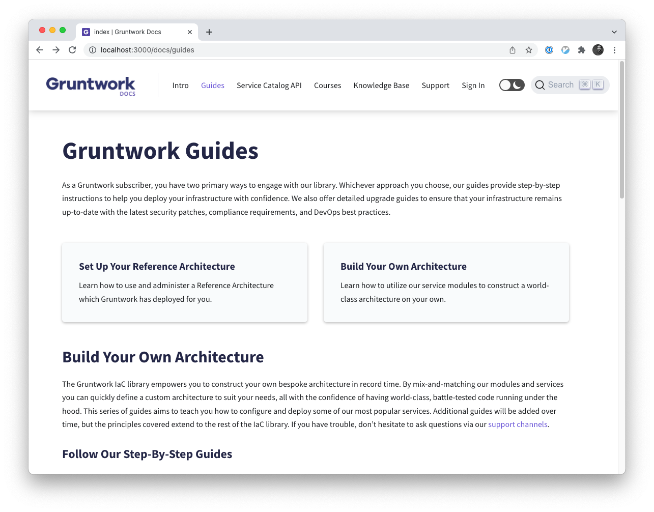
It's true. Given the choice to present step-by-step guides as self-contained entities (open to separate debate), we were reluctant to include them in the sidebar, where a click would jump you out of the context of the Guides sidebar and into the guide. That said, there's nothing preventing us from doing that if we want to take a hybrid approach that enumerates them in the sidebar but still preserves the benefits of breaking out the guides. We could also break the new Guides page down by section, and preserve the same top-level sidebar items (Reference Architecture, Build It Yourself, Stay Up to Date) as before, with each just providing a set of cards (or whatever structure we decide is best) enumerating the guides in that category.

The intro sentence says "As a Gruntwork subscriber, you have two primary ways to engage with our library", with those two ways being "Set up your reference architecture" and "e.g., Build your own architecture," but where do we put content that applies to both or neither of those items? Without a clear nav / list of content, the mental model is a bit muddy. For example, "stay up to date" and "dig into the code" both feel tacked on, and it's not obvious what they apply to.

I was dissatisfied with this, too. The dichotomy worked a bit better with the previous structure, although the same discrepancy was present in that design, also. If we break the guides out into pages by topic, perhaps there could still be a short guides intro page just like the one on the live site which presents this choice.

In general, it's worth thinking about how strongly we position this in our docs site. I think, at least for the purpose of guides it does make sense, since the method of engagement is quite different. If we introduce a separate section of docs for each product, the choice wouldn't apply there.

I wanted to add the "Gruntwork Production Framework" to the site, and again, it's not clear where it can go.

Yes! This is great to hear. For what it's worth, the simple answer to this particular question is that we expected it to live somewhere in the Intro section, outside of Guides entirely. We've discussed it fitting into the Overview somewhere, but anywhere you see fit would be fine.

Next Steps

I'd love to come to consensus with both you and @josh-padnick regarding our next steps. Here are some options.

  1. Release this as-is. If the rationale seems clear enough and the tradeoffs make sense we could keep this as-is. In fact, we could keep it as-is even if we want to make some changes, assuming a) you don't think any of the concerns are dealbreakers and b) we could address remaining concerns in a timely fashion.

  2. Revert the change. Maybe we made the wrong tradeoffs. Or maybe we can't come to consensus quickly and need to hop on a call to hammer it out. Either way, we may be better off reverting this, although it goes without saying that we'd lose a fair number of benefits in the process as well.

  3. Adopt a Hybrid sidebar. As discussed briefly above, we could keep the independent guide sidebars, but re-introduce the sidebar for the Guides section to include the three top-level pages, each of which would present the corresponding list of guides, most likely as cards.

  4. Adopt a "Link" sidebar. This is sort of like (3), except instead of having each section (Reference Architecture, Build it Yourself, Stay Up to Date) lead to an index page of those guides, we would enumerate the guides in the sidebar as before. The difference is that clicking one of those guide links would then warp you to the corresponding guide, thus swapping in its sidebar instead. You'd lose some context, which might be unexpected.

  5. Re-structure the guides. We could restructure the guides. Maybe we decomposed them one level too deep, thus leading to an extra, unnecessary level of hierarchy. (That's a lot of work.) Or maybe we should introduce category index pages, rename all of the pages, and switch to explicit sidebars to improve search as best we can without breaking them out independently.

Having spent some time on this response, I think I'm personally in favor of trying (1) and (3) together. We could likely produce something that addresses Jim's concern #2 (presentation of available guides) while keeping the overall refactor intact, along with its better search characteristics, easier maintenance, and other benefits.

@brikis98
Copy link
Member

TBH, I don't have nearly the same amount of context here as all of you, and therefore, don't have much of a recommendation on the best way to solve this, and leave it up to you.

The main thing is that those 4 points I mentioned originally are solved in some fashion. Having all guides in the left nav, as we used to, is one solution, but definitely not the only one. Another option is cleaning up the guides landing page, and putting in it a flat list of all guides (with clear, similar-looking links to all of them), either in the page itself right at the top, or perhaps in a custom left nav solely on that page.

As a concrete litmus test of whether this is solved, I just submitted #145, and the content there feels like a guide to me (it's long and detailed and it's not obvious it fits in our "Intro" content), but I have no idea how to expose it right now.

@josh-padnick
Copy link
Contributor

I haven't read through the full comment history here and this remains Eben's call to make, but I'll just share a couple quick thoughts:

  • Sidebars are key for discovery. I find I'm not really reading the content at all at https://deploy-preview-132--pensive-meitner-faaeee.netlify.app/docs/guides and that my eyes just dart right to the major links. That includes each of the following text excerpts:

    • "As a Gruntwork subscriber, you have two primary ways to engage with our library..."
    • "The Gruntwork IaC library empowers you to construct your own bespoke architecture in record time..."

    So I do miss having a sidebar that I can quickly glance at to see all available guides, sorted by some kind of higher-level categorization. We often reference https://stripe.com/docs/reports to see how they handle things, and in Stripe's case, I like how I can see all the guides at the left at once without having to scroll at all.

  • +1 on less nested subnavs for guides. OTOH, the dedicated guides subnav is a definite improvement while reading the guide itself. Maybe there are other options that address the previous comment, too, but at least once you're viewing a guide, it's very nice to see the nav for exactly what you're reading.

  • Opportunity to clean up nav. I do find some of the nav hard to parse because (a) the font is relatively large, and (b) the titles can sometimes be long. For example at https://deploy-preview-132--pensive-meitner-faaeee.netlify.app/docs/guides/reference-architecture/configure-gw-pipelines/intro, perhaps it'd be better to shrink the font so that "Configure Gruntwork Pipelines" is on one line, and shorten the titles to:

    • Intro
    • For infra code
    • For app code
    • Pipeline updates

    This echos some of the feedback around visual formatting I posted before the break.

Again, Eben, you make the call. Just food for thought!

@ebeneliason
Copy link
Contributor

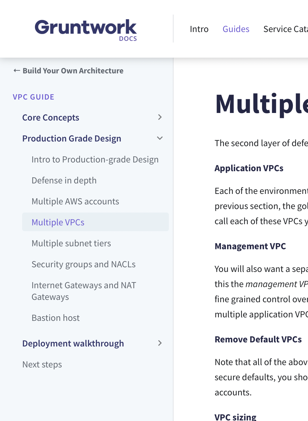
Yeah, we're on the same page, and I've been working with this a little bit today already. Here's WIP PR which reintroduces the sidebar for the guides to provide skimmable categorization, but maintains index pages with cards that link out to the guides themselves, with dedicated sidebars. I'm feeling pretty good about this direction but would love more feedback. Direct preview link.

@ebeneliason
Copy link
Contributor

Opportunity to clean up nav. I do find some of the nav hard to parse because (a) the font is relatively large, and (b) the titles can sometimes be long.

We've done the cleanup of the sidebar styles itself, as you can see here. We deferred making changes to most of the actual sidebar labels thus far, but I agree it's an improvement we should make. Hopefully we can distribute that work among content owners while the platform team focuses on improving the editing pipeline and pulling in/producing more dynamic content.

@josh-padnick
Copy link
Contributor

Roger on all points. The guides sidebar looks great! The one thing that felt like it was missing once you go to a guide (such as this one) is some kind of "back to guides" link in the top left of the sidenav. I know it's right there on the primary nav, but my brain wanted some way to "go back."

Great to see these steady improvements on the docs site overall. I used the docs site in a sales call today and it was instrumental!

@ebeneliason
Copy link
Contributor

ebeneliason commented Jan 20, 2022

The one thing that felt like it was missing once you go to a guide (such as this one) is some kind of "back to guides" link in the top left of the sidenav.

I played around with that idea (though it's not pushed to that preview branch yet). I managed to get something functional:

image

This has the function of returning to the appropriate guides index page. I even managed to work out how to style this independently, if we want to. The main caveat is that adding this is a manual step for every guide. This link must be added to the sidebar definition explicitly, including its label and the absolute path to the corresponding index page it links "back" to, like so:

const vpcGuide = [
  {
    label: "← Build Your Own Architecture",
    type: "link",
    href: "/docs/guides/index/deployment-guides",
    className: "back-button",
  },
  ...
}

It also behaves a little funny on mobile, where the sidebar nav is a flyout which already has a "← Back to Main Menu" link. They look similar but behave differently, since one navigates within the sidebar and the other navigates to a new page. If we choose to add this at all, maybe we just hide it on mobile?

image

Is this a net win worth the extra effort? I'm on the fence given that the "Guides" link is in the main nav, and there's always the browser back button. Then again, this would go back to the appropriate collection of guides, not the top level, and the guides themselves are multi-page by design, so the browser back button won't help there. Those reasons seem to justify this addition if others are in agreement.

@josh-padnick
Copy link
Contributor

It's neat to see this in action. I wish I could play with it directly, but overall I think it's a very "comforting" link. It feels similar to the way the iPhone always gives you the "go back" link in the top left and makes me feel more grounded in the nav. So I do like it and think there's enough of payoff here to justify some (albeit not huge) investment.

The dual "go back" thing is a little weird because you'd expect to keep going back until you get to the main menu, like traversing a linked list, but not to have both links at once. Perhaps it's possible to setup that pattern here?

As for the manual work, perhaps we could adjust the nav so that when you declare some kind of front matter, this auto-renders? Of course, if that's time-consuming, it might be worth a small amount of tech debt now and we can fix later.

@ebeneliason
Copy link
Contributor

ebeneliason commented Jan 20, 2022

It's neat to see this in action. I wish I could play with it directly

I cleaned it up and pushed it to the WIP PR linked above.

The dual "go back" thing is a little weird because you'd expect to keep going back until you get to the main menu, like traversing a linked list, but not to have both links at once. Perhaps it's possible to setup that pattern here?

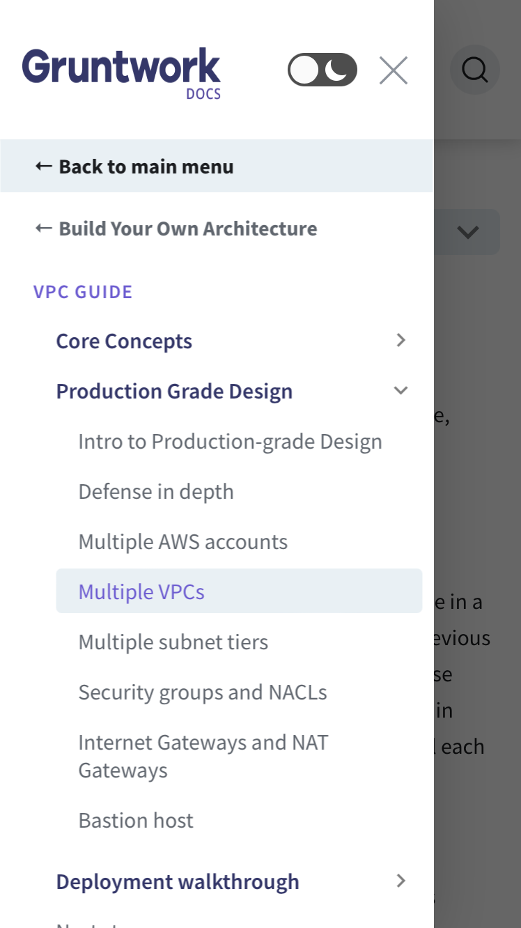
I don't believe this is possible. We have no control over the "Back to main menu" link here. What that link actually does is slide back to reveal the links usually in the header nav. The only configuration available to us is the links within the sidebar for the current page, shown in this screenshot, which can navigate anywhere we please but cannot impact the contents of the flyout menu.

As for the manual work, perhaps we could adjust the nav so that when you declare some kind of front matter, this auto-renders?

I'm not aware of any easy path to doing so. The definition for this back button lives in the sidebars file, which is located in a top level sidebars subdirectory in a .json file, entirely separate from the markdown for the article itself. Our docs-sourcer would need to somehow locate the appropriate sidebar file, locate the appropriate entry for the article in that file (if there are several), and then inject the corresponding JSON for the value passed in the front-matter. This seems technically achievable, but non-trivial.

@josh-padnick
Copy link
Contributor

Thanks for the update. Without commenting on the technical items, here's some UX feedback:

  • The sidebar of guide categories is great!
  • As soon as I began using it, I wanted the subnav of all guides under those categories.
  • I don't actually mind the dual "go backs" on mobile too much. It's a little weird, but perhaps not worth investing further in for now.
  • It's a little jarring to click on a card that says "Set Up Your AWS Accounts" and then see "Landing Zone Guide" on the left sidebar and "Configure Your Accounts with Landing Zone" as the main title. I'm not sure how to resolve this.

I realize I'm not offering solutions, but hopefully the feedback is useful.

@ebeneliason
Copy link
Contributor

As soon as I began using it, I wanted the subnav of all guides under those categories.

Can you expand on this point, and describe your motivation? If I understand you correctly, I'm not sure that would be compatible with dedicated per-guide sidebars. If we were to list the individual guides in the sidebar while also keeping per-guide sidebars, then I think two things would be true:

  1. Clicking a link to a guide in the sidebar would jump you directly to that guide, swapping out the sidebar, which may feel unexpected. (The current approach links to the guides from the cards in the page, where this sort of navigation feels more natural.)
  2. We'd still need to keep the index pages of the guides much as they are, despite the redundancy. Otherwise there would be nothing to show on the page itself — the sidebar would exist in a vacuum solely to navigate somewhere else, and there wouldn't be a way to link to all guides in a given category either e.g. "See our update guides".

It seems to me that listing the guides in the page has some benefits:

  1. It means we can link to each collection of guides directly from elsewhere in our docs
  2. There's room for longer, more complete titles
  3. We can provide context for each guide, such as descriptions, icons, tags, etc.
  4. We can provide context about each collection of guides as well
  5. It enables more natural navigation to guides with dedicated sidebars

What's motivating you toward seeing them listed in the sidebar itself? Is there something about the presentation of each collection of guides in the page that you think we could improve?

Sign up for free to join this conversation on GitHub. Already have an account? Sign in to comment

Labels

None yet

Projects

None yet

Development

Successfully merging this pull request may close these issues.

5 participants