As part of the Google BI Certificate, I had to deliver a Capstone Project. I chose this Google Fiber analysis because it simply sounded fun and more in line with my current customer support job. The scenario:
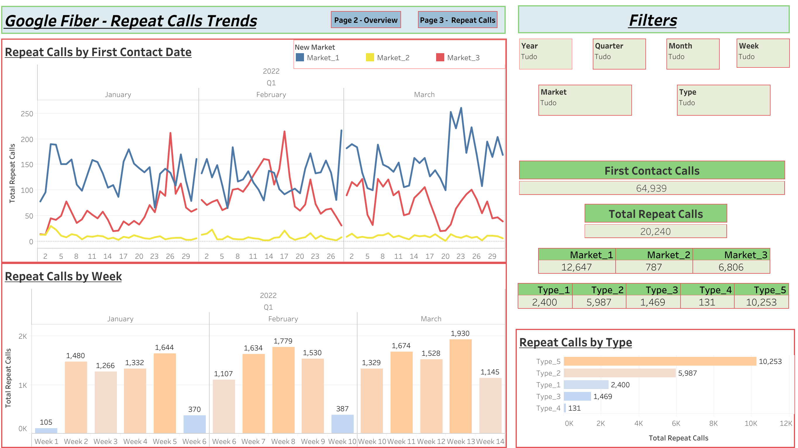
The Google Fiber customer service team’s goal is to determine how often customers are calling customer support after their first inquiry; this will help leadership understand how effectively the team is able to answer customer questions the first time. The dashboard you create should demonstrate an understanding of this goal and provide your stakeholders with insights about repeat caller volumes in different markets and the types of problems they represent. As part of the interview process, you have been asked to create a dashboard that will:
-
Help them understand how often customers are calling customer support after their first inquiry; this will help leadership understand how effectively the team is able to answer customer questions the first time
-
Provide insights into the types of customer issues that seem to generate more repeat calls
-
Explore repeat caller trends in the three different market cities
-
Design charts so that stakeholders can view trends by week, month, quarter, and year.
After drawing the Low Fidelity Dashboards (many times!), I felt ready to jump into Tableau to finish this Project.
This is the final result:
click the image to go to Tableau Public and play with the dashboard