Visit the Website | View Figma Design
This mobile-first landing page project for a Nothing demonstrates responsive design and a range of implemented features using HTML5, SCSS, and JavaScript.
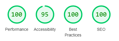
- Performance Metrics:
- Technologies Used: HTML5, SCSS
- Methodology: BEM (Block Element Modifier)
- Optimization:
- HTML/CSS: Validated using W3C validator
- Image and Font Compression
- SVG Usage for Scalability
- Responsive Design: Adapted for Desktop, Tablet, and Mobile
- Font Formats: TTF, WOFF, WOFF2 for performance and browser support
- Image Formats: WEBP with responsive sizing based on screen width
- Features:
- Semantic HTML Structure
- Excellent Accessibility Practices
- Header, Toggleable Aside Menu
- Pixel-Perfect Design
- Mobile-First Approach: The project follows a mobile-first design strategy, ensuring seamless responsiveness across various devices.
- SCSS Preprocessor Features: Leverages SCSS with placeholders, mixins, and other preprocessor features for efficient styling and code management.
- Layout with Flexbox and Grid: Utilizes Flexbox and GRID for creating flexible and responsive layouts.
- No External Fonts or Icon Libraries: The project is independent of external font and icon libraries like Google Fonts, utilizing only in-house assets like SVG icons for enhanced performance and autonomy.