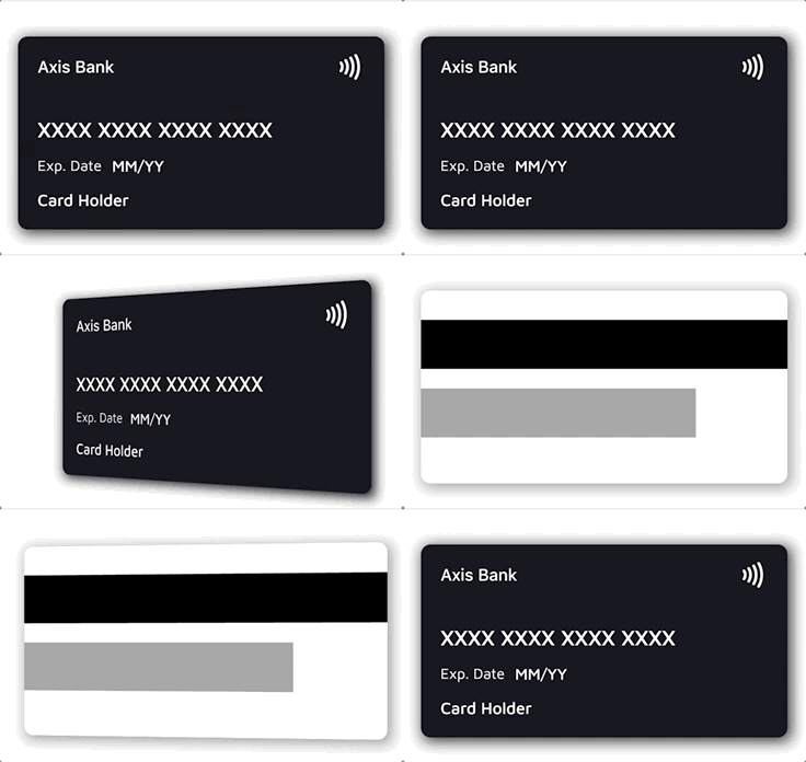



- 💳 Realistic credit card widget with front and back sides
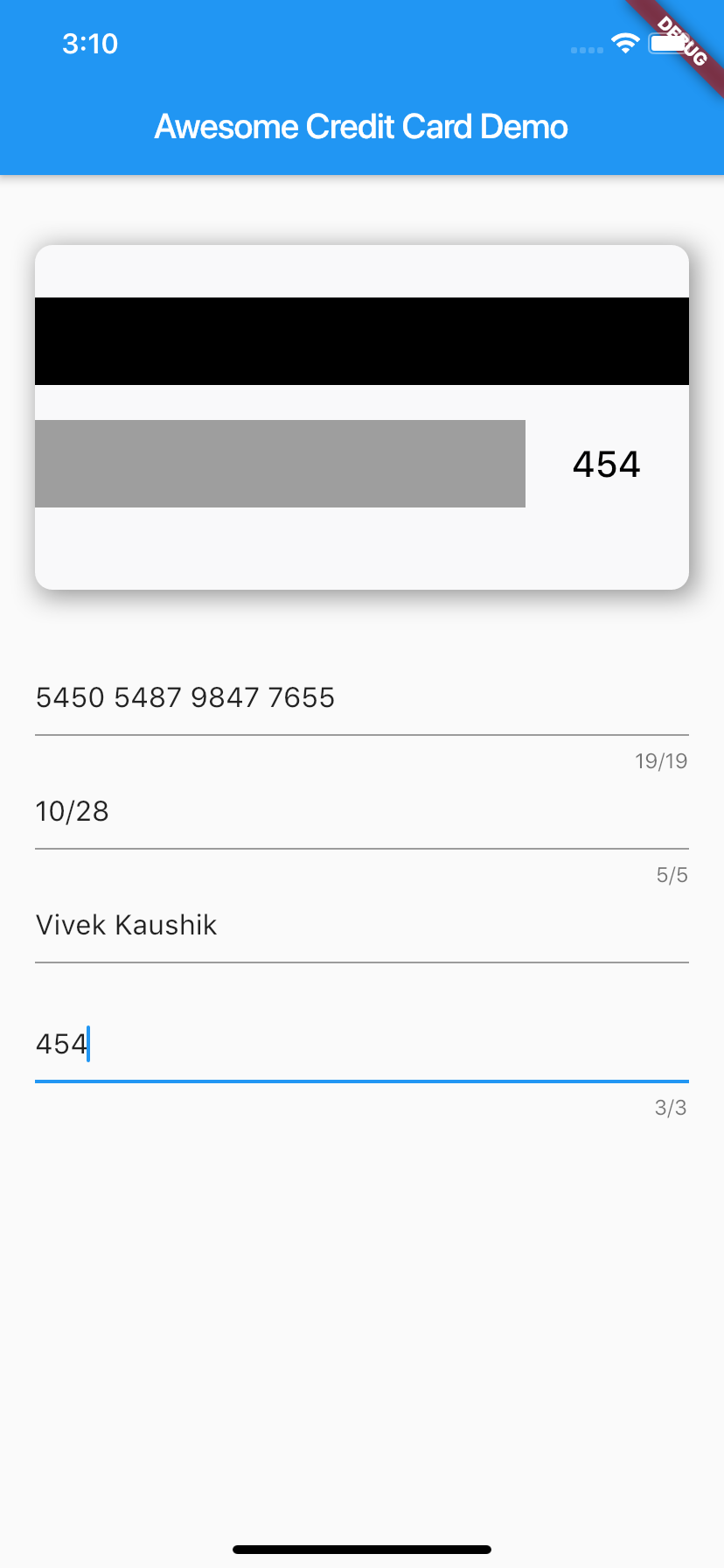
- 🔄 Smooth 3D flip animation between front and back
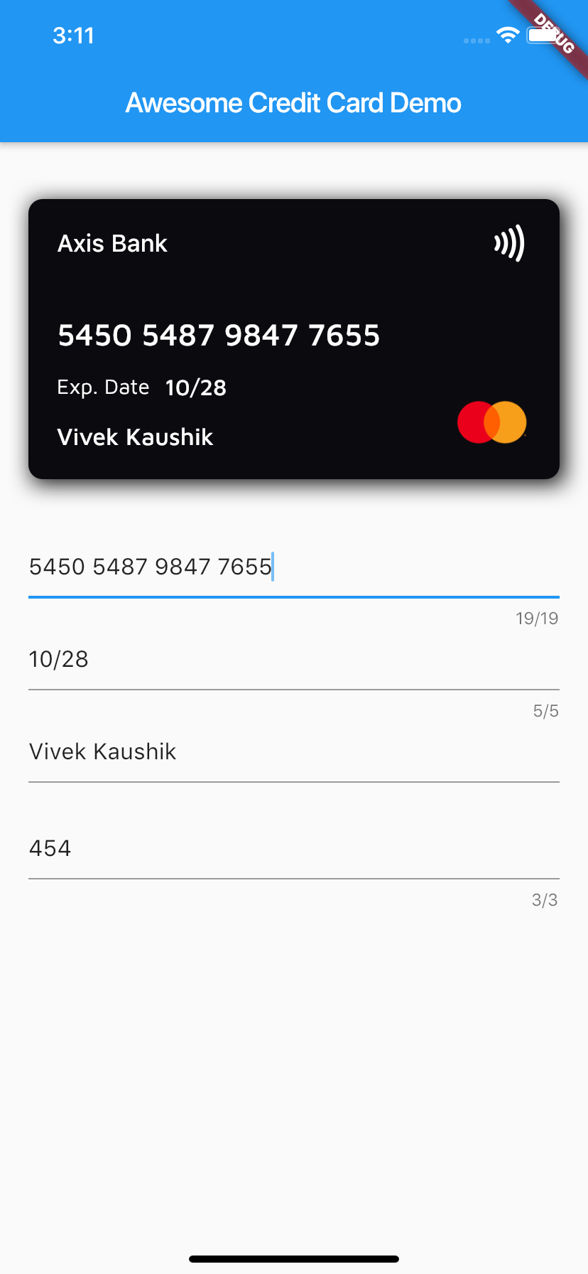
- 🔍 Automatic card brand detection from the number (Visa, Mastercard, Amex, RuPay, Elo, Discover, Diners Club, JCB, Maestro)
- 🎭 Automatic number masking per brand (e.g. Amex
XXXX XXXXXX XXXXX) - 🎨 Customizable backgrounds, text styles, labels, and fully custom layouts
- 📏 Responsive — content scales down gracefully on narrow cards instead of overflowing
- 📳 Optional contactless indicator and card shadow
Add the dependency to your pubspec.yaml:
dependencies:
  awesome_card: ^1.2.0
Requires Dart 3 / Flutter 3.10 or newer.
Then import it in your Dart file:
import 'package:awesome_card/awesome_card.dart';The only required parameters are the two backgrounds — everything else has sensible defaults:
CreditCard(
  frontBackground: CardBackgrounds.black,
  backBackground: CardBackgrounds.white,
)
A fully configured card:
CreditCard(
  cardNumber: "5450 7879 4864 7854",
  cardExpiry: "10/25",
  cardHolderName: "Card Holder",
  cvv: "456",
  bankName: "Axis Bank",
  cardType: CardType.masterCard, // optional — auto-detected from cardNumber
  showBackSide: false,
  frontBackground: CardBackgrounds.black,
  backBackground: CardBackgrounds.white,
  showShadow: true,
  isContactless: true,
  textExpDate: 'Exp. Date',
  textName: 'Name',
  textExpiry: 'MM/YY',
)The card flips whenever showBackSide changes across a rebuild. A common
pattern is to flip it while the CVV field has focus:
class _MyPageState extends State<MyPage> {
  bool showBack = false;
  late final FocusNode _cvvFocus;

  @override
  void initState() {
    super.initState();
    _cvvFocus = FocusNode()
      ..addListener(() => setState(() => showBack = _cvvFocus.hasFocus));
  }

  @override
  void dispose() {
    _cvvFocus.dispose();
    super.dispose();
  }

  @override
  Widget build(BuildContext context) {
    return Column(
      children: [
        CreditCard(
          cardNumber: cardNumber,
          cvv: cvv,
          showBackSide: showBack,
          frontBackground: CardBackgrounds.black,
          backBackground: CardBackgrounds.white,
        ),
        TextField(focusNode: _cvvFocus, /* CVV input */),
      ],
    );
  }
}Every text field's style can be overridden. Each style is merged over the
default, so a partial override (e.g. only fontSize) keeps the default
font, weight, and color for everything else:
CreditCard(
  // ...
  bankNameTextStyle: TextStyle(fontSize: 20),
  cardNumberTextStyle: TextStyle(fontSize: 24, letterSpacing: 2),
  cardExpiryTextStyle: TextStyle(fontStyle: FontStyle.italic),
  cardHolderNameTextStyle: TextStyle(fontWeight: FontWeight.bold),
  cvvTextStyle: TextStyle(color: Colors.red),
)
Text colors default to frontTextColor (white) on the front and
backTextColor (black) on the back.
Any widget works as a card background — a Container, gradient, or image:
// Built-in solid backgrounds
frontBackground: CardBackgrounds.black,
backBackground: CardBackgrounds.white,

// Solid color from a hex value
frontBackground: CardBackgrounds.custom(0xff1b447b),

// Anything else — e.g. a gradient
frontBackground: Container(
  decoration: BoxDecoration(
    gradient: LinearGradient(colors: [Colors.indigo, Colors.blueAccent]),
  ),
),To replace the entire front or back content (e.g. to center the card number or add extra elements), pass your own widget — it is stacked on top of the background and receives the full card area:
CreditCard(
  frontBackground: CardBackgrounds.black,
  backBackground: CardBackgrounds.white,
  frontLayout: MyCustomFront(),
  backLayout: MyCustomBack(),
)When cardType is not provided, the brand is detected from cardNumber and
the matching icon and number mask are applied automatically. Supported brands:
| Brand | Example prefixes |
|---|---|
| Visa | 4 |
| Mastercard | 51–55, 2221–2720 |
| American Express | 34, 37 |
| RuPay | 60, 6521, 6522 |
| Elo | 401178, 431274, 6362, 6516, 6550, … |
| Discover | 6011, 65, 644–649 |
| Diners Club | 300–305, 36, 38 |
| JCB | 35, 2131, 1800 |
| Maestro | 50, 56–69 |
The detection helpers are exported and can be used standalone:
CardType type = getCardType('4111111111111111');        // CardType.visa
String mask  = getCardTypeMask(cardNumber: '378282246310005'); // XXXX XXXXXX XXXXX
Widget icon  = getCardTypeIcon(cardNumber: '5555555555554444'); // Mastercard logo
To force a specific brand regardless of the number, pass cardType. To force
a specific mask, pass mask.
Brands the package doesn't ship (regional or store cards) can be registered
via customBrands. They are checked before the built-in detection and
support their own icon and optional number mask:
CreditCard(
  cardNumber: cardNumber,
  customBrands: [
    CardBrand(
      name: 'troy',
      icon: Image.asset('assets/troy.png', width: 55, height: 40),
      pattern: RegExp(r'^9792'),
      mask: 'XXXX XXXX XXXX XXXX', // optional
    ),
  ],
  frontBackground: CardBackgrounds.black,
  backBackground: CardBackgrounds.white,
)
Precedence: explicit cardType → customBrands (first match wins) →
built-in detection.
| Parameter | Type | Default | Description |
|---|---|---|---|
frontBackground |
Widget |
required | Background widget of the front side |
backBackground |
Widget |
required | Background widget of the back side |
cardNumber |
String? |
— | Card number; shown masked-style as typed. Empty shows the brand mask |
cardExpiry |
String? |
— | Expiry string, e.g. 10/25 |
cardHolderName |
String? |
— | Cardholder name (ellipsized when too long) |
cvv |
String? |
— | CVV shown on the back side |
bankName |
String |
'' |
Bank name shown at the top of the front |
cardType |
CardType? |
auto | Override the auto-detected brand |
customBrands |
List<CardBrand>? |
— | Custom brands checked before built-in detection |
mask |
String? |
auto | Override the auto-selected number mask |
showBackSide |
bool |
false |
Which side is visible; changing it animates the flip |
showShadow |
bool |
false |
Drop shadow behind the card |
isContactless |
bool? |
true |
Show the contactless (NFC) icon |
width |
double? |
screen width − margins | Card width |
height |
double? |
width / 2 + 24 |
Card height |
horizontalMargin |
double |
20 |
Horizontal margin used when width is not set |
frontTextColor |
Color |
Colors.white |
Default text color on the front |
backTextColor |
Color |
Colors.black |
Default text color on the back |
textExpDate |
String? |
'Exp. Date' |
Label above/next to the expiry |
textExpiry |
String? |
'MM/YY' |
Placeholder when cardExpiry is empty |
textName |
String? |
'Card Holder' |
Placeholder when cardHolderName is empty |
bankNameTextStyle |
TextStyle? |
— | Merged over the bank name style |
cardNumberTextStyle |
TextStyle? |
— | Merged over the card number style |
cardExpiryTextStyle |
TextStyle? |
— | Merged over the expiry style |
cardHolderNameTextStyle |
TextStyle? |
— | Merged over the holder name style |
cvvTextStyle |
TextStyle? |
— | Merged over the CVV style |
frontLayout |
Widget? |
built-in | Replaces the entire front content |
backLayout |
Widget? |
built-in | Replaces the entire back content |
A complete demo app lives in example/ — card preview wired to
text fields with live brand detection and the CVV-focus flip. Run it with:
cd example
flutter run
The package ships with a regression test suite (flutter test) covering
brand detection, null-safety, text-style merging, and narrow-card layouts.
Issues and pull requests are welcome! Please run flutter analyze and
flutter test before submitting a PR.
Awesome Card is released under the MIT license. See LICENSE for details.