AST-based Flutter UI Code Generator with Multi-Style Design System
Stop writing repetitive UI code. Define components once, render in any design system.


// Create meta/login.screen.dart
final loginScreen = ScreenDefinition(
  id: 'login',
  appBar: AstNode.appBar(title: 'Login'),
  layout: AstNode.column(children: [
    AstNode.text(text: 'Welcome', variant: TextVariant.headlineLarge),
    AstNode.textField(label: 'Email', keyboardType: KeyboardType.email),
    AstNode.textField(label: 'Password', obscureText: true),
    AstNode.button(label: 'Login', onPressed: 'handleLogin'),
  ]),
);
Run: dart run syntaxify build
Get: Complete Flutter screen in lib/screens/login_screen.dart
No boilerplate. No repetition. Just results. ✨
Check out the example app - A working Flutter app demonstrating all features with live style switching!
cd example && flutter runFlutter developers face a fundamental dilemma when building production apps:
The Multi-Platform UI Duplication Problem:
- Material Design for Android
- Cupertino for iOS
- Custom designs for brand identity
Traditional approach means writing everything 3 times:
// You write this for EVERY component!
Widget buildButton() {
  if (Platform.isIOS) {
    return CupertinoButton(
      onPressed: onPressed,
      child: Text(label),
    );
  } else if (useCustom) {
    return CustomButton(
      onPressed: onPressed,
      label: label,
    );
  } else {
    return ElevatedButton(
      onPressed: onPressed,
      child: Text(label),
    );
  }
}
Real-World Impact:
- 🏢 Large Apps: 100+ screens, 1000+ components
- 👥 Team Scale: Multiple developers, changing requirements
- 🔄 Maintenance Nightmare: "Change all buttons to rounded corners" = touching 500+ files
- 💸 Cost: "Switch from Material to Cupertino" = rewriting the entire app
- 🎨 Design Changes: "Our designer wants a custom look" = building everything from scratch
Syntaxify delivers on Flutter's original promise: "write once, run anywhere" - but for design systems.
With Syntaxify:
// Write once
AppButton(label: 'Click Me', onPressed: ...)

// Renders appropriately everywhere
AppTheme(style: MaterialStyle())   // Material on Android
AppTheme(style: CupertinoStyle())  // iOS-native on iPhone
AppTheme(style: NeoStyle())        // Custom brand design
Change your entire app's design system in one line:
// Before: Material Design
AppTheme(style: MaterialStyle(), child: MyApp())

// After: iOS-native Cupertino
AppTheme(style: CupertinoStyle(), child: MyApp())
// Zero component code changes needed!Most Flutter solutions offer partial fixes:
- ❌ Widget libraries - Still manual integration, not design-system-aware
- ❌ Themes - Only styling, not structure
- ❌ Code generation - Not multi-platform aware
Syntaxify combines all three:
- ✅ Code generation - Eliminate boilerplate
- ✅ Design system architecture - WHAT vs HOW separation
- ✅ Multi-platform rendering - One component, any design
- ✅ Type-safe APIs - Compile-time safety
Syntaxify uses a unique renderer pattern that separates concerns:
WHAT (Component Definition):
AppButton.primary(
  label: 'Click Me',
  onPressed: () => print('Hello!'),
)
HOW (Style Rendering):
- Material: Renders as
ElevatedButtonwith Material Design tokens - Cupertino: Renders as
CupertinoButtonwith iOS styling - Neo: Renders with modern, neumorphic design
The Magic: Same component code, different visual output based on AppTheme:
AppTheme(
  style: MaterialStyle(),  // or CupertinoStyle() or NeoStyle()
  child: MaterialApp(home: YourApp()),
)- Write Once, Render Anywhere - One component definition works across all design systems
- Easy Theme Switching - Change one line to switch your entire app's design
- Consistent Behavior - Button logic stays the same, only visuals change
- Custom Styles - Create your own design system by implementing
DesignStyle
The fastest way to build Flutter screens:
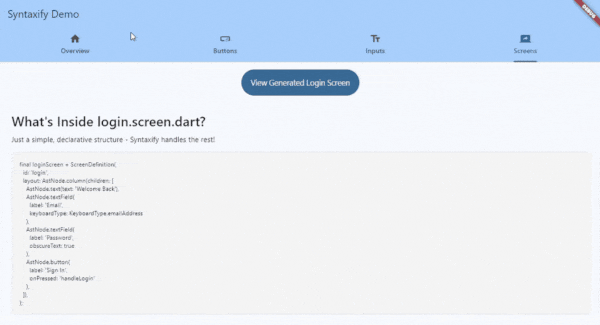
// meta/login.screen.dart
final loginScreen = ScreenDefinition(
  id: 'login',
  layout: AstNode.column(children: [
    AstNode.text(text: 'Welcome Back'),
    AstNode.textField(label: 'Email'),
    AstNode.button(label: 'Sign In', onPressed: 'handleLogin'),
  ]),
);
Run syntaxify build → Get a complete Flutter screen!
- ✅ Generate entire screens from simple definitions
- ✅ Editable after generation (you own the code)
- ✅ Type-safe callbacks and imports
- ✅ Proper structure and scaffolding
- ✅ No boilerplate, no repetition
These components work with Material, Cupertino, and Neo styles:
- AppButton - Buttons with variants (primary, secondary, outlined)
- AppText - Text with typography variants (display, headline, title, body, label)
- AppInput - Text fields with validation and keyboard types
You can define custom components (e.g., Card, Badge, Avatar), and Syntaxify will:
- ✅ Generate the component class
- ✅ Create constructor and fields
⚠️ Generate basic Container widget (not full renderer pattern yet)
Coming Soon: Full renderer pattern for more components (Card, Badge, Avatar, Chip, etc.)
Option A: From pub.dev (Recommended)
# pubspec.yaml
dev_dependencies:
  syntaxify: ^0.1.0-alpha.1
Then run:
dart pub getOption B: From GitHub (Latest)
# pubspec.yaml
dev_dependencies:
  syntaxify:
    git:
      url: https://github.com/ihardk/syntaxify.git
      ref: v0.1.0
      path: generator
⚠️ Alpha Release: This package is in alpha. API may change. See CHANGELOG for updates.
Optional: Global Installation
If you want syntaxify available system-wide (not just in your project):
dart pub global activate syntaxifyThen you can run syntaxify commands from anywhere. Otherwise, use dart run syntaxify in your project.
cd your_flutter_project
dart run syntaxify init
This creates:
meta/- Where you define component APIslib/syntaxify/design_system/- Customizable design system
Edit meta/button.meta.dart:
import 'package:syntaxify/syntaxify.dart';

@SyntaxComponent(description: 'A customizable button')
class ButtonMeta {
  /// The button label text
  @Required()
  final String label;

  /// The action to trigger (e.g. 'action:login')
  @Optional()
  final String? onPressed;

  /// Button variant (filled, outlined, etc)
  @Optional()
  final String? variant;

  /// Button size (sm, md, lg)
  @Optional()
  final String? size;

  /// Whether the button shows loading state
  @Optional()
  @Default('false')
  final bool isLoading;

  /// Whether the button is disabled
  @Optional()
  @Default('false')
  final bool isDisabled;
}dart run syntaxify buildThis generates:
lib/syntaxify/generated/components/app_button.dart- The componentlib/syntaxify/design_system/- Design system files (Material, Cupertino, Neo)lib/syntaxify/index.dart- Barrel export
import 'package:flutter/material.dart';
import 'package:your_app/syntaxify/index.dart';

void main() {
  runApp(
    AppTheme(
      style: MaterialStyle(),  // Try CupertinoStyle() or NeoStyle()!
      child: MaterialApp(
        home: Scaffold(
          body: Center(
            child: AppButton.primary(
              label: 'Click Me',
              onPressed: () => print('Hello from Syntaxify!'),
            ),
          ),
        ),
      ),
    ),
  );
}Create meta/login.screen.dart:
import 'package:syntaxify/syntaxify.dart';

final loginScreen = ScreenDefinition(
  id: 'login',
  layout: AstNode.column(children: [
    AstNode.text(text: 'Welcome Back'),
    AstNode.textField(label: 'Email', keyboardType: KeyboardType.emailAddress),
    AstNode.textField(label: 'Password', obscureText: true),
    AstNode.button(label: 'Sign In', onPressed: 'handleLogin'),
  ]),
);
Run dart run syntaxify build again - generates lib/screens/login_screen.dart (editable!)
Material Button:
ElevatedButton(
  onPressed: onPressed,
  style: ElevatedButton.styleFrom(
    backgroundColor: Colors.blue,
    padding: EdgeInsets.all(16),
  ),
  child: Text(label),
)
Cupertino Button:
CupertinoButton.filled(
  onPressed: onPressed,
  padding: EdgeInsets.all(16),
  child: Text(label),
)
Custom Button:
Container(
  decoration: BoxDecoration(
    gradient: LinearGradient(...),
    borderRadius: BorderRadius.circular(12),
    boxShadow: [BoxShadow(...)],
  ),
  child: Material(
    color: Colors.transparent,
    child: InkWell(
      onTap: onPressed,
      child: Padding(
        padding: EdgeInsets.all(16),
        child: Text(label),
      ),
    ),
  ),
)
Problem: 3 different implementations, hard to maintain, inconsistent behavior.
One Definition:
AppButton.primary(label: 'Submit', onPressed: handleSubmit)Three Renderings:
- Wrap with
MaterialStyle()→ Material Design - Wrap with
CupertinoStyle()→ iOS Design - Wrap with
NeoStyle()→ Modern Design
Result: Consistent API, different visuals, easy to switch.
your_project/
├── meta/                          # YOU EDIT: Component & screen definitions
│   ├── button.meta.dart
│   ├── input.meta.dart
│   ├── text.meta.dart
│   ├── login.screen.dart
│   └── app_icons.dart
│
└── lib/
    ├── screens/                   # EDITABLE: Generated screens
    │   └── login_screen.dart      # Generated once, then you own it
    │
    └── syntaxify/
        ├── design_system/         # CUSTOMIZABLE: Styles & tokens
        │   ├── design_system.dart
        │   ├── app_theme.dart
        │   ├── styles/
        │   │   ├── material_style.dart
        │   │   ├── cupertino_style.dart
        │   │   └── neo_style.dart
        │   └── tokens/
        │       ├── button_tokens.dart
        │       └── input_tokens.dart
        │
        ├── generated/             # DON'T EDIT: Auto-regenerated
        │   └── components/
        │       ├── app_button.dart
        │       ├── app_input.dart
        │       └── app_text.dart
        │
        └── index.dart             # Barrel export
For detailed API documentation, see API Reference.
Quick Overview:
| Component | Description |
|---|---|
AppButton |
Primary, secondary, outlined button variants |
AppText |
Typography with 6 text style variants |
AppInput |
Text fields with keyboard types & validation |
Design Styles: MaterialStyle(), CupertinoStyle(), NeoStyle()
Import: import 'package:your_app/syntaxify/index.dart';
- Define - Edit
meta/*.meta.dartto define component APIs - Build - Run
dart run syntaxify buildto generate implementations - Use - Import from
package:your_app/syntaxify/and use - Customize - Edit design system tokens in
lib/syntaxify/design_system/ - Switch Styles - Change
AppTheme(style: ...)to try different designs
Important: Two types of generated code with different lifecycles:
Location: lib/syntaxify/generated/components/
Behavior: Regenerated on EVERY syntaxify build
Rule:
// lib/syntaxify/generated/components/app_button.dart
// This file is REGENERATED on every build
class AppButton extends StatelessWidget {
  // Generated code - DO NOT MODIFY
}Location: lib/screens/
Behavior: Generated ONCE, then YOU own it
Rule: ✅ FREELY EDIT - Won't be overwritten
// lib/screens/login_screen.dart
// Generated once, then it's yours to edit
class LoginScreen extends StatelessWidget {
  // Edit this freely - it won't be regenerated
}
What happens when you rebuild?
- Components: Completely regenerated from meta files
- Screens: Skipped (only generated if file doesn't exist)
For advanced topics, see the detailed documentation:
- Design System Guide - Creating custom design styles, renderer pattern
- API Reference - Build options, CLI commands
Having issues? See Troubleshooting Guide for common errors and solutions.
Quick fixes:
TextVariant.headline→ UseTextVariant.headlineMediumKeyboardType.email→ UseTextInputType.emailAddress- Component not updating? → Edit
meta/*.meta.dart, not generated files
Need help? GitHub Issues
- AST-Based Generation - Type-safe, declarative UI definitions
- Renderer Pattern - Separates WHAT (behavior) from HOW (rendering)
- Multi-Style Support - Material, Cupertino, Neo (3 components currently, more coming)
- Smart Defaults - Auto-detects project structure
- Screen Generation - Generate editable screen scaffolds
- Design Tokens - Centralized styling with tokens
- Git-Friendly - Clean, readable generated code
- Extensible - Create custom design styles by implementing
DesignStyle
v0.1.0 (Current)
- ✅ Core architecture with renderer pattern
- ✅ 3 components (Button, Text, Input)
- ✅ 3 design styles (Material, Cupertino, Neo)
- ✅ Screen generation
- ✅ Smart build defaults
v0.2.0 (Next)
- 🔄 More components with full renderer pattern:
- Card, Badge, Avatar, Chip, Switch, Checkbox, Radio
- 🔄 Golden tests for visual regression
- 🔄 Better error messages
v1.0.0 (Future)
- 🔮 Complete component library
- 🔮 Theme editor UI
- 🔮 VS Code extension
- 🔮 Component marketplace
| Guide | Description |
|---|---|
| Getting Started | Installation & first steps |
| API Reference | Component usage & options |
| Design System | Renderer pattern & custom styles |
| Troubleshooting | Common issues & solutions |
| User Manual | Comprehensive user guide |
| Developer Manual | Architecture & contributing |
See Developer Manual for architecture details and contribution guidelines.
MIT License - See LICENSE for details
Built with ❤️ for Flutter developers who value consistency, productivity, and beautiful code