3.5 Principles and elements of visualisations
Note - content adapted from Principles and elements of visualisations https://royal-statistical-society.github.io/datavisguide/docs/principles.html
Data visualisations must serve a purpose. By understanding the purpose of a visualisation, we -- as author or reader -- are in a position to assess whether a visualisation succeeds in its aims or requires improvement!
Arguably the most common purpose of a visualisation is a comparison of groups of data, such as data on patients receiving different treatments. A good choice of axes, axis limits, labels and symbols can facilitate substantially the identification of patterns in the data, whereas poor choices for any of these elements can substantially hamper the extraction of information.
Various elements of a visualisation can contribute to the efficacy with which information can be distilled. All visualisation software packages will output graphics in a default style, but these will rarely, if ever, be the optimum choices for the data visualisation you are creating. When designing a data visualisation, one needs to consider the range of options available. Some of these options are discussed in what follows.
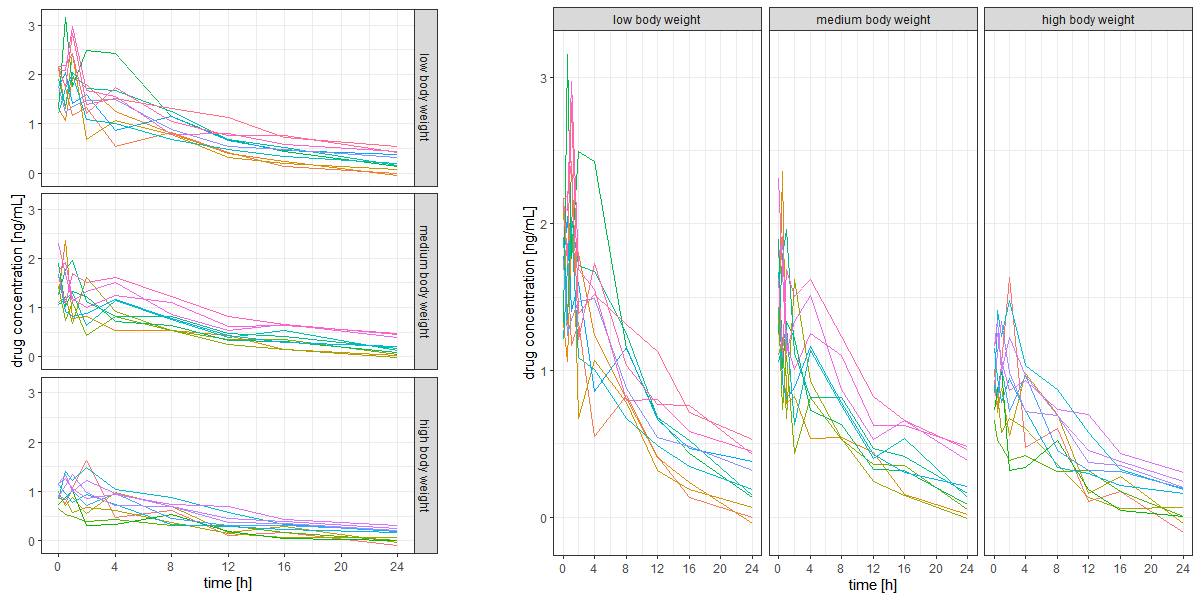
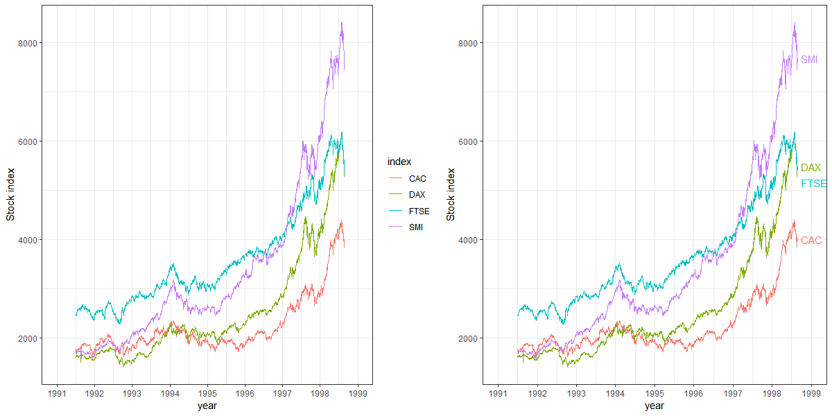
The layout (arrangement of multiple panels, facets, or subplots) is highly relevant for efficient comparison. If data on the y-axis are to be compared, a single y-axis with all panels aligned horizontally facilitates comparison, whereas for efficient comparison of x-axis values, panels should be stacked. Matrix layouts (multiple rows and columns in a single figure) should only be used if the data shown in individual panels are not related or space does not permit a single row or a single column (e.g., if there are too many panels to fit on a single row).
Example: The figure below shows two different layouts of exactly the same data with exactly the same type of visualisation except for the layout. Note how difficult it is to compare the data across panels on the left-hand side, while it is easy with the layout on the right-hand side. The key difference is that the panels on the right share a common y-axis, which is key for comparison of y-values across panels.
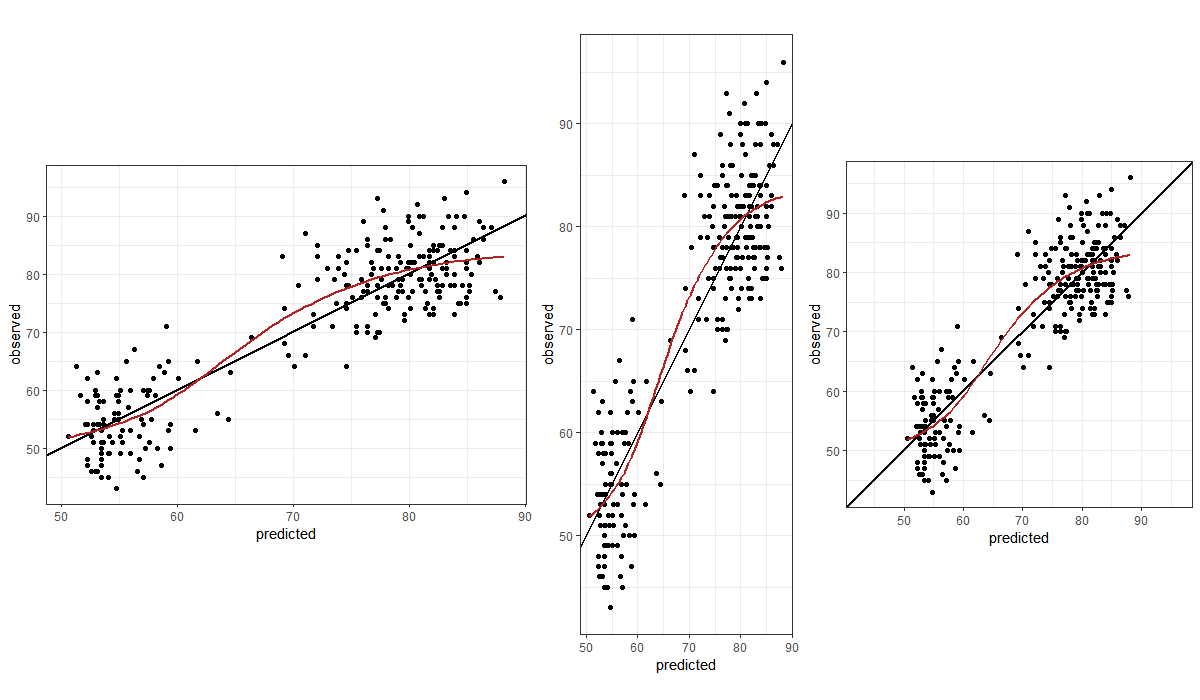
Our visual perception of data in a display must not depend on the choice of x- and y-axes. In many cases, a square figure avoids visual bias. A square figure should be considered in particular if the two axes share a communality such as a measurement before and after some event, observed data vs model-predicted values or, more generally, the same units (such as kg or metres). Generally, a 1:1 aspect ratio (the physical length of 1 measurement unit in the x- and the y-direction) is a good default. If the figure has identical ranges for the x- and the y-axis, a 1:1 aspect ratio yields a square figure.
Example: The three panels below all show the same data, aimed at enabling judgement about the goodness of a model fit (predicted vs observed values). Note the difference in visual perception between a stretched x-axis, a stretched y-axis, and a 1:1 aspect ratio with identical axis limits.
Lines introduce an order, a sequence. If there is no order, data should not be interconnected by lines. If different line types indicate different groups that have an inherent order, it is helpful if the chosen line styles have an order, too (example: line thickness, dash density, or darkness of colour increases with values from the lowest to the highest group).
Point symbols should be chosen such that the visualisation displays the data in a meaningful way. If thousands of data points are to be shown, open circles or smaller filled symbols are better than overlapping filled symbols. If the data are discrete and observations overlay, consider jittering the data gently for a better visualisation.
Colours should serve a purpose such as helping to identify different groups. Colours for pure decoration are discouraged. Tufte pointed out that because "they do have a natural visual hierarchy, varying shades of gray show varying quantities better than color", and "the shades of gray provide an easily comprehended order to the data measures. This is the key" [@Tufte2001, p. 154].
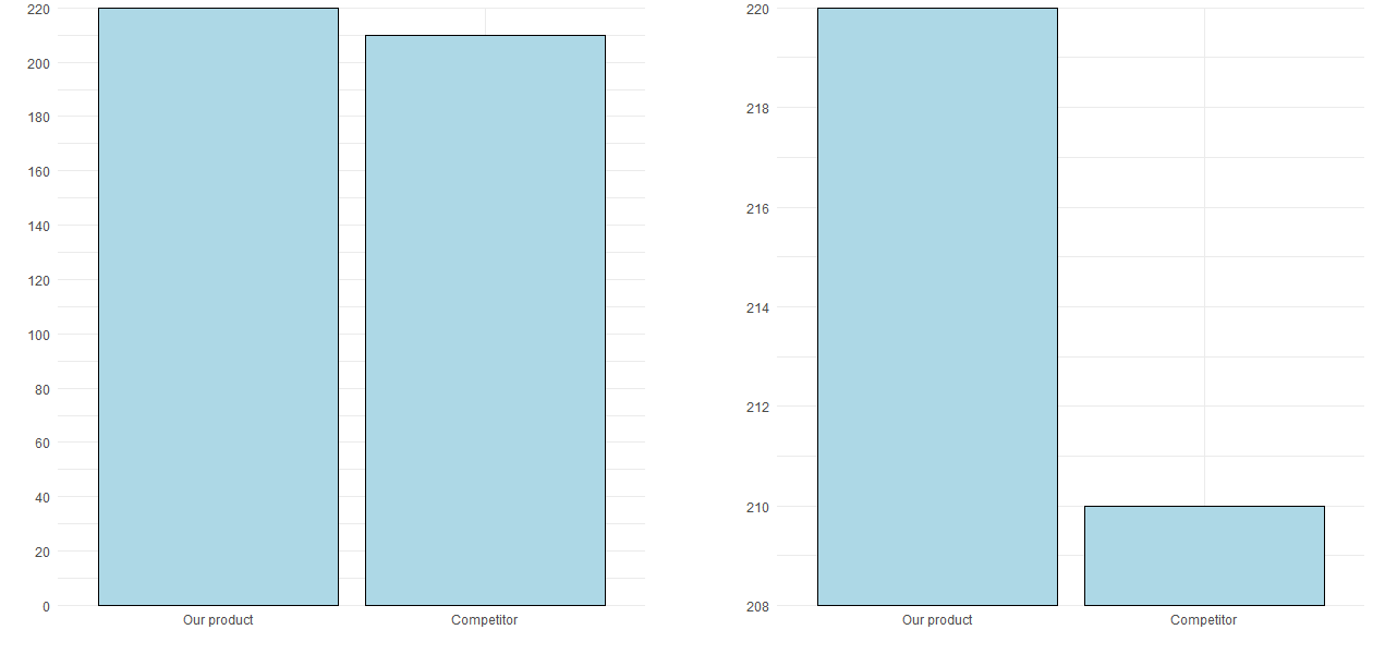
Axis ranges should generally start at 0 unless there is a good reason for choosing other ranges. If the data do not contain negative values, the axis should not stretch into negative values and in particular not have tick marks at negative values.
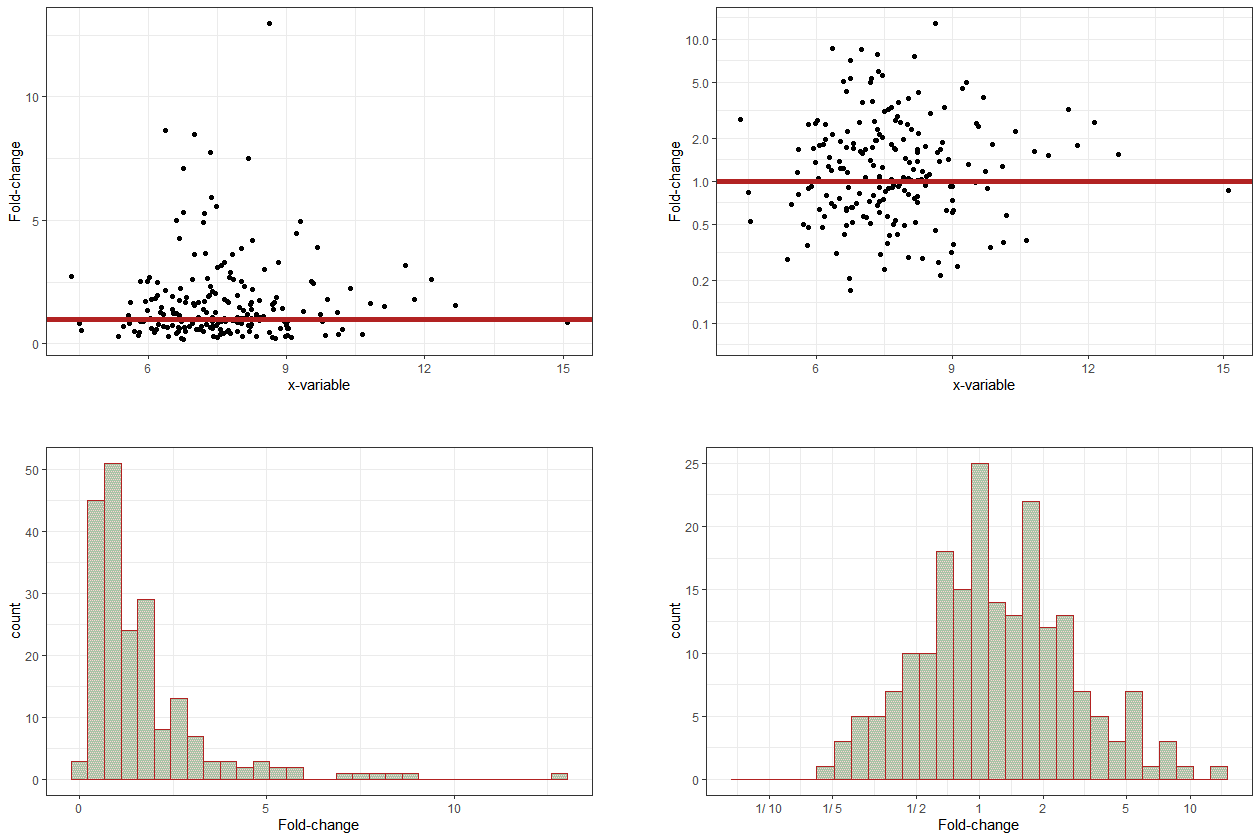
If relative changes or ratios are displayed, the corresponding axis should be logarithmic (such that, e.g., 1/4 has the same distance to the reference point, 1, as 4) and symmetric around the point of no change. An auxiliary line at the point of no change can facilitate interpretation. Axis tickmarks and auxiliary grey lines will facilitate reading off values, avoiding wrong linear interpolation by the viewer. Axis tick mark labels should indicate the ratio (e..g, "1/4" instead of 0.25).
If the data displayed as x and as y are comparable, axis limits should be identical and the figure square, such that distances are consistent in the x- and in the y-direction.
Example: The figure below illustrates that the deliberate choice of axis limits (here, y-axis limits) can make a big difference to perception, and therefore interpretation, by the reader. The only difference between the two panels is the y-axis range.
Example: Let's say that you want to know whether some variable, y, changes (compared to a reference or baseline measurement) depending on another variable, x. For example, does blood pressure change with treatment?
The figure below shows data with, on average, no change compared to a reference (baseline) measurement (red horizontal line, top two panels) -- approximately half the data are below the point of no change, and the other half are above. However, this is not easily apparent from the top-left panel, which uses a linear axis, and so space is allocated asymmetrically in the vertical direction -- both up and down -- away from the reference line. In the top-right panel, which uses a logarithmic axis, the relatively even spread of the data points around the reference line is clear to see. In the bottom row, the same data are shown in histogram form, again using linear and logarithmic axes.
Symbols should be intuitive (for example, "+" for a positive outcome, "--" for a negative outcome, "O" for a neutral outcome). In an ideal case, symbols require only a single look at the legend to subsequently focus on the visualisation.
Symbols such as triangles, circles, and squares do not have an intuitive connotation. However, if there is an order in the data, it might be reflected in the order of the symbols, e.g., the number of vertices (circle, dash, triangle, square, pentagon, etc.).
Legends should not attract too much attention and certainly not cover up data. They should be placed in the margins of the figure or can be captured in a small text below the figure.
If legend entries refer to single objects (e.g., one line per group), placing the legend next to the corresponding object makes it easier for the reader to map legend entries to display objects.
Example: The figure below shows that ease of reading can be improved by adding the legend directly into the figure, next to the corresponding data. Note that labels must not overlay and label positions might require adaptation depending on the data.
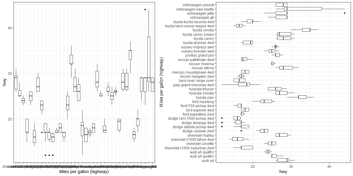
If there is an order in the data that is to be visualised, e.g., as a barplot, showing the data as horizontal bars and sorting values from top to bottom (highest value to lowest) is more intuitive than showing vertical bars with a left-to-right orientation [@Few2004, p. 182]. One common exception to this is where data are to be ordered according to units of time. Time is often visually interpreted as flowing left to right, from past to present to future.
In the case of boxplots, for example, a horizontal orientation allows for a more accurate visual comparison than a vertical orientation, since it is easier for the human eye to follow an imaginary vertical line than an imaginary horizontal line, as can be seen from the figure below. Note, also, that the long x-axis labels are not readable in the panel on the left since they overlap, but they become readable with a horizontal orientation in the panel on the right.
Tables can be an efficient means of visualisation, just like graphics -- and they also can be misleading or cumbersome to read if not properly presented. Tables should in particular be considered for a small number of data points or if precise numbers are to be shown. For example if numbers need to be overlaid on graphics to aid readability and interpretation (for example, appending digits to the end of the bars in a barchart), one might consider omitting the graphic entirely and displaying the numbers as a table.
Tables have design elements just like graphics. Some of them are discussed in the following.
One design element for tables is the layout, i.e., rows and columns. The layout should be chosen actively with the reader in mind. It is generally easier to compare numbers vertically than horizontally.
The number of digits should be consistent within a table row or column (i.e., the same variable) but can differ across variables (e.g., if the table contains small and large numbers). Unnecessary precision should be avoided, a lower number of digits might facilitate reading and comparison.
Numbers should be right-aligned to allow for easy identification of large and small numbers. In this way, large numbers literally stick out.
If table cells contain more than a single value (e.g., means and confidence intervals), it should be considered if there is a better way to display the data for easy reading. Options include splitting the numbers into multiple table cells, rows, or columns, or reducing the font size for the less relevant numbers (e.g., means might be more important than confidence intervals).
Landscape orientation is discouraged unless it cannot be avoided. Rotating a document in order to read a part of it is cumbersome for the reader, whether in print or on screen. Splitting a table into two might be a remedy to avoid landscape orientation -- but one will need to consider whether splitting the table makes important comparisons more difficult to achieve.
Different fonts and colours can be used if these serve a purpose, such as highlighting a particular value. Use of different fonts or colours for decorative purposes is discouraged.