Group 8
Contributors: Brandon Lam, Hamzah Bemat, Jed Rendo Magracia, Talike Bennett
Our group has designed a budgeting app that organizes the user’s income and expenses. For example, subscriptions to services like Netflix and Amazon Prime will be displayed at hand whenever necessary. Users will also be able to link any credit or debit cards to have quick access to their digital finances. Items added to the app can be edited or removed at any time. We have also incorporated additional useful features (such as reminders and personal goals) and created a modern design that users will find visually appealing. With all expenses and sources of income in one place, we hope users will find it easier to organize their finances, analyze spending patterns, pay bills on time, and more.
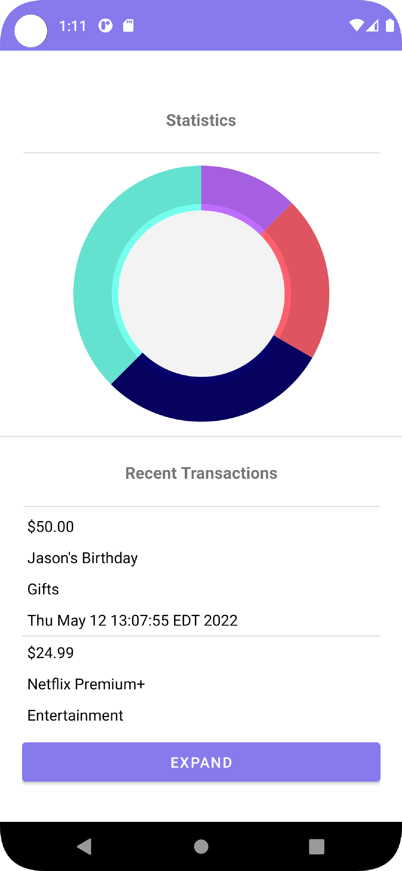
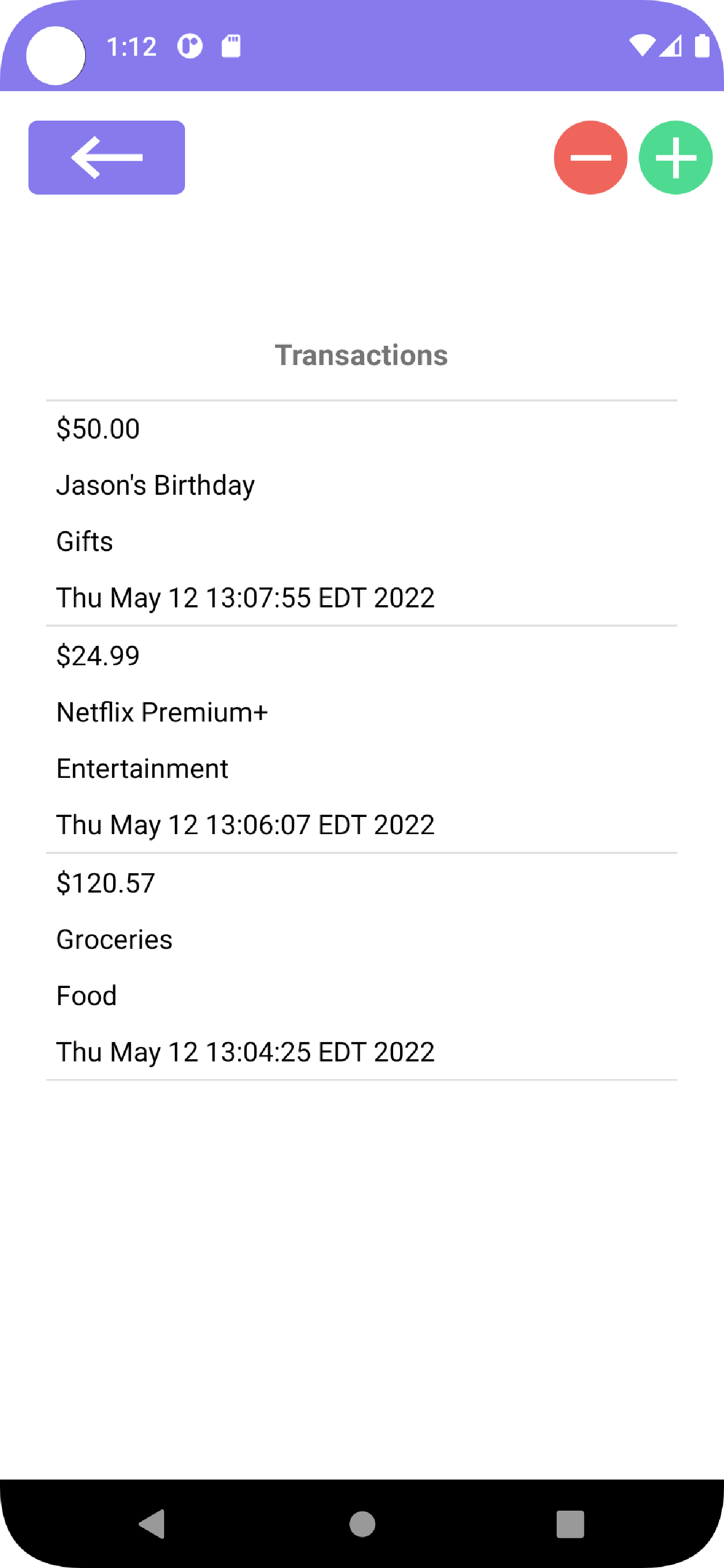
- Spending categories: This feature of the app shows the person where their money goes in different expense categories such as housing, transportation, food, utilities, etc. This will allow a person to understand where their money goes and pinpoint categories where they can reduce spending.
- Irregular expense: This feature shows expenses that may only come around twice a year, once a year, or spontaneously.
- Savings category: This category does not simply show how much money is leftover but also allows the user to create personal categories, such as “House down payment” or “Son College Tuition.” Because of this, they can see how much money is left after regular expenses and determine how much money they want to put into their category choice.
- Track cash use: This is a category where the user is able to note cash spendings. This allows them to be more organized and see where their money goes.
- Goals: This category is somewhat similar to the savings category. Goals category allows the user to create realistic goals such as “Buy a new car in 6 months,” “Buying a house in a year,” or “Kids College Tuition.” This category shows how much time is left and whether you are close to reaching your goals.
- Weekly Reminder: We don’t want the user to simply set everything up and look every month or two weeks or so. Therefore, reminders for regular review will allow users to see where most of their money goes and make any necessary changes as soon as possible. Regular review can also help someone see unnecessary expenses and remove things they barely use.
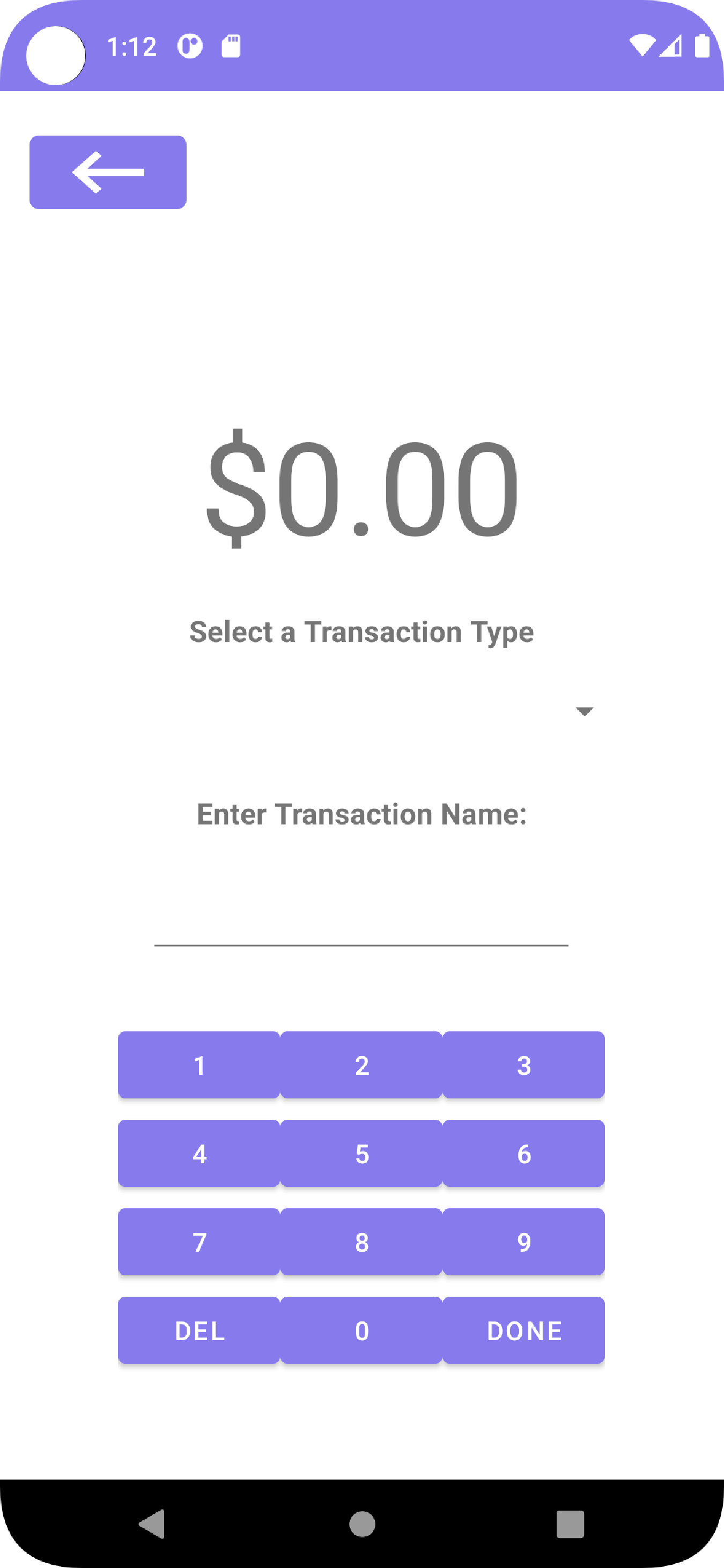
We designed our app to look minimal and modern. Our activity layouts have a simple design so that the user can, at a glance, easily find the information they're looking for. The user interface was made to be responsive and intuitive for the user. There is a smooth and seamless navigation between the different pages and menus in our app. The application has multiple scenes for each of its features. The buttons are rounded rather than sharp as it looks more appealing to the users.
Our group decided that we would need to store transactions and other important data (such as specific information about the transaction themselves) in an SQLite3 database. SQL is a technology that some of the group members are familiar with, so it was a great choice for storing the relevant data that we need. It’s also a bit more secure than a text or CSV file as you can’t easily access the data inside the file.
We designed the app to have a lot of interfaces and classes as a way to keep the code organized and have a separation of concerns when working on developing the application. Having separate classes for the transactions and the summaries made it easier to code as we made sure that the transactions work first before tackling the summary classes.