Improve the layout and design of the coverage columns #394
Conversation
Codecov Report
@@             Coverage Diff              @@
##             master     #394      +/-   ##
============================================
- Coverage     72.74%   71.45%   -1.30%
- Complexity      976      980       +4
============================================
  Files            82       86       +4
  Lines          3632     3713      +81
  Branches        432      436       +4
============================================
+ Hits           2642     2653      +11
- Misses          847      914      +67
- Partials        143      146       +3
Continue to review full report at Codecov.
|
| <j:choose> | ||
| <j:when test="${coverageValue.isPresent()}"> | ||
| <j:set var="displayColors" value="${it.getDisplayColors(job, coverageValue)}"/> | ||
| <j:set var="lineColor" value="${displayColors.getLineColorAsHex()}"/> |
There was a problem hiding this comment.
The intention behind this line is that it is guaranteed that the color of the text is readable on the background color.
With the currently used color palette, this shouldn't be a problem.
I guess this has been removed to make all URLs in the dashboard the same color?
When this line is removed, we have to take care that there are no background colors in use which causes problems with the readability.
There was a problem hiding this comment.
When we set a color then we should use the predefined color variables of Jenkins. Without the color, the links are using the Jenkins default, which should look good in all themes:
| ${coverageText} | ||
| </j:when> | ||
| <j:otherwise> | ||
| <a style="color:${lineColor}" href="${rootURL}/${job.url}lastSuccessfulBuild/${url}">${coverageText}</a> |
There was a problem hiding this comment.
style="color:${lineColor}" can be removed if there should always be the default URL color in use.
There was a problem hiding this comment.
That's right. I just deleted the variable and forgot to remove the reference.
| String cell = div().withClasses(COVERAGE_COLUMN_OUTER).with( | ||
| div().withClasses(COVERAGE_COLUMN_INNER) | ||
| .withStyle(String.format( | ||
| "color:%s; background-image: linear-gradient(90deg, %s %f%%, transparent %f%%);", |
There was a problem hiding this comment.
I think here we have the same problem. The whole UI looks somewhat funny in dark mode (I need to update the datatables CSS as well)
|
Yes, the dark mode needs to be fixed in an additional PR. PS: I did not merge the changes yet since the layout still needs to be improved for small screens. Currently the source code and the tables are only visible by 50% when used on a laptop. I started refactoring the data tables plugin so that superfluous columns will be hidden on small screens automatically. The works quite well already (not yet pushed). Hopefully I find some time next week to improve the source code view for small views as well. I think for those screens it might make sense to restore the old behavior of having a separate view for the source code and one for the table. Or do you have a better idea, @fo-code? |
|
Yes you are right. One option is that we could add an option to hide the integrated source code view, as already done for the coverage charts within the overview. Another option would be to always show the source code view next to the table, but put the focus on the table that it has always its required size - the source code is then only visible on small screens using horizontal scrolling. The most easy option is, that we change only the UI that the source code is shown below the table if the screen is to small to show both cards next to each other in the required size. I think these are approaches which covers every use case and can be integrated quite easily, since the code for opening new tabs already exist. |
Bumps [analysis-pom](https://github.com/jenkinsci/analysis-pom-plugin) from 5.26.0 to 5.28.0.
- [Release notes](https://github.com/jenkinsci/analysis-pom-plugin/releases)
- [Changelog](https://github.com/jenkinsci/analysis-pom-plugin/blob/master/CHANGELOG.md)
- [Commits](jenkinsci/analysis-pom-plugin@v5.26.0...v5.28.0)

---
updated-dependencies:
- dependency-name: org.jvnet.hudson.plugins:analysis-pom
  dependency-type: direct:production
  update-type: version-update:semver-minor
...

Signed-off-by: dependabot[bot] <support@github.com>
Bumps [codingstyle-pom](https://github.com/uhafner/codingstyle-pom) from 2.27.0 to 2.28.0.
- [Release notes](https://github.com/uhafner/codingstyle-pom/releases)
- [Changelog](https://github.com/uhafner/codingstyle-pom/blob/main/CHANGELOG.md)
- [Commits](uhafner/codingstyle-pom@v2.27.0...v2.28.0)

---
updated-dependencies:
- dependency-name: edu.hm.hafner:codingstyle-pom
  dependency-type: direct:production
  update-type: version-update:semver-minor
...

Signed-off-by: dependabot[bot] <support@github.com>
Make the UI views responsive so that the source code is shown on the same page when possible.
…odingstyle-pom-2.28.0' into column-design-improvement
…n.plugins-analysis-pom-5.28.0' into column-design-improvement
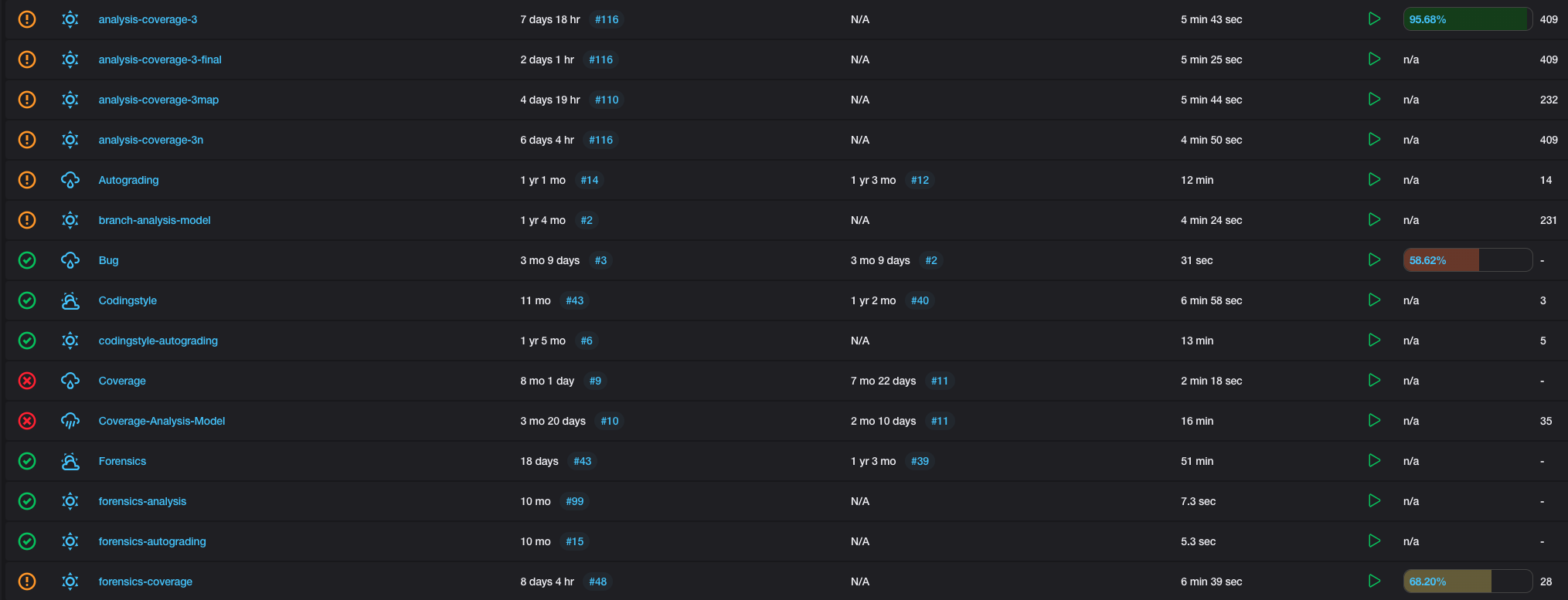
Main table
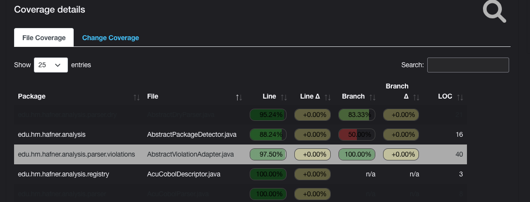
Coverage table