User Stories and Acceptance Criteria by Feature
- Unauthenticated visits are redirected to
/home - Authenticated visits are not redirected to
/home
- There is a demo user button
- Clicking the demo user button logs the user into the demo user account
- Login Button Displays Login / Signup Modal
- Successful login redirects user to
/dashboard - Unsuccessful login displays error message
- Logout button displays for logged-in users
- Clicking logout logs out user and redirects to
/home
- Sign Up Button Displays Login / Signup Modal
- Successful signup creates user, logs in, and redirects to
/dashboard - Unsuccessful signup displays appropriate error messages
- As a logged-in user, I can click a Create button to create a new board.
- As a logged-in user, when I click the Create button I am brought to a form to fill out my board with a title.
- As a logged-in user, I can click the board title on the Board page to edit the Board title.
- Clicking on the background confirms the edit
- Leaving the field blank or only whitespace should restore the old title
- As a logged-in user, I can view my collection of boards via a sidebar navigation area called Boards, according to the wireframe.
- The sidebar navigation link to Boards will display a grid layout of all the boards I have created and that have been shared with me
-
/boardsdisplays a grid view of user boards and shared boards according to the wireframe.
- Board page has a delete button per the wireframe
- Clicking the delete button displays a confirmation modal with delete board and cancel buttons
- Clicking the confirmation button deletes the board.
- Clicking the cancel button does not delete the board.
As a logged-in user, I can use a blank board or choose from a selection of templates to make my board unique.
- The create button exists in the
/boardsper the wireframe. - Clicking the Create button displays the new board form with a title field, the list of jello cubes, and a list of templates, per the wireframe.
- The board cannot be created with a blank or only whitespace title field.
- The selected jello cube avatar is highlighted with its respective highlight color.
- The cancel button closes the form
- Successful creation of the board redirects to the board page.
- The correct lists are displayed on the board view page
- The lists are displayed in the correct order
- Board Page matches wireframe
- There is an Add List button in a list section
- Clicking the Add List button opens a form for the title with confirm and cancel buttons
- Clicking on the background clears and hides the form
- Inputting a title and clicking the confirm button creates the list
- The new list is the last list in the board
- Clicking the confirm button without inputting a title does nothing
- Clicking on the title of a list makes the title editable
- cursor:pointer on hover, with cursor:text on hover while editable.
- Clicking on the background confirms the edit
- If the new title is blank or only whitespace, the old title is displayed and the list is not edited
- A list can be dragged by the title to change the order.
- When dragged, the list tilts slightly and follows the cursor, and a placeholder shape is present in the column that the list will be dropped into if dropped.
- Dropping the list should modify the appropriate columns so that the list order persists on refresh or reload
- A delete button / 'X' icon is present in the top right corner of the list
- Clicking on the button deletes the list
- If the list has cards in it, a confirmation prompt should appear with "confirm delete" and cancel buttons, which should behave as expected.
- By default, the bottom of each list should have a "+" icon and the text "Add a card"
- Clicking the "+ Add a card " button should replace the button with a card text input field, a confirmation button, and a cancel icon.
- Clicking on the background should act as the confirmation if the card has content. Otherwise, no card should be created. The "+ Add a card" button should then be visible.
- The "+ Add a card" button should do nothing if the card is empty.
- The cancel icon should clear the field and deactivate the form. The "+ Add a card" button should then be visible.
- Hovering over a card should display an edit icon pencil on the top right of the card.
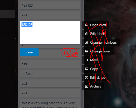
- Clicking the edit icon should open a modal of only the card text input form, a save button, and a delete button. Card content should be pre-populated in the form. The background is darkened.
- Clicking on the background of the modal should cancel the edit.
- Clicking on the save button should save the edit.
- The save button should not do anything if there is no content or only whitespace in the card.
- Clicking the delete button should delete the card.
- The cards for each list are displayed in the list in the correct order on the board view.
- When a logged-in user wants to share the board, they must own the board.
- If the logged-in user does not own the board, the Share button will not be visible to them.
- The Share button will open a modal for the owner of the board.
- After filling out the input field, the logged-in user can submit with a submit button.
- If the input is an invalid email or invalid username, then the Share Modal will deny the submission.
- The Share modal will show an error asking the owner to use a valid email or username to share.
- A logged-in user can view a list of users who have access to the board.
- Each member who has access will display their profile icon.
- For board owner, mouse-over on the user icon should display an 'x' over the user icon.
- For board owner, clicking the user icon should revoke sharing of the board with the user.
- For non-owner users, user cannot revoke access from other users to the board. No mouseover 'x' is displayed, and clicking the icon does nothing.
As a logged-in user, I can read comments for each card in case someone left some feedback or updates regarding the card.
- When a logged-in user clicks on a card, the user can view a list of comments posted underneath a brief description of the card.
- Each comment will include a body, the user, the user’s profile icon, and a date of when they commented.
- If the logged-in user wants to leave a comment, a comment input field will allow for text up to 300 characters.
- Once the user is satisfied with their comment, they can submit their comment with a Save button.
- If the comment input field is empty, the comment input field will display an error asking the user to input a comment with 2 characters or more.
- Hovering over a comment that the user owns should display an edit icon pencil on the top right of the comment.
- Clicking the edit icon should open a modal of only the comment text input form, a save button, and a delete button. Comment text should be pre-populated in the form. The background is darkened. Per the wireframe (attached).
- Clicking on the background of the modal should cancel the edit.
- Clicking on the save button should save the edit.
- The save button should not do anything if there is no content or only whitespace in the card.
- Clicking the delete button should delete the comment.
- Once the edit is saved, the date will show an “(edited)” next to the timestamp.
- User's comments present an 'X' icon, similar to lists.
- If the user does not own the comment, the delete button will not be visible to them.
- Once the user clicks the Delete button, the comment will be removed.