This code:
public static void main(String[] args) {
     XYChart myChart = new XYChart(800, 600);
     myChart.setTitle("Multiple Y axes scale bug");
     myChart.getStyler().setYAxisGroupPosition(0, Styler.YAxisPosition.Left);
     myChart.getStyler().setYAxisGroupPosition(1, Styler.YAxisPosition.Right);
     myChart.setXAxisTitle("x");
     myChart.setYAxisGroupTitle(0, "group zero");
     myChart.setYAxisGroupTitle(1, "group one");

     myChart.addSeries("series on group zero", new double[]{1, 2, 3}, new double[]{4, 5, 6})
             .setYAxisGroup(0);

     myChart.addSeries("series on group one", new double[]{1, 2, 3}, new double[]{-100, -200, -300})
             .setYAxisGroup(1);

     new SwingWrapper<>(myChart).displayChart();
  }
Produces this chart:
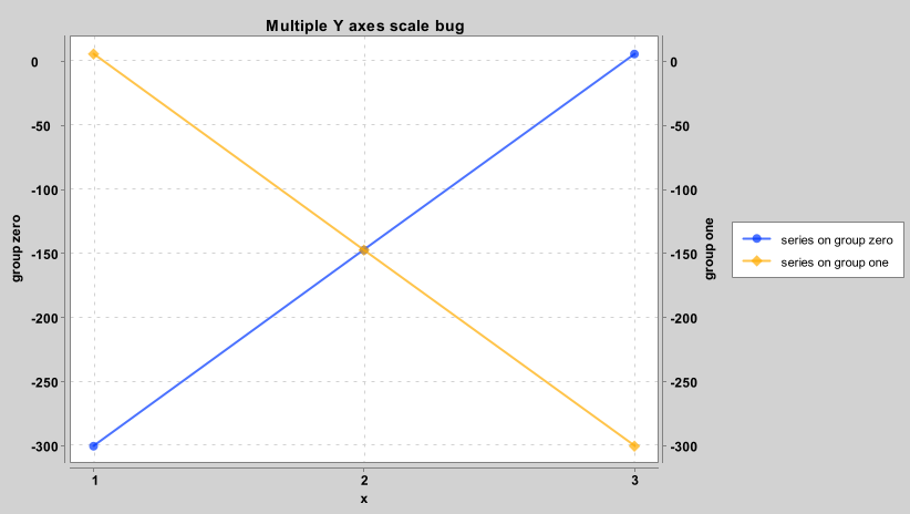
The range of the Y axis on the left (group zero) should be 4 to 6 but actually is 0 to -300.
The expected chart, according to Excel:
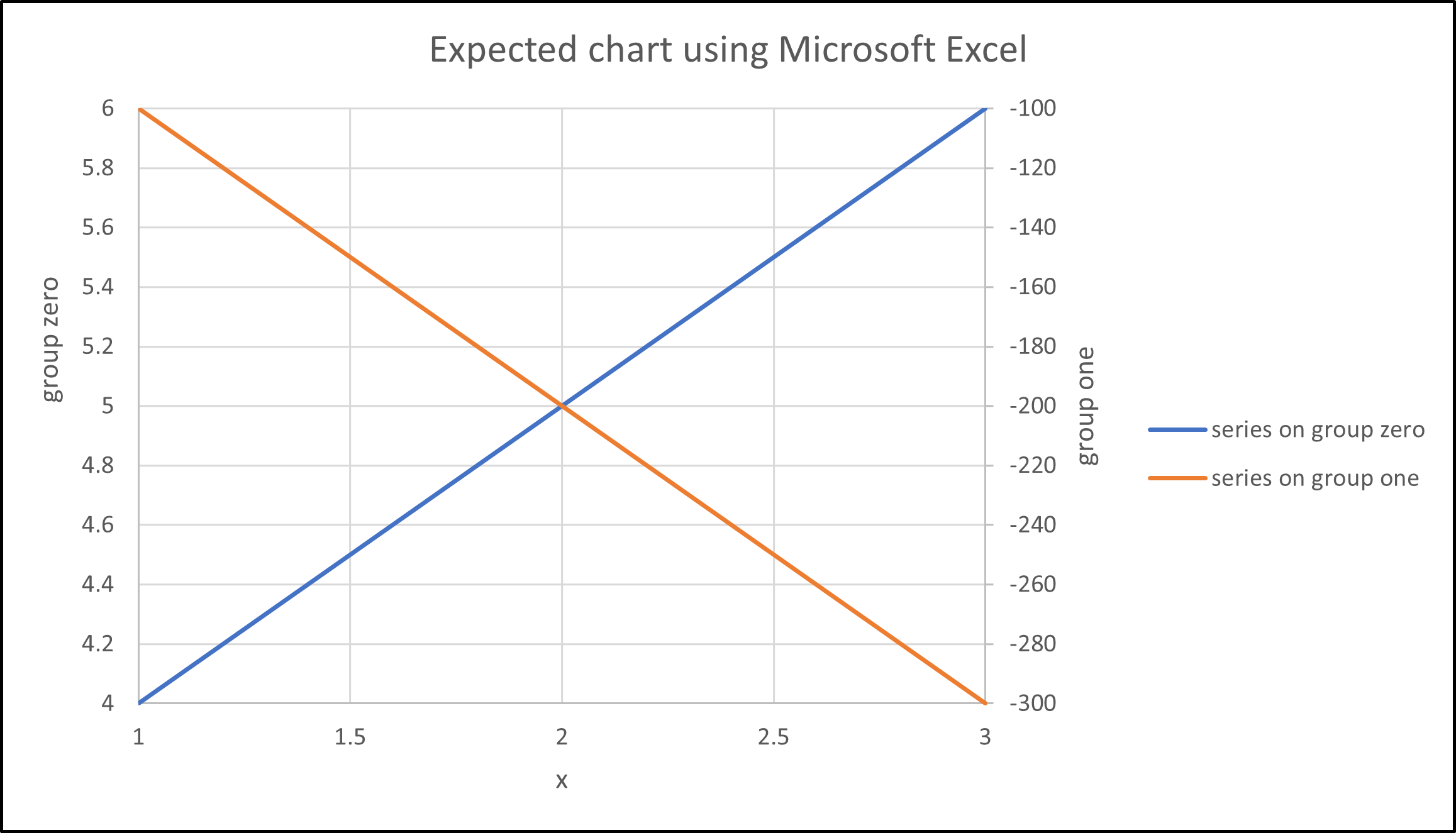
The least interesting Excel file ever: expected chart using Microsoft Excel.xlsx
This code:
Produces this chart:
The range of the Y axis on the left (group zero) should be 4 to 6 but actually is 0 to -300.
The expected chart, according to Excel:
The least interesting Excel file ever: expected chart using Microsoft Excel.xlsx