Conversation
| <StylesProvider injectFirst>{children}</StylesProvider> | ||
| </StyledThemeProvider> | ||
| <EmotionThemeProvider theme={theme()}> | ||
| <StyledThemeProvider theme={theme()}> |
There was a problem hiding this comment.
😭 until we can remove styled from core we will have 3 theming frameworks
| Destructive.args = { | ||
| text: "delete", | ||
| destructive: true, |
There was a problem hiding this comment.
should we call this one "Caution" too, like in button group?
There was a problem hiding this comment.
Reverted back to destructive
| export const Destructive = Template.bind({}); | ||
| Destructive.args = { |
There was a problem hiding this comment.
(couldn't comment on lines where changes weren't made) for "Default" - should we update it to "Primary", like in the button story?
This comment has been minimized.
This comment has been minimized.
|
looks better, can we ship the roboto font change to UIV2 first so we can be sure we're 1:1? edit: opened #683 |
| }); | ||
|
|
||
| export interface ButtonProps | ||
| extends Pick<MuiButtonProps, "disabled" | "endIcon" | "onClick" | "size" | "startIcon" | "type"> { |
There was a problem hiding this comment.
we can drop the size prop i think
|
Rebased off UIV2 with Roboto and using 700 font-weight:
|
|
from what i can tell in figma, neutral hover should be #eff0f2 but it's #cccccc |
3 participants
Description
New designs for buttons. Some colors are inlined into the component here and will be extracted later when we are updating global themes of the application. A subsequent PR will be opened to add icon support.
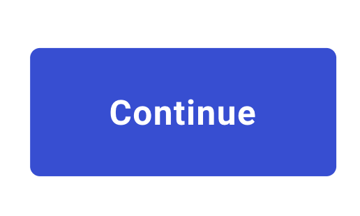
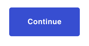
Primary
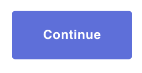
Primary with mouseover
Primary disabled

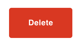
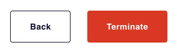
Destructive | Danger
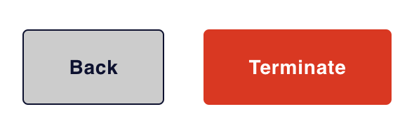
Destructive | Danger with mouseover

Panel
Panel with neutral mouseover
Testing Performed
manual with storybook and local app