PageHeader component draft #60
Conversation
|
cc @mapbox/docs to take a look, for ideas, etc., though you'll need a different implementation. |
|
More of a design concern, but I'd love it if the hamburger menu button and the close menu button were in the same spot. Makes it a little more convenient to use. |
|
@elifitch Thanks for chiming in. We can do that. My concern is that it then puts the logo + sitename in a weird place on the right. Suggestion: if we want the close button on the left, we make the menu open up to the full width of the viewport, extending down only as far as it needs to go. What do you think of that? OR we have the slider slide out beneath the header, instead of on top of it. |
This seems like a nice compromise :) |
In doing this, do you imagine that the hamburger menu icon will animate or fade into the cc: @angel |
|
Also, question related to the |
|
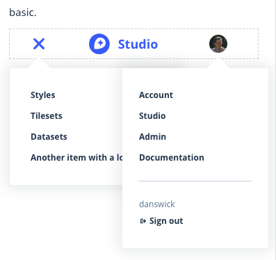
Could we have the user be a part of the menu then the menu can be back on the right hand side and the logo can stay on the left, and nothing has to move? |
|
Initial version will have no animation, unless @mapbox/accounts or @mapbox/studio has the opportunity to contribute that feature. Animation can always be added later. User menu will be a dropdown, as it is now, rather than a (non-sliding) slider. This way it can work essentially the same on desktop and mobile. Idea: the app menu could also be a dropdown. That could provide some nice symmetry between the two menus. If you click outside one of the menus, it should close. So if you have the user menu open and you click the app menu trigger, the user menu should close.
I don't think so, unless we were to scratch the user menu idea. The user menu is a standalone piece that @mapbox/frontend-platform will maintain. I don't know of a technically reasonable way for us to blend that into the subdomain-specific menus for apps and docs. |
|
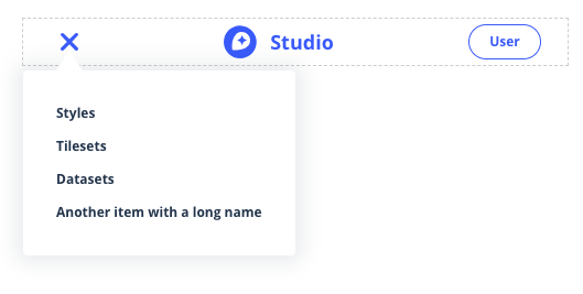
I made some tweaks based on the discussion in this ticket and would love feedback from folks. The biggest change was moving to a simple dropdown from a non-sliding slider per #60 (comment). I tried to make it look as much like the user menu as possible without going full pointy-popover and I'm not sure if it works well or if it's weird.
|
|
@danswick Positioning looks good. I think it needs more work to match the existing dropdowns. I can tell it lacks the triangle and the padding of the existing dropdowns. Maybe that's it? |
|
Thanks for the feedback, @davidtheclark. The latest commit adds a dynamically-positioned pointer triangle, updates padding to match that of the other dropdowns in the existing page shell, and cleans up some CSS nonsense from my previous commit.
|
|
@danswick looks like good progress. A couple of more visual points before we look at the code:
|
|
Pointer and spacing should be pretty close now, @davidtheclark. For the vertical position, I made a temporary change to initialize the user menu and compared the two. |
 davidtheclark
left a comment
davidtheclark
left a comment
davidtheclark
left a comment
There was a problem hiding this comment.
Good progress here. I looked at the code and the demo. The demo looks good and works, so we're on the right track.
| }); | ||
|
|
||
| return ( | ||
| <div className="limiter flex-parent-mm flex-parent--center-cross"> |
There was a problem hiding this comment.
flex-parent-mm could just flex-parent, I think.
| style={{ width: 66 }} | ||
| className="flex-child py6 round-full border color-blue txt-bold align-center txt-s" | ||
| > | ||
| User |
There was a problem hiding this comment.
I don't think we want this placeholder.
| <div | ||
| id="mbx-user-menu" | ||
| style={{ width: 66 }} | ||
| className="flex-child py6 round-full border color-blue txt-bold align-center txt-s" |
There was a problem hiding this comment.
None of these are necessar except flex-chidl, right?
| } | ||
|
|
||
| closeOnDocumentClick = event => { | ||
| // Close the popup if the target is me |
| // Close the popup if the target is me | ||
| if ( | ||
| this.state.open && | ||
| event.target instanceof Node && |
There was a problem hiding this comment.
Can we remove this line? I think @jseppi only included it in user menu code to please Flow.
| render() { | ||
| return ( | ||
| <div className="relative"> | ||
| <div className="limiter flex-parent flex-parent--center-cross flex-parent--space-between-main"> |
There was a problem hiding this comment.
Re flex-parent--space-between-main: We'll want to change the positioning so the logo & name is left-aligned, matching the recent move in the docs-page-shell.
| className="flex-child py6 round-full border color-blue txt-bold align-center txt-s" | ||
| > | ||
| User | ||
| </div> |
There was a problem hiding this comment.
Some comments on this element as above.
| if ( | ||
| this.state.open && | ||
| event.target instanceof Node && | ||
| !this.node.contains(event.target) |
There was a problem hiding this comment.
If this.node is the <button> node, doesn't that mean the menu will close when you click inside it (but maybe not on a link)?
I think we have the following requirements when the menu is open:
- If you click on a link in the menu, it closes.
- If you click the trigger, it closes.
- If you click outside the menu, it closes.
- If you click inside the menu but not on a link (e.g. you miss and hit some anodyne whitespace), it does not close.
| }, | ||
| { | ||
| href: '/foo', | ||
| text: 'Another item with a long name' |
There was a problem hiding this comment.
Let's cut this because it doesn't match a real use case. These names kind of need to be shortish. Instead, it would be good to test the width limits of this by trying the longer menu from Account Dashboard.
| return ( | ||
| <div | ||
| id="mobile-menu-container" | ||
| className="absolute left shadow-darken10-bold bg-white round" |
There was a problem hiding this comment.
Let's offset this from the left side just a little bit — 10 pixels, like the user menu body.
|
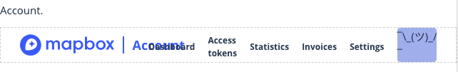
After adding a new test case for Accounts, it looks like we may need to consider some design options in order to make things fit. The following screenshots are taking with page width set to 640 pixels, the cutoff for our mobile breakpoint (note that the plain component doesn't actually have a visual user menu element, so I added a silly blue box to help you visualize the spacing):
For reference, the full complement of Nav items starts to look normal at around 880 pixels wide: Some ideasHere are some things we could try to make more room:
@mapbox/accounts @angel - would you mind chiming in with your reactions, feedback, and preferences for how we might better fit these items into the Account nav? |
|
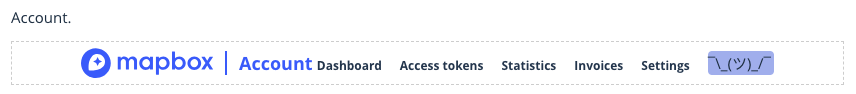
I vote for 2. Since we cut that off on mobile anyways, I think it would be ok to cut if off a little earlier, but I like have the links still available at the larger screen size to tap easily. |
| <nav className="flex-child flex-child--grow flex-parent flex-parent--center-cross flex-parent--end-main txt-bold txt-s mt6"> | ||
| {itemEls} | ||
| </nav> | ||
| <div id="mbx-user-menu" style={{ width: 66 }} className="flex-child" /> |
There was a problem hiding this comment.
This needs flex-child--no-shrink to ensure it's never narrower than 66px.
I noticed it got shrunk on one of the screenshots you posted.
|
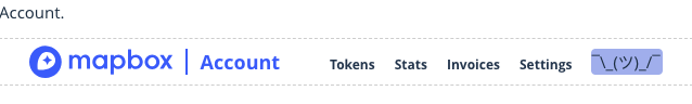
Thanks, @angel! How do you feel about dropping "Dashboard" and relying on the blue "Account" link to get users back to the main account page? If we dynamically remove "mapbox," this is as cramped as it gets:
followed by:
and then the most cramped before going mobile hamburger:
edit: also wanted to note that users will have another link back to their main account page from the user menu! edit2: after some rigorous IRL breakpoint testing with @angel, we came up with the following mix of:
The gif is a bit jumpy, but "Dashboards" never gets closer than about 15 pixels to "Account." |


davidtheclark
left a comment
davidtheclark
left a comment
There was a problem hiding this comment.
Looks like there are some z-index problems:
Also: I can't seem to open the mobile nav on the second example (Account).
| test('renders as expected', () => { | ||
| const wrapper = shallow( | ||
| React.createElement(testCase.component, testCase.props) | ||
| ); |
There was a problem hiding this comment.
Let's be as consistent as possible within a file about whether we create the wrapper in the beforeEach hook or in the test block.
| <div | ||
| id="mobile-menu-container" | ||
| className="absolute left shadow-darken10-bold bg-white round" | ||
| style={{ top: '56px', marginLeft: MOBILE_NAV_MENU_OFFSET_LEFT }} |
There was a problem hiding this comment.
Where does the magic number 56 come from? Can we make it a named constant?
| </div> | ||
| <div | ||
| id="mbx-user-menu-mobile" | ||
| style={{ width: 66 }} |
There was a problem hiding this comment.
Let's make this magic 66 a named constant, too.
| <div className="limiter flex-parent flex-parent--center-cross"> | ||
| <div className="flex-child flex-child--no-shrink flex-parent flex-parent--center-cross"> | ||
| <a | ||
| className="flex-child mb-logo wmax180-mxl wmax30-mm" |
There was a problem hiding this comment.
Can wmax30-mm be wmax30, to simplify things?
| </div> | ||
| </div> | ||
|
|
||
| <nav className="flex-child flex-child--grow flex-parent flex-parent--center-cross flex-parent--end-main txt-bold txt-s mt6"> |
There was a problem hiding this comment.
What is mt6 for? It looks to me like it throws off the vertical centering.
There was a problem hiding this comment.
I think it looks kind of weird to have different sizes of text vertically centered, so I aligned their baselines instead (tho I'm sure there's a better way to do it than with hardcoded margins). Though I guess everything else in the page shell is centered vertically and my stance on the issue isn't super strong, so I can change it back.

There was a problem hiding this comment.
I'm fine with whatever @angel and @mapbox/studio want. And if there's solid consensus we should implement the same alignment in docs-page-shell.
There was a problem hiding this comment.
I'm a fan of center alignment cause it would also be centered to the logo, button, and avatar, but can do this way if Studio feels more strongly about it.
There was a problem hiding this comment.
sounds good. switching back to centered text 👍
|
@davidtheclark I don't think we can have two functional test cases at the same time without reworking some aspects of the component. Because there are multiple components rendered on the same page, there are two popup triggers with the same ID, so |
|
@danswick The document-wide click event listener that causes the closing is currently added when the whole header mounts, removed when it unmounts. What if, instead, it was added only after the menu opened, then removed after the menu closed? This would also prevent there from being an unnecessary click handler attached to the document at all times. |
|
Another point to address would be to use a different element attribute instead of ID. It's true that this point wouldn't be worth spending too much time on because it isn't realistic. We could have just one test cases that pushes the limits. |
|
Ok! I think I got everything in here:
Going to merge, though I'm a bit disappointed we didn't hit 50 comments. |
5 participants
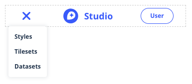
Draft component for a shareable page header. I want to confirm the appearance with anyone interested before finishing it off with tests and documentation. I'm imagining this will be used in apps owned by @mapbox/studio and @mapbox/accounts. Please share your ideas about how this looks and works, here or in chat!
Here's what you get:
href="/").-mmbreakpoint, non-mobile header shows above that.Pictures:
cc @mapbox/frontend @mapbox/frontend-platform