
A React component library for creating diamond-shaped containers with lazy-loaded images and customizable styles.


- Installation
- Usage
- Customization
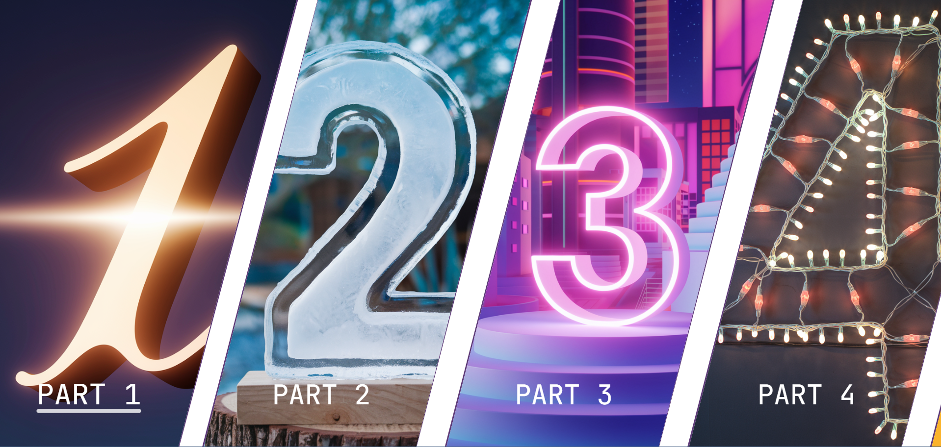
- Demo
- Notes
yarn add react-diamond@lastest| Property | Type | Description | Default |
|---|---|---|---|
items |
Array<DiamondItem> |
Array of items to display in the diamond containers | [] |
| Property | Type | Description |
|---|---|---|
title |
string |
Title of the item |
onClick |
function |
Function to call when the item is clicked |
image |
string |
URL of the image to display |
You can customize the appearance of the diamond containers using CSS variables:
| Variable | Description |
|---|---|
--borderColorDiamond |
Color of the diamond border |
--textColorDiamond |
Color of the text |
--backgroundColorDiamond |
Background color behind the images |
import React from "react";
import Diamond from "react-diamond-container";
import img1 from "path/to/img1.png";
import img2 from "path/to/img2.png";

const items = [
  {
    title: "Part 1",
    onClick() {
      alert("Part 1 clicked");
    },
    image: img1,
  },
  {
    title: "Part 2",
    onClick() {
      alert("Part 2 clicked");
    },
    image: img2,
  },
  // Add more items as needed
];

const App = () => (
  <div
    style={{
      "--borderColorDiamond": "#5e3a78",
      "--textColorDiamond": "#ffffff",
      "--backgroundColorDiamond": "#000000",
    }}
  >
    <Diamond items={items} />
  </div>
);

export default App;
Tip: For a better experience, if you want the component in full screen, deactivate the scroll bar.
body {
  overflow: auto;
}

/* Firefox */
@supports (-moz-appearance: none) {
  body {
    scrollbar-width: none;
  }
}

/* WebKit (Chrome, Safari) */
@media screen and (-webkit-min-device-pixel-ratio: 0) {
  body::-webkit-scrollbar {
    width: 0;
  }
}
Tip: Add this link to your index.html for the font family.
<link
  href="https://fonts.googleapis.com/css?family=JetBrains Mono"
  rel="stylesheet"
/>Check out the demo to see the component in action. You can fount the code source at template
- The library is available only for React.
- The layout changes from horizontal to vertical on mobile devices.
- Single item layouts are also supported.
- Images are lazy-loaded for performance optimization.
- Continuous improvements and updates are being made.