navigation
Muximux supports five navigation layouts. You can switch between them at any time in the Settings panel or by editing config.yaml directly.
| Left Sidebar | Top Bar | Bottom Bar |
|---|---|---|
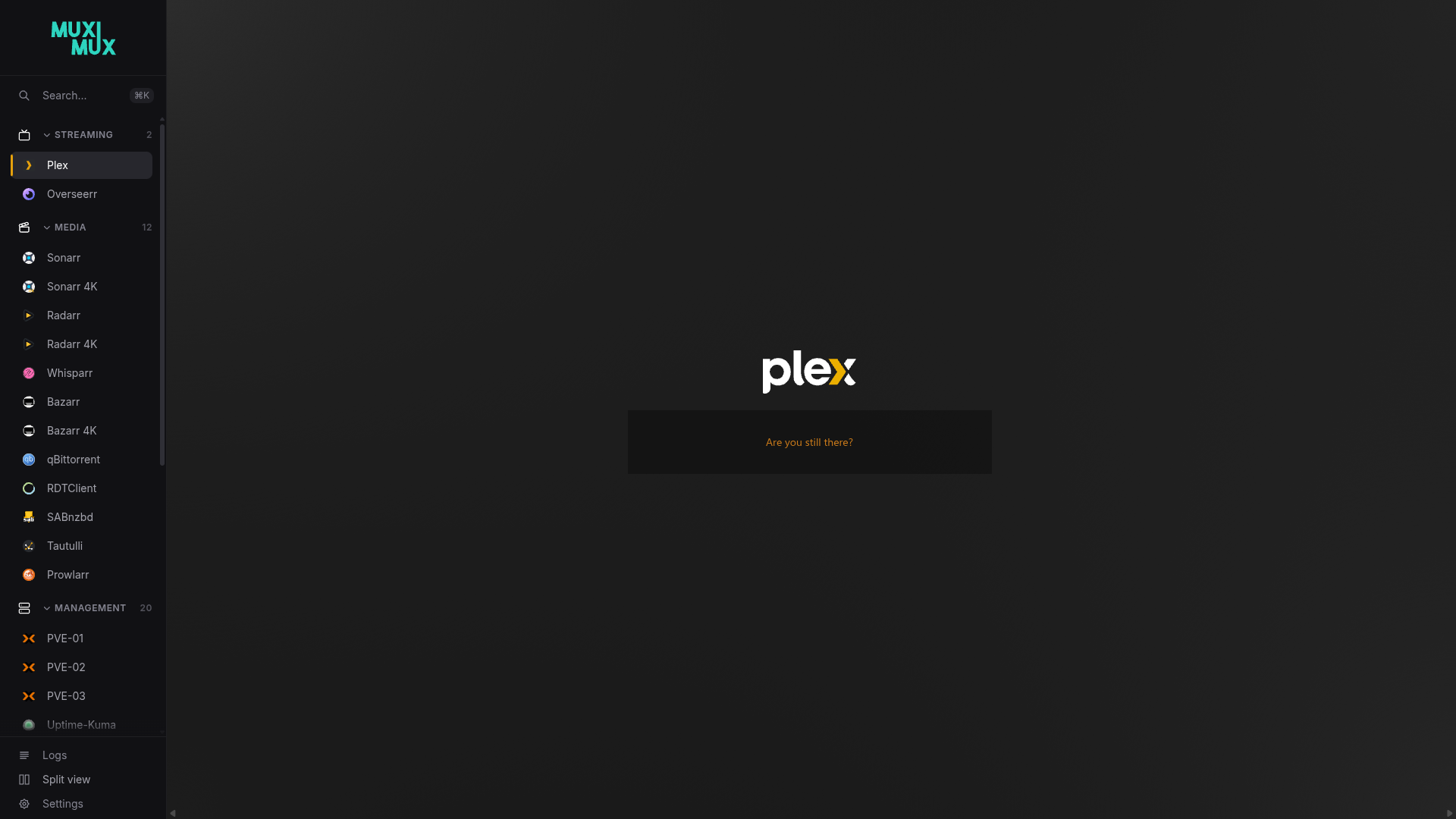 |
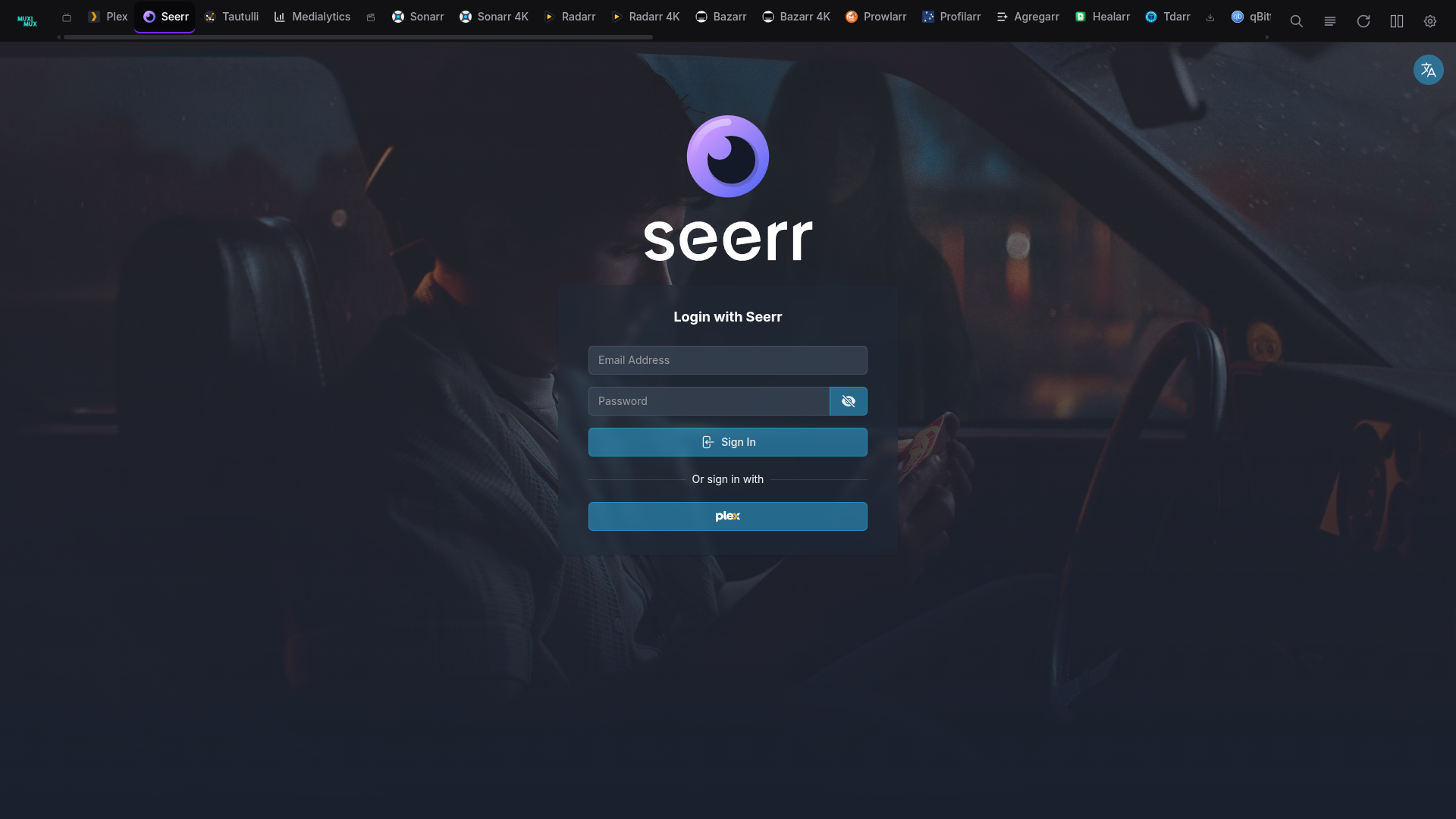 |
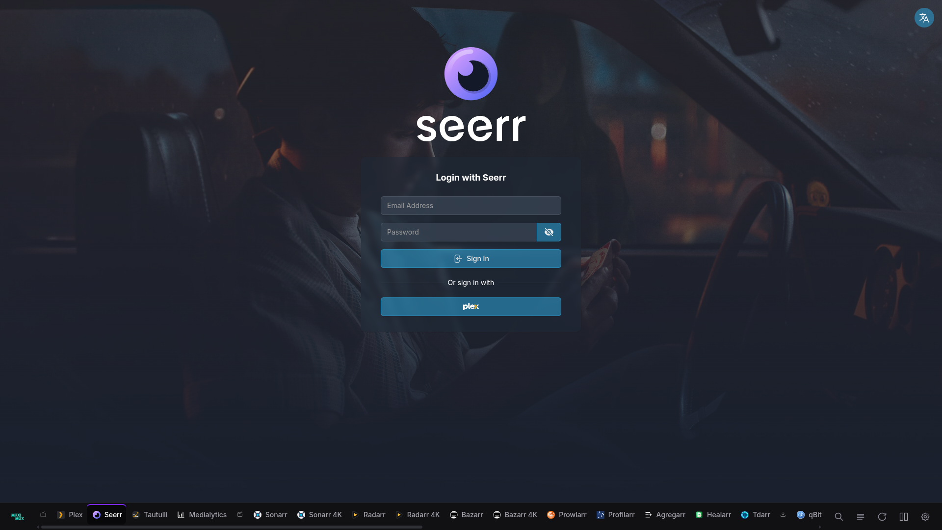 |
| Floating | Right Sidebar |
|---|---|
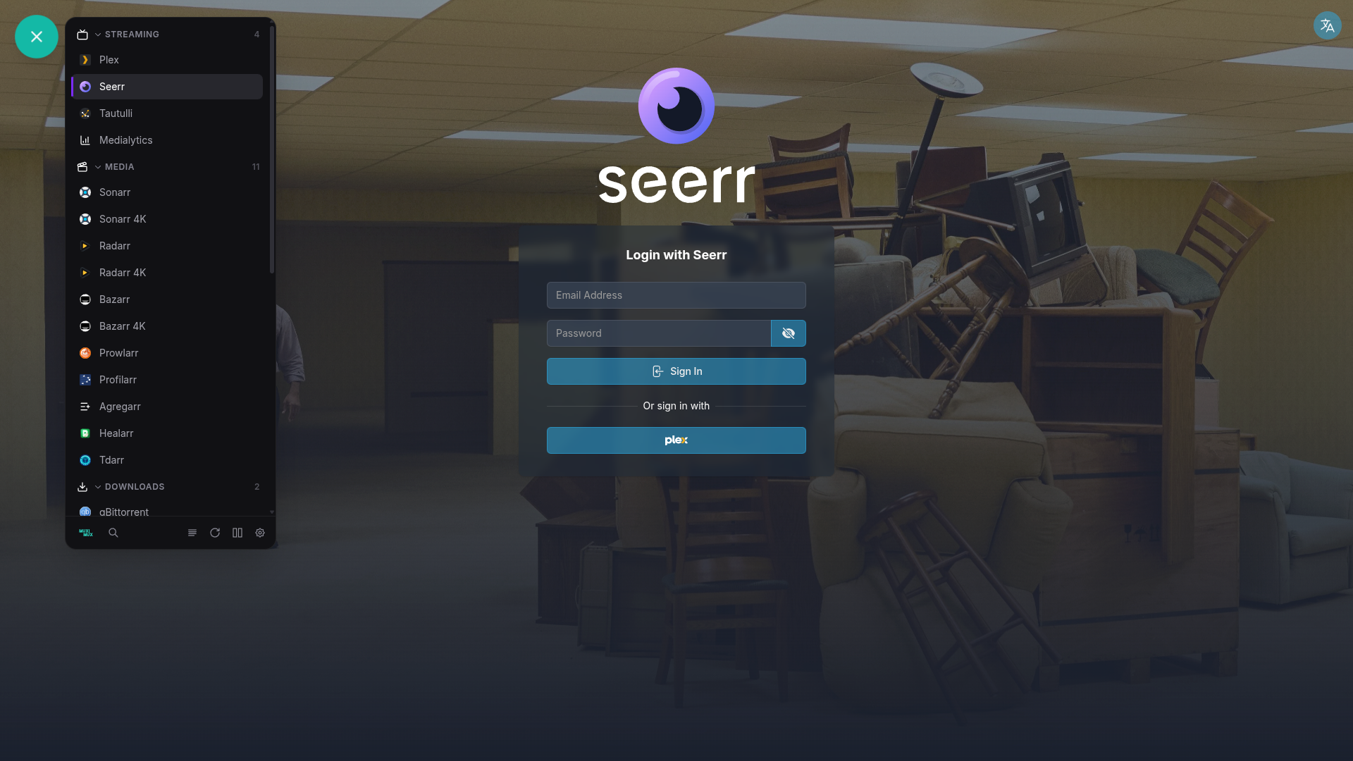 |
 |
Horizontal bar across the top of the screen. Apps are shown as icons with optional labels below. This layout works well on wide screens with many apps, as the full width is available for app icons.
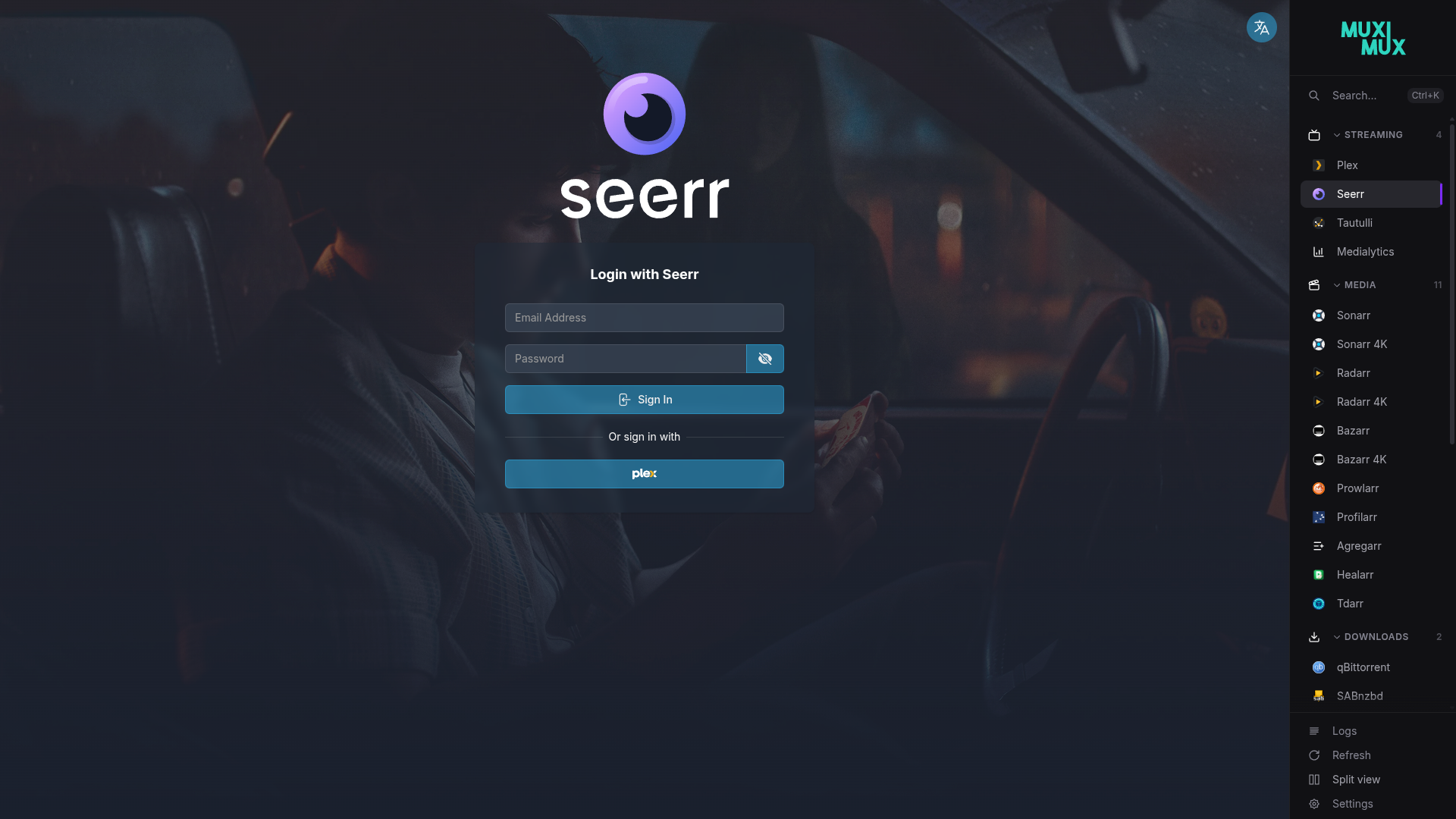
Vertical sidebar on the left side of the screen. This is the classic dashboard layout. The sidebar width is configurable.
Vertical sidebar on the right side of the screen. A mirror of the left layout, useful if you prefer navigation on the right.
Horizontal bar across the bottom of the screen. Same layout as the top bar, just anchored to the bottom edge.
A floating action button (FAB) that opens a popover panel with your apps organized by group. This option maximizes the screen space available to your apps since nothing is visible until you tap the button. The FAB can be dragged to any position on the screen - its location is saved per browser in localStorage. The floating_position config option (bottom-right, bottom-left, top-right, top-left) sets the default corner for first-time visitors. Double-click the FAB to snap it back to its configured corner.
When using top or bottom navigation, you can choose between two bar styles:
Apps are organized under collapsible group headers. Each group has its own section with the group name displayed above its apps. This is the standard layout and works well when you have many apps organized into distinct categories.
A streamlined layout that displays all apps in a single continuous row. Groups are separated by small icon dividers (using the group's configured icon) rather than full headers. This creates a more compact, dock-like appearance and is useful when you want to maximize horizontal space or prefer a cleaner look.
navigation:
  position: top
  bar_style: flat    # grouped (default) or flat
The flat style only applies to top and bottom bars. Left, right, and floating navigation always use the grouped layout with collapsible sections.
All navigation settings are available in config.yaml under the navigation key:
navigation:
  position: top              # top, left, right, bottom, floating
  width: 220px               # Sidebar width (for left/right/floating)
  auto_hide: false            # Hide navigation after inactivity
  auto_hide_delay: 0.5s       # Delay before hiding (when auto_hide is true)
  show_on_hover: true         # Show hidden nav on mouse hover
  show_labels: true           # Display app names under/beside icons
  show_logo: true             # Show Muximux logo in navigation
  show_app_colors: true       # Tint app icons with their configured color
  show_icon_background: false # Show circular background behind icons
  show_splash_on_startup: false # Show splash screen on initial load
  show_shadow: true           # Add drop shadow to navigation bar
  bar_style: grouped          # grouped or flat (top/bottom only)
  icon_scale: 1.0             # Scale factor for navigation icons (default: 1.0)
  floating_position: bottom-right # Default FAB corner (bottom-right, bottom-left, top-right, top-left); user can drag to any position
hide_sidebar_footer: false # Hide the footer section in left/right sidebarsWhen show_labels is false on left or right sidebars, the sidebar collapses to a narrow icon strip. In this mode, the footer automatically uses a drawer pattern:
- A cogwheel icon appears at the bottom of the sidebar.
- Hover over it to expand the sidebar and reveal a drawer with all footer actions (Logs, Refresh, Split View, Sign Out, Settings) and their labels.
- The drawer closes when the mouse leaves the sidebar.
This ensures all controls remain accessible regardless of whether labels are visible or hidden.
The navigation bar includes inline split view controls on all five positions. When split view is off, a single icon enables it. When split view is active, the controls expand to show orientation toggle, panel selector arrows, and a close button - all within the existing button row.
See the Split View page for full documentation.
The Overview and Logs buttons in the navigation bar act as toggles. Clicking the logs button while viewing an app opens the log viewer. Clicking it again returns to the app you were viewing. The overview button works the same way - click to see the overview, click again to return to your app.
When auto_hide is set to true:
- The navigation starts collapsed on page load, so it doesn't sit open until you happen to mouse over and then leave it. (If your cursor is already over the navigation area when the page loads, it reveals immediately.)
- The navigation bar hides itself after
auto_hide_delayof no mouse activity near the navigation area. - Move your mouse to the navigation edge of the screen to reveal it again (when
show_on_hoveristrue). - The floating position always overlays content regardless of visibility state. The other positions (top, left, right, bottom) reclaim the screen space when the navigation is hidden, giving your apps more room.
Toggling auto_hide in Settings during a session does not retroactively collapse the navigation you are currently using; the start-collapsed behavior applies on the next page load.
With navigation.dynamic_tab_branding: true (Settings -> General -> "Dynamic tab title and icon", off by default), the browser tab reflects the app you are viewing: the tab title becomes <App Name> - <dashboard title> and the tab icon becomes that app's icon, so a Muximux tab is recognisable among many. The overview, logs, and settings views restore the dashboard's own title and icon. In split view, the focused panel drives the tab.
Notes:
- If your dashboard title template already contains
%title%, the template output is used as-is (the app name is not prefixed twice). - Monochrome lucide icons are tinted with the app's colour so they stay visible on dark tab strips. Apps without an icon keep the Muximux favicon.
On small screens (below 640px), Muximux automatically switches to the floating navigation regardless of your configured position. This provides a clean mobile experience with a FAB button in the bottom-right corner that opens the full app list as a popover panel. Your configured position is preserved in settings and takes effect again on wider viewports.
Swipe left or right on the main content area to switch between apps.
Every navigation setting can be changed in the Settings panel with an immediate preview. Changes take effect instantly -- no page reload or restart is needed. This makes it easy to experiment with different layouts and find the one that works best for your setup.