Larger Extension Editor preview #136986
Description
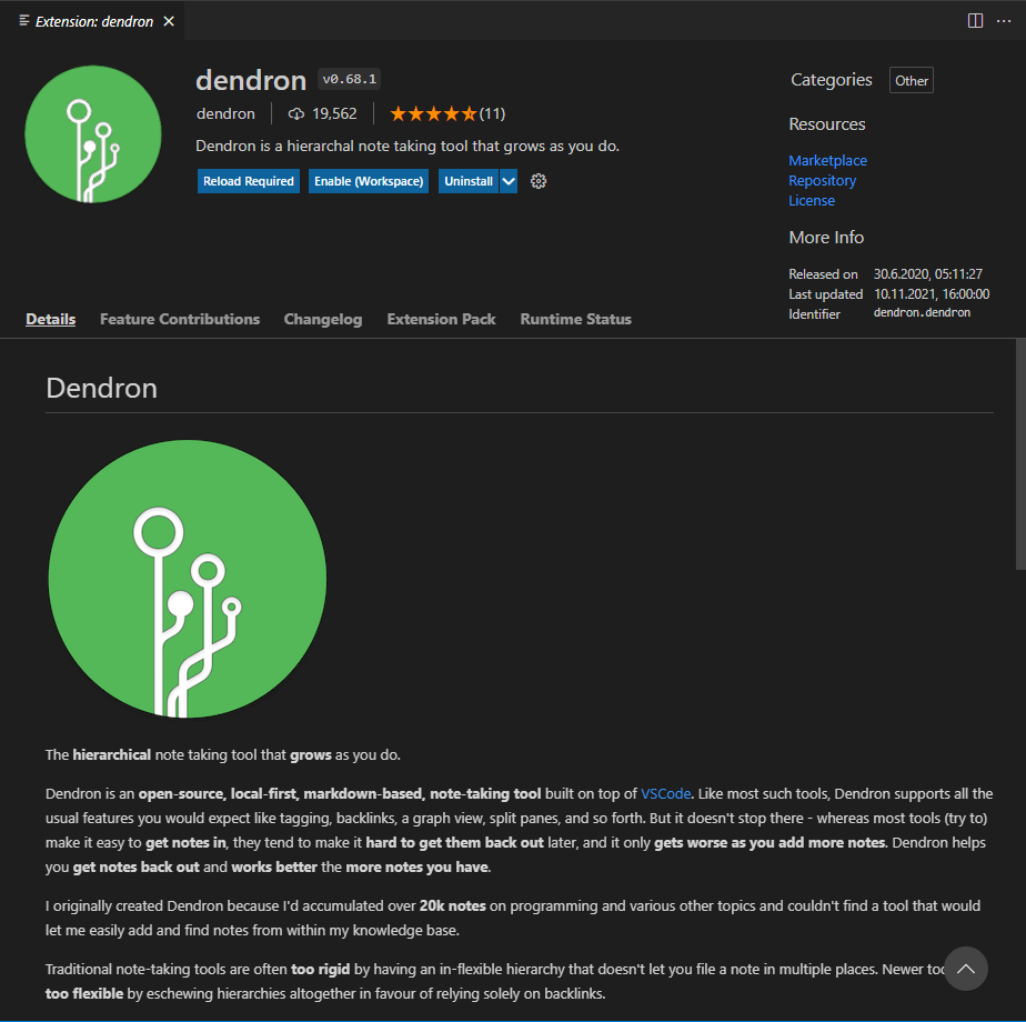
The extension preview features a very space wasting side panel that contains very little information given the space it occupies and could easily fit to the right side of the header. This would leave much more room to the IFrame rendering the extension's readme/description which often is too narrow -- for people not having a HD/Retina monitor, a monitor under 2K (i.e me) or with screen scaling enabled. So consider this an a11y feature as well.
Here's a simple mock-up of how this could look like instead:
The header being a flex container would then have three flex children. The following flex values seemed reasonable when I tried this in the dev-tools:
.icon-container: flex:1
.details: flex: 4
.additional-details-container: flex: 1 (the new one, originally from the right side of .content)
Then .content > .details would no longer require to be a flex container for the lack of useful child elements. It appears .readme-container's only purpose was to move the sidebar to the right.
Thanks for considering.