UI enhanceent: allow switching of Request & Response panes from top/bottom to side-by-side layout #143
Description
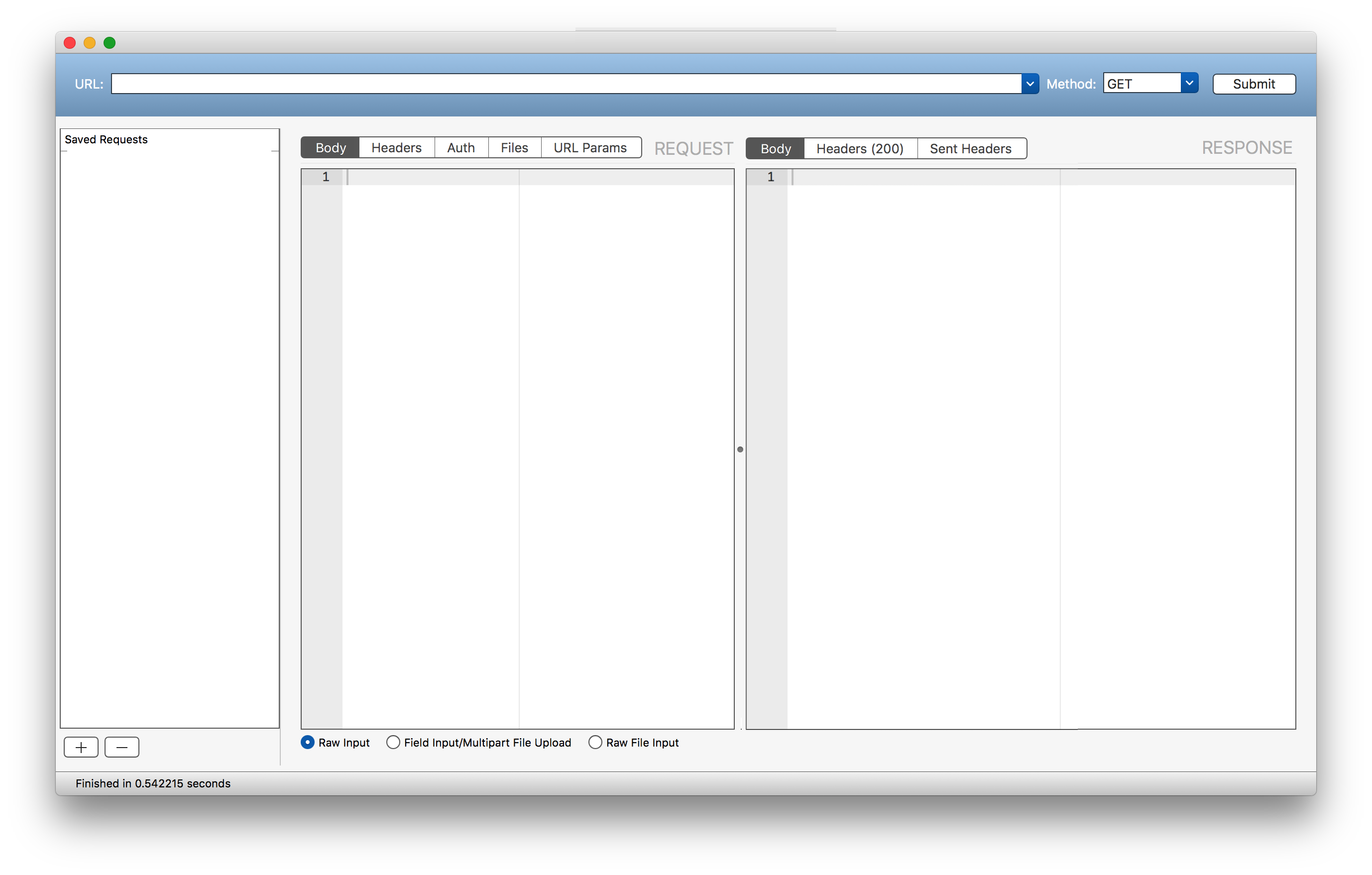
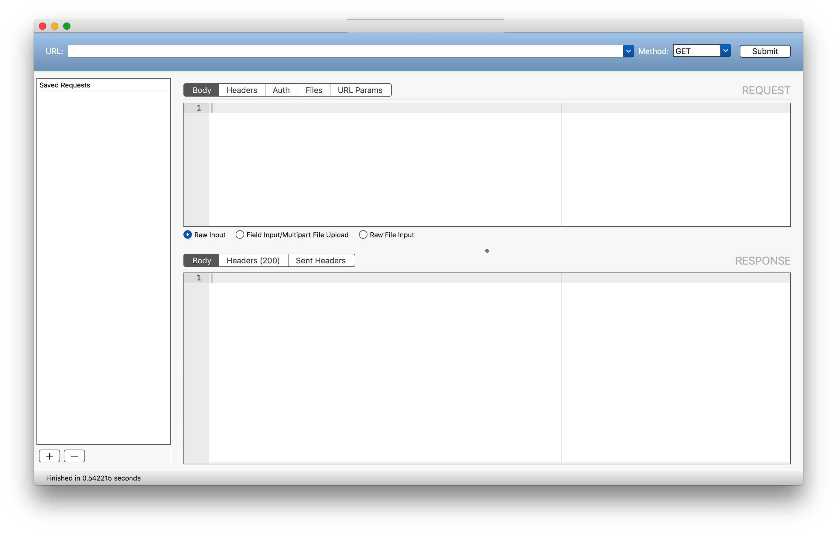
Depending on the contents of requests & responses and the computer display, it may be more efficient to have both panes side by side instead of request data on top of response data. Especially if you get responses with lots of short XML/JSON lines and work on a modern 16:9 screen, taller text fields would ease browsing a lot.
Please add an option to switch between both layouts, preferably not in prefs pane but as a hotkey and a button in the UI, so it can be easily used on the fly.