[feat]: The visualisation of uptime chart needs to be improved #621
Description
Bug description
The uptime chart Y axis shows the time elapsed since the last restart and the current format is unreadable.
We should improve the unit display for also all such charts that are related to uptime.
Additionally, the default grouping for the uptime chart needs to be "By node" as averaging the uptime of multiple nodes makes absolutely no sense.
Expected behavior
- The Y axis should show time in a more readable format (may be just show days on the Y axis and when scrolling on the chart show the actual time as well) - @cakrit and @christophidesp and ideas?
- The grouping for the uptime chart should be by Node by default
Steps to reproduce
- Open the Overview tab and look at the uptime chart
Screenshots
Change default visualisation from this:
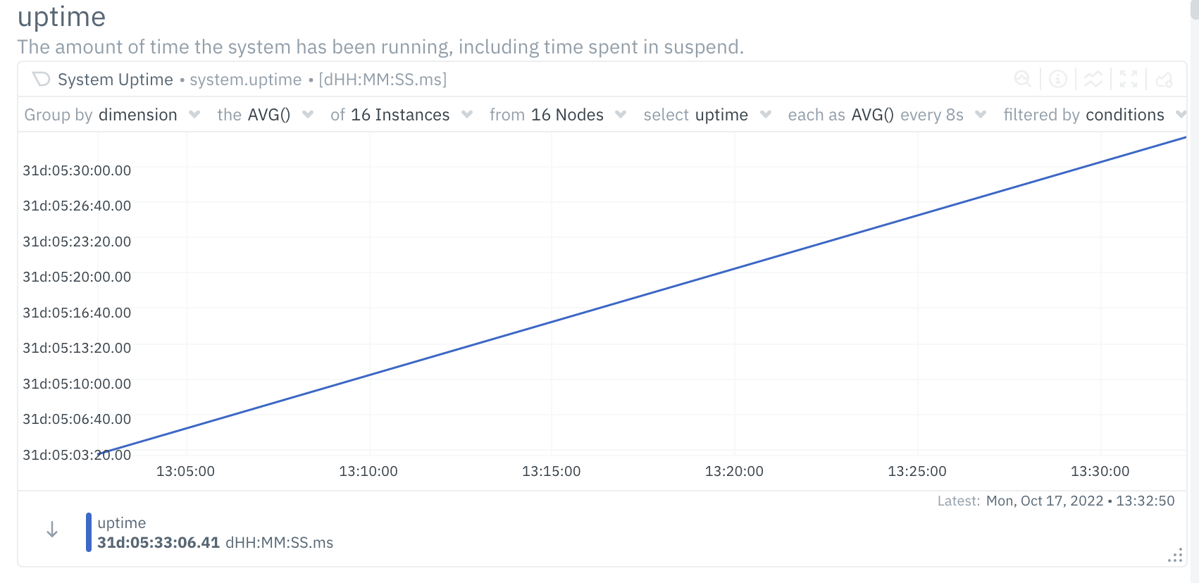
to:

And improve the units on the Y axis
Error Logs
No response
Desktop
OS: [e.g. iOS]
Browser [e.g. chrome, safari]
Browser Version [e.g. 22]
Additional context
No response