Show transparent contact photo on a lighter background#1415
Conversation
Codecov Report
@@           Coverage Diff           @@
##           master    #1415   +/-   ##
=======================================
  Coverage   62.31%   62.31%
=======================================
  Files           4        4
  Lines          69       69
=======================================
  Hits           43       43
  Misses         26       26
Continue to review full report at Codecov.
|

|
Very cool @hanzi! Would this also fix it for the Mail app, as we have the same issue there: nextcloud/mail#1821 Possibly should be in the Vue component as well? @juliushaertl @skjnldsv @ChristophWurst, and cc @gary-kim as you were active in the issue too |
| <div class="contact-header-avatar__background" @click="toggleModal" /> | ||
| <div v-if="contact.photo" | ||
| :style="{ 'backgroundImage': `url(${contact.photoUrl})` }" | ||
| :style="{ 'backgroundImage': `url(${contact.photoUrl})`, 'backgroundColor': 'rgba(255, 255, 255, 0.8)' }" |
There was a problem hiding this comment.
Just use #fff here, since it looks weird with the color still shining through. :) Also we don’t need to theme it because with dark mode, the backgrounds of these images should still be white.
There was a problem hiding this comment.
I've changed it now, though I liked the old style a bit better. Made the contrast seem less harsh.
|
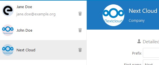
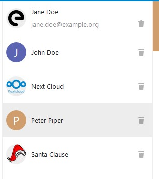
@jancborchardt On second thought, you were probably referring to the contacts list and not the title bar of the details area (which is the code you've annotated.) I've given this some thought beforehand: Making the background transparent/white at the very least makes the list look less structured. But it starts looking really weird and confusing when an irregularly shaped avatar gets cropped in a circle shape: (see Santa's photo)
So as an alternative, I tried setting it to
But to me, this also looks a bit dull, so the current version was actually my favourite:
|
|
Here's another one, using
|
|
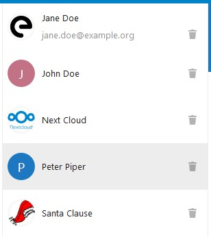
This screenshot with white background actually looks best by far. :) It does not interfere with the icons and avatars, especially not with the color generated from our placeholder, which does not have anything to do with the actual avatars. 👍 |
|
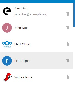
I still prefer the last one I posted, with the very light grey background. Reason being (as I said before) that this way it feels less 'broken' when a transparent image (such as Santa's hat in my example) gets cropped. Because it's such an irregular shape, you don't really see that it's just cropped into a circle. Just seems like parts of the picture are missing for no good reason. With the light grey background you can always see the full circle so the cropping doesn't feel as surprising to me. But if you still want the white version, that's your call to make. Just let me know and I'll fix it. |
|
Right, so for that we could do it like Twitter – they seem to use a veeery very slight If we do that, we tick all the boxes:
What do you think? Best check at Twitter and inspect it there, or let me know and I can do it. :) |
b0f97c1 to
199ae69
Compare
|
I couldn't find any place on Twitter where they use an inset box shadow, but I like the idea.
How about it? |
199ae69 to
e8f01f3
Compare
|
@jancborchardt What do you think about the version with the very faint inset shadow? Once we've decided on one, I would like to apply the same solution to the Avatar component on nextcloud/vue which should fix it in Mail as well. |
Signed-off-by: Christian Kraus <hanzi@hanzi.cc>
e8f01f3 to
efb8aa8
Compare
|
@hanzi sorry I haven’t had time to test it due to the time it takes updating the whole local instance and being on my way to vacation. :\ From looking at it it seems fine, but could be subdued a bit – less intense. You can check the value Twitter uses on a profile with a transparent avatar, like https://twitter.com/osdiversity |
| backgroundColor: '#fff', | ||
| // The contact photo gets cropped in a circular shape, which might look odd with transparent photos. | ||
| // This box shadow ensures that there's always a very faint edge hinting at the circle. | ||
| boxShadow: '0 0 6px rgba(0, 0, 0, 0.08) inset', |
There was a problem hiding this comment.
| boxShadow: '0 0 6px rgba(0, 0, 0, 0.08) inset', | |
| boxShadow: '0 0 5px rgba(0, 0, 0, 0.05) inset', |
Let’s go for a bit more subdued here. :)
There was a problem hiding this comment.
For reference, this is what Twitter uses and looks quite nice:
box-shadow: rgba(0, 0, 0, 0.02) 0px 0px 2px inset;
border: 1px solid rgba(0, 0, 0, 0.04);
There was a problem hiding this comment.
Also, we have a variable for this, no?
There was a problem hiding this comment.
No, as this is very new. Also, in dark mode it can be exactly the same as it’s just very transparent black.
|
Hey! So what is the status here? :) |
I’d say let’s merge this, I will submit a follow-up pull request to fix the details? :) |
| <div class="contact-header-avatar__background" @click="toggleModal" /> | ||
| <div v-if="contact.photo" | ||
| :style="{ 'backgroundImage': `url(${contact.photoUrl})` }" | ||
| :style="{ 'backgroundImage': `url(${contact.photoUrl})`, 'backgroundColor': '#fff' }" |
There was a problem hiding this comment.
Shall we use default background variable here @jancborchardt ?
There was a problem hiding this comment.
No, as said above at #1415 (comment)
Just use
#fffhere, since it looks weird with the color still shining through. :) Also we don’t need to theme it because with dark mode, the backgrounds of these images should still be white.
 skjnldsv
left a comment
skjnldsv
left a comment
There was a problem hiding this comment.
Code looks good to me! 👍
Thanks!
|
@hanzi can you rebase? :) |
|
Not sure @hanzi will reply since they have not been active since January. I’ll create a pull request based on this and doing the adjustments I mentioned in the comments, and rebased. :) |
|
Rebased and with my added small adjustment at #1596, let’s continue there :) |
|
Hi! Sorry for my prolonged absence, got very busy with work and had to tune out all other distractions for a while. 😃 Thanks @jancborchardt for picking it up and getting it merged! |
|
No worries at all @hanzi, very cool collaboration! :) If you want to pick up something new, there’s plenty of other issues. :D (Also, if you are interested, we can invite you to our Contacts team chat?) |
fixes #1414
fixes #1066
This improves support for transparent contact photos by