Conversation
Signed-off-by: Luka Trovic <luka@nextcloud.com>
Signed-off-by: Luka Trovic <luka@nextcloud.com>
|
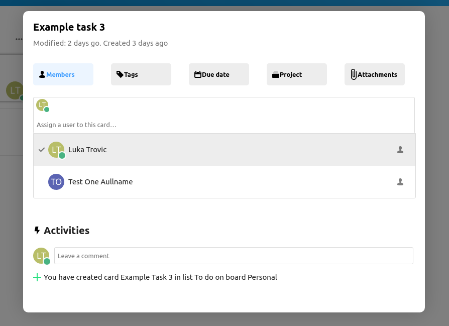
Members tab: |
Signed-off-by: Luka Trovic <luka@nextcloud.com>
|
|
 julien-nc
left a comment
julien-nc
left a comment
julien-nc
left a comment
There was a problem hiding this comment.
I didn't check the code yet.
- The CardModal component is not displayed in a modal but rather at the right sidebar's location.
- The member/user multiselect disappears on mouseout.
- I don't see the tag input like in your screenshot.
Did I do something wrong? Did you forgot to include some commits?
Signed-off-by: Luka Trovic <luka@nextcloud.com>
…update-card-modal-ui
…update-card-modal-ui
Signed-off-by: Luka Trovic <luka@nextcloud.com>
 juliusknorr
left a comment
juliusknorr
left a comment
juliusknorr
left a comment
There was a problem hiding this comment.
Looks fine from the overall structure, I left some comments inline and also a longer one regarding the "tabs" behaviour which might be something to adjust further.
src/components/card/CardModal.vue
Outdated
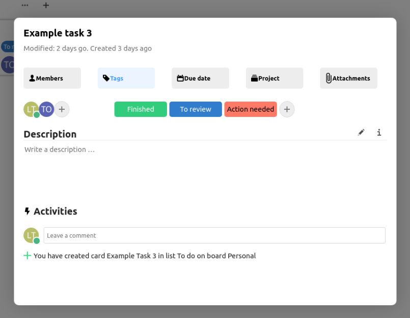
| Example task 3 | ||
| </h1> | ||
| <p class="top-modified"> | ||
| Modified: 2 days go. Created 3 days ago |
There was a problem hiding this comment.
Should of course use the actual card data instead of placeholder text.
src/components/card/CardModal.vue
Outdated
| <div class="tabs"> | ||
| <div class="tab members" :class="{active: activeTab === 'members'}" @click="activeTab = 'members'"> | ||
| <i class="icon-user icon" /> | ||
| Members |
There was a problem hiding this comment.
Please make this translatable
src/components/card/CardModal.vue
Outdated
| </div> | ||
| <div class="tab tags" :class="{active: activeTab === 'tags'}" @click="activeTab = 'tags'"> | ||
| <i class="icon icon-tag" /> | ||
| Tags |
There was a problem hiding this comment.
Please make this translatable
src/components/card/CardModal.vue
Outdated
| </div> | ||
| <div class="tab due-date" :class="{active: activeTab === 'duedate'}" @click="activeTab = 'duedate'"> | ||
| <i class="icon icon-calendar-dark" /> | ||
| Due date |
There was a problem hiding this comment.
Please make this translatable
src/components/card/CardModal.vue
Outdated
| </div> | ||
| <div class="tab project" :class="{active: activeTab === 'project'}" @click="activeTab = 'project'"> | ||
| <i class="icon icon-deck" /> | ||
| Project |
There was a problem hiding this comment.
Please make this translatable
src/components/card/CardModal.vue
Outdated
| </div> | ||
| <div class="tab attachments"> | ||
| <i class="icon-attach icon icon-attach-dark" /> | ||
| Attachments |
There was a problem hiding this comment.
Please make this translatable
src/components/card/CardModal.vue
Outdated
| </div> | ||
| <div class="activities"> | ||
| <h2 class="activities-title"> | ||
| <div class="icon-flash-black" /> Activities |
There was a problem hiding this comment.
I'd call this icon-activity then, and the text should be translatable
src/components/card/CardModal.vue
Outdated
| <Avatar :user="currentUser.uid" /> | ||
| <CommentForm v-model="newComment" @submit="createComment" /> | ||
| </div> | ||
| <div class="activities-logs"> |
There was a problem hiding this comment.
Activities and comments are two different things, we currently have no way to merge them easily on the backend side, so in addition to this section. So for adding the activities list, we can make use of the already existing component from https://github.com/nextcloud/deck/blob/master/src/components/card/CardSidebarTabActivity.vue#L24-L29
There was a problem hiding this comment.
For comments itself I think we should then also reuse the existing component for now:
https://github.com/nextcloud/deck/blob/master/src/components/card/CardSidebarTabComments.vue
Basically other than in the mockups, lets go for something like this to start with for the UI structure of the new modal:
Comments
----------
CardSidebarTabComments

Activities
----------
CardSidebarTabActivity
src/components/card/CardModal.vue
Outdated
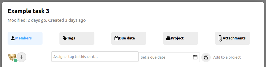
| Modified: 2 days go. Created 3 days ago | ||
| </p> | ||
| </div> | ||
| <div class="tabs"> |
There was a problem hiding this comment.
I think there might have been a bit of confusion on what the purpose of the top buttons is, they are not tabs in specific, but more toggle buttons for the actual input fields. Let me maybe describe the idea there a bit further:
Taking the due date as an example
- By default the input field is hidden
- The user decides to add a due date by clicking the "Due date" button
- Then the input is shown
- If a card has a due date set, we always show the input field
The same would be the case for the others (Members, Projects, Attachments, Tags)
| @@ -0,0 +1 @@ | |||
| <svg fill="#26e07f" xmlns="http://www.w3.org/2000/svg" viewBox="0 0 24 24" width="24px" height="24px"><path fill-rule="evenodd" d="M 11 2 L 11 11 L 2 11 L 2 13 L 11 13 L 11 22 L 13 22 L 13 13 L 22 13 L 22 11 L 13 11 L 13 2 Z"/></svg> | |||
There was a problem hiding this comment.
This should be available already as a global icon class icon-add https://docs.nextcloud.com/server/latest/developer_manual/html_css_design/icons.html
Otherwise we can make use of https://github.com/robcresswell/vue-material-design-icons for pulling in icons.
julien-nc
left a comment
julien-nc
left a comment
There was a problem hiding this comment.
Ok got it, "Use bigger card view" must be checked to display the card modal.
It looks nice!
- If the modal content is too long, there is no way to scroll down. A simple way to solve that is to add
overflow: scroll;to the.modal-containerbut there might be a cleaner approach. - We could use more partial vue component import like in line 48 of App.vue
- Clicking on tabs does not have any effect on the modal content. What's the purpose of the tabs?
- User select, tag, date and "Add to project" are all displayed on the same line
- Multiselect disappears on mouseout for users and tags
Signed-off-by: Luka Trovic <luka@nextcloud.com>
Signed-off-by: Luka Trovic <luka@nextcloud.com>
Signed-off-by: Luka Trovic <luka@nextcloud.com>
|
@juliushaertl @max-nextcloud Could you review? Thanks. |
…update-card-modal-ui
Signed-off-by: Luka Trovic <luka@nextcloud.com>
Signed-off-by: Luka Trovic <luka@nextcloud.com>
…update-card-modal-ui
Signed-off-by: Luka Trovic <luka@nextcloud.com>
|
Let me close this since this has quite some heavy conflicts meanwhile, we can pick this up once relevant again |
3 participants
Signed-off-by: Luka Trovic luka@nextcloud.com
Summary
TODO
Checklist