Repository navigation
User Guide: Configuring the Manager UI
The manager_config.json can be used in a custom deployment to style your deployment and configure how the pages of the Manager displays the assets and attributes in your system. On this page we will use an example config and give a short description of each section you could include. Note that some pages have a default config that you can overwrite using the manager_config.
View the example manager_config used in the sections on this page.
{
  "pages": {
    "map": {
      "card": {
        "default": {
          "exclude": [
            "notes"
          ]
        },
        "assetTypes": {
          "WeatherAsset": {
            "exclude": [
              "location",
              "notes",
              "model",
              "manufacturer"
            ]
          }
        }
      }
    },
    "rules": {
      "rules": {
        "controls": {
          "allowedLanguages": ["JSON", "FLOW", "GROOVY"],
          "allowedActionTargetTypes": {
            "actions": {
              "email": [
                "CUSTOM", "USER"
              ],
              "push": [
                "ASSET", "USER"
              ]
            }
          }
        },
        "descriptors": {
          "all": {
            "excludeAssets": [
              "TradfriLightAsset",
              "TradfriPlugAsset",
              "ArtnetLightAsset"
            ],
            "assets": {
              "*": {
                "excludeAttributes": [
                  "location"
                ]
              }
            }
          }
        }
      }
    },
    "insights": {
      "dataViewer" {
        "panels": {
          "chart": {
            "type": "chart",
            "hideOnMobile": true,
            "panelStyles": {
              "gridColumn": "1 / -1"
            }
          },
          "kpi1": {
            "type": "kpi",
            "hideOnMobile": false
          },
          "kpi2": {
            "type": "kpi",
            "hideOnMobile": false
          },
          "kpi3": {
            "type": "kpi",
            "hideOnMobile": false
          },
          "kpi4": {
            "type": "kpi",
            "hideOnMobile": false
          },
          "kpi5": {
            "type": "kpi",
            "hideOnMobile": false
          },
          "kpi6": {
            "type": "kpi",
            "hideOnMobile": false
          },
          "kpi7": {
            "type": "kpi",
            "hideOnMobile": false
          },
          "kpi8": {
            "type": "kpi",
            "hideOnMobile": false
          },
          "chart2": {
            "type": "chart",
            "hideOnMobile": true,
            "panelStyles": {
              "gridColumn": "1 / -1"
            }
          },
          "chart3": {
            "type": "chart",
            "hideOnMobile": true,
            "panelStyles": {
              "gridColumn": "1 / -1"
            }
          }
        }
      }
    },
    "assets": {
      "tree": {
        "add": {
          "typesParent": {
            "default": {
              "exclude": [
                "TradfriLightAsset",
                "TradfriPlugAsset",
                "ArtnetLightAsset",
                "ArtnetAgent",
                "MacroAgent",
                "ControllerAgent",
                "KNXAgent",
                "ZWAgent",
                "TradfriAgent",
                "TimerAgent",
                "VelbusTcpAgent",
                "VelbusSerialAgent"
              ]
            }
          }
        }
      },
      "viewer": {
        "default": {
          "panels": {
            "attributes": {
              "type": "info",
              "attributes": {
                "exclude": ["location", "notes", "manufacturer", "model"]
              },
              "properties": {
                "include": []
              }
            }
          }
        },
        "assetTypes": {
          "WeatherAsset": {
            "panels": {
              "attributes": {
                "type": "info",
                "attributes": {
                  "exclude": ["location", "Radiation", "UVIndex", "currentWeather", "notes", "manufacturer", "model"]
                },
                "properties": {
                  "include": []
                }
              }
            }
          }
        },
        "historyConfig": {
          "table": {
            "attributeNames": {
              "optimiseTarget": {
                "columns": [
                  {
                    "header": "Optimise target",
                    "type": "prop",
                    "path": "$."
                  },
                  {
                    "header": "Timestamp",
                    "type": "timestamp"
                  }
                ]
              }
            }
          }
        }
      }
    }
  },
  "realms": {
    "default": {
      "appTitle": "ACME IoT",
      "headers": [
        "map", "assets", "rules", "insights", "language", "users", "roles", "account", "logs", "logout"
      ],
      "styles": ":host > * {--or-app-color2: #F9F9F9; --or-app-color3: #22211f; --or-app-color4: #1b5630; --or-app-color5: #CCCCCC;}",
      "logo": "/images/logo.png",
      "logoMobile": "/images/logo-mobile.png",
      "favicon": "/images/favicon.png",
      "language": "en"
    }
  }
}
Map - Card: You can set the attributes to exclude (or include) on the top right card of the map when an asset is selected. This can be done for all asset types (by using default), or per asset type (as shown for WeatherAsset).
{
  "pages": {
    "map": {
      "card": {
        "default": {
          "exclude": [
            "notes"
          ]
        },
        "assetTypes": {
          "WeatherAsset": {
            "exclude": [
              "location",
              "notes",
              "model",
              "manufacturer"
            ]
          }
        }
      }
    },
Map - Marker config: This configures how the markers behave. They can either change their colour based on an attribute value (number, boolean, or string), show a label with or without units, and/or show the direction an asset is facing. Note that this part of the config is not in the manager_config used in the manager demo yet.
"markers": {
  "ElectricityProducerSolarAsset": {
    "attributeName": "energyExportTotal",
    "showLabel": true,
    "showUnits": true,
    "colours": {
      "type": "range",
      "ranges": [
        {
          "max": 50,
          "colour": "39B54A"
        },
        {
          "max": 80,
          "colour": "F7931E"
        },
        {
          "max": 100,
          "colour": "C1272D"
        }
      ]
    }
  }
}
Rules - Controls: Set which types of rules are available (for users with the correct permissions), and which actions a rule can perform.
    "rules": {
      "rules": {
        "controls": {
          "allowedLanguages": ["JSON", "FLOW", "GROOVY"],
          "allowedActionTargetTypes": {
            "actions": {
              "email": [
                "CUSTOM", "USER"
              ],
              "push": [
                "ASSET", "USER"
              ]
            }
          }
        },
Rules - When-Then: Set which assettypes are excluded from the list of asset types that can be selected in the When-Then rule. Additionally you can set per asset (or all '*') which attributes should be excluded from the select list.
        "descriptors": {
          "all": {
            "excludeAssets": [
              "TradfriLightAsset",
              "TradfriPlugAsset",
              "ArtnetLightAsset"
            ],
            "assets": {
              "*": {
                "excludeAttributes": [
                  "location"
                ]
              }
            }
          }
        }
      }
    },
Insights: The insights page layout and its panel types can be modified.
    "insights": {
      "dataViewer": {
        "panels": {
          "chart": {
            "type": "chart",
            "hideOnMobile": true,
            "panelStyles": {
              "gridColumn": "1 / -1"
            }
          },
          "kpi1": {
            "type": "kpi",
            "hideOnMobile": false
          },
          "kpi2": {
            "type": "kpi",
            "hideOnMobile": false
          },
          "kpi3": {
            "type": "kpi",
            "hideOnMobile": false
          },
          "kpi4": {
            "type": "kpi",
            "hideOnMobile": false
          },
          "kpi5": {
            "type": "kpi",
            "hideOnMobile": false
          },
          "kpi6": {
            "type": "kpi",
            "hideOnMobile": false
          },
          "kpi7": {
            "type": "kpi",
            "hideOnMobile": false
          },
          "kpi8": {
            "type": "kpi",
            "hideOnMobile": false
          },
          "chart2": {
            "type": "chart",
            "hideOnMobile": true,
            "panelStyles": {
              "gridColumn": "1 / -1"
            }
          },
          "chart3": {
            "type": "chart",
            "hideOnMobile": true,
            "panelStyles": {
              "gridColumn": "1 / -1"
            }
          }
        }
      }
    },
Assets - tree: Exclude asset types from the 'Add asset' dialog.
    "assets": {
      "tree": {
        "add": {
          "typesParent": {
            "default": {
              "exclude": [
                "TradfriLightAsset",
                "TradfriPlugAsset",
                "ArtnetLightAsset",
                "ArtnetAgent",
                "MacroAgent",
                "ControllerAgent",
                "KNXAgent",
                "ZWAgent",
                "TradfriAgent",
                "TimerAgent",
                "VelbusTcpAgent",
                "VelbusSerialAgent"
              ]
            }
          }
        }
      },
Assets - viewer: Configure which panels are shown on the assets page. You can include or exclude attributes to shown per panel. These panels can be set for all asset types, or specified per type. This is an extension or overwrite of the default config of the asset-viewer. In historyConfig an example is given on how to specify the columns shown in a table for an attribute that is not a number or boolean; if no config is given, it will automatically create columns.
      "viewer": {
        "default": {
          "panels": {
            "attributes": {
              "type": "info",
              "attributes": {
                "exclude": ["location", "notes", "manufacturer", "model"]
              },
              "properties": {
                "include": []
              }
            }
          }
        },
        "assetTypes": {
          "WeatherAsset": {
            "panels": {
              "attributes": {
                "type": "info",
                "attributes": {
                  "exclude": ["location", "Radiation", "UVIndex", "currentWeather", "notes", "manufacturer", "model"]
                },
                "properties": {
                  "include": []
                }
              }
            }
          }
        },
        "historyConfig": {
          "table": {
            "attributeNames": {
              "optimiseTarget": {
                "columns": [
                  {
                    "header": "Optimise target",
                    "type": "prop",
                    "path": "$."
                  },
                  {
                    "header": "Timestamp",
                    "type": "timestamp"
                  }
                ]
              }
            }
          }
        }
      }
    }
  },
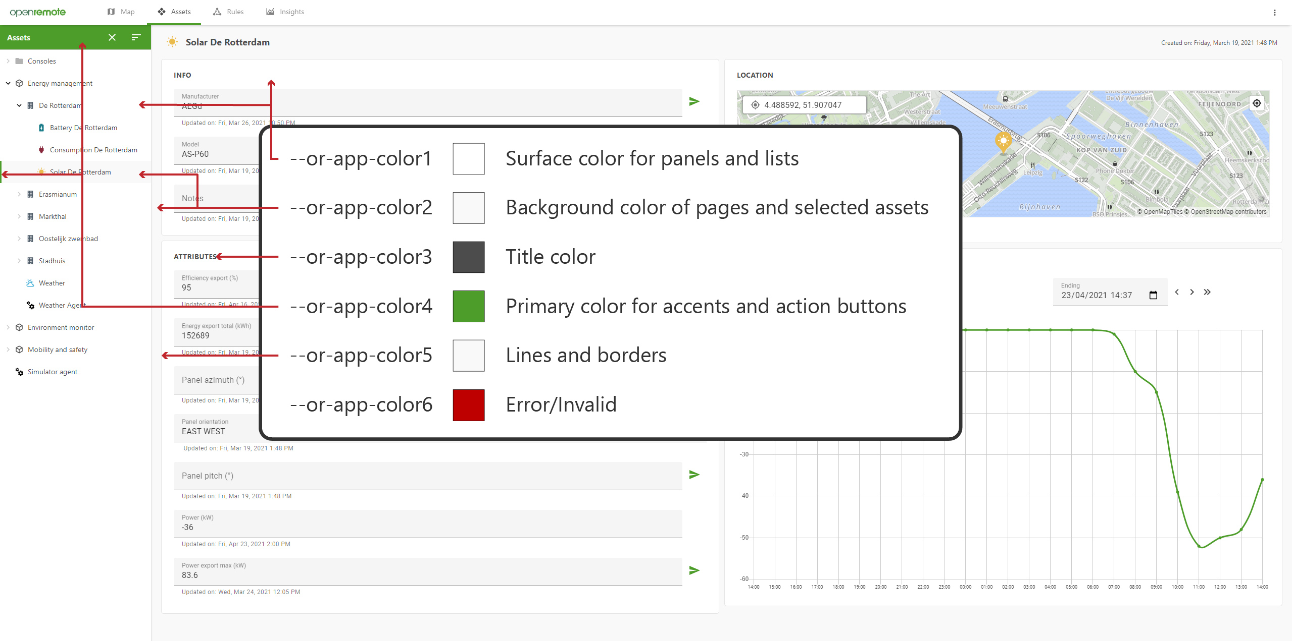
Realm configuration: As explained on the custom deployment wiki page you can set the branding per realm. In the example below you can see how the page title, headers, colors, and logo's are set.
  "realms": {
    "default": {
      "appTitle": "ACME IoT",
      "headers": [
        "map", "assets", "rules", "insights", "language", "users", "roles", "account", "logs", "logout"
      ],
      "styles": ":host > * {--or-app-color2: #F9F9F9; --or-app-color3: #22211f; --or-app-color4: #1b5630; --or-app-color5: #CCCCCC;}",
      "logo": "/images/logo.png",
      "logoMobile": "/images/logo-mobile.png",
      "favicon": "/images/favicon.png",
      "language": "en"
    }
  }
}