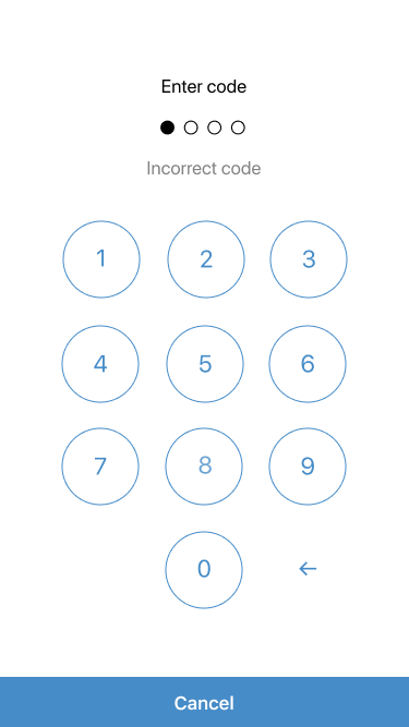
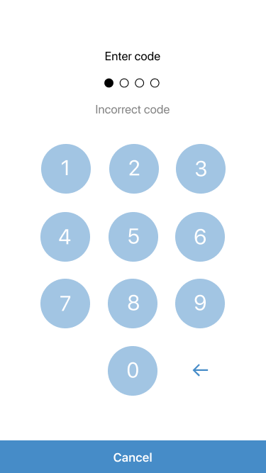
The passcode UI should get a more iOS like UI.
The current passcode has in my opinion some problems:
- Square Button not really iOS like
- Font size to small, not so easy to read
- Button Background Color to dark
I have two design suggestions which can you see below.
- Increased the font size
- Round Button, also used in iOS for passcodes
I added two different designs, please vote which one to you prefer or give suggestions, what we can do better.
Important for the development should be, to test it with:
- External keyboard connected
- Accessibility enabled (use accessibility label)
- Check iPad UI (use
viewController.modalPresentationStyle = UIModalPresentationFormSheet;)
| Draft 1: |
Draft 2: |
 |
 |


The passcode UI should get a more iOS like UI.
The current passcode has in my opinion some problems:
I have two design suggestions which can you see below.
I added two different designs, please vote which one to you prefer or give suggestions, what we can do better.
Important for the development should be, to test it with:
viewController.modalPresentationStyle = UIModalPresentationFormSheet;)