add pfBootstrapDatepicker #719
Conversation
|
@nicolethoen A couple of minor things:
I can't tell by your images if you have hover states on the month selection and the "Today" selection but those should match the core implementation in PatternFly if possible.
Thanks! |
 beanh66
left a comment
beanh66
left a comment
beanh66
left a comment
There was a problem hiding this comment.
Requested minor visual changes
src/datepicker/datepicker.module.js
Outdated
| * @name patternfly datepicker | ||
| * | ||
| * @description | ||
| * Select module for patternfly. |
There was a problem hiding this comment.
Add description apropos for the control, eg.
Datepicker module for patternfly
There was a problem hiding this comment.
nice catch. and sublime use of apropos.
| * | ||
| * @param {date} date must be a Javascript Date - to be displayed in the input. Can be left empty. | ||
| * @param {string} format default date format for displayed dates | ||
| * @param {object} dateOptions an object to configure the uib-datepicker in one place (optional) |
There was a problem hiding this comment.
As this is an object, some reference material might be helpful. See other object descriptions which describe the format/syntax of the options allowed for date.
| * @param {string} format default date format for displayed dates | ||
| * @param {object} dateOptions an object to configure the uib-datepicker in one place (optional) | ||
| * @param {boolean} isOpen whether or not to show the datepicker (default false) (optional) | ||
| * @param {object} popupPlacement Placement of the datepicker popup relative to the input element. Passing in 'auto' separated by a space bfore the placement will enable auto positioning. (optional) |
There was a problem hiding this comment.
Same as above vis a vis the object description, but additionally, with this option it might be nice to see the allowance for different placements in the demo area below. ie a radio button for say above/below.
 jcaianirh
left a comment
jcaianirh
left a comment
jcaianirh
left a comment
There was a problem hiding this comment.
Minor comments. Looks awesome Nicole!!
| * @param {object} popupPlacement Placement of the datepicker popup relative to the input element. Passing in 'auto' separated by a space bfore the placement will enable auto positioning. (optional) | ||
| * | ||
| * @description | ||
| * A wrapper for the Angular UI {@link http://angular-ui.github.io/bootstrap/#!#datepickerPopup datepicker}. |
There was a problem hiding this comment.
That link isn't working for me, it goes to the top of Angular UI Bootstrap page. I think http://angular-ui.github.io/bootstrap/#datepickerPopup will be enough to link-n-launch to the correct part of the page.
Hmm..still not working in some cases. Funny, even their GitHub page's 'here' and 'inline datepicker' links do not work correctly for me.
There was a problem hiding this comment.
yeah - i've noticed the same problem as I've tried linking to the param documentation in response to Joe's comments... Not sure what to do about that.
src/datepicker/datepicker.less
Outdated
|
|
||
| &.active { | ||
| background: @color-pf-blue-400; | ||
| border-color: #003d5f; |
There was a problem hiding this comment.
This should be a color from the patternfly color palette.
| bindings: { | ||
| format: '@', | ||
| date: '<', | ||
| dateOptions: '@', |
There was a problem hiding this comment.
dateOptions is an object, not a string, so it needs to be defined as dateOptions: '<'. You'll notice when you make this change, your overrides in your example no longer work Ex:
$scope.dateOptions = {
        showWeeks : true
      };
:-(
This is because the $onInit() is actually called after the objects from the example are bound. Try adding this to your component:
    ctrl.$onChanges = function (changesObj) {
      console.log("on changes");
    };
Then in the browser, source tab, open up angular-patternfly.js, find the component, set breakpoints in $onInit() and $onChanges(). You may want to remove the first datepicker example, just to see how the lifecycle of one example works. You'll see that $onChanges() is called first with the objects from the example, then $onInit() is called afterwards -in this case overriding the $scope.dateOptions set by the user/example.
We typically have some sort of if (!angular.isDefined(...).. or 'defaulting' operation in the $onInit() to prevent overriding.
Here's some code which has some examples of $onInit(), $onChanges, and even $doCheck for deep comparisions.
Here is another code example where we use lodash ._defaults(...) to handle default props and user defined props.
There was a problem hiding this comment.
^^ I'd probably stick with the last example and lodash ._defaults(...) it's a nice solution.
 dtaylor113
left a comment
dtaylor113
left a comment
dtaylor113
left a comment
There was a problem hiding this comment.
Pls see previous comment about bindings
|
You also have to change your commit msg to be something like this. I think |
beanh66
left a comment
beanh66
left a comment
There was a problem hiding this comment.
@nicolethoen The visual changes look good based on your updated screenshot. Thanks!
|
Hi @nicolethoen, latest code looks good! Here are my findings on updating attributes: So, for this particular component/usecase I think these are acceptable. |
|
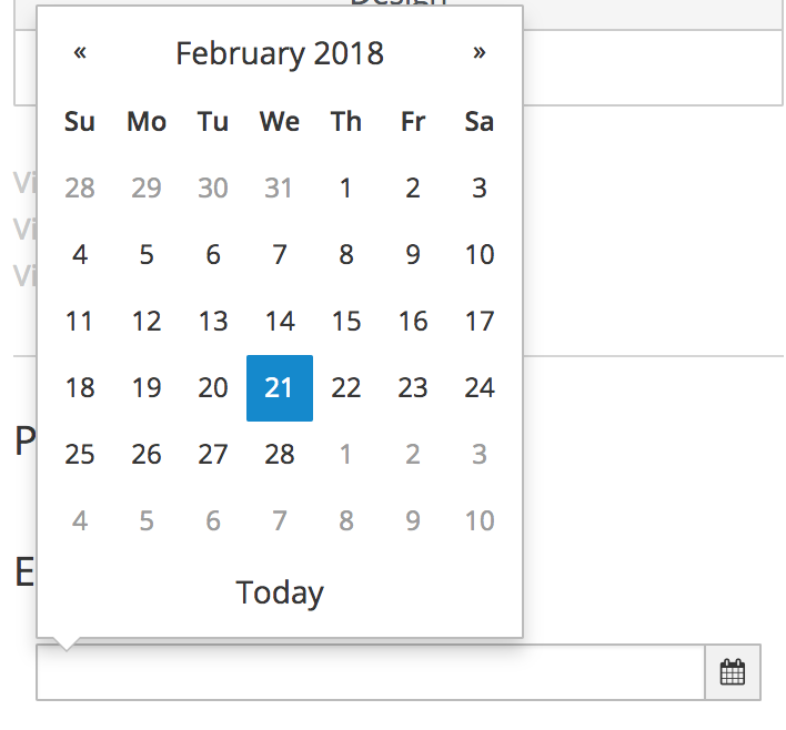
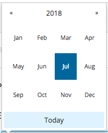
Can you pls look into changing the selected color to match pf design: PF Design: Current Impl: The pf core example is showing the correct color: http://www.patternfly.org/pattern-library/forms-and-controls/datepicker/#code |
| @@ -0,0 +1,78 @@ | |||
| describe('Component: pfBootstrapDatepicker', function () { | |||
There was a problem hiding this comment.
Appreciate the unit tests! 👍
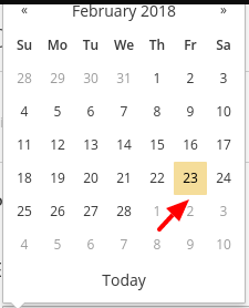
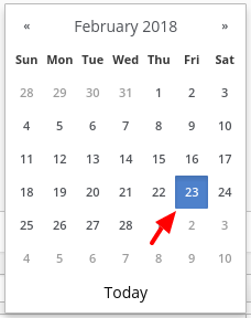
so, the yellow color here is actually highlighting today's date - not the selected date. For some reason, the angular ui component doesn't distinguish between todays date and your selected date. So it will show today's date as if it were selected in blue until you select a date and it will highlight that in blue. I've had a hard time getting the yellow to stick to todays date, but I'll keep trying. |
Ok, sounds good. Not a show stopper :-) |
Hi @beanh66, could you please approve this PR if satisfied with the visuals. -thanks! @jeff-phillips-18, pls review again, I think your issue(s) have been addressed -thanks! |
|
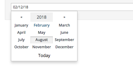
@dtaylor113 @nicolethoen Yes this satisfies the visuals from what I can tell. I can't see if there are hover colors on the month and the current date. Are those matching the design? And does the month selection open up to a display of all months? Not sure if there is somewhere I can check out the current implementation. If not, the screenshots work. Thanks! |
|
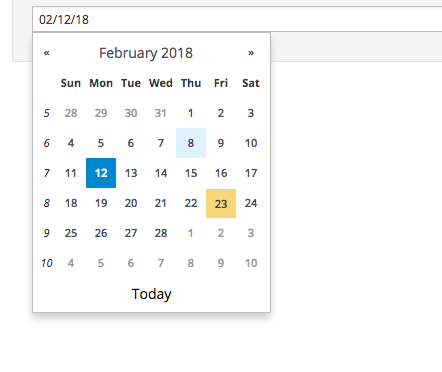
Here i've tried capturing the latest changes with hover states. |
 nicolethoen
force-pushed
the
pfBootstrapDatepicker
branch
from
nicolethoen
force-pushed
the
pfBootstrapDatepicker
branch
from
501a515 to
3ad3395
Compare
|
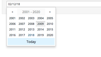
Thanks @nicolethoen! Hover states look great. It looks like the version with years or months should have more space around them and in the PF core implementation the months are abbreviated. Is that possible here? Posted a screenshot below: |
5 participants
Description
fixes #711
Styled the Angular UI datepicker so that it looks more like the patternfly datepicker.
Mostly removing the week numbers from the beginning of each week and styling the various buttons.
The user can also still pass dateOptions to the Angular UI datepicker to customize its behavior.
PR Checklist